Compelling Fresh Visualization Picks for Inspiration — DataViz Weekly
May 9th, 2025 by AnyChart Team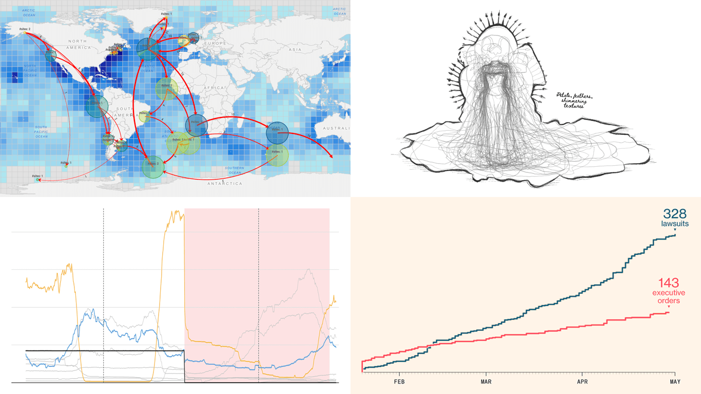 We skipped a few Fridays — but for good reason. With Qlik Connect just around the corner, we have been deep in prep mode: finalizing assets, polishing demos, and getting our brand-new Spreadsheets extension for Qlik Sense completely ready to launch. Still, we could not hold off any longer, so we carved out a quick break to bring you a new edition of DataViz Weekly! Here are the most compelling visualizations we have come across lately — take a look:
- Marine migration pathways — MiCO
- Spain’s energy system under strain — Colpisa
- Lawsuits against Trump’s executive orders — Bloomberg
- Met Gala outfit silhouettes over time — Reuters
- Categories: Data Visualization Weekly
- No Comments »
Insightful Data Visualizations You Need to See — DataViz Weekly
March 7th, 2025 by AnyChart Team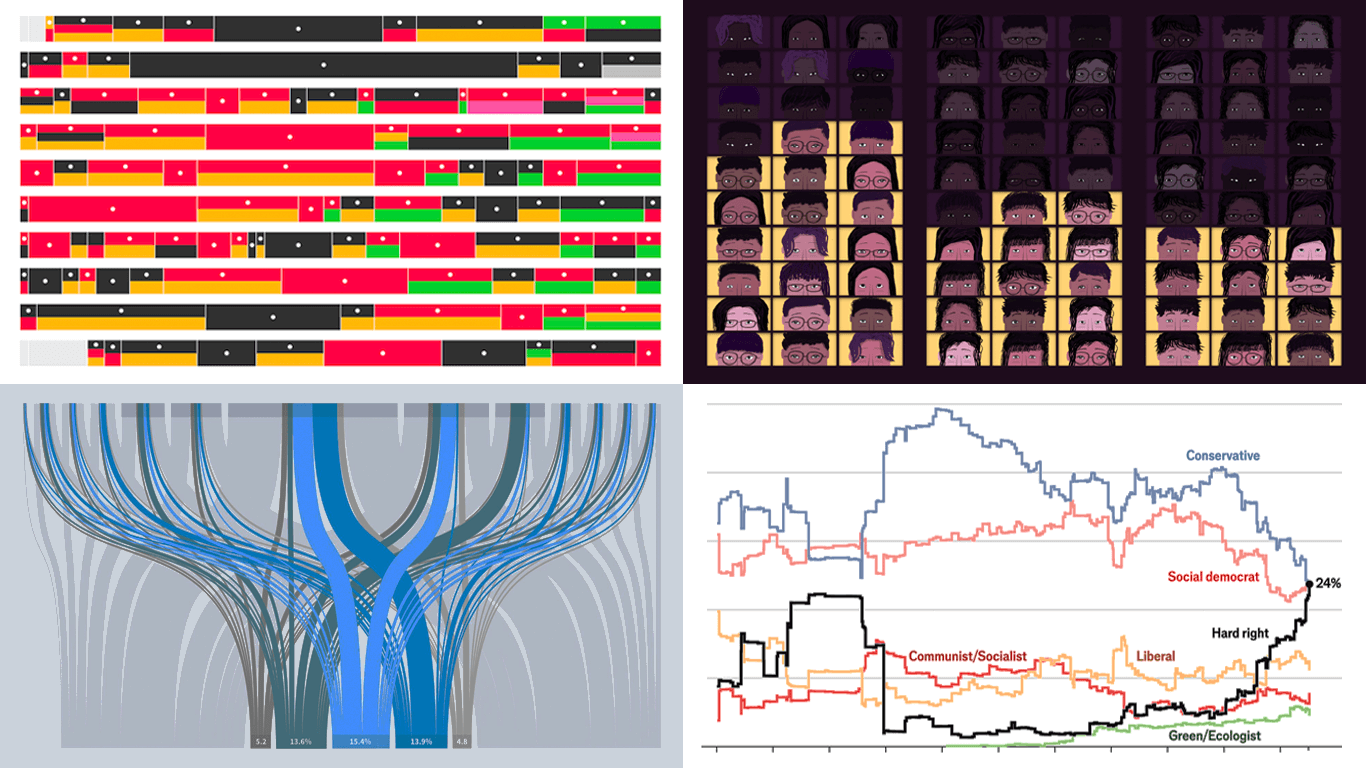 Data visualization is powerful — when done right, it conveys meaning clearly and helps insights emerge naturally. We continue DataViz Weekly, where we regularly highlight some excellent examples from around the internet, offering a firsthand look at how graphical representation can effectively reveal and clarify information. This time, we think you just need to see the following:
- U.S. imports and tariffs — Reuters
- Coalition scenarios in Germany — Bloomberg
- Hard-right parties in Europe — The Economist
- Emotional experiences of middle schoolers — The Pudding
- Categories: Data Visualization Weekly
- No Comments »
Awesome New Data Visualization Works — DataViz Weekly
November 15th, 2024 by AnyChart Team Welcome back to DataViz Weekly, where we spotlight the most awesome data visualization works we have recently come across. Check out the projects we’re diving into this time:
- Love songs: death or evolution? — The Pudding
- Historical dry streaks in NYC — Bloomberg Green
- NYC subway ridership in detail — Subway Stories
- Vote swings in U.S. presidential elections — NYT
- Categories: Data Visualization Weekly
- No Comments »
27 Election Maps of 2024 U.S. Presidential Vote Results — DataViz Weekly Special Edition
November 8th, 2024 by AnyChart Team The 2024 U.S. presidential election has concluded, and media outlets worldwide are offering a plethora of data graphics to convey the election results. In this special edition of DataViz Weekly, we’ve curated a collection of over twenty election maps, showcasing diverse ways to represent voting data — cartograms, choropleth maps, bubble maps, and more. Whether you’re a data enthusiast, professional, or simply intrigued by the 2024 election outcomes, explore the latest U.S. election maps from top media!
💡 Also see our previous special editions with election maps: 2020 U.S. election maps and 2024 UK election maps.
- Categories: AnyMap, Dashboards, Data Visualization Weekly
- No Comments »
Top Data Visualizations We’ve Recently Seen — DataViz Weekly
October 18th, 2024 by AnyChart Team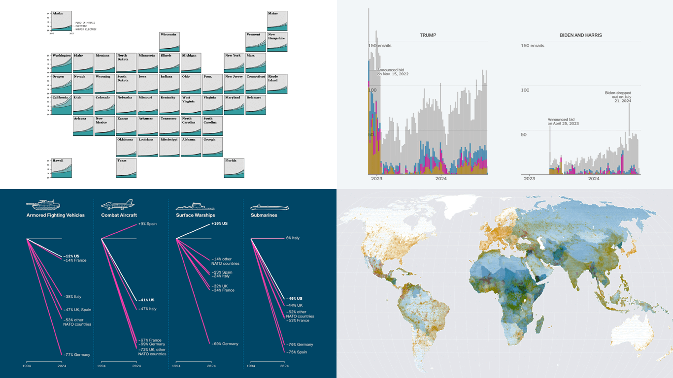 It’s Friday, which means it’s the perfect moment to look back at the data visualizations that have sparked our curiosity over the past few days. So, without further ado, welcome to DataViz Weekly!
- Electric vehicle adoption across the United States — FlowingData
- Europe’s military reductions and defense challenges — Bloomberg
- Climate—Conflict—Vulnerability Index for global risk assessment — UniBw München, PIK, AA, Truth & Beauty
- Campaign emails with donation incentives in the 2024 U.S. presidential race — The New York Times
- Categories: Data Visualization Weekly
- No Comments »
Impressive New Data Visuals for Your Inspiration — DataViz Weekly
October 11th, 2024 by AnyChart Team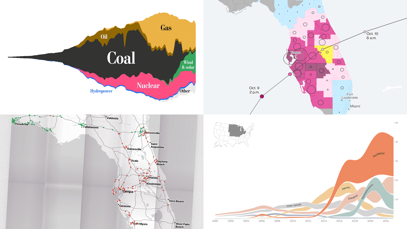 Ready for another dose of impressive data visuals? DataViz Weekly is back with a fresh selection of projects that use powerful graphics to help unravel various trends and patterns. Here are our top picks from what we’ve most recently come across out there:
- End of the UK’s coal power era and lessons for the world — The Washington Post
- Hurricane Milton’s impact and power outages — Bloomberg
- Waffle House Index for Florida under and after Milton — Riley Walz
- Opioid overdose deaths across the United States — NYT Opinion
- Categories: Data Visualization Weekly
- No Comments »
Stunning New Charts & Maps from Around Internet — DataViz Weekly
October 4th, 2024 by AnyChart Team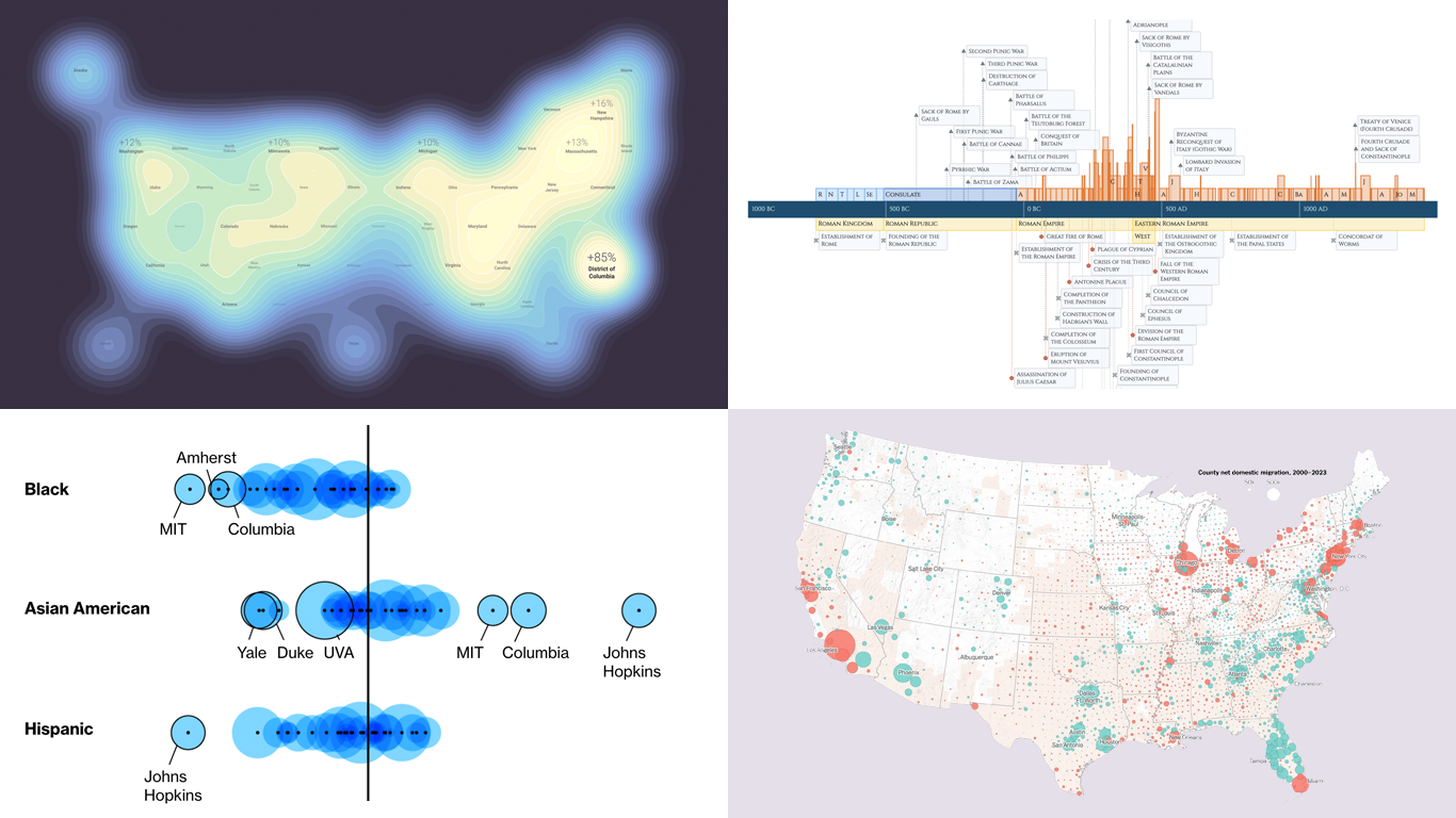 Charts and maps have a unique power to let data talk, transforming raw numbers into meaningful insights that anyone can grasp. In this edition of DataViz Weekly, we’re featuring some of the most stunning new examples of how data visualization brings information to life.
- Hazard-prone locations in the United States attracting migration — NYT
- Shifts in college admissions after the affirmative action ruling — Bloomberg
- Google search trends around U.S. elections — Google Trends and Truth & Beauty
- Interactive timeline of Roman history — AnyChart
- Categories: Data Visualization Weekly
- No Comments »
Unlocking Visual Data Insights — DataViz Weekly
August 16th, 2024 by AnyChart Team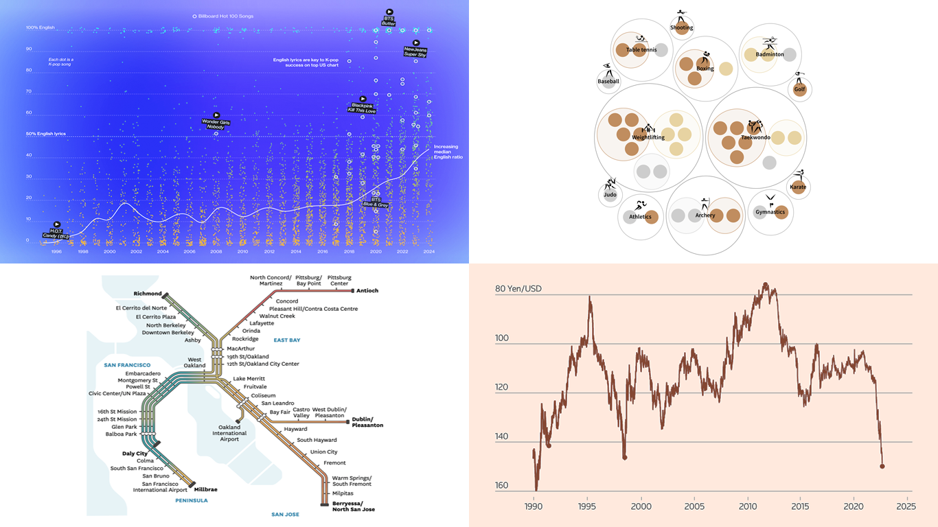 Data speaks louder when it’s represented graphically. Unlock the power of visual data insights in our new edition of DataViz Weekly, putting a spotlight on new charts and maps that make trends and patterns clear and engaging. Take a look at the projects that have stood out to us this week:
- K-pop’s global reach through internationalization — Bloomberg
- The Bay Area’s microclimates revealed through the BART network — The San Francisco Chronicle
- Taiwan’s Olympic medals — Taiwan Data Stories
- Yen fluctuations and the Bank of Japan’s influence — Reuters
- Categories: Data Visualization Weekly
- No Comments »
Paris 2024 Olympic Medal Count Trackers — DataViz Weekly
August 9th, 2024 by AnyChart Team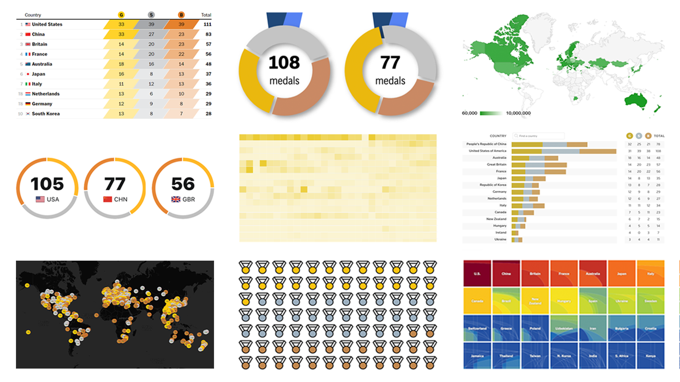 The Paris Summer Olympics are in full swing. If you’re interested in tracking the results and want to know which countries are excelling, numerous media outlets have prepared a variety of medal count trackers. In this special edition of DataViz Weekly, we showcase a selection of these projects, with a special focus on those that not only display numbers but also present them through compelling visualizations. Let’s dive in!
- Categories: Data Visualization Weekly
- No Comments »
Stunning New Data Visualization Examples in Our Curated Collection — DataViz Weekly
July 26th, 2024 by AnyChart Team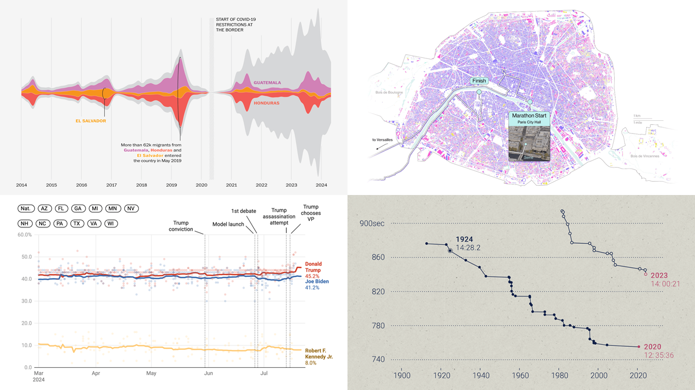 Welcome to DataViz Weekly, where we present a curated selection of stunning data visualization examples our there. Whether you’re a data professional or simply interested in visual data, these charts and maps can provide both inspiration and practical ideas. Here’s what we have for you to explore today:
- U.S. immigration patterns — WaPo
- 2024 U.S. presidential election forecast — Silver Bulletin
- Paris Olympics 100 years later — SCMP
- Extreme heat challenges at the 2024 Summer Olympics — Bloomberg Green
- Categories: Data Visualization Weekly
- No Comments »