Best Data Visualizations of 2024 — DataViz Weekly
January 17th, 2025 by AnyChart Team In 2024, data visualization remained a vital tool for exploring complex topics and presenting insights in engaging ways. From global conflicts and environmental challenges to cultural phenomena and historical trends, charts and maps provided valuable perspectives and captivated audiences.
This special edition of DataViz Weekly highlights the best data visualizations of 2024. Featuring projects selected by FlowingData, The Pudding, and the Global Investigative Journalism Network (GIJN), as well as year-in-review collections from leading media sources, it offers a curated look at some of the most compelling visual storytelling created during the year. All aboard!
- Categories: Data Visualization Weekly
- No Comments »
Information Visualization Techniques in Action on Democracy, Covid-19, Inequality & Gerrymandering — DataViz Weekly
June 26th, 2020 by AnyChart Team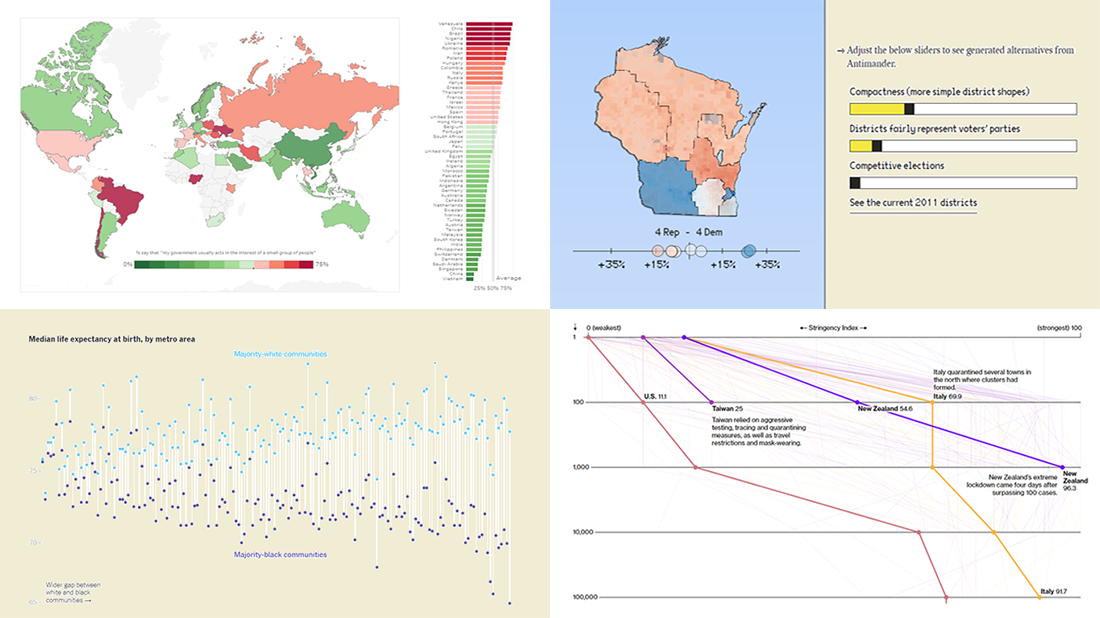 DataViz Weekly is here exhibiting new interesting projects from around the web that demonstrate a great use of different information visualization techniques to deliver better insight. See our new picks:
- Democracy Perception Index 2020 — Dalia
- Government reactions to the Covid-19 pandemic — Bloomberg News
- Gaps between Black and White America — The New York Times Opinion
- Antimander, a tool to expose gerrymandering in congressional districts — Joel Simon
- Categories: Data Visualization Weekly
- No Comments »
AnyChart Blog Named in 50 Best Data Visualization Blogs to Follow in 2019
April 10th, 2019 by AnyChart Team Yay, AnyChart Blog with our flagship regular feature DataViz Weekly has made it to the Top 50 Data Visualization Blogs and Websites To Follow in 2019! Curated by Feedspot, this newly updated list ranks our blog as high as second — right next to Nathan Yau’s brilliant blog FlowingData deservedly occupying the first place among the best data visualization blogs.
- Categories: News
- 1 Comment »