Politics Across New Data Visualizations — DataViz Weekly
April 4th, 2025 by AnyChart Team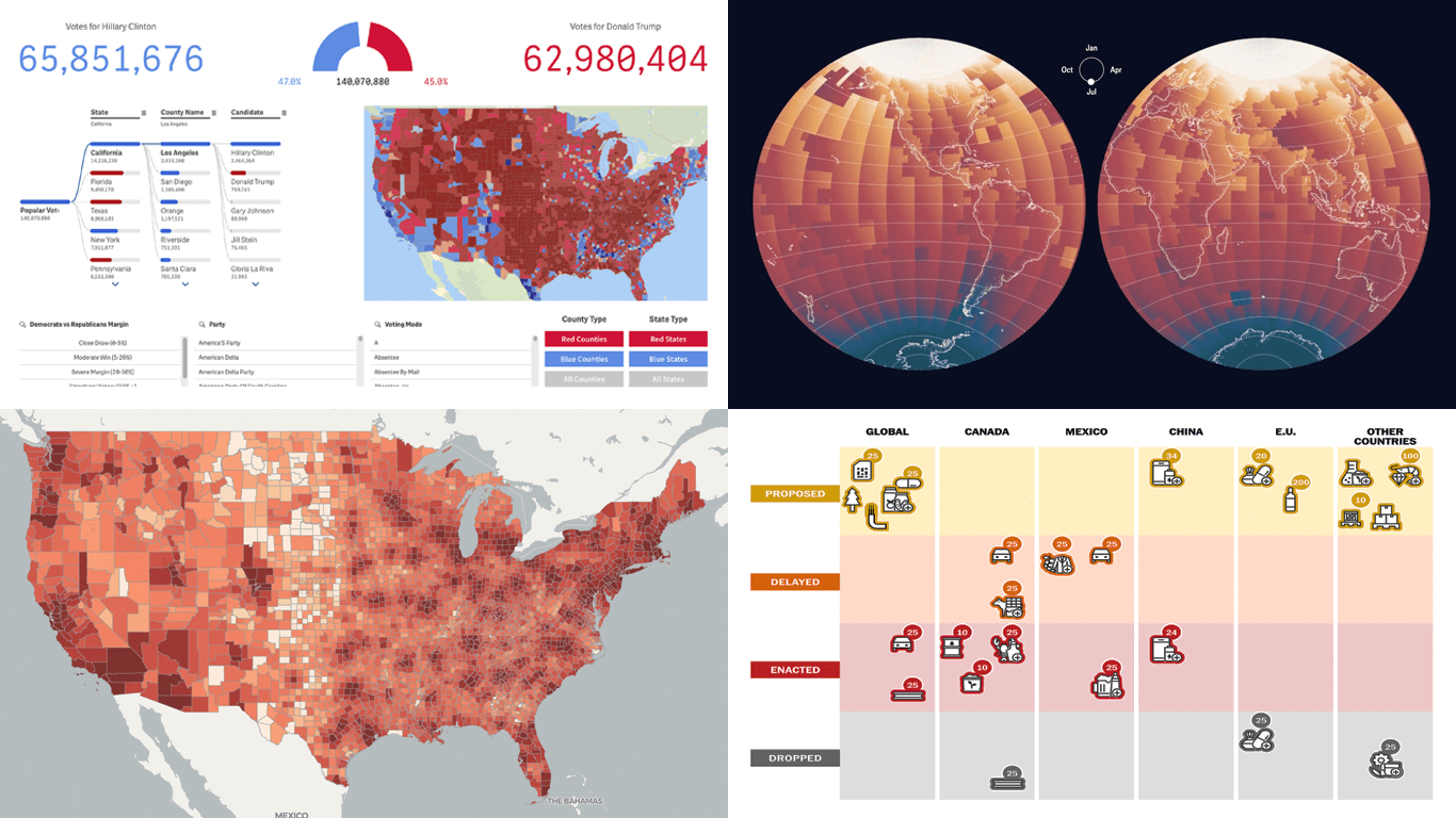 Politics shapes the world in many ways — and, as always, data visualization helps make sense of it all. This time in DataViz Weekly, we are looking at how charts and maps reflect political shifts, decisions, and consequences — from election results and government budgets to tariff policies and even time zones.
One of these projects is ours. We hesitated for a moment — but let’s be honest, we would have featured it anyway if we had stumbled upon it elsewhere.
So, without further ado, here are the four new data visualization projects we think you’ll want to check out:
- U.S. presidential elections — AnyChart
- Trump tariffs timeline — The Washington Post
- Science funding cuts in the United States — SCIMaP
- Politics of time zones — The Economist
- Categories: Data Visualization Weekly
- No Comments »
Data Visualization in Action: Fresh Examples — DataViz Weekly
February 14th, 2025 by AnyChart Team We’re back with DataViz Weekly, where we showcase some of the best new data visualization examples — from individual charts and maps to full-scale visual stories and projects. Take a look at our latest picks:
- Swiss research funding — Colas Droin
- Education and voting patterns in U.S. presidential elections — Jon Boeckenstedt
- City walkability and improvement potential — The Economist & Matteo Bruno et al.
- Self-censorship in Super Bowl halftime shows — Artur Galocha for The Washington Post
- Categories: Data Visualization Weekly
- No Comments »
Awesome New Data Visualization Works — DataViz Weekly
November 15th, 2024 by AnyChart Team Welcome back to DataViz Weekly, where we spotlight the most awesome data visualization works we have recently come across. Check out the projects we’re diving into this time:
- Love songs: death or evolution? — The Pudding
- Historical dry streaks in NYC — Bloomberg Green
- NYC subway ridership in detail — Subway Stories
- Vote swings in U.S. presidential elections — NYT
- Categories: Data Visualization Weekly
- No Comments »
27 Election Maps of 2024 U.S. Presidential Vote Results — DataViz Weekly Special Edition
November 8th, 2024 by AnyChart Team The 2024 U.S. presidential election has concluded, and media outlets worldwide are offering a plethora of data graphics to convey the election results. In this special edition of DataViz Weekly, we’ve curated a collection of over twenty election maps, showcasing diverse ways to represent voting data — cartograms, choropleth maps, bubble maps, and more. Whether you’re a data enthusiast, professional, or simply intrigued by the 2024 election outcomes, explore the latest U.S. election maps from top media!
💡 Also see our previous special editions with election maps: 2020 U.S. election maps and 2024 UK election maps.
- Categories: AnyMap, Dashboards, Data Visualization Weekly
- No Comments »
Fresh Data Visuals That Impressed Us — DataViz Weekly
November 4th, 2024 by AnyChart Team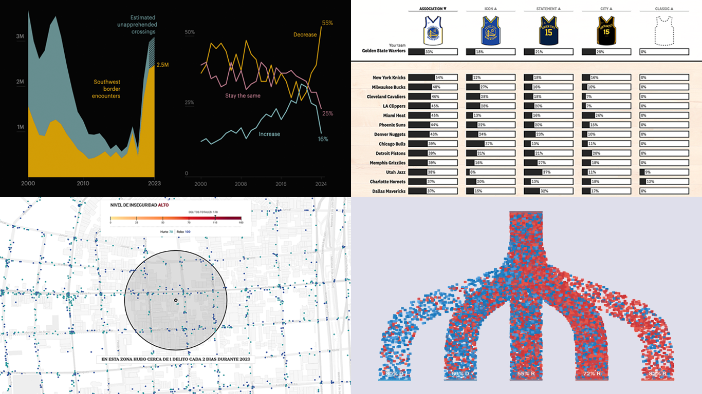 We’re a bit behind schedule after last week’s big release of updates for our Qlik Sense extensions, including the transformative AI Splits feature in the Decomposition Tree. But finally, here we are with a fresh edition of DataViz Weekly! Check out the projects with charts and maps that stood out to us most lately:
- U.S. immigration trends in historical context — ProPublica
- Crime trends in Buenos Aires — LA NACION
- Evolution of NBA uniform colors — The Pudding
- Internal migration and political polarization in the United States — The Upshot
- Categories: Data Visualization Weekly
- No Comments »
Stunning New Charts & Maps from Around Internet — DataViz Weekly
October 4th, 2024 by AnyChart Team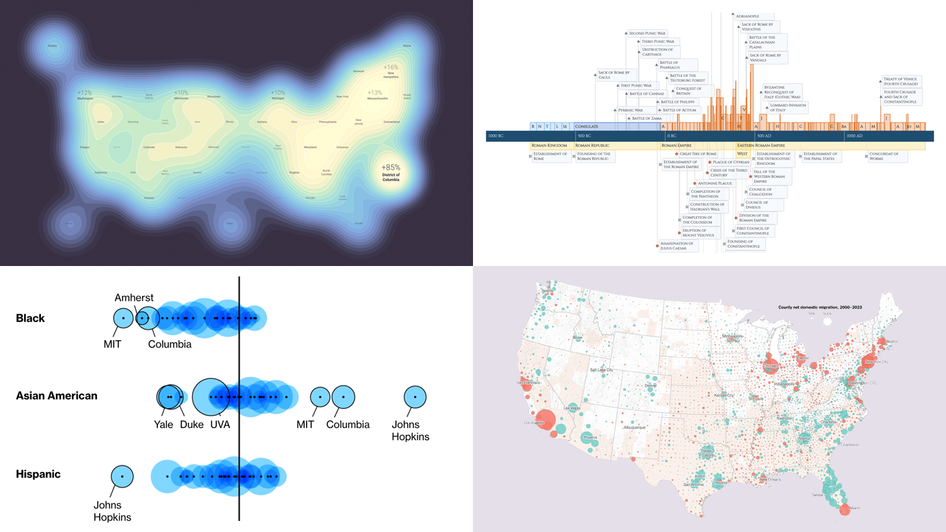 Charts and maps have a unique power to let data talk, transforming raw numbers into meaningful insights that anyone can grasp. In this edition of DataViz Weekly, we’re featuring some of the most stunning new examples of how data visualization brings information to life.
- Hazard-prone locations in the United States attracting migration — NYT
- Shifts in college admissions after the affirmative action ruling — Bloomberg
- Google search trends around U.S. elections — Google Trends and Truth & Beauty
- Interactive timeline of Roman history — AnyChart
- Categories: Data Visualization Weekly
- No Comments »
New Data Visualization Projects Worth Checking Out — DataViz Weekly
July 19th, 2024 by AnyChart Team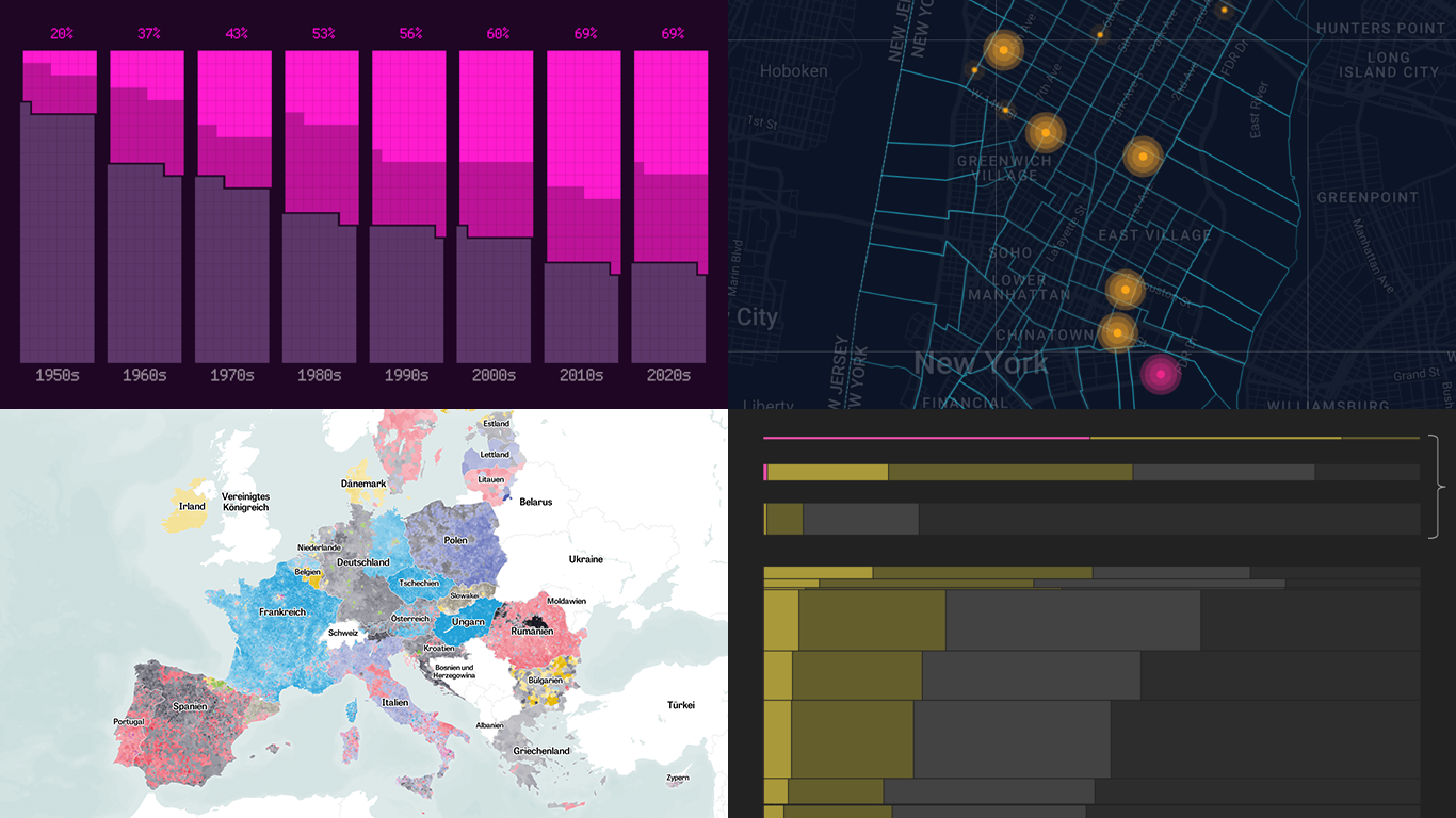 Data is easier to explore and analyze when visualized. If you’re looking for practical examples, you’ve arrived at the right place. DataViz Weekly is here to introduce you to some new data visualization projects we have found on the web.
- NYC congestion zone crash tracker — Transpo Maps
- 2024 European Parliament election map — ZEIT ONLINE
- Global hunger insights — Reuters
- Evolution of sci-fi films — The Pudding
- Categories: Data Visualization Weekly
- No Comments »
2024 UK Election Maps — DataViz Weekly
July 8th, 2024 by AnyChart Team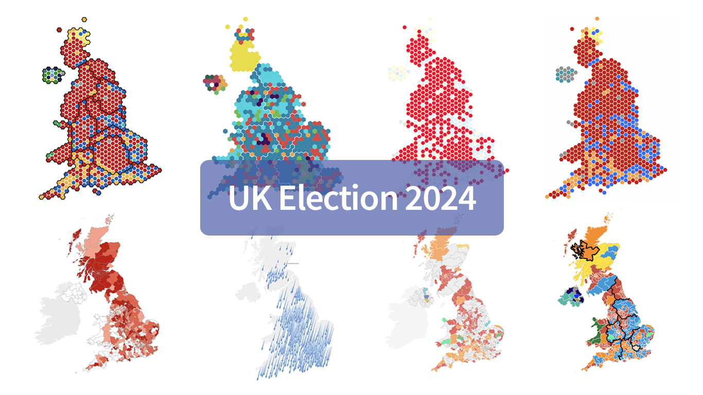 Last Thursday’s 2024 United Kingdom general election resulted in a historic shift within the nation’s political landscape, marking the Conservatives’ most severe defeat in nearly two centuries. As people look for clarity on these changes, election maps have come to the forefront as effective visual tools to make sense of voting outcomes and underlying patterns.
In this special edition of DataViz Weekly, we present a quick overview of UK election maps from prestigious sources including Sky News, The Independent, the BBC, The Financial Times, The Guardian, CNN, Open Innovations, and The New York Times, complete with links to them. Explore these data visualization projects to delve deeper into the dramatic shifts of the 2024 election, experience the power of effective electoral data mapping, and perhaps find inspiration for your own work.
💡 See also: 2024 U.S. Election Maps (November 2024).
- Categories: Data Visualization Weekly
- No Comments »