January 22nd, 2015 by Margaret Skomorokh
Today we are releasing a small bug fix update to AnyChart and an improvement update to AnyGantt.
AnyChart 7.3.1: bug fixes
- Problems with updating data points on Pie Charts.
- Problems with updating legend items and appending series in Scatter/Cartesian/Radar/Polar Charts.
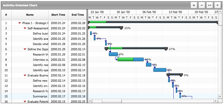
AnyGantt 7.3.1: new features
- The Tooltips feature for Resource and Project Charts.
- Data grid and timeline rows highlighting.
- Improvements of scrollbar style.
AnyChart version history: https://www.anychart.com/products/anychart/history/
AnyGantt version history: https://www.anychart.com/products/anygantt/history/
Trial download: https://www.anychart.com/download/
December 17th, 2014 by Margaret Skomorokh
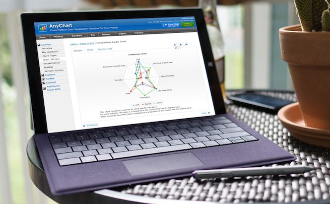
Great news! We are happy to announce the release of a new version of our product – AnyChart 7.3.0. The basic package of AnyChart now includes three long-awaited chart types: Scatter, Radar, and Polar.
A Scatter Chart shows the relationships among the numeric values in several data series, or plots two groups of numbers as one series of XY coordinates.
A Radar Chart is a graphical method of displaying multivariate data in the form of a two-dimensional chart of three or more quantitative variables represented on axes starting from the same point. It is also known as web chart, spider chart, star chart, cobweb chart, star plot, irregular polygon, or kiviat diagram.
A Polar Chart allows to draw a scatter chart using the polar coordinate system, which is a two-dimensional coordinate system in which each point on a plane is determined by a distance from a fixed point and an angle from a fixed direction.
AnyChart version history: https://www.anychart.com/products/anychart/history/
Trial download: https://www.anychart.com/download/
December 17th, 2014 by Margaret Skomorokh
Today we present you a beta version of AnyGantt – now JavaScript (HTML5). Note that the new AnyGantt is much better integrated with AnyChart (and vice versa): all charts or their components can be combined and used together.

Though it is just a beta, all key features are already available:
AnyGantt version history: http://6.anychart.com/products/anygantt7/history/
Trial download: https://www.anychart.com/download/
October 28th, 2014 by Margaret Skomorokh
We are glad to announce that AnyChart 7.2.0, a new version of our charting component, is available. It includes new features and important improvements, which we hope will make your charting experience even better.
A new chart type, Bullet Chart, was added.
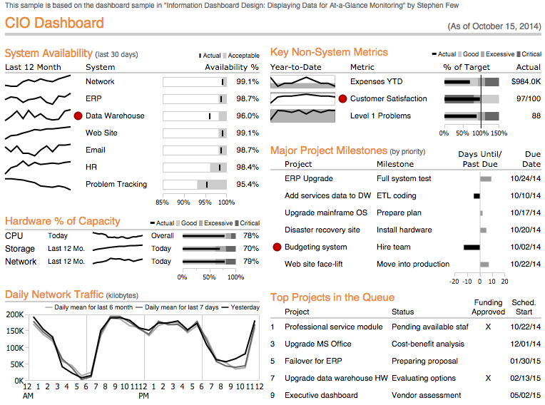
Another new feature is Table Layout. It allows to create complex dashboards like this one:
Now it is also possible to add, remove, and alter data, which allows to create live streaming charts and do many other useful things. For details, see this article: Working with data.
Here is the full list of changes:
New features
- Bullet Charts
- Table Layout
- Add/Remove/Update Operations
Improvements
- Warning and error messages improved
- Performance improvemed
Bug fixes
- Z-index bug fixed
- Marker issues in DateTime scales fixed
- FireFox 32 and IE11 bug fixed
AnyChart version history: http://6.anychart.com/products/anychart7/history/
Trial download: https://www.anychart.com/download/
September 18th, 2014 by Timothy Loginov
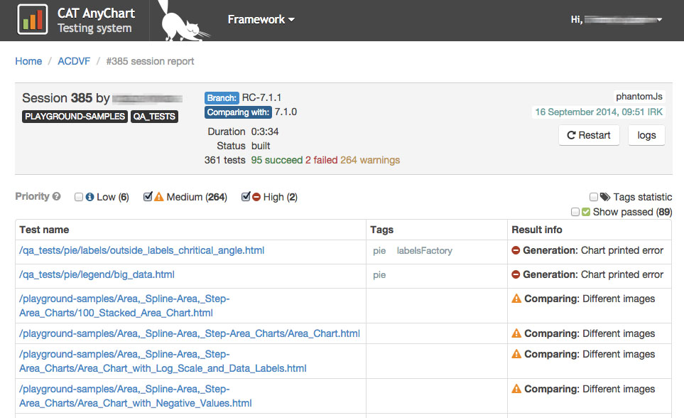
Today we are making a minor release with some bug fixes. We would like to mention that these bugs were found with a help of our extensive QA and testing systems. To create a good component, it is not enough to implement all features needed — one should also make them work well. That is why AnyChart products go through numerous tests and the strict verification by our QA Team.
To make tests and control quality, we use our own testing system with a cute name CAT — which, in fact, stands for The Complex for Automated Testing. The systems uses Selenium and makes all tests both in the headless WebKit PhantomJS and real browsers. The CAT supports testing sessions and never stands idle. There are thousands of tests which cover all methods of all classes from the API. All bugs we have ever found are also covered with tests, so we are sure that a bug which was killed once will never appear again.
Though we are doing our best to find all issues ourselves, we appreciate help from our customers, and for in 7.1.1 release we thank our good friend Kevin Brown from Xportability for two bug reports:
- DVF-752 Duplicate namespace declaration in IE.
- DVF-808 A conflict with the prototype.
And we thank our QA Team for the other bug fixes. You can take a look at the list in our version history.
Trial download is available at https://www.anychart.com/download/, try AnyChart – the tested solution you can trust!
August 29th, 2014 by Margaret Skomorokh
AnyChart is entering a new era – leaving behind Flash and moving to a more modern and promising technology, JavaScript HTML5.

Today we are proud to announce the release of AnyChart 7 – a new HTML5 version of our product. The main great features of AnyChart 7 are:
- Groundbreaking, much more flexible API.
- A higher performance – milliseconds of rendering time, even on large data sets.
- A completely new system of dealing with data.
- Incredibly flexible opportunities for dashboard creation.
- An opportunity to use any element separately (framework).
- An opportunity to change any setting of your chart on-the-fly.
- Full compatibility of all types of charts (including, very soon, AnyStock, AnyGantt and AnyMap).
- Borderless opportunities for customization.
- Compatibility with all platforms including iOS/Android and outdated browsers.
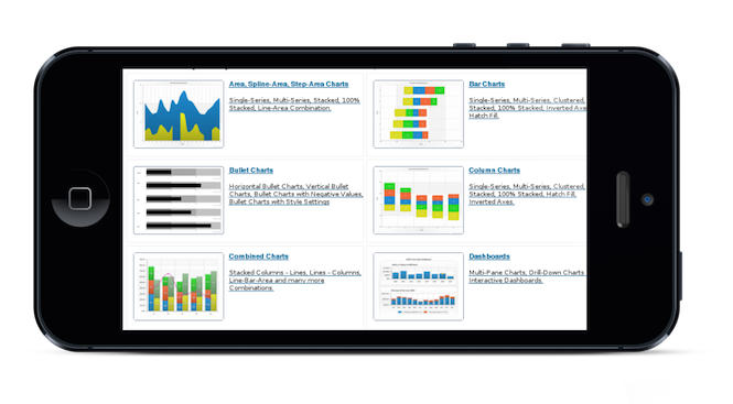
The chart types available in AnyChart 7 are presented in the gallery. You can also learn about the new API and read the documentation.
We have already released two versions, AnyChart 7.0.0 and AnyChart 7.1.0 (see our version history). Further we are going to release a new update every two-three months or more often. You can find out our plans for the future in the roadmap.
Those who use AnyChart 6 should not be worried: we will satisfy our support obligations according to the agreements, and all resources related to the old version will be available here: http://6.anychart.com/products/. But public bug fixes will be made during only one year, and there will be no new features for AnyChart 6. As for migration from 6.x to 7.x – in a couple of months we will offer a converter module which will help you to move to the new version.
If you need clarification on your licensing terms, want to purchase additional licenses or extend the support period, you can get in touch with our sales and licensing team using email: sales@anychart.com or phone: +1 (888) 845-1211 (USA) or +44 20 7193 9444 (Europe). If you need technical support, any help with the development and configuration, or have bug reports and improvement suggestions, please open a ticket at http://support.anychart.com/ – our support team will be happy to help.
And be sure to follow us in Twitter and Facebook to get the latest news and updates.
December 6th, 2013 by Margaret Skomorokh
A new version of our component – AnyChart 6.2.0 – is available for download. Here is the list of changes:
New features
The Double-Click event is now supported, both in the HTML5 and Flash engines.
Improvements
Rendering performance of the HTML5 engine in Internet Explorer 6.x, 7.x, and 8.x is improved.
Bug fixes
Fixed the Pie/Doughnut exploded settings bug.
Fixed the bug with the minimum value of the scale calculation.
AnyChart version history: http://6.anychart.com/products/anychart7/history/
Trial download: https://www.anychart.com/download/
September 20th, 2013 by Margaret Skomorokh
We are glad to announce the release of AnyChart 6.1.0. By popular demand, we have made our component compatible with old versions of Internet Explorer; here is the full list of improvements, mostly affecting AnyChart HTML5 engine:
New features
- Internet Explorer 6.x, 7.x, and 8.x support added to the HTML5 engine.
Improvements
- Text rendering improved in the HTML5 engine.
Bug fixes
- Custom labels in Gauges no longer break rendering in the HTML5 engine.
- Cone series in stacked mode with first zero value no longer breaks rendering in the Flash engine.
- Axes border issues in the HTML5 engine solved.
- The {%YPercentOfCategory}, {%YSum}, {%YMax}, {%YMin}, {%YPercentOfCategory} tokens are now correctly calculated in the HTML5 engine.
- Gauge tickmarks issues in the HTML5 engine solved.
- updateChart actions with external chart data now correctly work in all browsers.
Here you can see AnyChart version history: http://6.anychart.com/products/anychart7/history/
The new version is available for trial download: https://www.anychart.com/download/
April 26th, 2013 by Timothy Loginov
AnyStock 1.9.0., a new version of AnyChart Stock and Financial Charts, is now available for download. The improvements we have made include a long-awaited feature – Minimum and Maximum for Timescale. Please note, if you are going to use it in the default mode (Ordinal Timescale Mode), you will have to read the documentation carefully.
New Features
Here you can see AnyStock version history: http://6.anychart.com/products/anystock7/history/
The new version is available for trial download: https://www.anychart.com/download/
April 26th, 2013 by Timothy Loginov
Our current priority is developing AnyChart HTML5 engine and making our component even more compatible with different browsers and platforms. Today we have released AnyChart 6.0.12, where you will find new HTML5 features and other improvements:
New HTML5 features
- Added 3D Plot.
- Added CSV support.
Improvements
- Improved Stacked Bar and Area charts behavior with missing values.
- Improved Stacked Bar charts behavior with zero and negative values.
Bug fixes
- The Chart.remove() method now works correctly in IE9.
HTML5 bug fixes
- Fixed incorrect positioning of labels on Pie charts.
- The HTML5 engine now treats empty text nodes correctly.
- The {%DataPlotYMin} and {%DataPlotYMax} tokens are now correctly calculated.
- Legend icon custom settings no longer break rendering.
- Empty data nodes in templates are now correctly treated.
- Backgroundless charts size is now correctly calculated.
- Solved Gauge Frame gradient issues.
- Fixed outside labels positioning.
Here you can see AnyChart version history: http://6.anychart.com/products/anychart7/history/
The new version is available for trial download: https://www.anychart.com/download/