Compelling New Data Visualizations From Around the Web — DataViz Weekly
October 31st, 2025 by AnyChart Team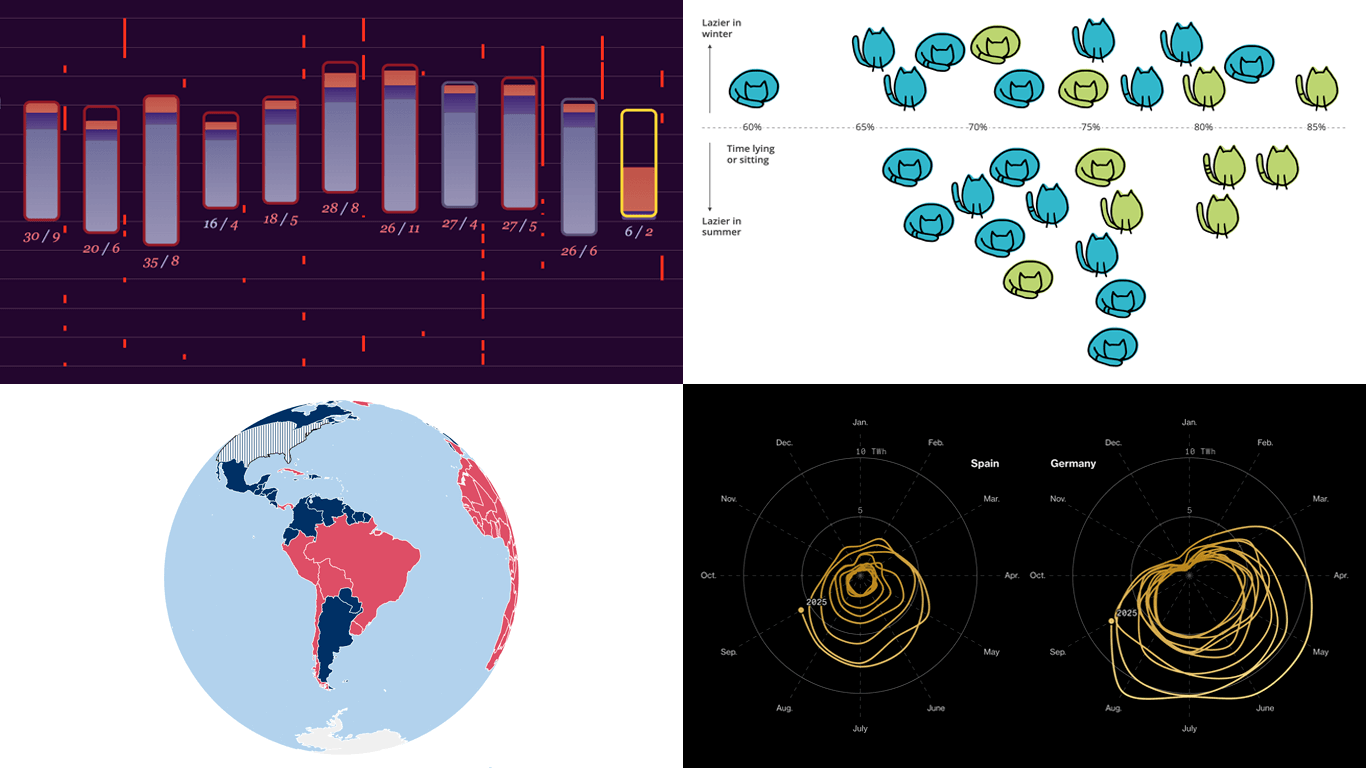 Data becomes much easier to explore and explain when it is shown visually. If you want to see how that plays out in practice, you are in the right place. Welcome to DataViz Weekly, where we round up the most interesting charts and maps we have spotted over the past week. Featuring this time:
- Solar pressure on Europe’s power grid — Bloomberg
- China’s trade rise over two decades — Folha de S.Paulo
- Sleep deprivation in wartime Ukraine — Texty.org.ua
- Cats’ laziness — Lisa Hornung
- Categories: Data Visualization Weekly
- No Comments »
How Visualization Reveals Meaning in Data — DataViz Weekly
October 24th, 2025 by AnyChart Team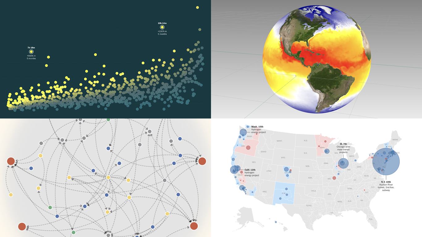 Visualization is a well-established way to translate complex data into a form people can quickly understand, making patterns, trends, and outliers easier to see. Depending on the nature of the data and the questions behind it, different techniques may be used. DataViz Weekly is here with a few fresh, illustrative examples from the real world:
- AI industry interconnections — De Tijd
- Funding halt across Democratic and Republican districts — The New York Times
- TikTok watch-time trends — The Washington Post
- Sea temperatures and anomalies worldwide — Gary Oberbrunner
- Categories: Data Visualization Weekly
- No Comments »
Recent Data Visualization Highlights — DataViz Weekly
October 17th, 2025 by AnyChart Team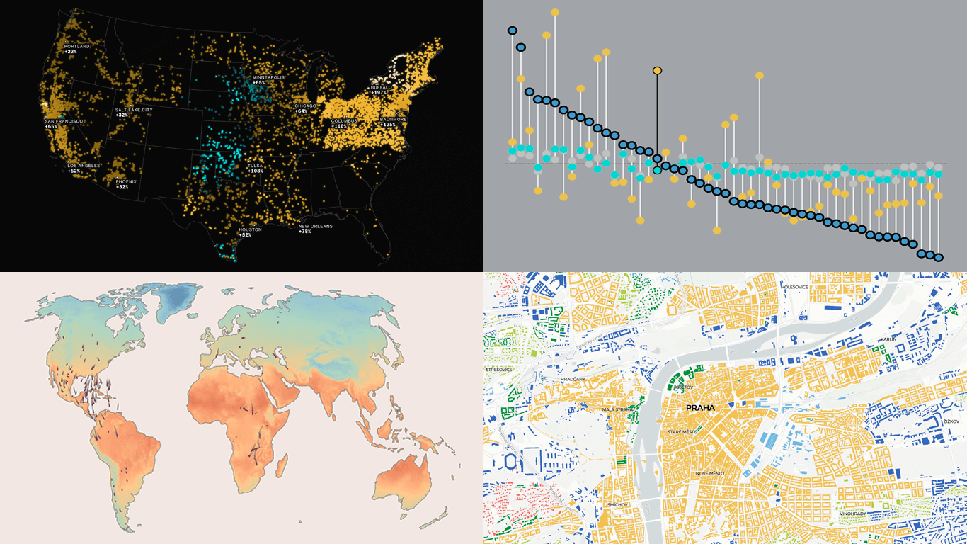 Welcome back to DataViz Weekly, where we regularly observe how visualization helps bring data to life. This time, we invite you to take a look at the following projects that we have recently found particularly interesting:
- Bird journeys amid global warming — The Guardian
- Living costs across the United States — FlowingData
- Electricity prices across the U.S. in the AI era — The Big Take
- Urban patterns in Europe — Urban Taxonomy
- Categories: Data Visualization Weekly
- No Comments »
Great New Visuals Letting Data Speak — DataViz Weekly
October 10th, 2025 by AnyChart Team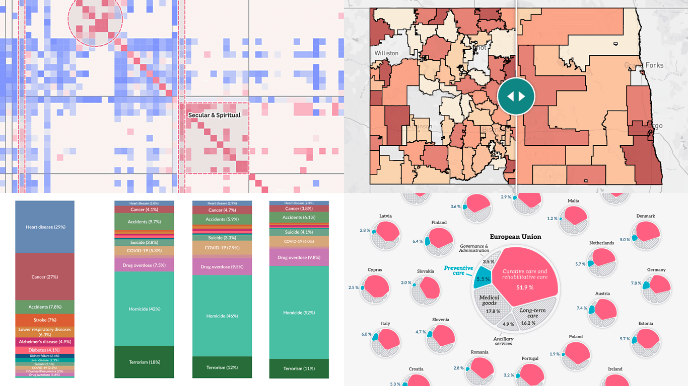 Raw data can be difficult to read and interpret at a glance. Charts and maps make it easier to see what it has to say. We continue to curate great new visuals in our regular series DataViz Weekly, and here’s our latest selection:
- Causes of death in reality and in media — Our World in Data
- EU healthcare priorities — European Data Portal
- U.S. school system redistricting — New America
- Religious mixing in Australian marriages — ABC News
- Categories: Data Visualization Weekly
- No Comments »
Fresh Examples of Data Visualization in Action — DataViz Weekly
October 3rd, 2025 by AnyChart Team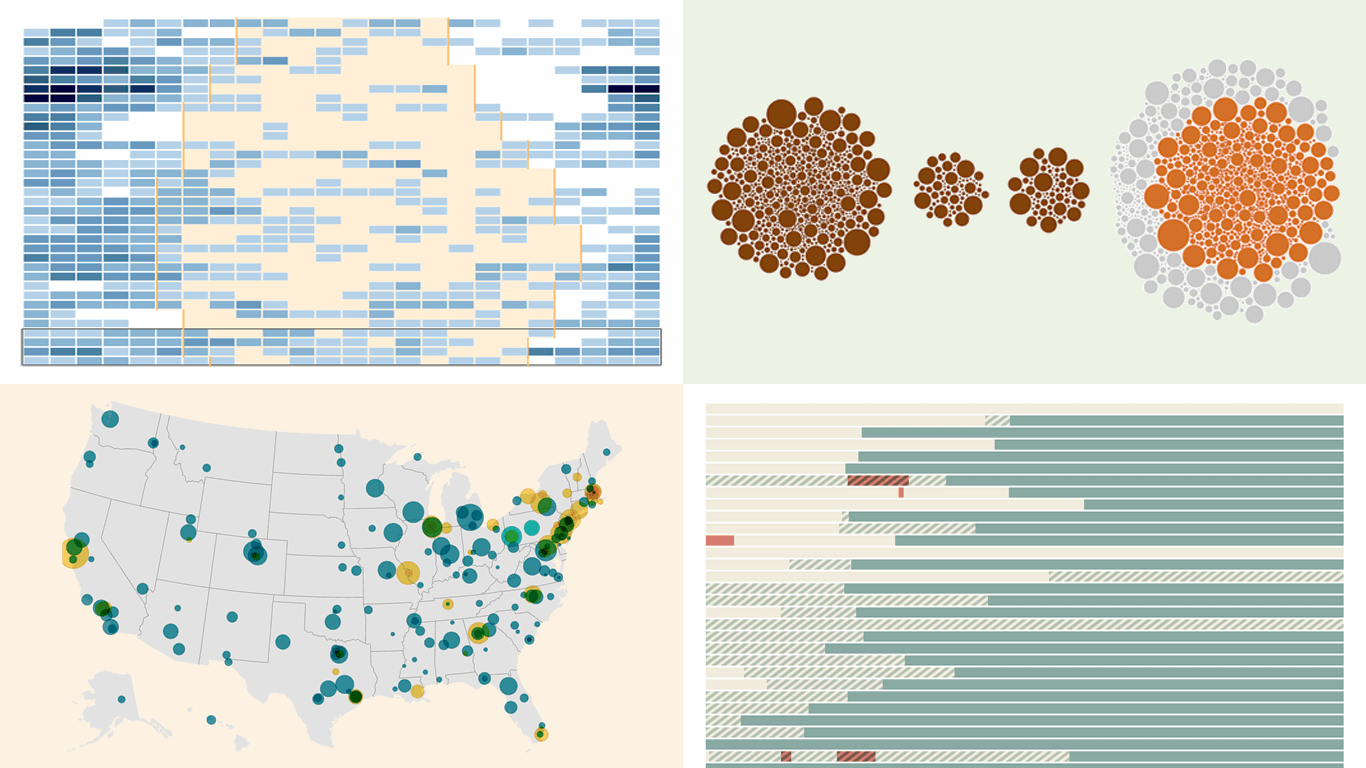 When data needs to be explored or explained, visualization helps. Here are several fresh examples of how that works in practice. On the agenda in DataViz Weekly today:
- U.S. federal funding and shutdowns — The New York Times
- H-1B workers at U.S. research institutions — The Xylom
- USAID medical supply disruptions — The Washington Post
- Daytime air alerts in Kyiv — CNN
- Categories: Data Visualization Weekly
- No Comments »