New Data Graphics Worth Checking Out — DataViz Weekly
September 19th, 2025 by AnyChart Team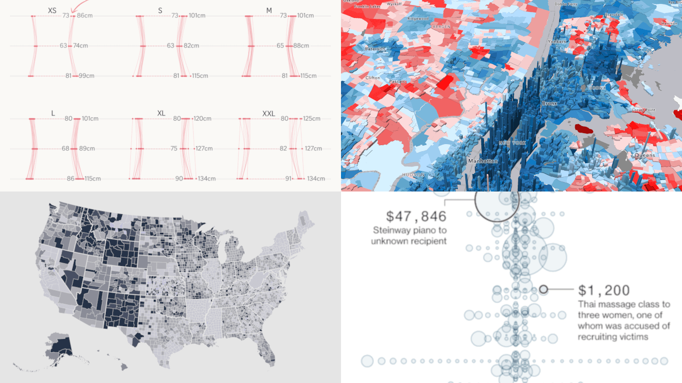 Want to see some compelling real-world data graphics? You’re in the right place. Welcome to DataViz Weekly, spotlighting the most interesting projects we’ve come across lately. Here’s what we’ve lined up for you this time:
- Epstein–Maxwell emails and gifts — Bloomberg
- Childhood vaccination backslide — NBC News
- Women’s clothing sizes across brands — The Straits Times
- Precinct-level view of the 2024 U.S. election results — VoteHub
- Categories: Data Visualization Weekly
- No Comments »
When Data Becomes Visual Insight — DataViz Weekly
September 12th, 2025 by AnyChart Team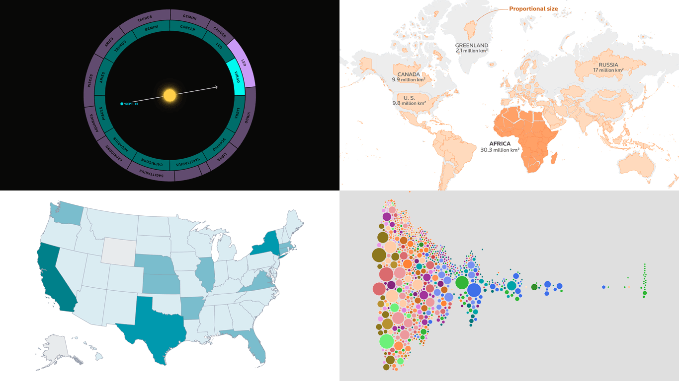 Numbers often stay abstract until they are put into form. Visuals can help reveal what is hidden in plain figures, generating insight and bringing meaning to the surface. In this edition of DataViz Weekly, we offer a quick look at four recent projects that turn data into something we, humans, can truly see and grasp more clearly.
- Pay across occupations — FlowingData
- Billionaires in America — WSJ
- Africa’s real size — Reuters
- Zodiac signs out of sync — The Upshot
- Categories: Data Visualization Weekly
- No Comments »
Fresh Data Visualization Practices to Explore — DataViz Weekly
September 5th, 2025 by AnyChart Team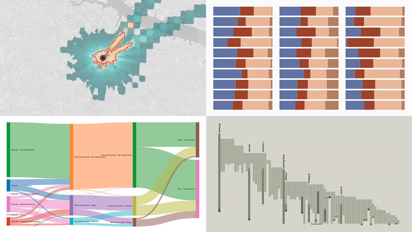 One of the best ways to understand the practice of data visualization is to look at how others put it to use. Every week, new projects come out that apply charts or maps to real issues in different ways. We keep an eye on this flow and bring together a few examples worth a look in DataViz Weekly. Here’s what we invite you to explore with us this time:
- Xi’s military purge — The Big Take
- Workplace harassment in Mexican hospitals — Serendipia
- Bias in AI models about Ukraine — Texty.org.ua
- Health risks from methane emissions in the U.S. — PSE Healthy Energy
- Categories: Data Visualization Weekly
- No Comments »