 Want to see some compelling real-world data graphics? You’re in the right place. Welcome to DataViz Weekly, spotlighting the most interesting projects we’ve come across lately. Here’s what we’ve lined up for you this time:
- Epstein–Maxwell emails and gifts — Bloomberg
- Childhood vaccination backslide — NBC News
- Women’s clothing sizes across brands — The Straits Times
- Precinct-level view of the 2024 U.S. election results — VoteHub
Data Visualization Weekly: September 12-19, 2025
Epstein–Maxwell Emails and Gifts
The Jeffrey Epstein case has continued to attract public scrutiny long after his conviction and death. Over the years, trials, documents, and fresh records have added new layers to the story, offering further insight into his activities and the people connected to him.
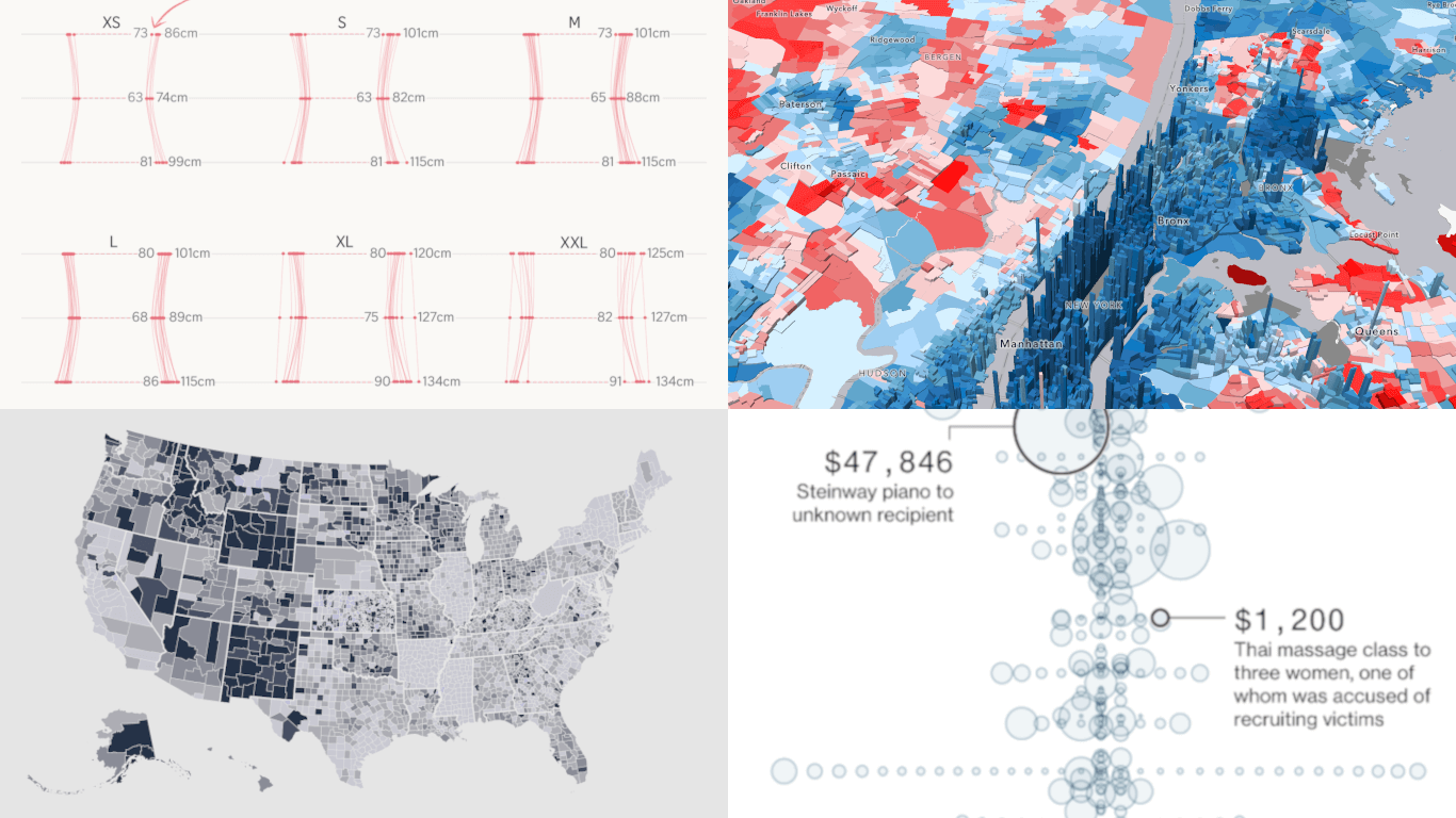
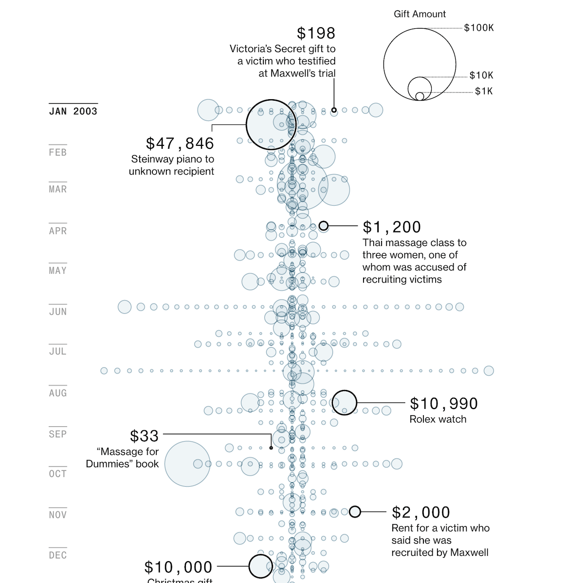
Bloomberg obtained access to a large cache of emails from Epstein’s personal Yahoo account, which included extensive correspondence with Ghislaine Maxwell. The messages indicate that their relationship was closer and lasted longer than had previously been acknowledged. Among the files was a spreadsheet from an accountant that listed gifts and payments for various people, with records suggesting Maxwell’s involvement in arranging them. Bloomberg visualized this data in a bubble diagram, where the circle size shows the value of each gift.
See the article on Bloomberg, by Jason Leopold, Ava Benny-Morrison, Jeff Kao, Dhruv Mehrotra, Surya Mattu, Harry Wilson, and Max Abelson.
Childhood Vaccination Backslide
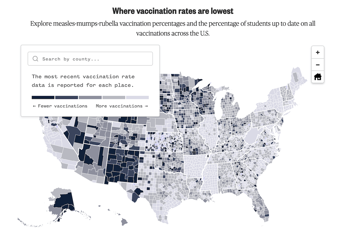
For more than fifty years, childhood immunizations helped protect U.S. communities from highly contagious diseases such as measles. Today, those protections are weakening as vaccination coverage falls across much of the country.
NBC News, working with researchers from Stanford University, spent six months collecting and harmonizing data on vaccine uptake across the United States. On Monday, they published the first part of their The Vaccine Divide investigation, which features an interactive choropleth map showing county-level measles-mumps-rubella (MMR) vaccination coverage, with darker shades indicating lower rates. Users can search for a county or click directly on the map, while a linked line chart below shows vaccination rates in that state over time, highlighting the selected county alongside the state average.
Check it out on NBC News, by Erika Edwards, Jason Kane, Stephanie Gosk, Mustafa Fattah, and Joe Murphy.
Women’s Clothing Sizes Across Brands
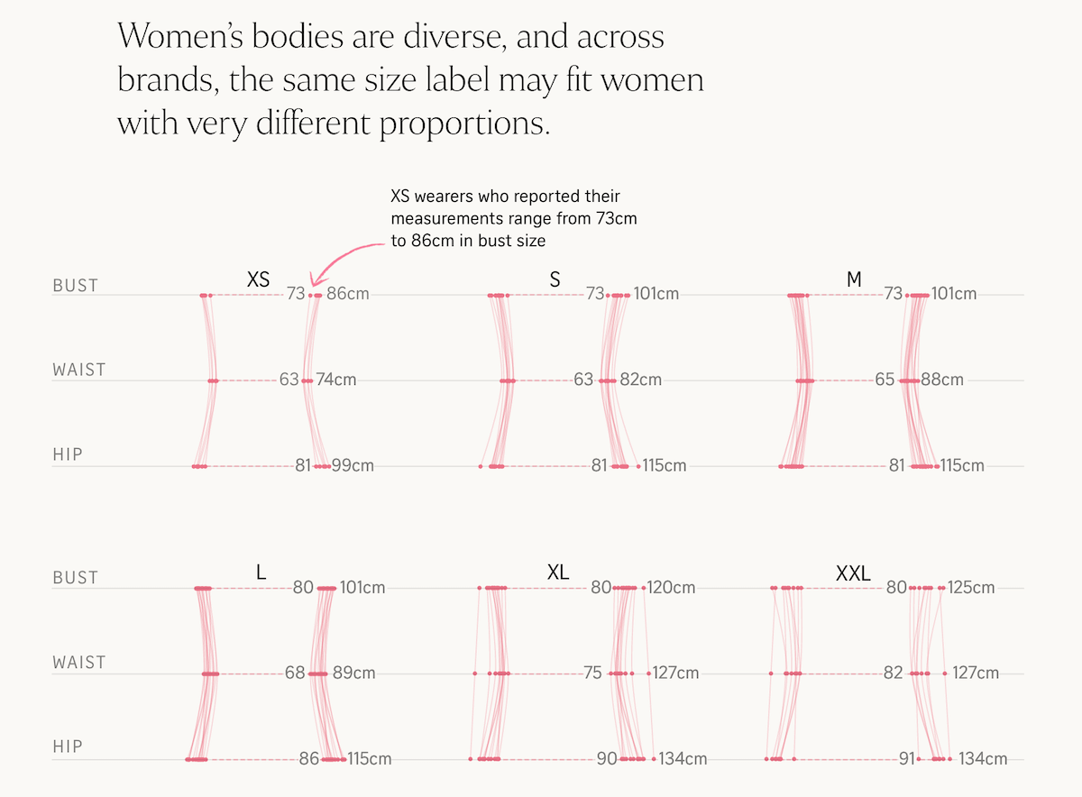
Sizing labels like S, M, and L often look straightforward, but in practice, they conceal wide differences. That is why a medium in one store may fit quite differently from a medium in another.
The Straits Times compared bust, waist, and hip measurements from eight major fashion brands in Singapore — Uniqlo, H&M, Cotton On, Sandro, COS, Lululemon, Love & Bravery, and Love, Bonito. Among various visuals, the chart shown above illustrates how women carrying the same size label can have very different proportions, highlighting why tags do not translate uniformly across brands. The story also includes an interactive tool that lets readers enter their own measurements to find out where they fall on each guide.
Take a look at the article on The Straits Times, by Alyssa Mungcal, Amanda Chai, Chee Wei Xian, Ernest Ong, Khoo Zi Qi, Stephanie Adeline, and Tang Hao Liang.
Precinct-Level View of 2024 U.S. Election Results
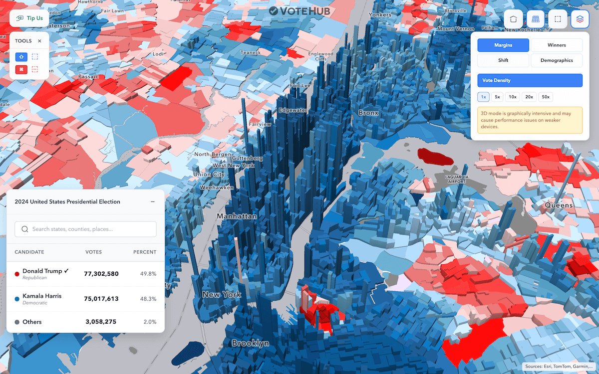
The 2024 U.S. presidential election produced a decisive result. Still, the picture of how Americans voted changes once you go below the state level.
VoteHub released an interactive precinct-level map designed to explore the election in detail. It allows filtering by state, county, metro area, city, or legislative district, and even freehand selection to calculate totals instantly. Users can also compare results with 2020 and 2016 to see shifts over time, and view statistical estimates of how different demographic groups cast their ballots. A standout feature is the 3D vote density mode, which raises columns where ballots were concentrated to illustrate that people, not land, decide elections.
Explore the map on VoteHub. And if you want to see more election maps and dashboards, check out our 2024 U.S. Election Maps special, and our Qlik app U.S. Presidential Elections where official 2024 data is being added as it becomes available from the MIT Election Data and Science Lab (MEDSL).
Wrap-Up
That concludes this edition of Data Visualization Weekly. From email archives and vaccination records to clothing sizes and election results, these projects show how data can be transformed into clear, engaging visuals that enrich understanding. Stay connected for more visual brilliance.
- Categories: Data Visualization Weekly
- No Comments »