When Data Makes the Story — DataViz Weekly
March 27th, 2026 by AnyChart Team
Data has stories to tell. Visualization helps them reach us. Continuing our regular DataViz Weekly feature, we are happy to share new examples of how that works in the real world. Here’s what caught our attention these days:
- Strait of Hormuz oil and gas flows — The New York Times
- Rural hospital crisis in the United States — Reuters
- Arrests of immigrant parents of U.S. citizen children — ProPublica
- U.S. state-to-state migration flows — Will Sigal
- Categories: Data Visualization Weekly
- No Comments »
Great New Visuals Letting Data Speak — DataViz Weekly
October 10th, 2025 by AnyChart Team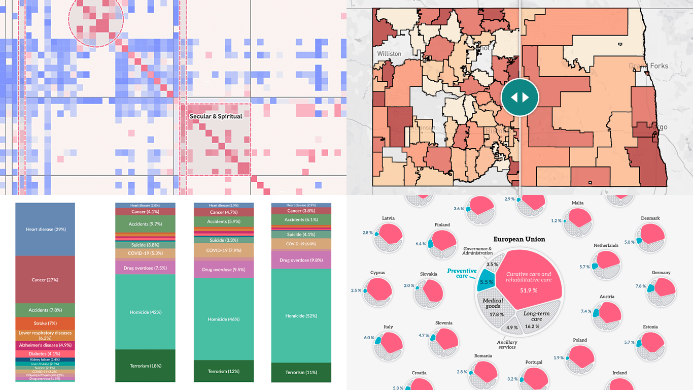 Raw data can be difficult to read and interpret at a glance. Charts and maps make it easier to see what it has to say. We continue to curate great new visuals in our regular series DataViz Weekly, and here’s our latest selection:
- Causes of death in reality and in media — Our World in Data
- EU healthcare priorities — European Data Portal
- U.S. school system redistricting — New America
- Religious mixing in Australian marriages — ABC News
- Categories: Data Visualization Weekly
- No Comments »
When Data Becomes Visual Insight — DataViz Weekly
September 12th, 2025 by AnyChart Team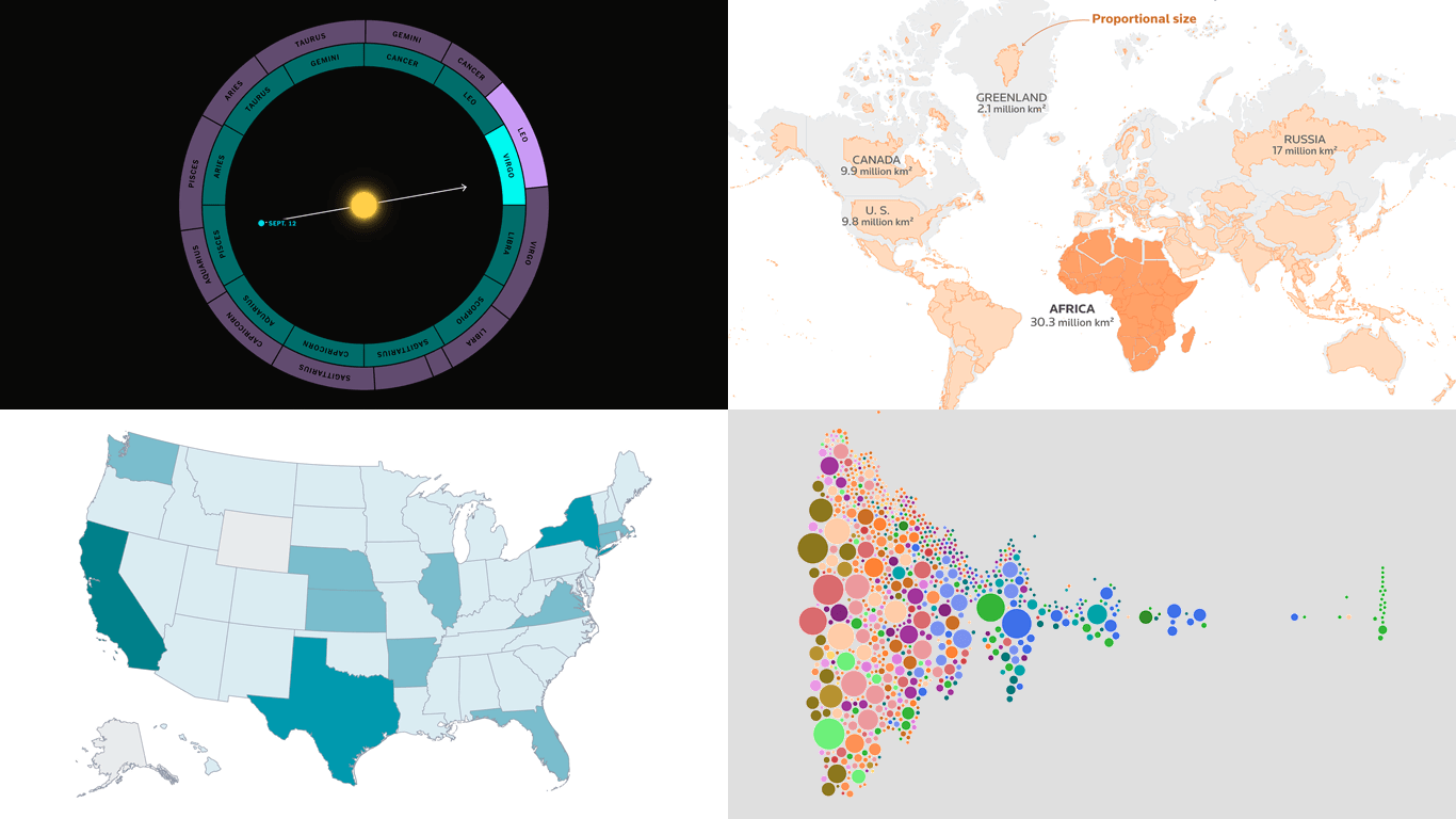 Numbers often stay abstract until they are put into form. Visuals can help reveal what is hidden in plain figures, generating insight and bringing meaning to the surface. In this edition of DataViz Weekly, we offer a quick look at four recent projects that turn data into something we, humans, can truly see and grasp more clearly.
- Pay across occupations — FlowingData
- Billionaires in America — WSJ
- Africa’s real size — Reuters
- Zodiac signs out of sync — The Upshot
- Categories: Data Visualization Weekly
- No Comments »
When Data Becomes Visual Insight — DataViz Weekly
May 23rd, 2025 by AnyChart Team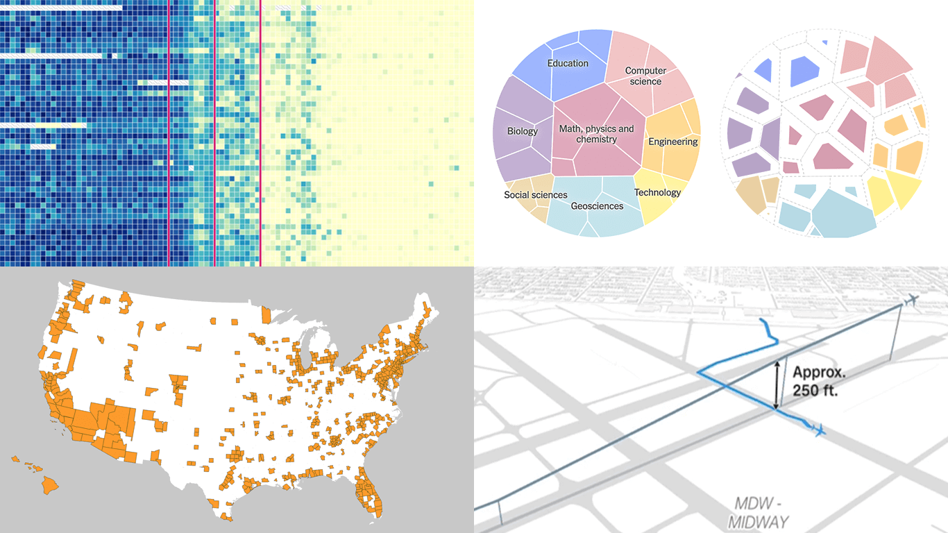 Seeing data is not the same as understanding it — that is where visualization makes the difference. This edition of DataViz Weekly features fresh examples showing how insight emerges when numbers are presented thoughtfully. Whether you work with data or just follow it, here’re four new projects we thought you wouldn’t want to miss:
- Aviation incidents in America — CNN
- County population across the United States — Kyle Walker
- Cuts in U.S. science funding — The Upshot
- Measles vaccination impact — Our World in Data
- Categories: Data Visualization Weekly
- No Comments »
Noteworthy New Visualizations to Explore — DataViz Weekly
February 7th, 2025 by AnyChart Team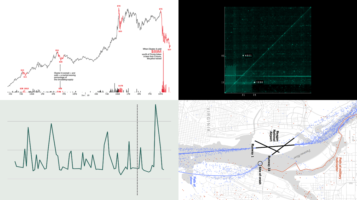 Continuing our regular DataViz Weekly, we’re glad to share the most interesting of all the new data visualizations we’ve recently come across, well worth a look. Here’s what we have lined up this time:
- PIN code popularity — ABC News
- Complexity of D.C. airspace amid the Potomac River midair collision — The New York Times
- Trading patterns in the Trump memecoin — Bloomberg Crypto
- U.S. federal expenditures in real time — The Hamilton Project
- Categories: Data Visualization Weekly
- No Comments »
Awesome New Data Visualization Works — DataViz Weekly
November 15th, 2024 by AnyChart Team Welcome back to DataViz Weekly, where we spotlight the most awesome data visualization works we have recently come across. Check out the projects we’re diving into this time:
- Love songs: death or evolution? — The Pudding
- Historical dry streaks in NYC — Bloomberg Green
- NYC subway ridership in detail — Subway Stories
- Vote swings in U.S. presidential elections — NYT
- Categories: Data Visualization Weekly
- No Comments »
27 Election Maps of 2024 U.S. Presidential Vote Results — DataViz Weekly Special Edition
November 8th, 2024 by AnyChart Team The 2024 U.S. presidential election has concluded, and media outlets worldwide are offering a plethora of data graphics to convey the election results. In this special edition of DataViz Weekly, we’ve curated a collection of over twenty election maps, showcasing diverse ways to represent voting data — cartograms, choropleth maps, bubble maps, and more. Whether you’re a data enthusiast, professional, or simply intrigued by the 2024 election outcomes, explore the latest U.S. election maps from top media!
? Also see our previous special editions with election maps: 2020 U.S. election maps and 2024 UK election maps.
- Categories: AnyMap, Dashboards, Data Visualization Weekly
- No Comments »
Fresh Data Visuals That Impressed Us — DataViz Weekly
November 4th, 2024 by AnyChart Team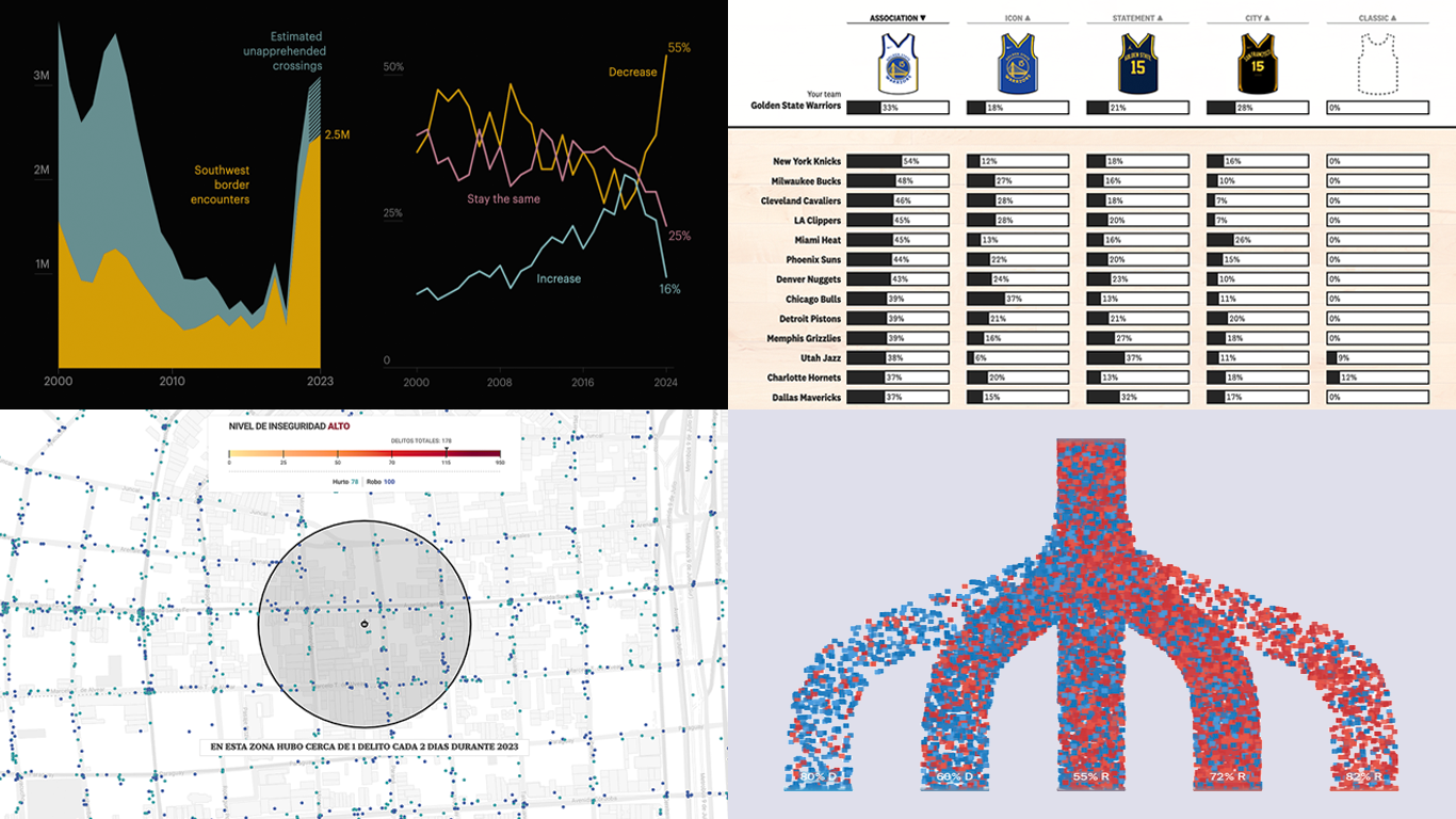 We’re a bit behind schedule after last week’s big release of updates for our Qlik Sense extensions, including the transformative AI Splits feature in the Decomposition Tree. But finally, here we are with a fresh edition of DataViz Weekly! Check out the projects with charts and maps that stood out to us most lately:
- U.S. immigration trends in historical context — ProPublica
- Crime trends in Buenos Aires — LA NACION
- Evolution of NBA uniform colors — The Pudding
- Internal migration and political polarization in the United States — The Upshot
- Categories: Data Visualization Weekly
- No Comments »
Top Data Visualizations We’ve Recently Seen — DataViz Weekly
October 18th, 2024 by AnyChart Team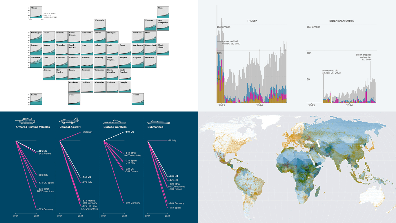 It’s Friday, which means it’s the perfect moment to look back at the data visualizations that have sparked our curiosity over the past few days. So, without further ado, welcome to DataViz Weekly!
- Electric vehicle adoption across the United States — FlowingData
- Europe’s military reductions and defense challenges — Bloomberg
- Climate—Conflict—Vulnerability Index for global risk assessment — UniBw München, PIK, AA, Truth & Beauty
- Campaign emails with donation incentives in the 2024 U.S. presidential race — The New York Times
- Categories: Data Visualization Weekly
- No Comments »
Impressive New Data Visuals for Your Inspiration — DataViz Weekly
October 11th, 2024 by AnyChart Team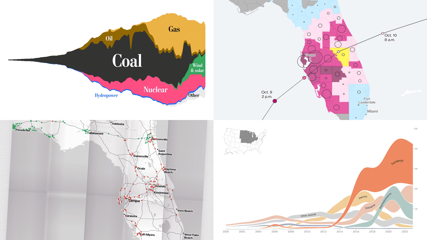 Ready for another dose of impressive data visuals? DataViz Weekly is back with a fresh selection of projects that use powerful graphics to help unravel various trends and patterns. Here are our top picks from what we’ve most recently come across out there:
- End of the UK’s coal power era and lessons for the world — The Washington Post
- Hurricane Milton’s impact and power outages — Bloomberg
- Waffle House Index for Florida under and after Milton — Riley Walz
- Opioid overdose deaths across the United States — NYT Opinion
- Categories: Data Visualization Weekly
- No Comments »