Recalling Most Awesome Recent Data Visualizations — DataViz Weekly
February 11th, 2022 by AnyChart Team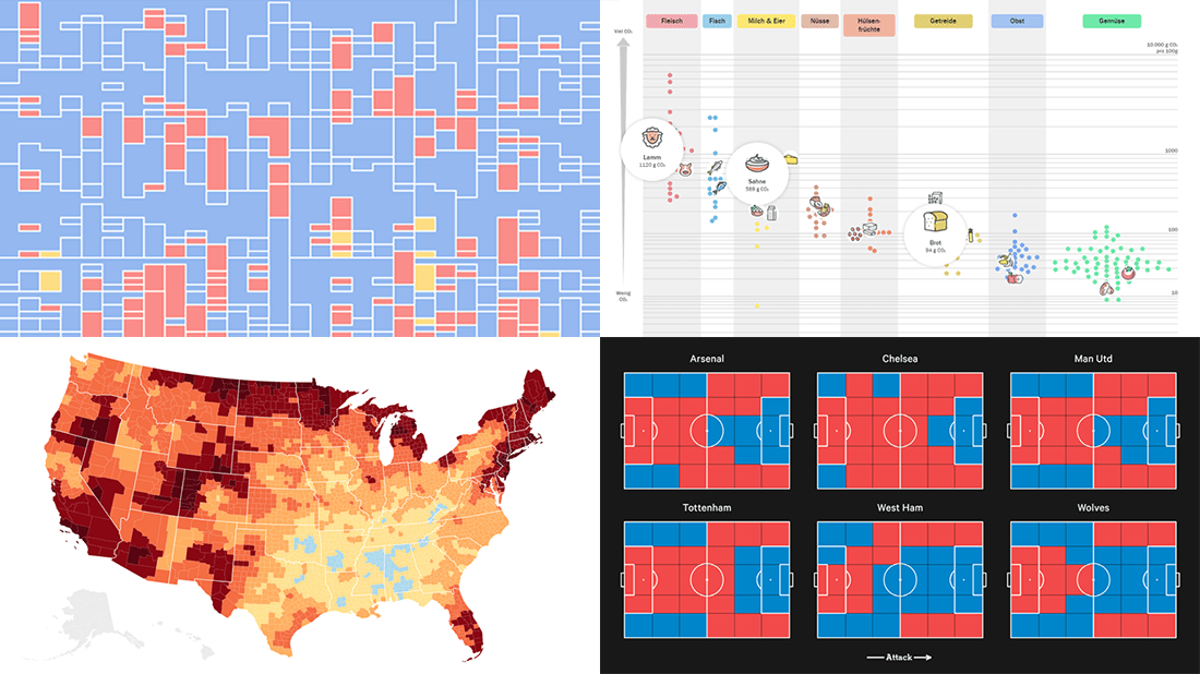 It’s Friday, time to recall the most awesome data visualizations of all that have caught our attention over the past week. So everyone, welcome to DataViz Weekly!
- Decline of English on Spotify — The Economist
- English Premier League contenders for the Champions League qualification — The Athletic
- Carbon footprint of food — Der Tagesspiegel
- Air temperature change in every U.S. county — The Guardian
- Categories: Data Visualization Weekly
- No Comments »
How to Build JavaScript Donut Charts
July 6th, 2021 by Shachee Swadia Wondering how data designers and developers create compelling donut charts using JavaScript? Then you’ve come to the right place at the right time. Follow along and you will learn how to build an interactive JS donut chart with great ease even if you are a beginner!
In this tutorial, we will be visualizing data about the global market share of the top online music streaming platforms. It is a good example of information that can be nicely represented in a donut chart.
To make sure we are on the same page, let’s first see what a donut chart is and then get down to charting straight away!
Read the JS charting tutorial »
- Categories: AnyChart Charting Component, HTML5, JavaScript, JavaScript Chart Tutorials, Tips and Tricks
- 2 Comments »