Plotting NBA Shots, Diversity, Disasters, and Air Traffic — DataViz Weekly
May 3rd, 2019 by AnyChart Team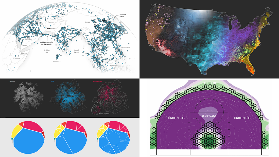 Check out new interesting examples of how plotting data on charts and maps can be both insightful and beautiful. Here is what we are happy to feature in today’s article in the DataViz Weekly series:
- Visualizing how India-Pakistan tensions disrupt air travel
- Plotting diversity of Brussels
- Mapping where natural disasters tend to strike in the United States
- Charting NBA shots
- Categories: Data Visualization Weekly
- No Comments »