New Data Stories Driven by Visualization — DataViz Weekly
August 22nd, 2025 by AnyChart Team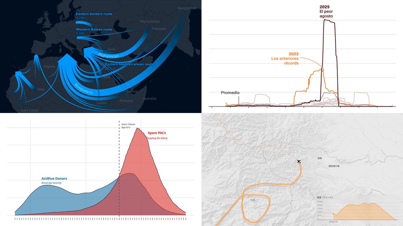 Visual graphics often play a crucial role in revealing the stories hidden in data. They help untangle complex realities while highlighting insights that might otherwise be hard to grasp. This edition of DataViz Weekly showcases recent articles where robust visualization of data drives effective storytelling:
- Donor age in U.S. political fundraising — On Data and Democracy
- Migration across the Mediterranean — Reuters
- Wildfires in Spain — Colpisa
- Japan Airlines Flight 123 crash, 40 years ago — Nikkei
- Categories: Data Visualization Weekly
- No Comments »
When Data Becomes Visual Insight — DataViz Weekly
May 23rd, 2025 by AnyChart Team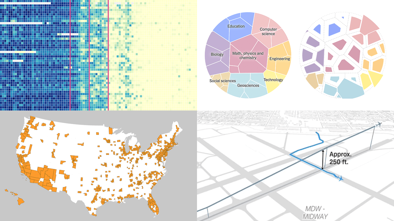 Seeing data is not the same as understanding it — that is where visualization makes the difference. This edition of DataViz Weekly features fresh examples showing how insight emerges when numbers are presented thoughtfully. Whether you work with data or just follow it, here’re four new projects we thought you wouldn’t want to miss:
- Aviation incidents in America — CNN
- County population across the United States — Kyle Walker
- Cuts in U.S. science funding — The Upshot
- Measles vaccination impact — Our World in Data
- Categories: Data Visualization Weekly
- No Comments »
Compelling Fresh Visualization Picks for Inspiration — DataViz Weekly
May 9th, 2025 by AnyChart Team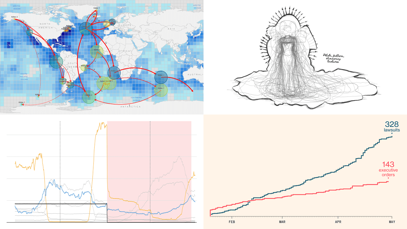 We skipped a few Fridays — but for good reason. With Qlik Connect just around the corner, we have been deep in prep mode: finalizing assets, polishing demos, and getting our brand-new Spreadsheets extension for Qlik Sense completely ready to launch. Still, we could not hold off any longer, so we carved out a quick break to bring you a new edition of DataViz Weekly! Here are the most compelling visualizations we have come across lately — take a look:
- Marine migration pathways — MiCO
- Spain’s energy system under strain — Colpisa
- Lawsuits against Trump’s executive orders — Bloomberg
- Met Gala outfit silhouettes over time — Reuters
- Categories: Data Visualization Weekly
- No Comments »
New Impressive Examples of How Data Visualization Works in Practice — DataViz Weekly
April 11th, 2025 by AnyChart Team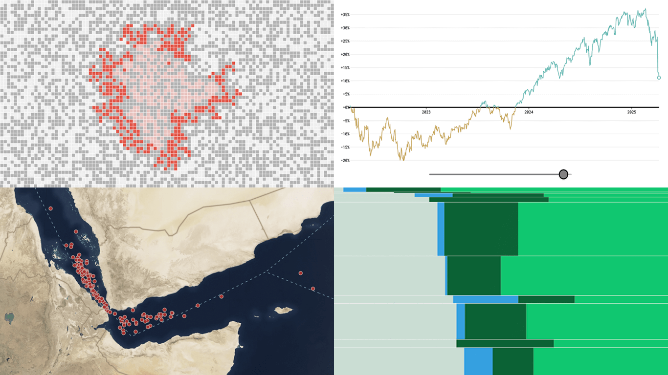 New week, new visualizations that deserve your look! DataViz Weekly brings together several strong new examples demonstrating how data visualization works in practice — making patterns visible, comparisons clearer, and context easier to understand.
- S&P 500 drops and recoveries over time — FlowingData
- Herd immunity thresholds in disease outbreaks — The Upshot
- Renewable energy targets in the Mediterranean — Ember
- Red Sea under Houthi attacks — International Crisis Group
- Categories: Data Visualization Weekly
- No Comments »
Insightful Data Visualizations You Need to See — DataViz Weekly
March 7th, 2025 by AnyChart Team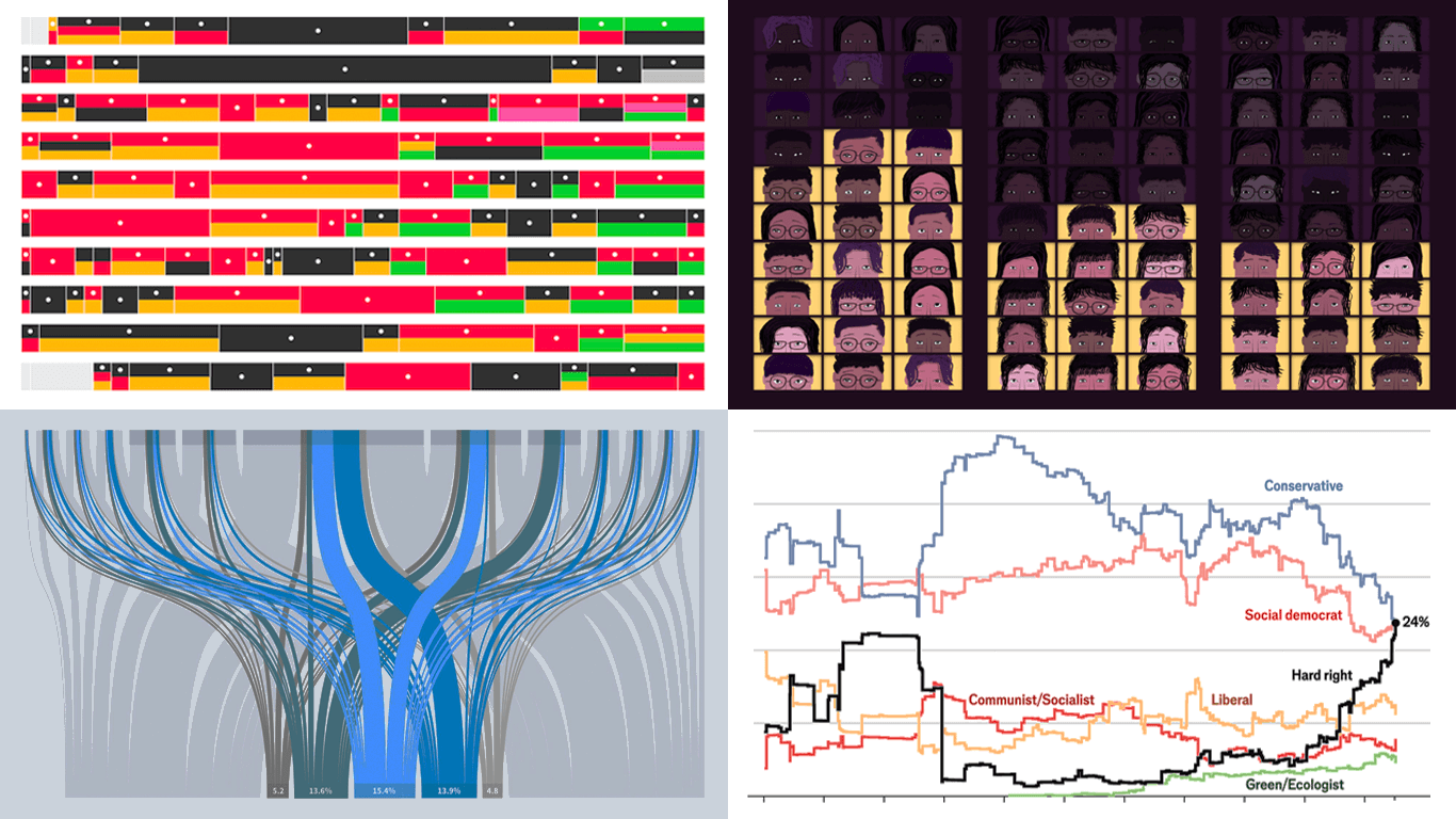 Data visualization is powerful — when done right, it conveys meaning clearly and helps insights emerge naturally. We continue DataViz Weekly, where we regularly highlight some excellent examples from around the internet, offering a firsthand look at how graphical representation can effectively reveal and clarify information. This time, we think you just need to see the following:
- U.S. imports and tariffs — Reuters
- Coalition scenarios in Germany — Bloomberg
- Hard-right parties in Europe — The Economist
- Emotional experiences of middle schoolers — The Pudding
- Categories: Data Visualization Weekly
- No Comments »
New Selection of Significant Data Visualization Examples — DataViz Weekly
February 28th, 2025 by AnyChart Team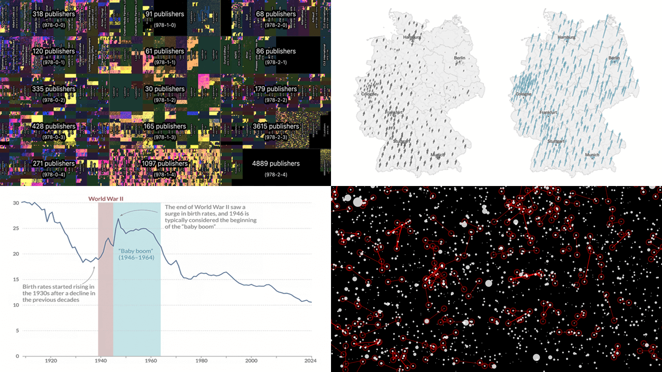 Our JavaScript charting library, Qlik Sense extensions, and other products give you the flexibility to visualize data how, where, and when you need. But making a chart or map truly effective — whether for exploration or explanation — is an art of its own. That is why we run DataViz Weekly: to share a selection of significant examples we have recently encountered, showcasing how others tackle visualization challenges across different contexts and datasets.
Here are some new examples — take a closer look and see what insights they might inspire:
- All books in the ISBN space — phyresky
- Germany’s 2025 federal election — The New York Times (and more)
- Baby boom in 7 charts — Our World in Data
- School shootings in America — Mohamad Waked
- Categories: Data Visualization Weekly
- No Comments »
Noteworthy New Visualizations to Explore — DataViz Weekly
February 7th, 2025 by AnyChart Team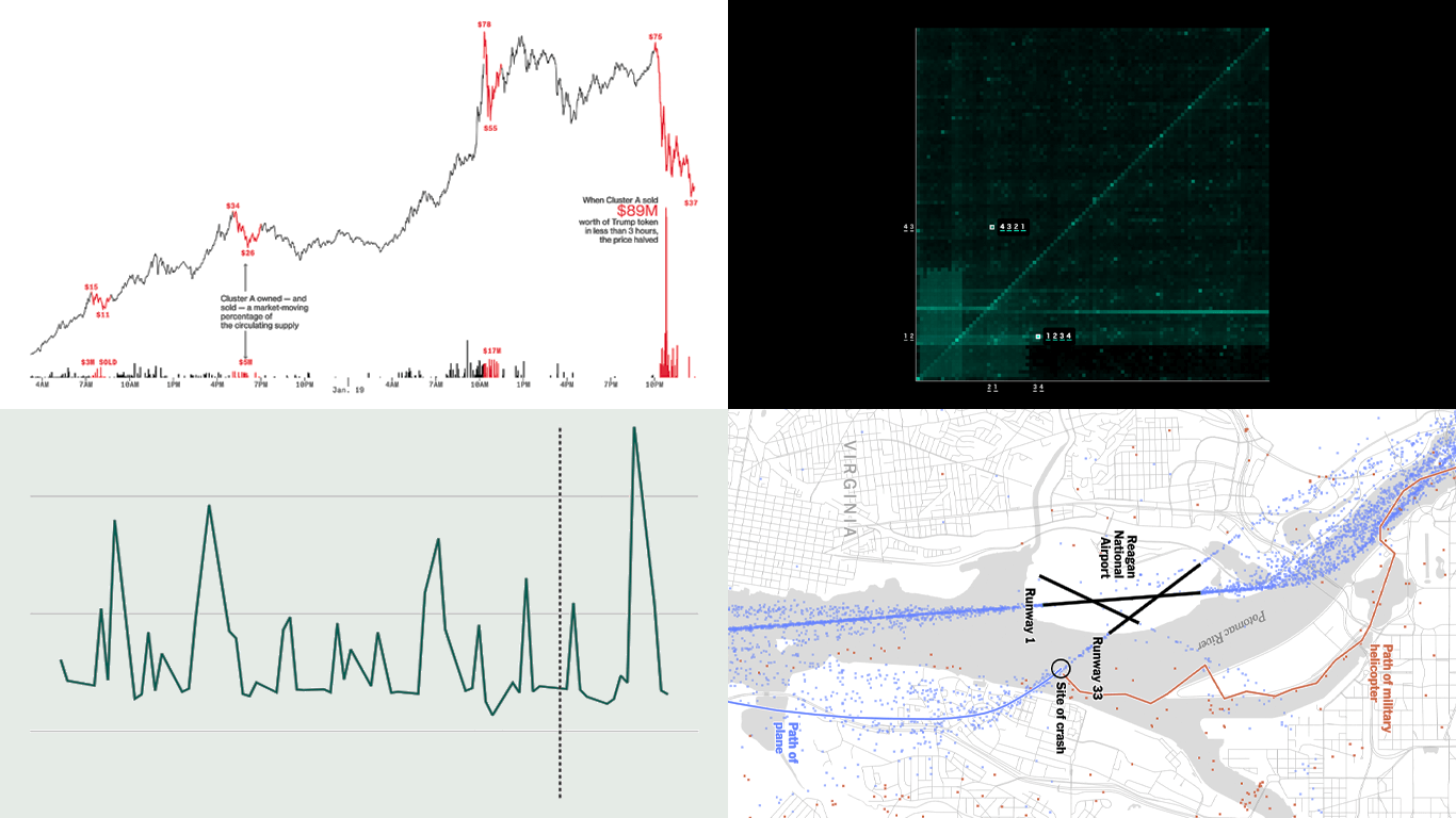 Continuing our regular DataViz Weekly, we’re glad to share the most interesting of all the new data visualizations we’ve recently come across, well worth a look. Here’s what we have lined up this time:
- PIN code popularity — ABC News
- Complexity of D.C. airspace amid the Potomac River midair collision — The New York Times
- Trading patterns in the Trump memecoin — Bloomberg Crypto
- U.S. federal expenditures in real time — The Hamilton Project
- Categories: Data Visualization Weekly
- No Comments »
New Charts & Maps Turning Data Into Insights — DataViz Weekly
January 31st, 2025 by AnyChart Team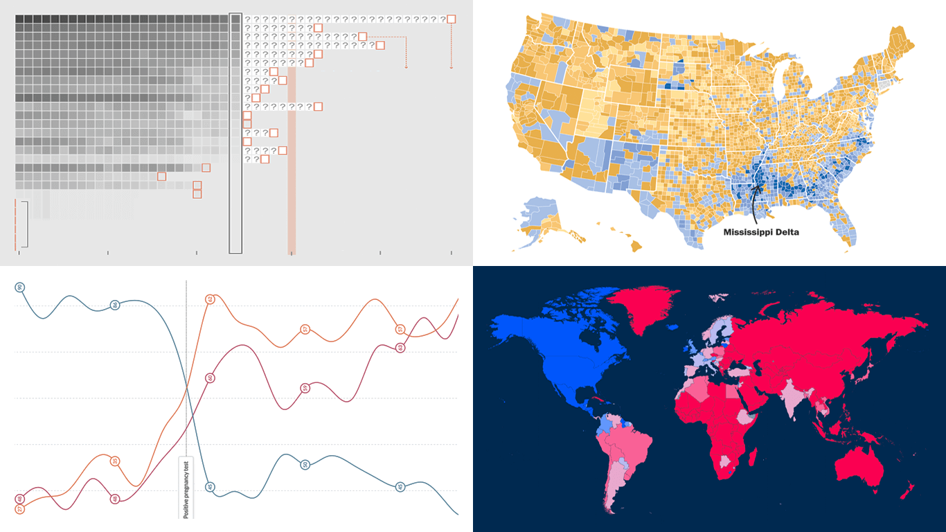 DataViz Weekly is here with a spotlight on new charts and maps that do a great job of turning data into meaningful insights. Today, we invite you to explore the following projects, each demonstrating how data visualization helps reveal patterns, tell stories, and deepen understanding:
- European electricity transition — Ember
- The United States vs. China on global trade — Lowy Institute
- Single-parent families in America — The Washington Post
- Pregnancy through health metric shifts — Maggie Appleton
- Categories: Data Visualization Weekly
- No Comments »
Compelling Fresh Data Visualizations Not to Miss — DataViz Weekly
January 24th, 2025 by AnyChart Team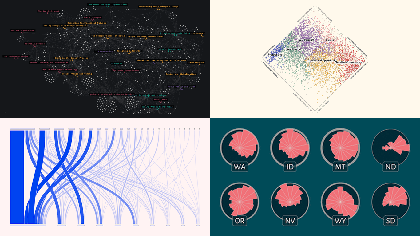 Welcome to the first regular edition of DataViz Weekly in 2025! Last Friday, we wrapped up the year with a special Best Data Visualizations of 2024 post. Now we’re back to our usual format, highlighting some of the most compelling new visuals that caught our attention recently. Here are the first featured projects of the year — dive in and get inspired:
- Nokia Design Archive — Aalto University
- AI research collaborations — Rest of World
- Orientation of ski slopes — OpenSkiStats
- Policy preferences in a hypothetical U.S. multiparty system — NYT Opinion
- Categories: Data Visualization Weekly
- No Comments »
Best Data Visualizations of 2024 — DataViz Weekly
January 17th, 2025 by AnyChart Team In 2024, data visualization remained a vital tool for exploring complex topics and presenting insights in engaging ways. From global conflicts and environmental challenges to cultural phenomena and historical trends, charts and maps provided valuable perspectives and captivated audiences.
This special edition of DataViz Weekly highlights the best data visualizations of 2024. Featuring projects selected by FlowingData, The Pudding, and the Global Investigative Journalism Network (GIJN), as well as year-in-review collections from leading media sources, it offers a curated look at some of the most compelling visual storytelling created during the year. All aboard!
- Categories: Data Visualization Weekly
- No Comments »