AnyChart カイゼン:Qlik 拡張機能の最新イノベーションを発見しよう(東京・8月6日|CEO自ら進行)|Meet AnyChart CEO in Tokyo
July 29th, 2025 by AnyChart Team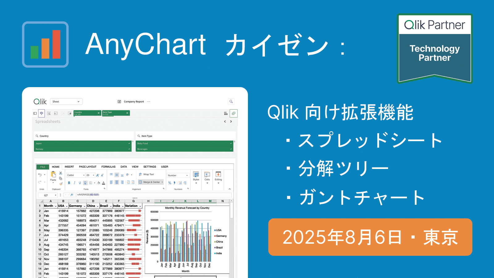 2025年8月6日(水)、私たちは東京にて、Qlik の分析環境を強化するための実用的なツールをご紹介する対面セッションを開催いたします。
本セッションでは、AnyChart 社 CEO の Anton Baranchuk が自ら進行を務め、Qlik Sense 拡張機能における最新のイノベーションを紹介し、それらが分析ワークフローをどのように改善し、より的確なデータドリブンな意思決定を支援できるかを実演を交えてご説明します。
We are pleased to invite you to an in-person session in Tokyo introducing practical tools to enhance your Qlik analytics environment.
During the session, AnyChart‘s CEO Anton Baranchuk will present the latest in Qlik Sense extensions, demonstrating how they can improve analysis workflows and support more informed, data-driven decision-making.
詳しく見る | Read more at qlik.anychart.com »
- Categories: AnyChart Charting Component, Big Data, Business Intelligence, Dashboards, News, Qlik
- No Comments »
Qlik Connect 2025 Recap: Incredible Ride for Excel-lence
June 19th, 2025 by AnyChart Team Qlik Connect 2025 is now in the books, and it was everything we hoped for — and more. Building on last year’s success, we returned to Orlando to find even more connections, deeper engagement, and a truly electric atmosphere around our booth. Our brand-new Excel-style Spreadsheets for Qlik Sense turned heads, and our chance-to-win activities became a real magnet on the show floor.
The buzz was real — just take a look below, then read on for a recap of our time at Qlik Connect:
Read more at qlik.anychart.com »
- Categories: AnyChart Charting Component, Big Data, Business Intelligence, Dashboards, News, Qlik
- No Comments »
Compelling Fresh Visualization Picks for Inspiration — DataViz Weekly
May 9th, 2025 by AnyChart Team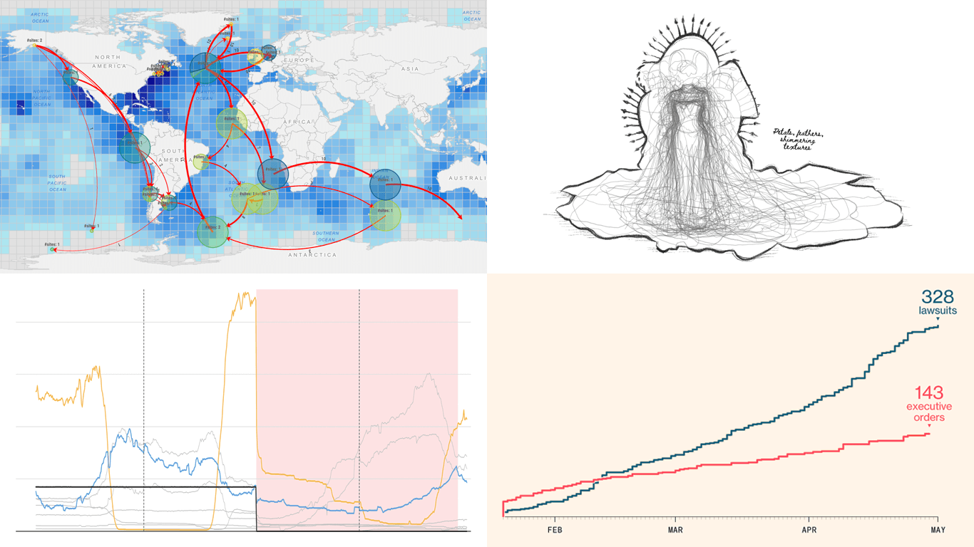 We skipped a few Fridays — but for good reason. With Qlik Connect just around the corner, we have been deep in prep mode: finalizing assets, polishing demos, and getting our brand-new Spreadsheets extension for Qlik Sense completely ready to launch. Still, we could not hold off any longer, so we carved out a quick break to bring you a new edition of DataViz Weekly! Here are the most compelling visualizations we have come across lately — take a look:
- Marine migration pathways — MiCO
- Spain’s energy system under strain — Colpisa
- Lawsuits against Trump’s executive orders — Bloomberg
- Met Gala outfit silhouettes over time — Reuters
- Categories: Data Visualization Weekly
- No Comments »
Meet AnyChart at Qlik Connect 2025: Booth #1007 — Plus Chances to Win Apple Prizes!
April 30th, 2025 by AnyChart Team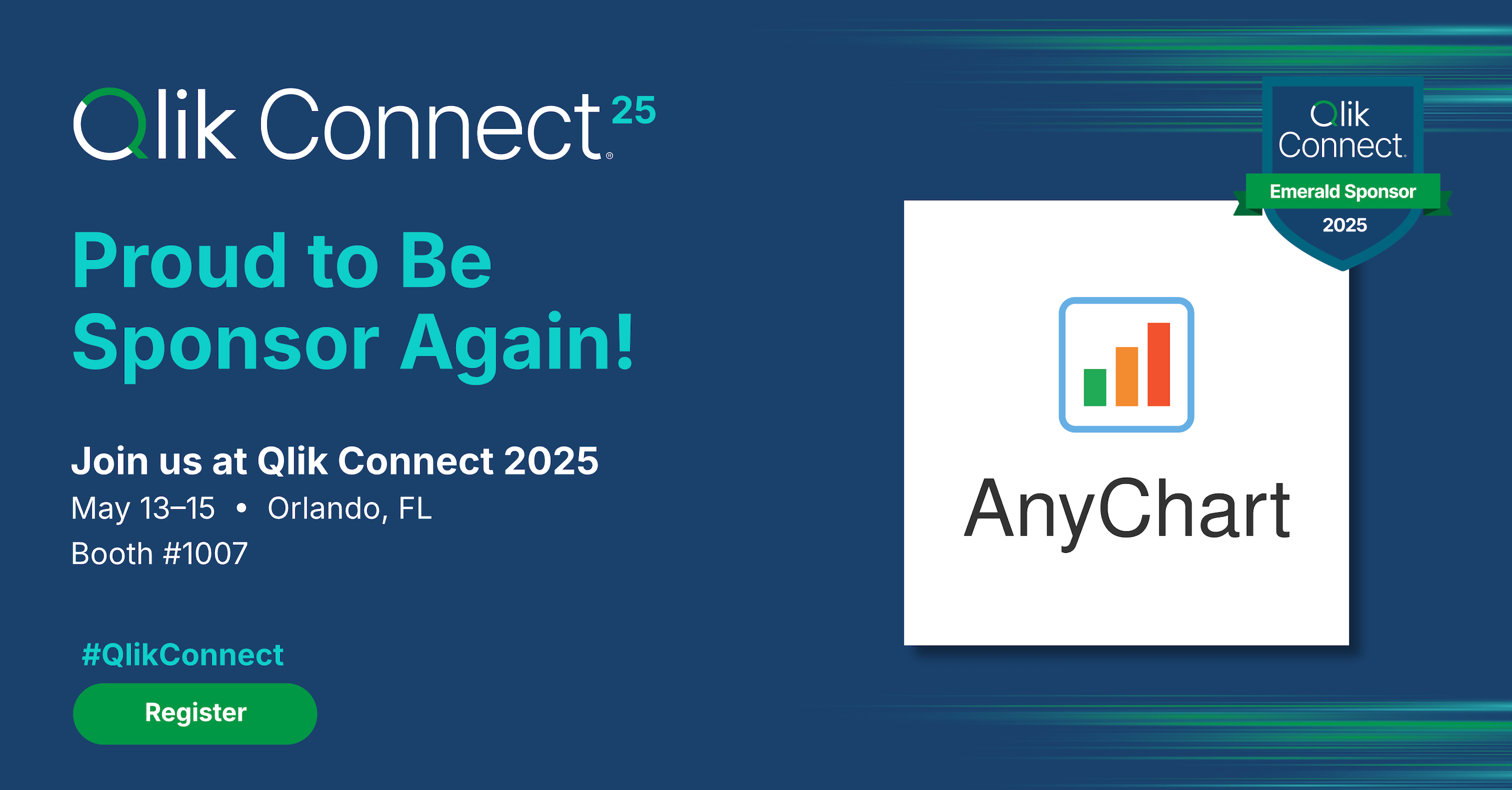 Qlik Connect 2025 is coming up fast, and we at AnyChart are excited to return as a sponsor and exhibitor after last year’s success! Mark your calendar for May 13–15 and join us at Disney’s Coronado Springs Resort in Lake Buena Vista, Florida.
Be sure to stop by Booth #1007 to explore the latest in our suite of Qlik Sense extensions. Discover Excel-like Spreadsheets for Qlik, see what’s new and upcoming in other tools, and enter our contests for a chance to win premium Apple prizes — including a MacBook, Apple Watch, iPad, and more!
Read more at qlik.anychart.com »
- Categories: AnyChart Charting Component, Big Data, Business Intelligence, Dashboards, News, Qlik
- No Comments »
Politics Across New Data Visualizations — DataViz Weekly
April 4th, 2025 by AnyChart Team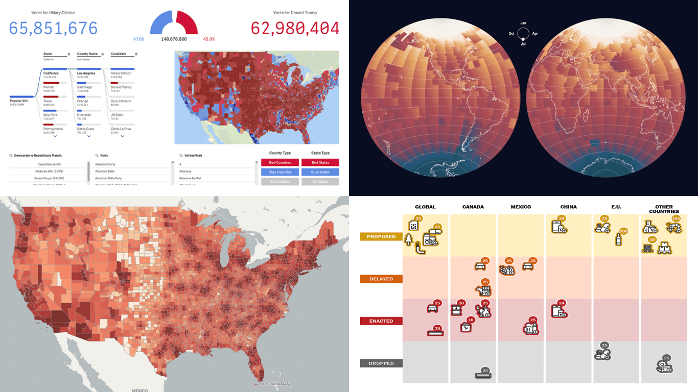 Politics shapes the world in many ways — and, as always, data visualization helps make sense of it all. This time in DataViz Weekly, we are looking at how charts and maps reflect political shifts, decisions, and consequences — from election results and government budgets to tariff policies and even time zones.
One of these projects is ours. We hesitated for a moment — but let’s be honest, we would have featured it anyway if we had stumbled upon it elsewhere.
So, without further ado, here are the four new data visualization projects we think you’ll want to check out:
- U.S. presidential elections — AnyChart
- Trump tariffs timeline — The Washington Post
- Science funding cuts in the United States — SCIMaP
- Politics of time zones — The Economist
- Categories: Data Visualization Weekly
- No Comments »
Heading to Qlik Connect 2025 — Join Us There!
February 25th, 2025 by AnyChart Team We are going to Qlik Connect 2025! 🚀
Not packing just yet — May is still a bit away. But we are getting ready and looking forward to meeting the amazing Qlik community in Orlando, with lots of great presentations and conversations ahead.
We will be there with our Qlik Sense extensions, bringing something special to push the boundaries of visual analytics in Qlik even further. Make sure to stop by if you are around — we would love to connect!
And while we are counting down the days, feel free to check out how great it was last year — take a moment to revisit our Qlik Connect 2024 recap.
See you in Florida! 📍
- Categories: Big Data, Business Intelligence, Dashboards, News, Qlik
- No Comments »
Introducing AI Splits for Instant Root Cause Insights in Qlik Sense
October 31st, 2024 by AnyChart Team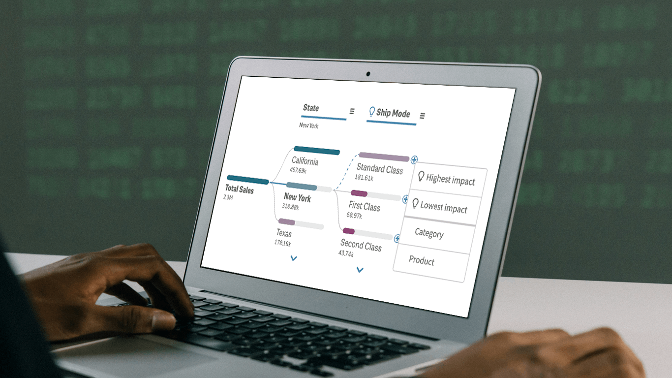 In today’s fast-paced business environment, rapidly understanding the underlying factors within vast amounts of data is crucial for informed decision-making. The Decomposition Tree in Qlik Sense excels at breaking down complex datasets to reveal the “why” behind the numbers. Now, with the game-changing AI Splits feature, this visual becomes even more powerful, automatically highlighting critical impacts and elevating root cause analysis to new heights.
Let’s explore what makes AI Splits transformative and how to implement it.
Read more at qlik.anychart.com »
- Categories: Big Data, Business Intelligence, News, Qlik
- No Comments »
New AI & Visualization Features for Data Analysis in Qlik Sense
October 31st, 2024 by AnyChart Team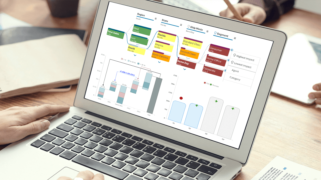 We’re excited to announce a series of updates to our extensions for Qlik Sense! They bring greater flexibility and precision to your data visualizations, allowing for uncovering deeper insights even more effectively. The most stunning new feature is AI Splits in the Decomposition Tree — let your users find the highest and lowest impacts with unprecedented speed!
Read on to learn what’s new at qlik.anychart.com »
- Categories: Big Data, Business Intelligence, News, Qlik
- No Comments »
Celebrating Success at Qlik Connect: Recap from AnyChart
July 10th, 2024 by AnyChart Team Qlik Connect 2024 was nothing short of amazing, not just for its vibrant atmosphere but also for the palpable successes we experienced. Beyond the buzz, we showcased our latest advancements for Qlik Sense, gathered a wealth of insights, made meaningful contacts, and ran a hit interactive game that became the talk of the event. We even clinched a win in the social media contest — an unplanned but welcome accolade indeed! Join us for a recap of our time at Qlik Connect in Orlando.
Read more at qlik.anychart.com »
- Categories: Big Data, Business Intelligence, Dashboards, News, Qlik, Success Stories
- No Comments »
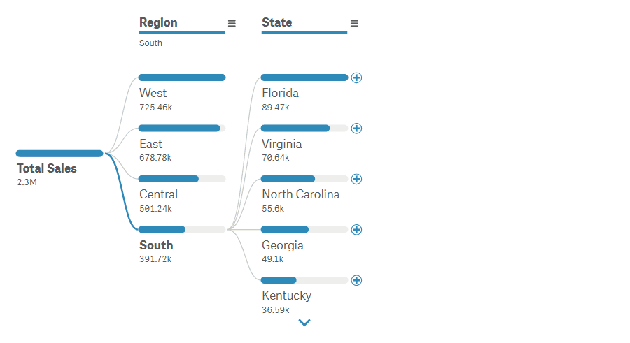
Pivot Table vs. Decomposition Tree: Advancing Data Insights
June 27th, 2024 by AnyChart Team In the evolving data landscape, the pivot table has long been a cornerstone of the data analyst’s toolkit. Traditionally used to summarize datasets in a condensed tabular form, pivot tables facilitate quick overviews and basic drill-down capabilities. However, as data sets grow larger and more complex, the static and manual nature of pivot tables can limit their effectiveness.
Enter the decomposition tree, an advanced data visualization technique that not only presents data but also uncovers deeper patterns and insights ad-hoc, all through its dynamic, interactive hierarchical structure. As a relatively new tool in the realm of data analysis and business intelligence, it is increasingly used as an effective alternative to a pivot table yet still often underrated, given its inherent potential.
This article explores several reasons why decomposition trees can be advantageous over traditional pivot tables, illustrated with real-world use cases.
Read more at qlik.anychart.com »
- Categories: Big Data, Business Intelligence, Dashboards, Qlik, Tips and Tricks
- No Comments »