Test Your Data Literacy & Luck — Win iPad at Qlik Connect!
May 30th, 2024 by AnyChart Team If you’re heading to the Qlik Connect show next week (June 3–5), don’t miss out on the chance to test your data smarts with our fun, interactive game, “Connections.” It’s not only a challenge of knowledge but also an opportunity to win an iPad!
Read more at qlik.anychart.com »
- Categories: AnyChart Charting Component, AnyGantt, Big Data, Business Intelligence, Dashboards, Gantt Chart, Qlik
- No Comments »
Let’s Connect at Qlik Connect 2024: AnyChart Booth #807
May 13th, 2024 by AnyChart Team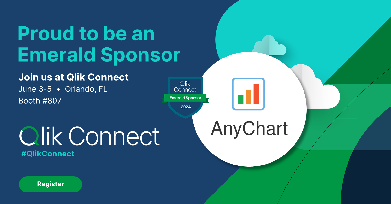 Qlik Connect 2024 is on the horizon, and we’re pleased to announce that AnyChart will be participating as an Emerald sponsor and exhibitor. Join us from June 3–5 at Rosen Shingle Creek in Orlando, Booth #807!
Read more at qlik.anychart.com »
- Categories: AnyChart Charting Component, Business Intelligence, Dashboards, Gantt Chart, News, Qlik
- No Comments »
How to Create Decomposition Tree in Qlik Sense: Transform Root Cause Analysis [Video Tutorial]
March 25th, 2024 by AnyChart Team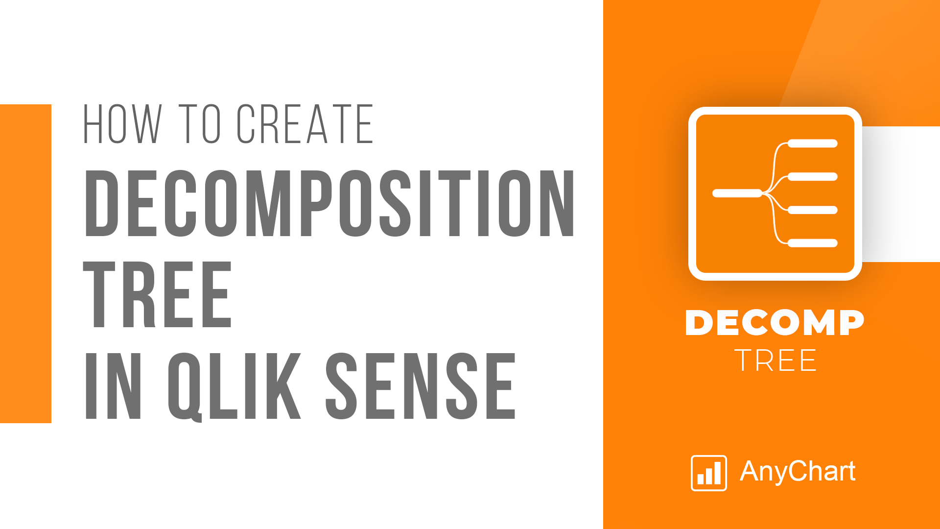 An important note for Qlikkies: Are you ready to elevate your dashboards? Dive into our latest Qlik tutorial — discover the power of the Decomposition Tree and learn how to create it in Qlik Sense in about no time!
Learn more and watch the tutorial at qlik.anychart.com »
- Categories: Qlik
- No Comments »
Free Qlik Webinar: Qlik Sense Revolution — One Sheet Is Enough
March 6th, 2024 by AnyChart Team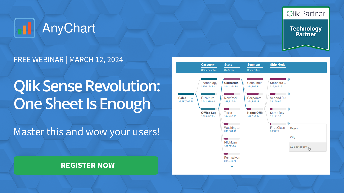 Hey Qlikkies! Still burying insights under layers of charts and sheets? It’s time to break free from wrestling with complex datasets and win the hearts of your business users!
Join our exclusive webinar and meet the Decomposition Tree — a new powerhouse visualization that’s taken Power BI by storm and now graces Qlik Sense. This game-changer slices through data complexity, offering root cause analysis on a single sheet. Drilling down into the heart of any value with superhero speed has never been easier! No more juggling overcomplicated visuals — just instant insights, effortlessly.
- Categories: Big Data, Business Intelligence, News, Qlik
- No Comments »
AnyChart Triumphs Again: Awarded Best in Data Analytics and Visualization in 2024
February 19th, 2024 by AnyChart Team We are delighted to announce that AnyChart has won the prestigious 2024 DEVIES Awards in the Data Analytics & Visualization category, marking our victory for the second consecutive year!
The award celebrates our JavaScript charting library, continuously acknowledged as the world’s leading data visualization solution for developers. As AnyChart JS forms the cornerstone of our broader product line, this recognition once again highlights the technological excellence and innovation inherent in our entire suite of offerings, including the extensions for Qlik Sense.
- Categories: AnyChart Charting Component, AnyGantt, AnyMap, AnyStock, Big Data, Blogroll, Business Intelligence, Dashboards, Financial Charts, Gantt Chart, HTML5, JavaScript, News, Oracle Apex, Qlik, Stock Charts, Success Stories
- No Comments »
Introducing Updates to Waterfall Charts for Qlik Sense
February 1st, 2024 by AnyChart Team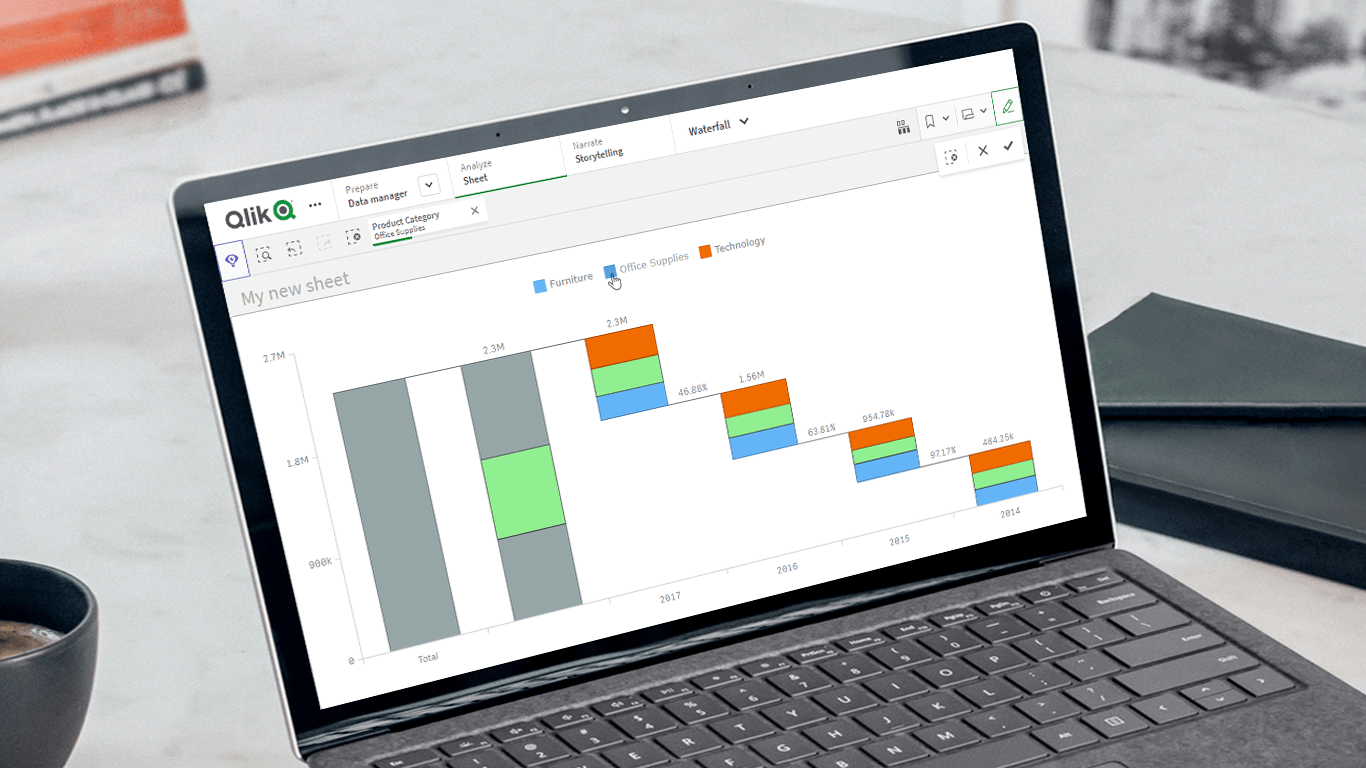 Unveiling the latest updates to our Waterfall Charts for Qlik Sense! In line with our commitment to empowering users to do more with Qlik, we’ve just added a set of new helpful features and improvements to our Waterfall Advanced and Waterfall Classic extensions. These enhancements are designed to further facilitate extracting valuable insights using stacked waterfall visualizations. Check out what’s in store!
Read more at qlik.anychart.com »
- Categories: Big Data, Business Intelligence, News, Qlik
- No Comments »
Qlik Webinar: Fewer Sheets, More Insights
January 30th, 2024 by AnyChart Team Hey Qlikkies! Ever feel overwhelmed by complex datasets, endless sheets, and constant requests from business users? The solution is here — join our exclusive webinar on February 8th and meet the Decomposition Tree, a new rockstar chart in Qlik Sense that’s worth a dozen! Enabling users to slice and dice metrics as they please, this game-changing visualization unlocks root cause analysis and ad-hoc exploration of complex datasets on the spot.
- Categories: Big Data, Business Intelligence, News, Qlik
- No Comments »
Elevated Data Control & Customization in AnyChart’s Latest Qlik Sense Extensions
September 12th, 2023 by AnyChart Team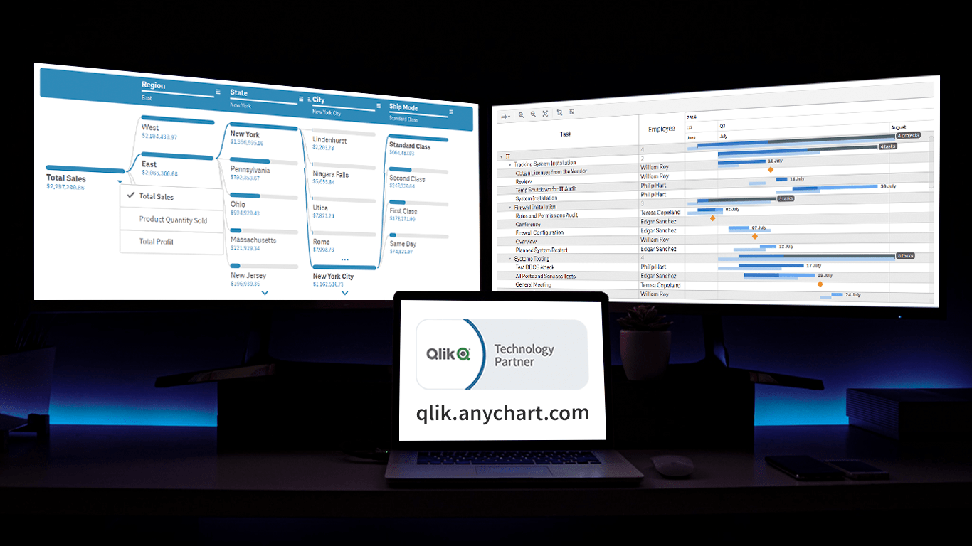 Prepare for an advanced level of data control and customization as we unveil the latest update for our Qlik Sense extensions! The September 2023 release is dedicated to enhancing your visual analytics experience, with a particular emphasis on the Decomposition Tree and Gantt Chart visuals. So, without delay, let’s delve into what’s new.
Read more at qlik.anychart.com »
- Categories: Big Data, Business Intelligence, News, Qlik
- No Comments »
Join AnyChart at QlikWorld Tour 2023
August 10th, 2023 by AnyChart Team Get ready to dive into an exceptional data experience at QlikWorld Tour 2023! We at AnyChart are super stoked to be part of this epic roadshow as proud sponsors and warmly invite you to join us in one of the participating U.S. cities:
- Dallas (The Star in Frisco) — August 10
- San Francisco (Oracle Park) — August 24
- New York (Pier60 at Chelsea Pier) — September 18
- Atlanta (College Football Hall of Fame) — September 20
Spoiler alert: The star of the show will be our first-ever presentation of YODA — Your Own Documents Assistant, the newest, groundbreaking, AI-driven extension for Qlik Sense. Be among the first to witness its power!
Read more at qlik.anychart.com »
- Categories: AnyChart Charting Component, AnyGantt, Big Data, Business Intelligence, Dashboards, Gantt Chart, News, Qlik
- No Comments »
Creating Decomposition Tree in Qlik Sense
June 27th, 2023 by Alejandro Wassermann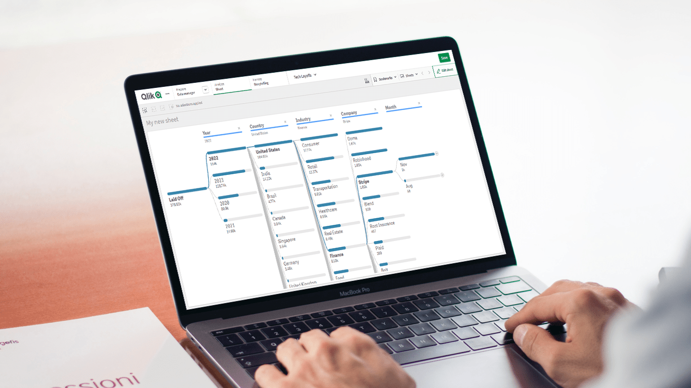 Hey Qlikkies, are you itching to explore your data ad-hoc across multiple dimensions and conduct root cause analysis like a boss? Look no further than the Decomposition Tree visualization! I first stumbled upon this gem in Power BI, but guess what? Now you can harness its power within the realms of the Qlik Analytics Platform. In this tutorial, I’ll demonstrate how you can easily create amazing decomposition trees for your BI dashboards and apps in Qlik Sense.
A decomposition tree is a type of chart that uses a tree-like structure to represent how a whole metric or outcome can be broken down into its constituent parts or factors. It provides a hierarchical view of the relationships between different dimensions or variables and their contributions to the overall metric. By visually displaying the decomposition of a measure, such as sales or revenue, into various components, such as product categories, regions, or time periods, the decomposition tree helps identify the key drivers and understand the underlying factors influencing the metric. And I’ll use the tech layoffs data to show you how this can look and work in reality.
Let’s dive in and unleash the decomposition tree power in Qlik Sense!
Read more at qlik.anychart.com »
- Categories: AnyChart Charting Component, Big Data, Business Intelligence, Dashboards, Qlik, Tips and Tricks
- No Comments »