Building JS Resource Gantt Chart to Visualize Tokyo 2020 Paralympic Schedule
August 17th, 2021 by Shachee Swadia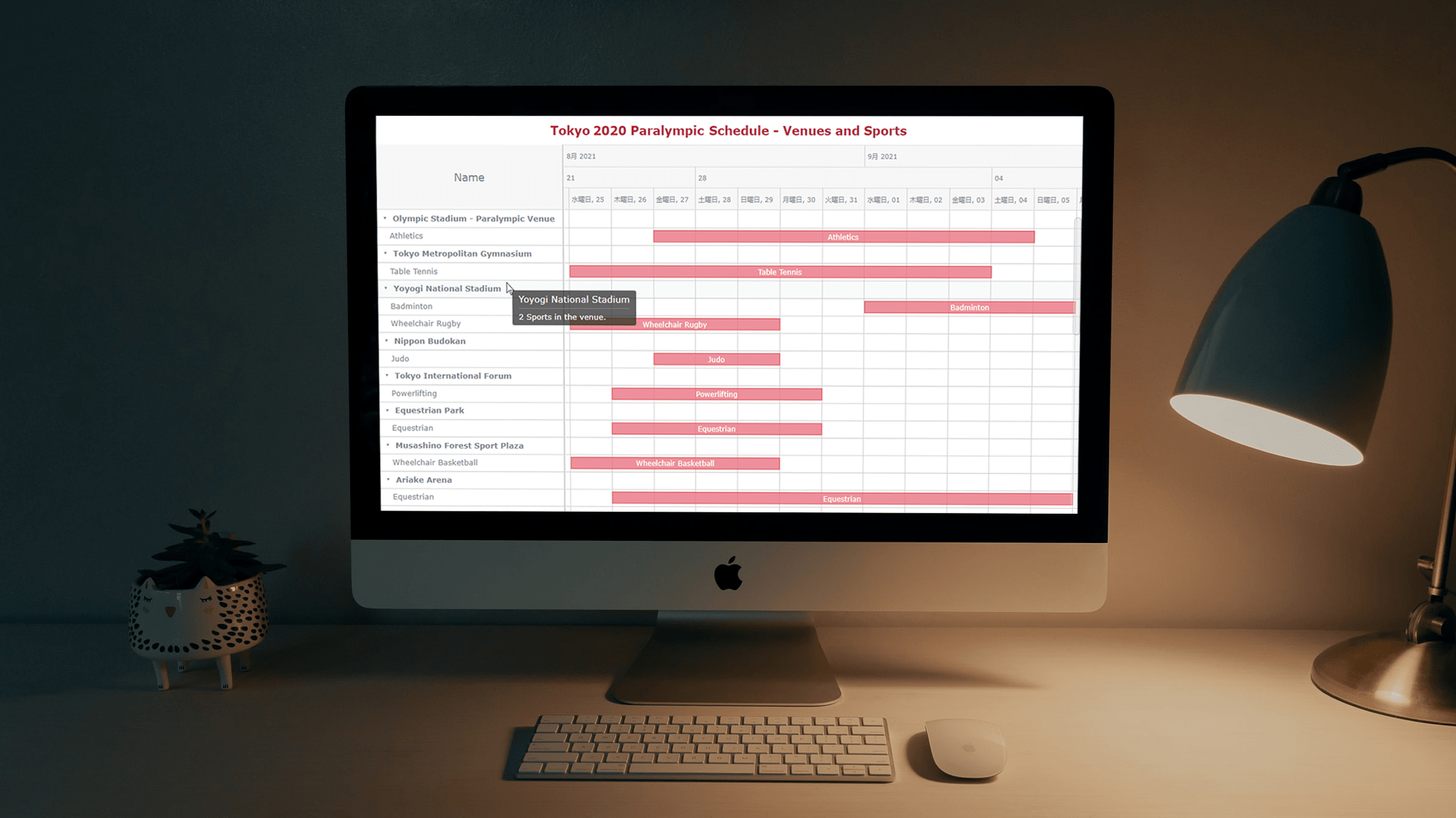 Smart resource allocation is a must to achieve a high level of operational efficiency. Aiming to ensure it, project management professionals commonly rely on a special form of data visualization called a Resource Gantt chart. Creating graphics like this may seem daunting at first sight. But I am here to show you an easy way to build Resource Gantt charts with JS using a compelling, topical example.
Resource Gantt charts, also known as simply Resource charts, consist of bars oriented along the horizontal axis. Each bar visualizes a resource used by an activity, with the length representing the duration while that resource is occupied by that activity. The left and right edges of the bars display the start and end times. The resources, or event labels, are listed on the left. The dates and times are shown in the header.
Tokyo 2020 Paralympic Games are just around the corner. So, I decided to visualize their sports program by venue. Follow along with this stepwise tutorial and you will learn how to create a cool JavaScript Resource Gantt chart visualizing the Tokyo 2020 Paralympic schedule!
Read the JS charting tutorial »
- Categories: AnyChart Charting Component, AnyGantt, Big Data, Business Intelligence, Gantt Chart, HTML5, JavaScript, JavaScript Chart Tutorials, Tips and Tricks
- No Comments »
Bullseye Chart and Gantt Chart Improvements in Qlik Sense Extensions by AnyChart
March 8th, 2021 by AnyChart Team
? Bam! Meet Bullseye charts in Qlik Sense! Qlik counted on us to provide its customers with “additional choices for building even more compelling visualizations.” And we could not stop innovating, so Bullseye has become the 42nd chart type in AnyChart’s extensions for Qlik Sense — enjoy and hit the bull’s-eye in data-driven decision making!
Also, we have added new awesome features to our Gantt charts in Qlik Sense to help expedite actionable insights into your project data. Learn more about the highlights of the March 2021 release of the AnyChart and AnyGantt extensions in a quick overview, and download the latest version!
Read more at qlik.anychart.com »
- Categories: AnyChart Charting Component, AnyGantt, Big Data, Business Intelligence, Gantt Chart, News, Qlik
- No Comments »
Qlik Sense Timeline Chart and More New Features in AnyGantt Extension V 4.1.244
April 24th, 2020 by AnyChart Team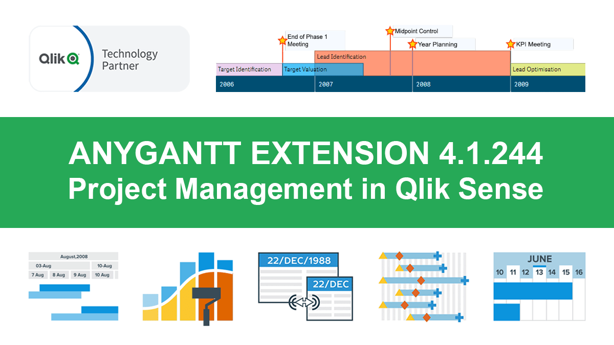 Hey Qlikkies, meet the awesome Qlik Sense Timeline Chart from AnyChart! We are excited to deliver it in the new, just-released version of our AnyGantt extension.
Hence the Timeline Chart has become — wait for it — the 40th chart type available in our data visualization extensions for Qlik Sense overall! For AnyGantt specifically it is the 3rd one, making AnyGantt a unique, cutting-edge Project Management Bundle for Qlik now comprising the Project Gantt Chart, Resource Chart, and Timeline Chart in a single intuitive extension.
However, it is not all great news. Release 4.1.244 also brings a bunch of other awesome features and improvements to the AnyGantt extension.
Read more at qlik.anychart.com »
- Categories: AnyChart Charting Component, AnyGantt, Big Data, Business Intelligence, Gantt Chart, News, Qlik
- No Comments »
How to Color Qlik Gantt Chart Powered by AnyGantt Extension for Qlik Sense
April 15th, 2020 by AnyChart Team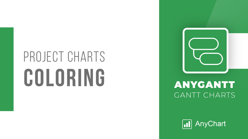 Within the framework of our series of tutorials explaining in detail different aspects of building a Gantt chart in Qlik Sense, we are glad to share a new quick visual manual. This one describes how to color a Project Gantt chart in the AnyGantt extension for Qlik Gantt charts.
Join us as in this tutorial we are going to make it completely clear how to color all main parts of Project Gantt charts: elements, chart area, table cells, table header, and timeline levels. In addition, you can see tutorials about labels, tooltips, and reference lines and ranges — they can also be colored. (Those about tooltips and reference lines and ranges are coming soon. Meanwhile, check out the AnyGantt extension’s documentation or ask our support engineers for assistance.)
For your convenience, this tutorial is available in two versions. Check it out as a video with a voice over or keep reading the alternative, text+pictures version.
Read more at qlik.anychart.com »
- Categories: AnyGantt, Big Data, Business Intelligence, Gantt Chart, Qlik
- No Comments »
How to Configure Project Gantt Chart Labels in Qlik Sense
April 1st, 2020 by AnyChart Team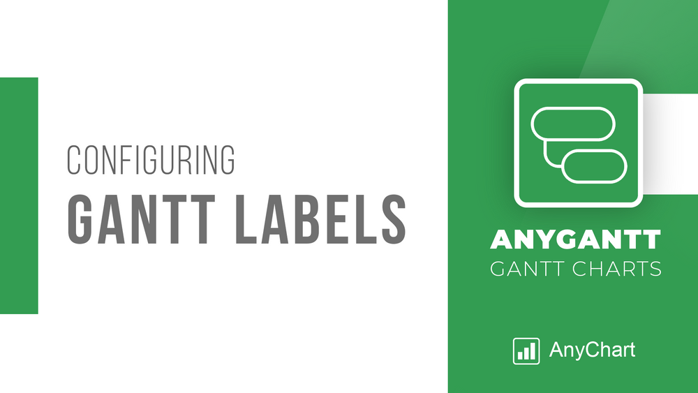 We continue a series of tutorials delving into the details of how to create Gantt charts in Qlik Sense and customize them using our intuitive AnyGantt Extension. This time, let’s look at configuring Gantt chart labels.
You can watch the video version of this tutorial or keep reading to see it in the text and pictures.
Read more at qlik.anychart.com »
- Categories: AnyGantt, Big Data, Business Intelligence, Gantt Chart, Qlik
- 1 Comment »
AnyGantt Extension NOW Available in Qlik Sense Cloud Edition! [+ How-to-Install Video]
March 12th, 2020 by AnyChart Team Great news for Qlik users! AnyGantt Extension for Qlik Sense is now available in the cloud!
As of February 2020, customers using Qlik Sense in the cloud can benefit from 3rd party extensions such as those by AnyChart, a trusted Qlik Technology Partner.
Read more at qlik.anychart.com »
- Categories: AnyChart Charting Component, AnyGantt, Big Data, Business Intelligence, Dashboards, Gantt Chart, News, Qlik
- No Comments »