How to Make JavaScript Polar Chart
November 11th, 2021 by Shachee Swadia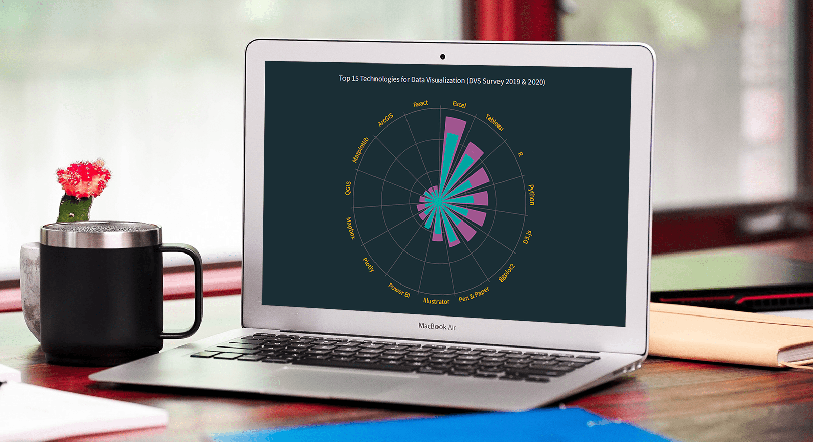 Polar charts often look impressive, which makes some people think that creating them is a tricky process demanding plenty of skills and expertise. Well, I am going to debunk this myth right now! Let me show you how to easily visualize data in a beautiful interactive JavaScript Polar Chart.
Fundamentally, a polar chart is a variation of a circular graph drawn with polar coordinates. It can also work well to visualize some sorts of categorical data for comparisons, which is exactly the case I want to demonstrate now. In this tutorial, I will build a column polar chart, with the bars growing from the center of the diagram to represent values with their length.
Data Visualization Society (DVS) conducts an annual State of the Industry survey of data viz practitioners, and I thought it could be a great opportunity to play with some of its latest data. In particular, I wanted to look at the most popular technologies used for data visualization based on the responses. So here, I will produce a JS polar chart that plots the top 15 ones, making up a cool illustrative real-world example.
It will be fun — come along, everyone!
Read the JS charting tutorial »
- Categories: AnyChart Charting Component, HTML5, JavaScript, JavaScript Chart Tutorials, Tips and Tricks
- No Comments »