Wonderful Data Graphics on Time Use, Rents, COVID-19, Airlines — DataViz Weekly
April 22nd, 2022 by AnyChart Team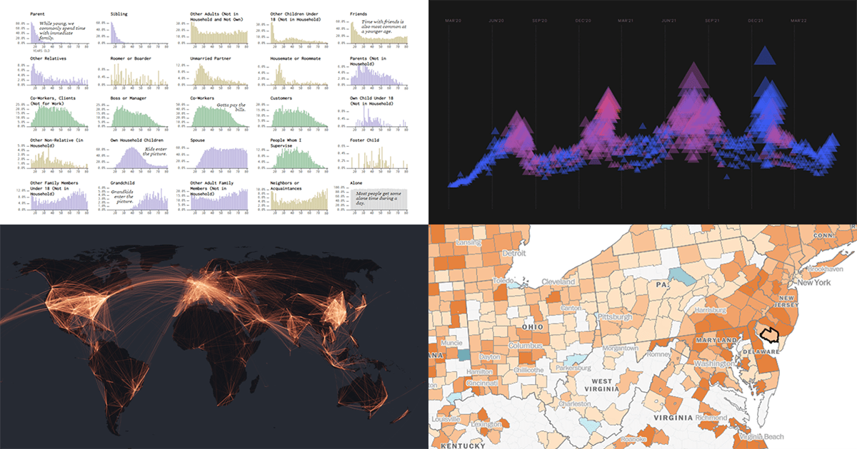 Each Friday, we recall the best data graphics we have seen out there over the last seven days or so and present them to you in a quick roundup. So, DataViz Weekly is here! Just making sure you have not missed these wonderful visualizations:
- People we spend time with over the lifetime — Nathan Yau
- Housing rents across the U.S. from Q1 2021 to Q1 2022 — The Washington Post
- Two years of the COVID-19 pandemic in South Africa — Media Hack
- Air travel market recovery worldwide — The Financial Times
- Categories: Data Visualization Weekly
- No Comments »