When Data Becomes Visual Insight — DataViz Weekly
May 23rd, 2025 by AnyChart Team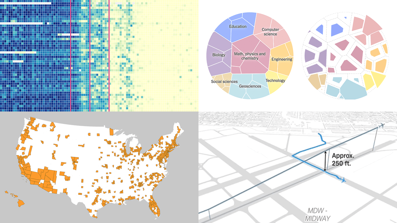 Seeing data is not the same as understanding it — that is where visualization makes the difference. This edition of DataViz Weekly features fresh examples showing how insight emerges when numbers are presented thoughtfully. Whether you work with data or just follow it, here’re four new projects we thought you wouldn’t want to miss:
- Aviation incidents in America — CNN
- County population across the United States — Kyle Walker
- Cuts in U.S. science funding — The Upshot
- Measles vaccination impact — Our World in Data
- Categories: Data Visualization Weekly
- No Comments »
New Impressive Examples of How Data Visualization Works in Practice — DataViz Weekly
April 11th, 2025 by AnyChart Team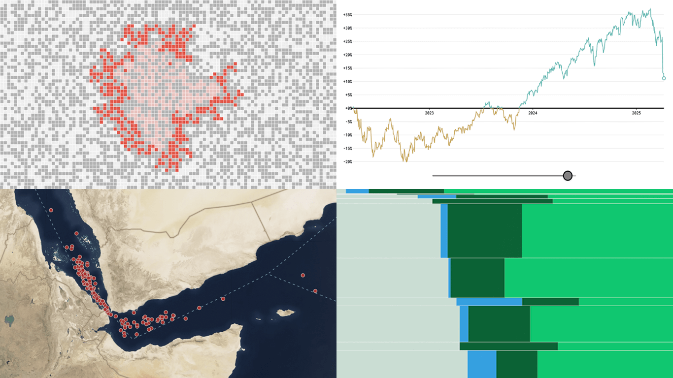 New week, new visualizations that deserve your look! DataViz Weekly brings together several strong new examples demonstrating how data visualization works in practice — making patterns visible, comparisons clearer, and context easier to understand.
- S&P 500 drops and recoveries over time — FlowingData
- Herd immunity thresholds in disease outbreaks — The Upshot
- Renewable energy targets in the Mediterranean — Ember
- Red Sea under Houthi attacks — International Crisis Group
- Categories: Data Visualization Weekly
- No Comments »
Insightful Data Visualizations You Need to See — DataViz Weekly
March 7th, 2025 by AnyChart Team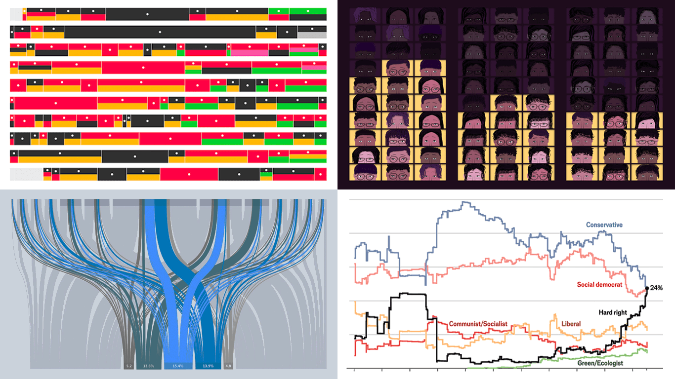 Data visualization is powerful — when done right, it conveys meaning clearly and helps insights emerge naturally. We continue DataViz Weekly, where we regularly highlight some excellent examples from around the internet, offering a firsthand look at how graphical representation can effectively reveal and clarify information. This time, we think you just need to see the following:
- U.S. imports and tariffs — Reuters
- Coalition scenarios in Germany — Bloomberg
- Hard-right parties in Europe — The Economist
- Emotional experiences of middle schoolers — The Pudding
- Categories: Data Visualization Weekly
- No Comments »
Noteworthy New Visualizations to Explore — DataViz Weekly
February 7th, 2025 by AnyChart Team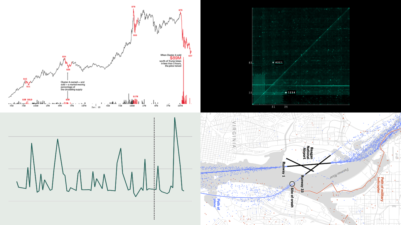 Continuing our regular DataViz Weekly, we’re glad to share the most interesting of all the new data visualizations we’ve recently come across, well worth a look. Here’s what we have lined up this time:
- PIN code popularity — ABC News
- Complexity of D.C. airspace amid the Potomac River midair collision — The New York Times
- Trading patterns in the Trump memecoin — Bloomberg Crypto
- U.S. federal expenditures in real time — The Hamilton Project
- Categories: Data Visualization Weekly
- No Comments »
Awesome New Data Visualization Works — DataViz Weekly
November 15th, 2024 by AnyChart Team Welcome back to DataViz Weekly, where we spotlight the most awesome data visualization works we have recently come across. Check out the projects we’re diving into this time:
- Love songs: death or evolution? — The Pudding
- Historical dry streaks in NYC — Bloomberg Green
- NYC subway ridership in detail — Subway Stories
- Vote swings in U.S. presidential elections — NYT
- Categories: Data Visualization Weekly
- No Comments »
Top Data Visualizations We’ve Recently Seen — DataViz Weekly
October 18th, 2024 by AnyChart Team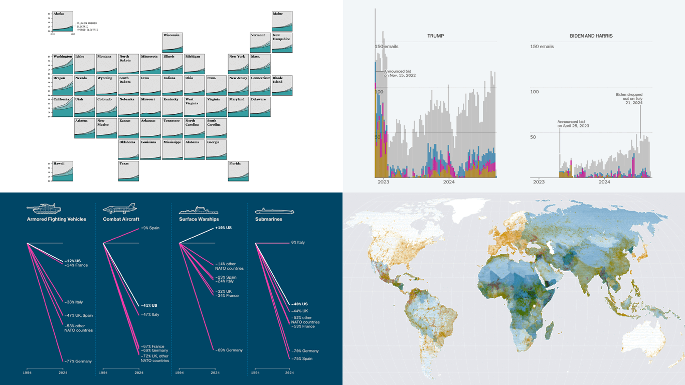 It’s Friday, which means it’s the perfect moment to look back at the data visualizations that have sparked our curiosity over the past few days. So, without further ado, welcome to DataViz Weekly!
- Electric vehicle adoption across the United States — FlowingData
- Europe’s military reductions and defense challenges — Bloomberg
- Climate—Conflict—Vulnerability Index for global risk assessment — UniBw München, PIK, AA, Truth & Beauty
- Campaign emails with donation incentives in the 2024 U.S. presidential race — The New York Times
- Categories: Data Visualization Weekly
- No Comments »
Impressive New Data Visuals for Your Inspiration — DataViz Weekly
October 11th, 2024 by AnyChart Team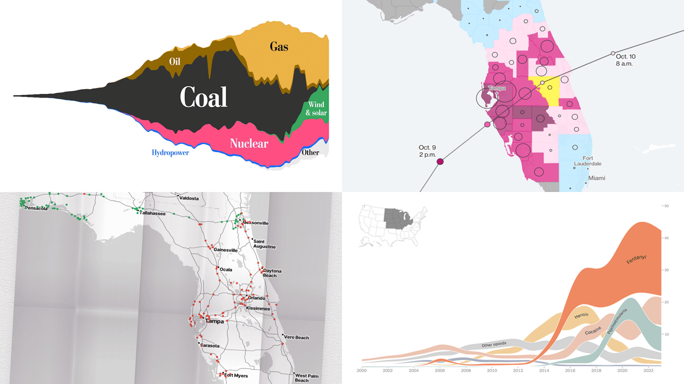 Ready for another dose of impressive data visuals? DataViz Weekly is back with a fresh selection of projects that use powerful graphics to help unravel various trends and patterns. Here are our top picks from what we’ve most recently come across out there:
- End of the UK’s coal power era and lessons for the world — The Washington Post
- Hurricane Milton’s impact and power outages — Bloomberg
- Waffle House Index for Florida under and after Milton — Riley Walz
- Opioid overdose deaths across the United States — NYT Opinion
- Categories: Data Visualization Weekly
- No Comments »
Stunning New Charts & Maps from Around Internet — DataViz Weekly
October 4th, 2024 by AnyChart Team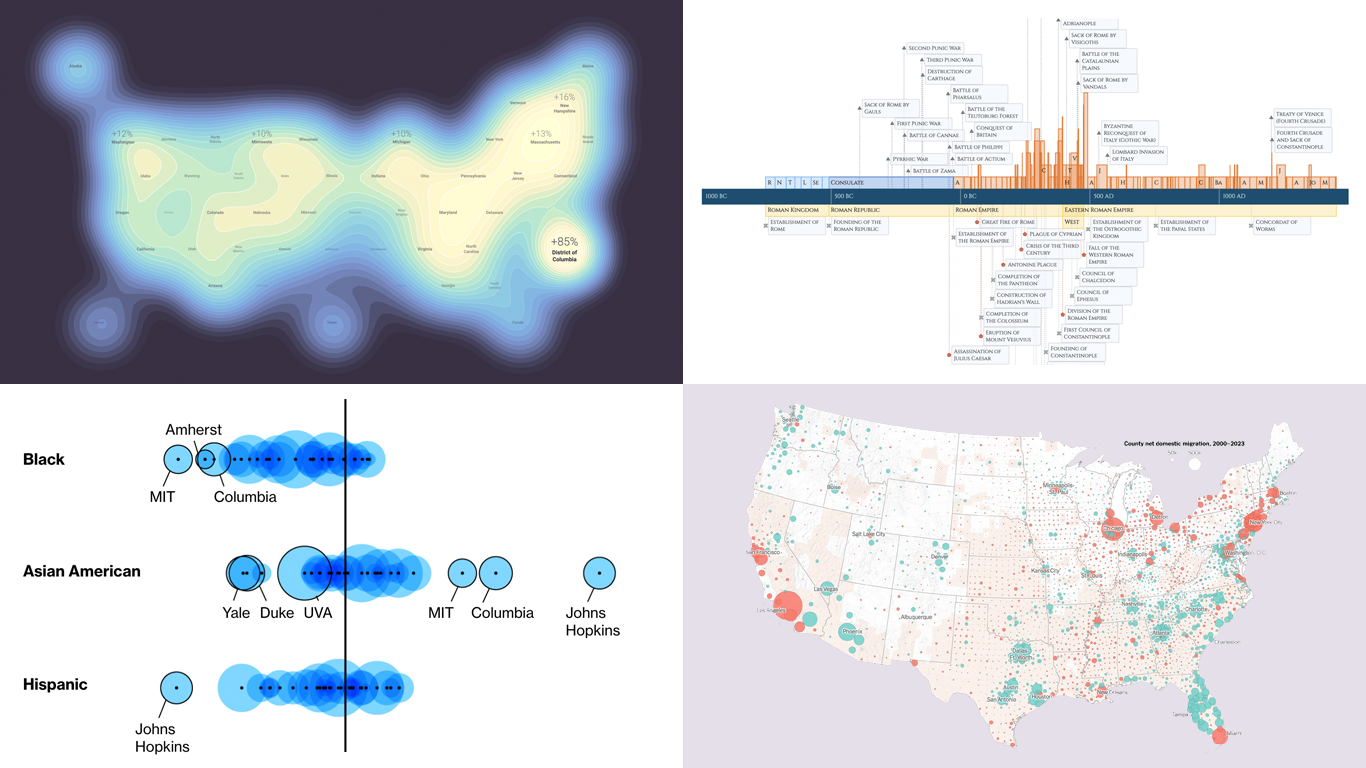 Charts and maps have a unique power to let data talk, transforming raw numbers into meaningful insights that anyone can grasp. In this edition of DataViz Weekly, we’re featuring some of the most stunning new examples of how data visualization brings information to life.
- Hazard-prone locations in the United States attracting migration — NYT
- Shifts in college admissions after the affirmative action ruling — Bloomberg
- Google search trends around U.S. elections — Google Trends and Truth & Beauty
- Interactive timeline of Roman history — AnyChart
- Categories: Data Visualization Weekly
- No Comments »
Fresh Charts and Maps You Need to See — DataViz Weekly
August 2nd, 2024 by AnyChart Team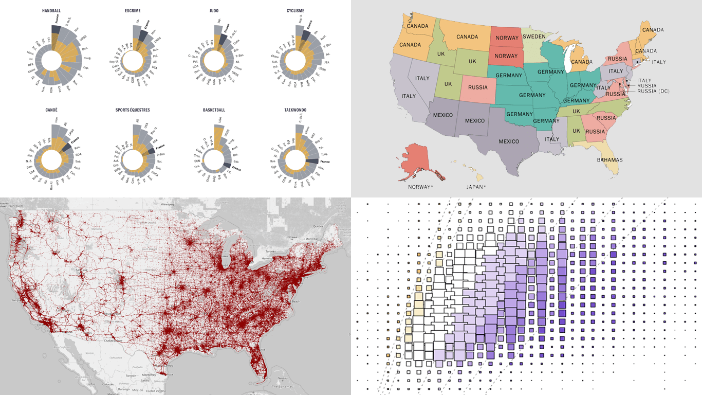 Greetings from DataViz Weekly, a feature on our blog dedicated to exploring the power of charts and maps in uncovering and communicating data. As visual creatures, humans understand and engage with information more effectively when it’s presented in graphical form. Our series focuses on highlighting outstanding and fresh data visualizations that have captured our attention. Today, we’ll showcase these great projects:
- Olympic performances since 1948 with focus on France — Le Monde
- U.S. immigrant origins and settlements in 1850–2022 — Pew Research Center
- Body mass index in the United States — FlowingData
- Traffic fatalities in the U.S. in 2001–2022 — Roadway Report
- Categories: Data Visualization Weekly
- No Comments »
Stunning New Data Visualization Examples in Our Curated Collection — DataViz Weekly
July 26th, 2024 by AnyChart Team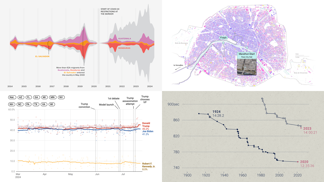 Welcome to DataViz Weekly, where we present a curated selection of stunning data visualization examples our there. Whether you’re a data professional or simply interested in visual data, these charts and maps can provide both inspiration and practical ideas. Here’s what we have for you to explore today:
- U.S. immigration patterns — WaPo
- 2024 U.S. presidential election forecast — Silver Bulletin
- Paris Olympics 100 years later — SCMP
- Extreme heat challenges at the 2024 Summer Olympics — Bloomberg Green
- Categories: Data Visualization Weekly
- No Comments »