Gantt Chart Legend — JS Chart Tips
November 21st, 2024 by AnyChart Team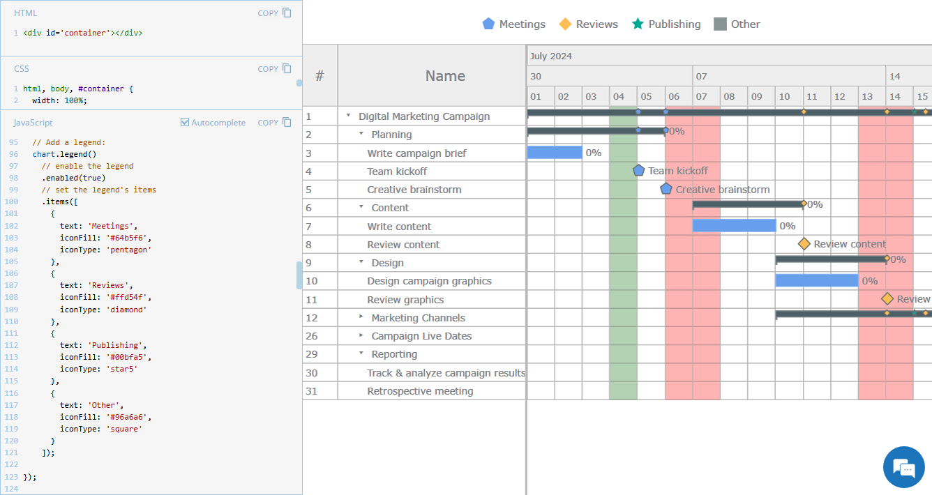 Legend is a vital element in many charts, helping viewers quickly understand what each visual component represents. However, it is not always a must-have for every chart type. For instance, Gantt charts often work perfectly fine without a legend, so it is not enabled in our JavaScript Gantt Chart by default. That said, creating one is straightforward. Right now, we will show you how to add a legend to a Gantt chart — join us as we continue our JS Chart Tips series, sharing quick solutions inspired by real customer queries!
- Categories: AnyChart Charting Component, AnyGantt, Business Intelligence, Gantt Chart, HTML5, JavaScript, JS Chart Tips, Tips and Tricks
- 2 Comments »
Awesome New Data Visualization Works — DataViz Weekly
November 15th, 2024 by AnyChart Team Welcome back to DataViz Weekly, where we spotlight the most awesome data visualization works we have recently come across. Check out the projects we’re diving into this time:
- Love songs: death or evolution? — The Pudding
- Historical dry streaks in NYC — Bloomberg Green
- NYC subway ridership in detail — Subway Stories
- Vote swings in U.S. presidential elections — NYT
- Categories: Data Visualization Weekly
- No Comments »
27 Election Maps of 2024 U.S. Presidential Vote Results — DataViz Weekly Special Edition
November 8th, 2024 by AnyChart Team The 2024 U.S. presidential election has concluded, and media outlets worldwide are offering a plethora of data graphics to convey the election results. In this special edition of DataViz Weekly, we’ve curated a collection of over twenty election maps, showcasing diverse ways to represent voting data — cartograms, choropleth maps, bubble maps, and more. Whether you’re a data enthusiast, professional, or simply intrigued by the 2024 election outcomes, explore the latest U.S. election maps from top media!
💡 Also see our previous special editions with election maps: 2020 U.S. election maps and 2024 UK election maps.
- Categories: AnyMap, Dashboards, Data Visualization Weekly
- No Comments »
Top Data Visualizations We’ve Recently Seen — DataViz Weekly
October 18th, 2024 by AnyChart Team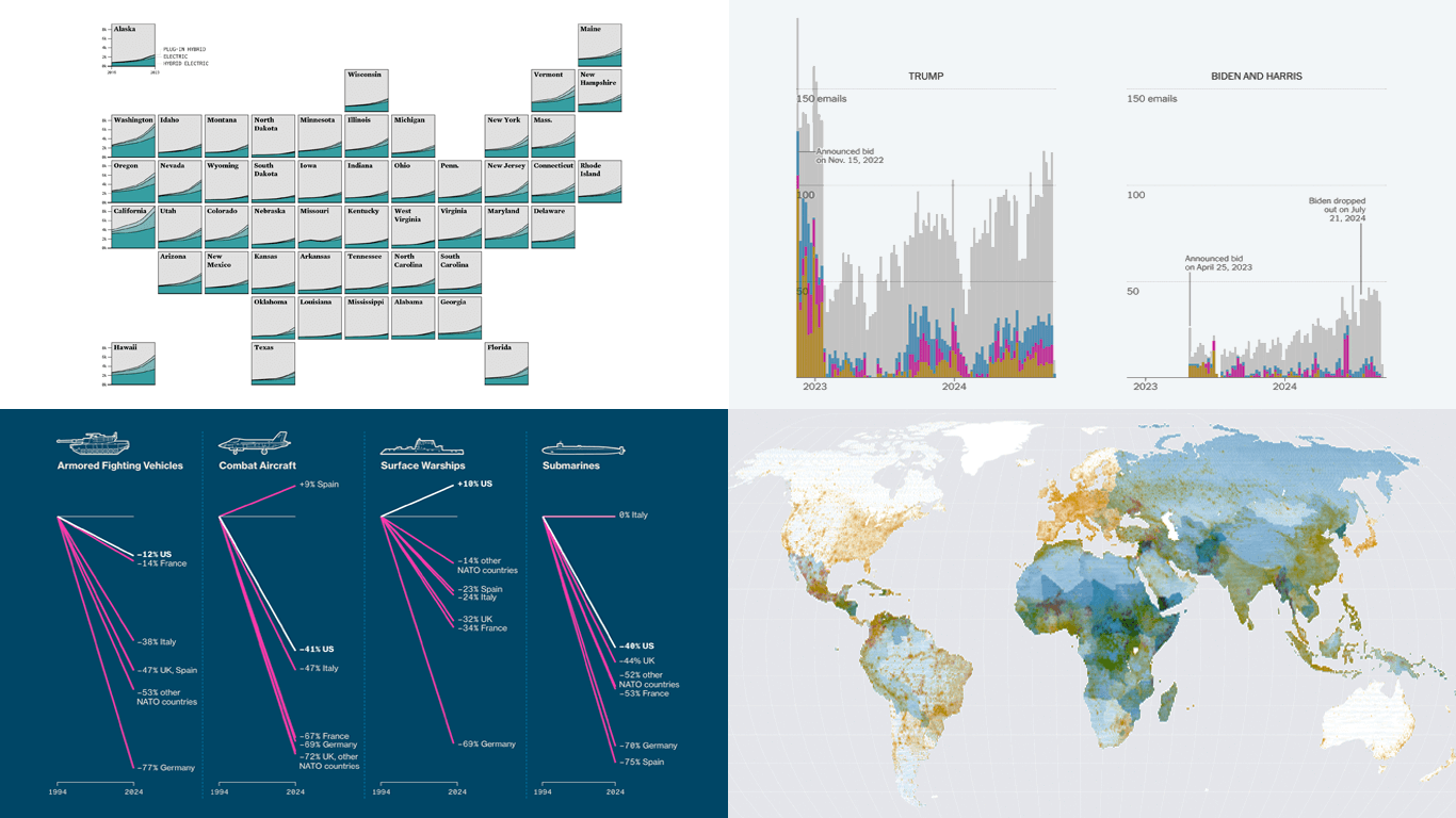 It’s Friday, which means it’s the perfect moment to look back at the data visualizations that have sparked our curiosity over the past few days. So, without further ado, welcome to DataViz Weekly!
- Electric vehicle adoption across the United States — FlowingData
- Europe’s military reductions and defense challenges — Bloomberg
- Climate—Conflict—Vulnerability Index for global risk assessment — UniBw München, PIK, AA, Truth & Beauty
- Campaign emails with donation incentives in the 2024 U.S. presidential race — The New York Times
- Categories: Data Visualization Weekly
- No Comments »
3 Ways to Set Height and Width of JavaScript Charts — JS Chart Tips
October 17th, 2024 by AnyChart Team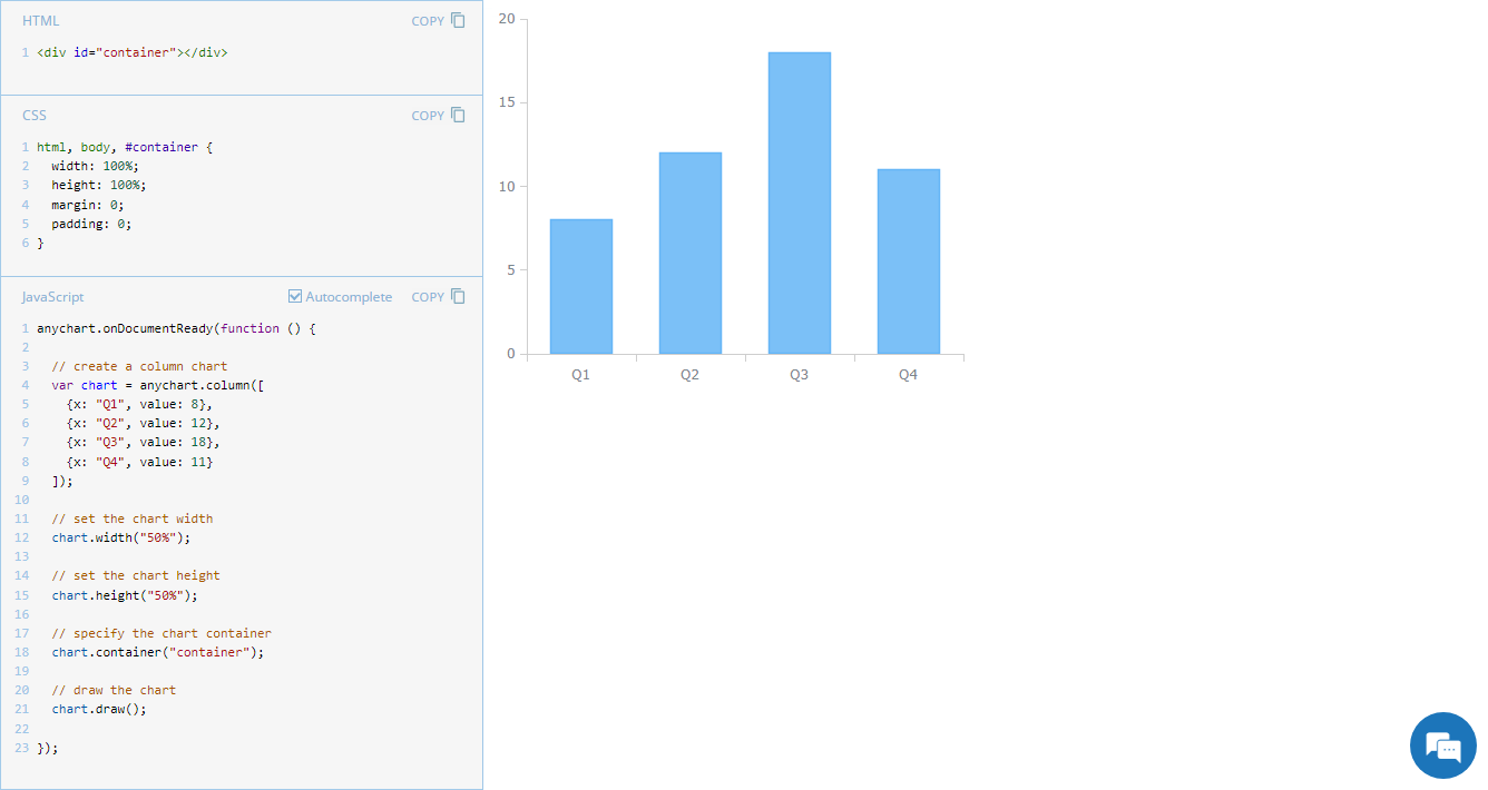 Navigating chart dimensions is key in crafting user-friendly visual presentations, especially when integrating multiple charts into an existing web page or app screen. In our JavaScript chart tutorials, charts are usually showcased as stretching across an entire web page. But it’s far from rocket science to make them smaller. In today’s JS Chart Tips, we explore three effective ways to resize your charts by adjusting their width and height.
- Categories: AnyChart Charting Component, Dashboards, HTML5, JavaScript, JS Chart Tips, Tips and Tricks
- No Comments »
Impressive New Data Visuals for Your Inspiration — DataViz Weekly
October 11th, 2024 by AnyChart Team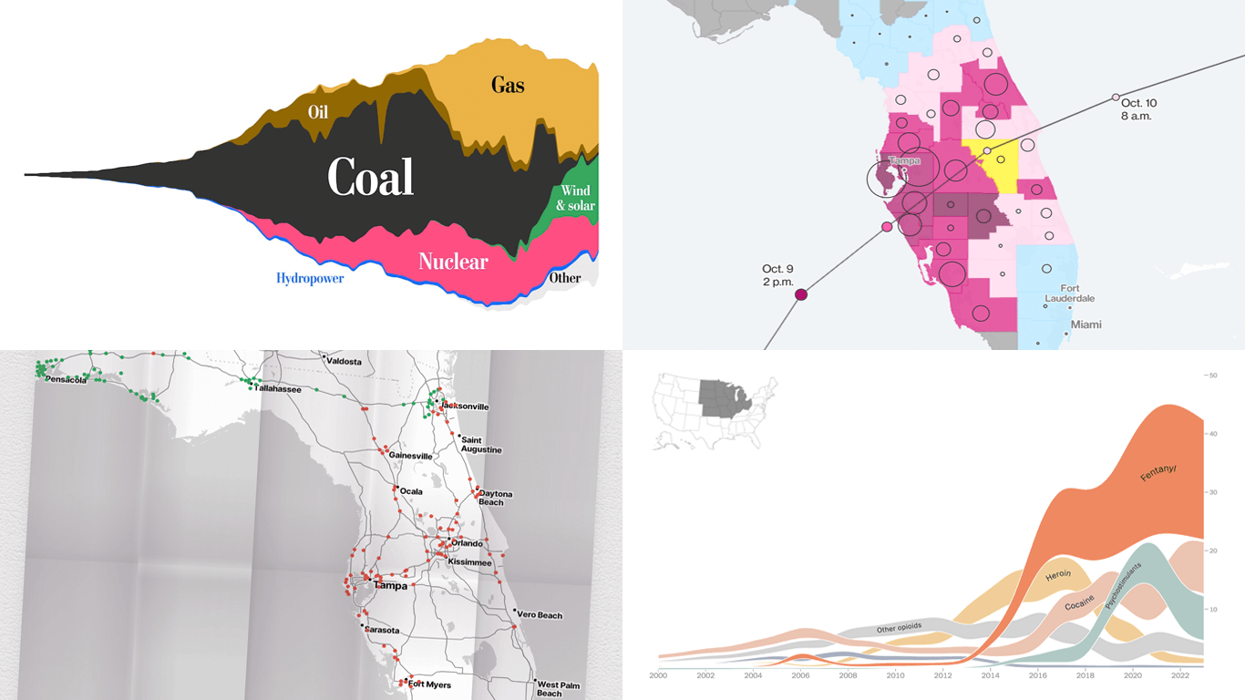 Ready for another dose of impressive data visuals? DataViz Weekly is back with a fresh selection of projects that use powerful graphics to help unravel various trends and patterns. Here are our top picks from what we’ve most recently come across out there:
- End of the UK’s coal power era and lessons for the world — The Washington Post
- Hurricane Milton’s impact and power outages — Bloomberg
- Waffle House Index for Florida under and after Milton — Riley Walz
- Opioid overdose deaths across the United States — NYT Opinion
- Categories: Data Visualization Weekly
- No Comments »
JavaScript Line Chart with Annotations — JS Chart Tips
October 10th, 2024 by AnyChart Team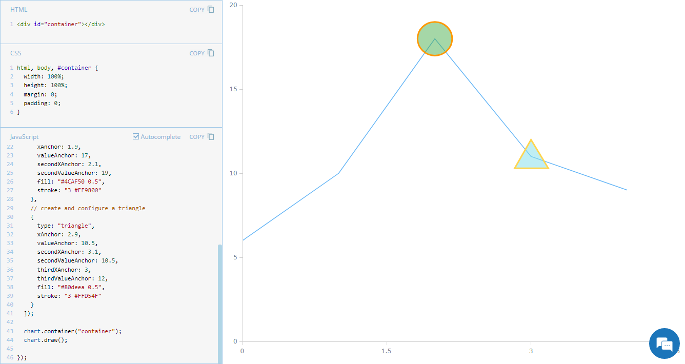 Annotations in charts, such as shapes or text markers, can greatly enhance data narratives by providing more context directly on the visual plane. Thus, it’s no surprise that the ability to add them is one of the most sought-after features of our JavaScript charting library. Although typically used in stock charts, annotations can be just as effective in standard graphics for highlighting specific data points or trends. In this edition of JS Chart Tips, you’ll learn how to add annotations to a basic line chart.
- Categories: AnyChart Charting Component, Charts and Art, HTML5, JavaScript, JS Chart Tips, Tips and Tricks
- No Comments »
Stunning New Charts & Maps from Around Internet — DataViz Weekly
October 4th, 2024 by AnyChart Team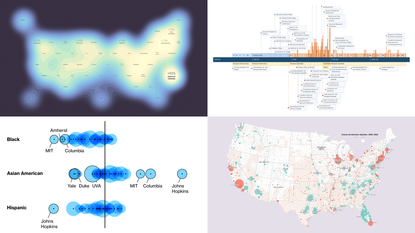 Charts and maps have a unique power to let data talk, transforming raw numbers into meaningful insights that anyone can grasp. In this edition of DataViz Weekly, we’re featuring some of the most stunning new examples of how data visualization brings information to life.
- Hazard-prone locations in the United States attracting migration — NYT
- Shifts in college admissions after the affirmative action ruling — Bloomberg
- Google search trends around U.S. elections — Google Trends and Truth & Beauty
- Interactive timeline of Roman history — AnyChart
- Categories: Data Visualization Weekly
- No Comments »
New Real-Life Data Visualization Examples — DataViz Weekly
September 27th, 2024 by AnyChart Team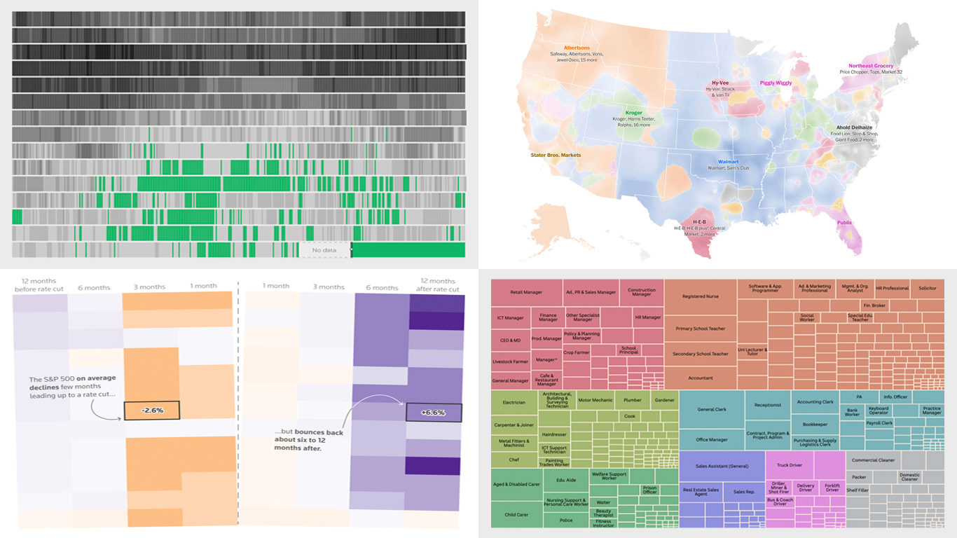 Each week, DataViz Weekly brings you a curated selection of charts and maps based on real-life data. Welcome to our new roundup, continuing to demonstrate how effective data graphics can truly help make sense of complex topics. Take a look at the new data visualization examples we’ve lately found worth highlighting:
- The United Kingdom’s coal-free power era — Ember
- Grocery store ownership in the United States — The Washington Post
- Market reactions to the Federal Reserve’s rate cuts — Reuters
- Marriage patterns by occupation in Australia — ABC News
- Categories: Data Visualization Weekly
- No Comments »
Discovering Fresh Compelling Visual Data Stories — DataViz Weekly
September 20th, 2024 by AnyChart Team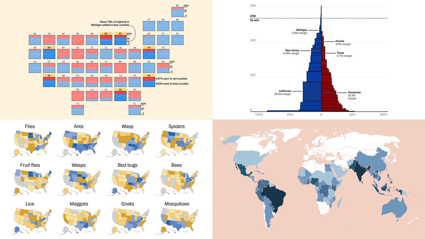 When properly visualized, data comes to life and reveals the stories hidden within the numbers. In this edition of DataViz Weekly, we showcase a selection of new projects that present data in compelling and insightful ways. Let’s dive into the visual data stories that caught our attention this week.
- Neglected tropical diseases — Nexo
- Migrants in U.S. swing states — Bloomberg
- Decisive votes in U.S. presidential elections — The Guardian
- What Americans are searching to kill — The Washington Post
- Categories: Data Visualization Weekly
- No Comments »