Visualizing Information That Matters: Data Visualization Weekly
July 21st, 2017 by AnyChart Team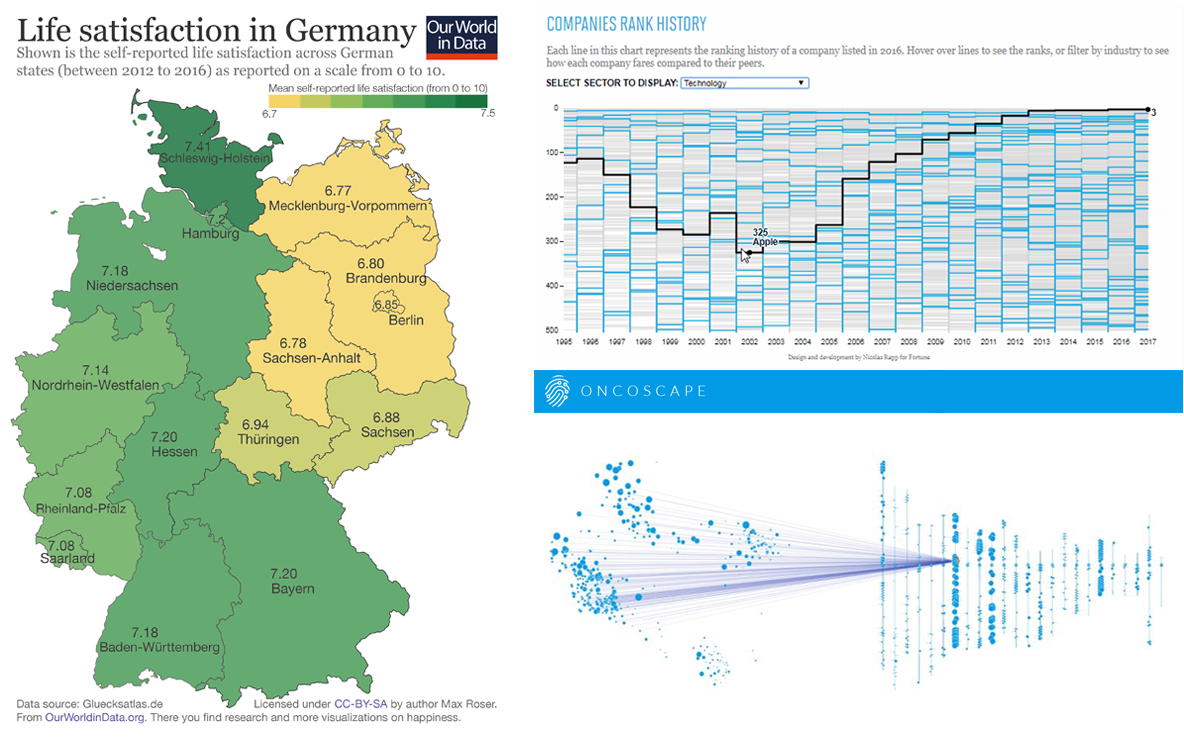 Visualizing information is a complicated matter. But as you are becoming more experienced it gets easier to successfully handle it. All the data visualization examples presented in this issue of DataViz Weekly were created by long-time professionals and made public just lately, but they have already become widely recognized.
So, today’s article is bringing to another light the following data visualization masterpieces:
- map of life satisfaction in Germany by region;
- visualizations of the information from the Fortune 500 list;
- Oncoscape, visualizing clinical and molecular cancer data.
- Categories: Data Visualization Weekly
- No Comments »