Stock Chart with Custom Time Intervals — JS Chart Tips
January 30th, 2025 by AnyChart Team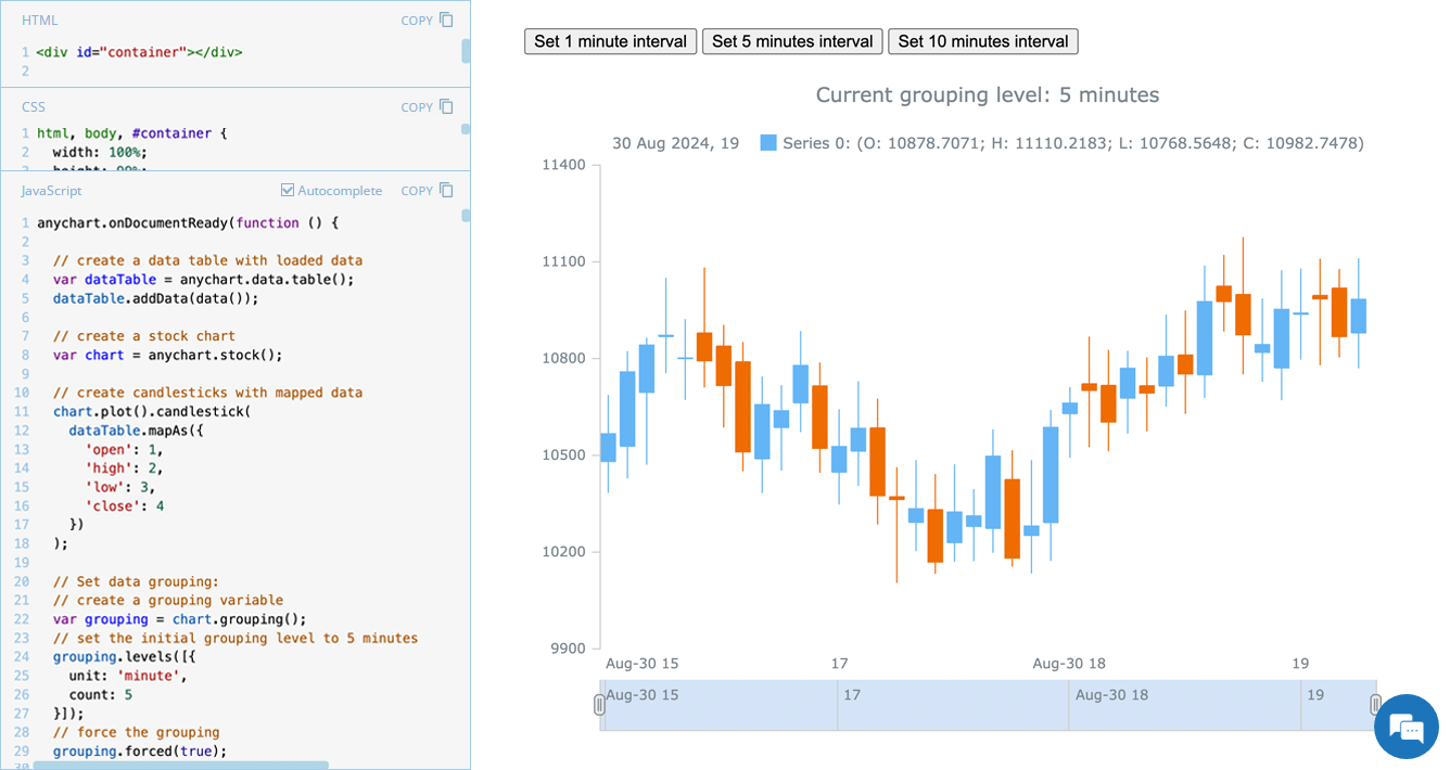 Grouping data points into appropriate time intervals is essential for making stock charts more readable and insightful. While raw data may be collected at a high frequency, such as every minute, financial analysts and traders often need to view broader trends, where grouping data into 5-minute, 15-minute, 1-hour, 1-day, and other time frames can provide clearer insights. In this edition of JS Chart Tips, we will walk you through the process of setting a custom time interval for a stock chart using our JavaScript charting library.
- Categories: AnyChart Charting Component, AnyStock, Big Data, Financial Charts, HTML5, JavaScript, JS Chart Tips, Stock Charts, Tips and Tricks
- No Comments »
Compelling Fresh Data Visualizations Not to Miss — DataViz Weekly
January 24th, 2025 by AnyChart Team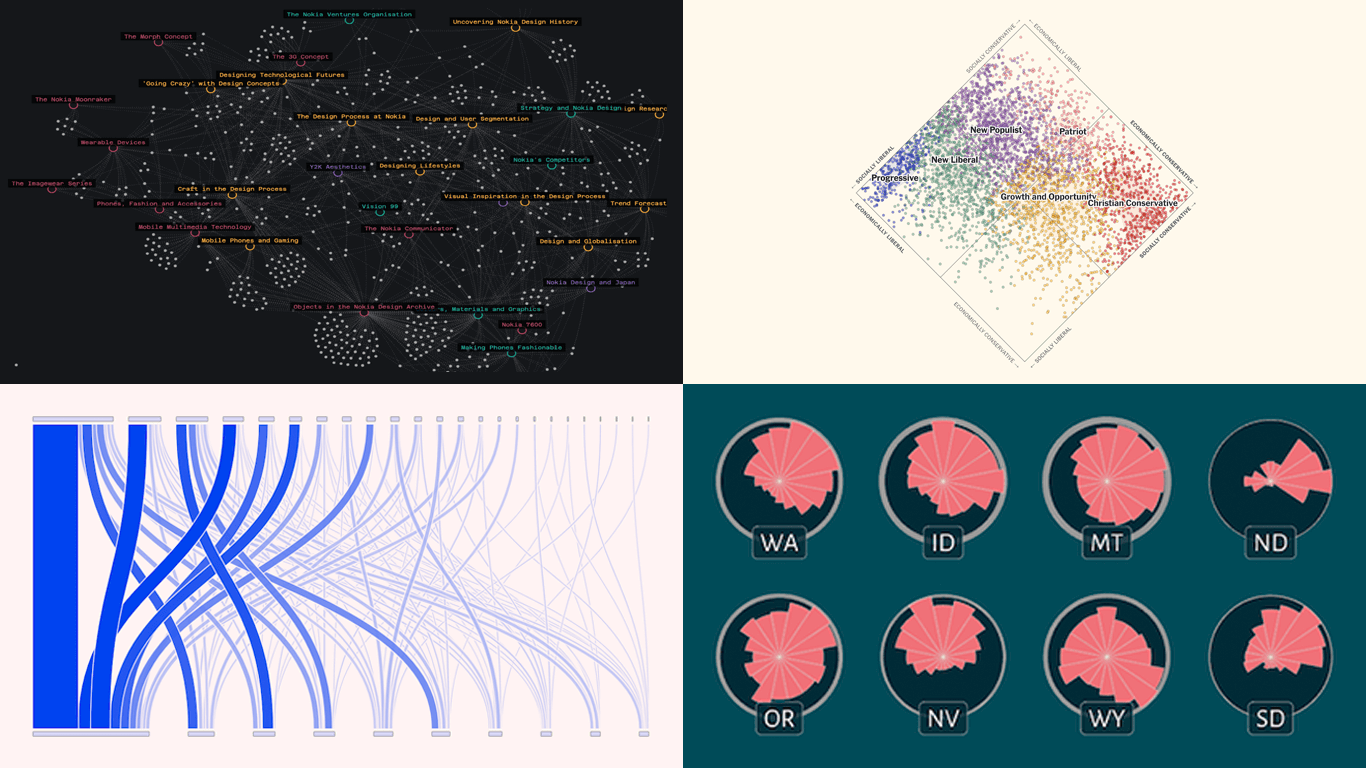 Welcome to the first regular edition of DataViz Weekly in 2025! Last Friday, we wrapped up the year with a special Best Data Visualizations of 2024 post. Now we’re back to our usual format, highlighting some of the most compelling new visuals that caught our attention recently. Here are the first featured projects of the year — dive in and get inspired:
- Nokia Design Archive — Aalto University
- AI research collaborations — Rest of World
- Orientation of ski slopes — OpenSkiStats
- Policy preferences in a hypothetical U.S. multiparty system — NYT Opinion
- Categories: Data Visualization Weekly
- No Comments »
Best Data Visualizations of 2024 — DataViz Weekly
January 17th, 2025 by AnyChart Team In 2024, data visualization remained a vital tool for exploring complex topics and presenting insights in engaging ways. From global conflicts and environmental challenges to cultural phenomena and historical trends, charts and maps provided valuable perspectives and captivated audiences.
This special edition of DataViz Weekly highlights the best data visualizations of 2024. Featuring projects selected by FlowingData, The Pudding, and the Global Investigative Journalism Network (GIJN), as well as year-in-review collections from leading media sources, it offers a curated look at some of the most compelling visual storytelling created during the year. All aboard!
- Categories: Data Visualization Weekly
- No Comments »
Integrating AnyChart JS Charts in Python Django Financial Trading Dashboard
December 3rd, 2024 by Michael Whittle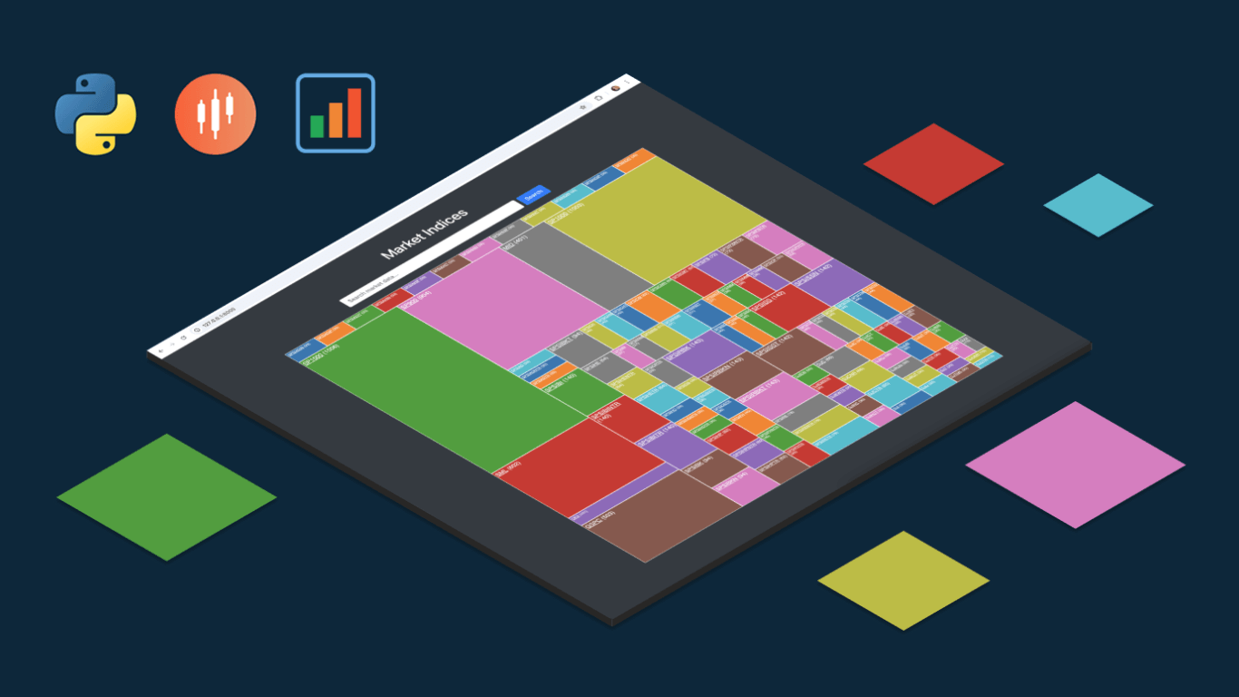 We are pleased to share an insightful article by Michael Whittle, a seasoned solution architect and developer with over 20 years of experience. Originally published on EODHD.com, it explores how he integrated our JavaScript charting library into a financial trading dashboard built with Python Django. Michael also shares his experience migrating a treemap from D3.js to AnyChart and explains why he chose our solution for implementing a stock chart, highlighting the intuitive code and enhanced functionality. Read on to discover how you can elevate your financial data visualizations in Python Django web applications with AnyChart JS Charts.
- Categories: AnyChart Charting Component, AnyStock, Big Data, Dashboards, Financial Charts, HTML5, JavaScript, Stock Charts, Third-Party Developers, Tips and Tricks
- No Comments »
Gantt Chart Legend — JS Chart Tips
November 21st, 2024 by AnyChart Team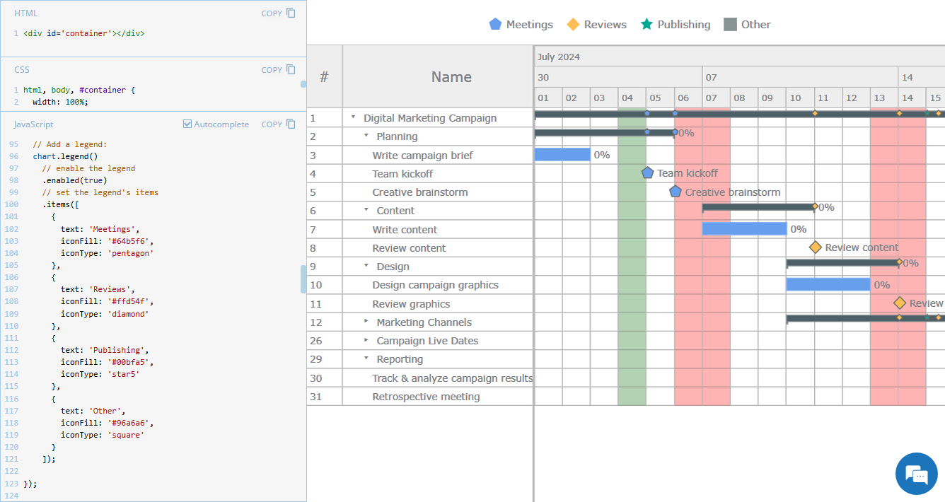 Legend is a vital element in many charts, helping viewers quickly understand what each visual component represents. However, it is not always a must-have for every chart type. For instance, Gantt charts often work perfectly fine without a legend, so it is not enabled in our JavaScript Gantt Chart by default. That said, creating one is straightforward. Right now, we will show you how to add a legend to a Gantt chart — join us as we continue our JS Chart Tips series, sharing quick solutions inspired by real customer queries!
- Categories: AnyChart Charting Component, AnyGantt, Business Intelligence, Gantt Chart, HTML5, JavaScript, JS Chart Tips, Tips and Tricks
- 2 Comments »
Fresh Data Visuals That Impressed Us — DataViz Weekly
November 4th, 2024 by AnyChart Team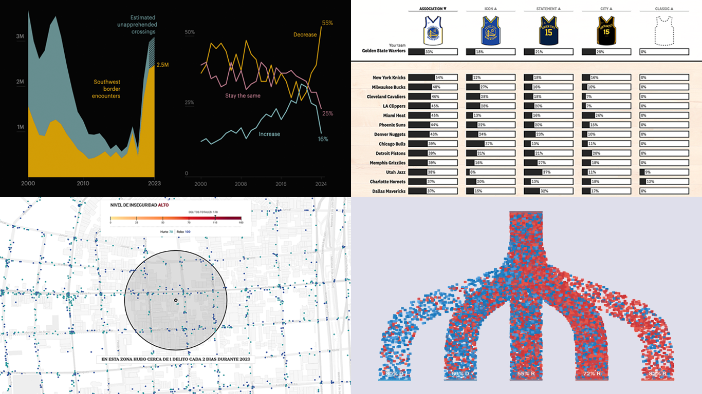 We’re a bit behind schedule after last week’s big release of updates for our Qlik Sense extensions, including the transformative AI Splits feature in the Decomposition Tree. But finally, here we are with a fresh edition of DataViz Weekly! Check out the projects with charts and maps that stood out to us most lately:
- U.S. immigration trends in historical context — ProPublica
- Crime trends in Buenos Aires — LA NACION
- Evolution of NBA uniform colors — The Pudding
- Internal migration and political polarization in the United States — The Upshot
- Categories: Data Visualization Weekly
- No Comments »
Top Data Visualizations We’ve Recently Seen — DataViz Weekly
October 18th, 2024 by AnyChart Team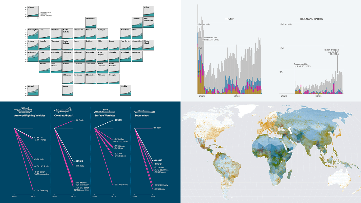 It’s Friday, which means it’s the perfect moment to look back at the data visualizations that have sparked our curiosity over the past few days. So, without further ado, welcome to DataViz Weekly!
- Electric vehicle adoption across the United States — FlowingData
- Europe’s military reductions and defense challenges — Bloomberg
- Climate—Conflict—Vulnerability Index for global risk assessment — UniBw München, PIK, AA, Truth & Beauty
- Campaign emails with donation incentives in the 2024 U.S. presidential race — The New York Times
- Categories: Data Visualization Weekly
- No Comments »
3 Ways to Set Height and Width of JavaScript Charts — JS Chart Tips
October 17th, 2024 by AnyChart Team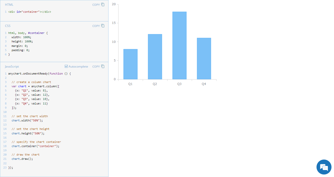 Navigating chart dimensions is key in crafting user-friendly visual presentations, especially when integrating multiple charts into an existing web page or app screen. In our JavaScript chart tutorials, charts are usually showcased as stretching across an entire web page. But it’s far from rocket science to make them smaller. In today’s JS Chart Tips, we explore three effective ways to resize your charts by adjusting their width and height.
- Categories: AnyChart Charting Component, Dashboards, HTML5, JavaScript, JS Chart Tips, Tips and Tricks
- No Comments »
Impressive New Data Visuals for Your Inspiration — DataViz Weekly
October 11th, 2024 by AnyChart Team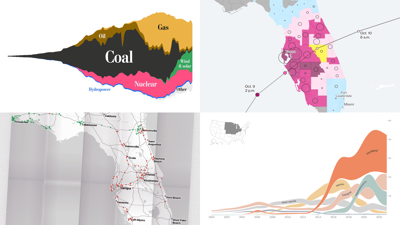 Ready for another dose of impressive data visuals? DataViz Weekly is back with a fresh selection of projects that use powerful graphics to help unravel various trends and patterns. Here are our top picks from what we’ve most recently come across out there:
- End of the UK’s coal power era and lessons for the world — The Washington Post
- Hurricane Milton’s impact and power outages — Bloomberg
- Waffle House Index for Florida under and after Milton — Riley Walz
- Opioid overdose deaths across the United States — NYT Opinion
- Categories: Data Visualization Weekly
- No Comments »
JavaScript Line Chart with Annotations — JS Chart Tips
October 10th, 2024 by AnyChart Team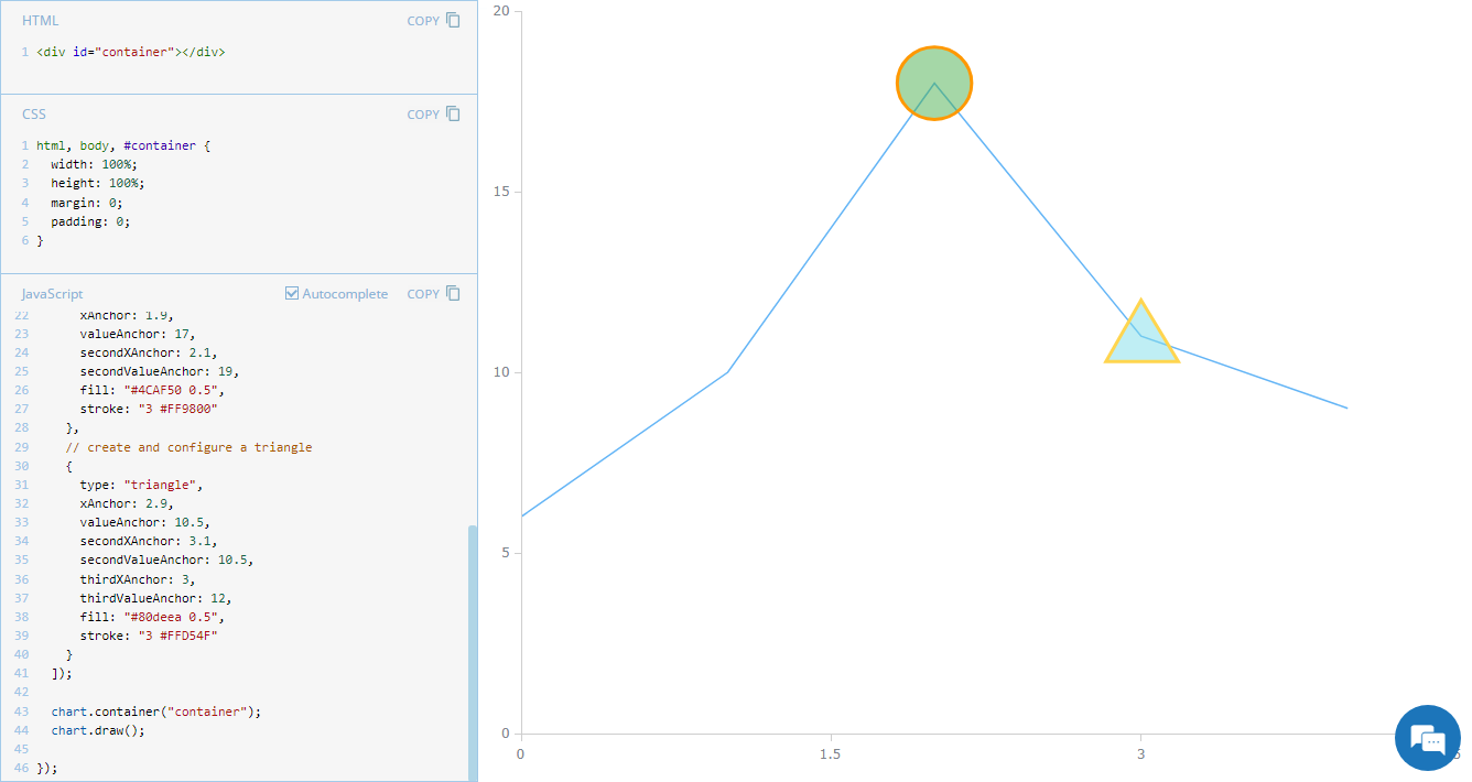 Annotations in charts, such as shapes or text markers, can greatly enhance data narratives by providing more context directly on the visual plane. Thus, it’s no surprise that the ability to add them is one of the most sought-after features of our JavaScript charting library. Although typically used in stock charts, annotations can be just as effective in standard graphics for highlighting specific data points or trends. In this edition of JS Chart Tips, you’ll learn how to add annotations to a basic line chart.
- Categories: AnyChart Charting Component, Charts and Art, HTML5, JavaScript, JS Chart Tips, Tips and Tricks
- No Comments »