Unwrapping Enhanced Interactivity for Calendar and Circle Packing Charts in AnyChart 8.12.0
December 7th, 2023 by AnyChart Team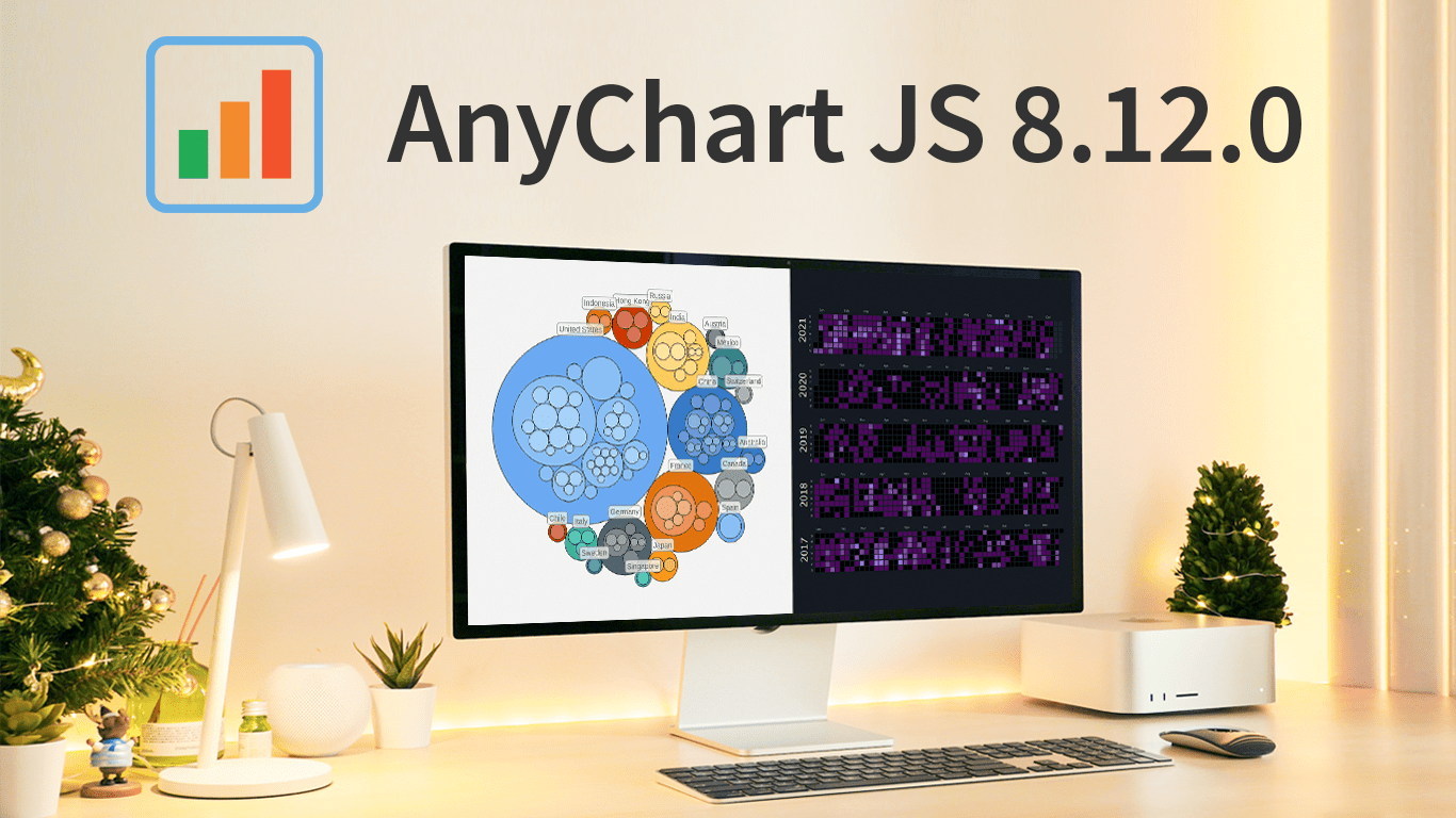 As the magic holiday season approaches, we’re thrilled to unwrap our latest gift of the year — AnyChart 8.12.0, the newest version of our powerful JavaScript charting library. Packed with various bug fixes and improvements, this release introduces a remarkable feature for Calendar and Circle Packing charts — interactivity events. Learn more about it and upgrade right now!
- Categories: AnyChart Charting Component, AnyGantt, AnyMap, AnyStock, Big Data, Business Intelligence, Dashboards, Financial Charts, Gantt Chart, HTML5, JavaScript, News, Stock Charts
- No Comments »
Join AnyChart at QlikWorld Tour 2023
August 10th, 2023 by AnyChart Team Get ready to dive into an exceptional data experience at QlikWorld Tour 2023! We at AnyChart are super stoked to be part of this epic roadshow as proud sponsors and warmly invite you to join us in one of the participating U.S. cities:
- Dallas (The Star in Frisco) — August 10
- San Francisco (Oracle Park) — August 24
- New York (Pier60 at Chelsea Pier) — September 18
- Atlanta (College Football Hall of Fame) — September 20
Spoiler alert: The star of the show will be our first-ever presentation of YODA — Your Own Documents Assistant, the newest, groundbreaking, AI-driven extension for Qlik Sense. Be among the first to witness its power!
Read more at qlik.anychart.com »
- Categories: AnyChart Charting Component, AnyGantt, Big Data, Business Intelligence, Dashboards, Gantt Chart, News, Qlik
- No Comments »
Creating Decomposition Tree in Qlik Sense
June 27th, 2023 by Alejandro Wassermann Hey Qlikkies, are you itching to explore your data ad-hoc across multiple dimensions and conduct root cause analysis like a boss? Look no further than the Decomposition Tree visualization! I first stumbled upon this gem in Power BI, but guess what? Now you can harness its power within the realms of the Qlik Analytics Platform. In this tutorial, I’ll demonstrate how you can easily create amazing decomposition trees for your BI dashboards and apps in Qlik Sense.
A decomposition tree is a type of chart that uses a tree-like structure to represent how a whole metric or outcome can be broken down into its constituent parts or factors. It provides a hierarchical view of the relationships between different dimensions or variables and their contributions to the overall metric. By visually displaying the decomposition of a measure, such as sales or revenue, into various components, such as product categories, regions, or time periods, the decomposition tree helps identify the key drivers and understand the underlying factors influencing the metric. And I’ll use the tech layoffs data to show you how this can look and work in reality.
Let’s dive in and unleash the decomposition tree power in Qlik Sense!
Read more at qlik.anychart.com »
- Categories: AnyChart Charting Component, Big Data, Business Intelligence, Dashboards, Qlik, Tips and Tricks
- No Comments »
AnyChart Named Best in Data Analytics & Visualization 🏆
February 3rd, 2023 by AnyChart Team We’re proud to announce that AnyChart has won a prestigious 2023 DEVIES Award in the Data Analytics & Visualization category! Many thanks to the jury and congratulations to all our partners and customers!
Celebrating 20 years in the market this year, we at AnyChart have been working hard to develop the best-in-class data visualization solutions. And we will keep innovating and excelling!
The DEVIES Awards are the definitive annual awards for the software industry, recognizing outstanding design, engineering, and innovation in developer technology across multiple categories. This year’s winners were selected from record-high hundreds of nominations by an expert-led panel of the DevNetwork Advisory Board, including representatives of Accenture, DigitalOcean, EA, Google, IBM, Salesforce, and other great companies.
- Categories: AnyChart Charting Component, AnyGantt, AnyMap, AnyStock, Big Data, Business Intelligence, Dashboards, Financial Charts, Gantt Chart, GraphicsJS, HTML5, JavaScript, News, Oracle Apex, Qlik, Stock Charts, Success Stories
- 2 Comments »
Decomposition Tree Now in Qlik Sense
January 24th, 2023 by AnyChart Team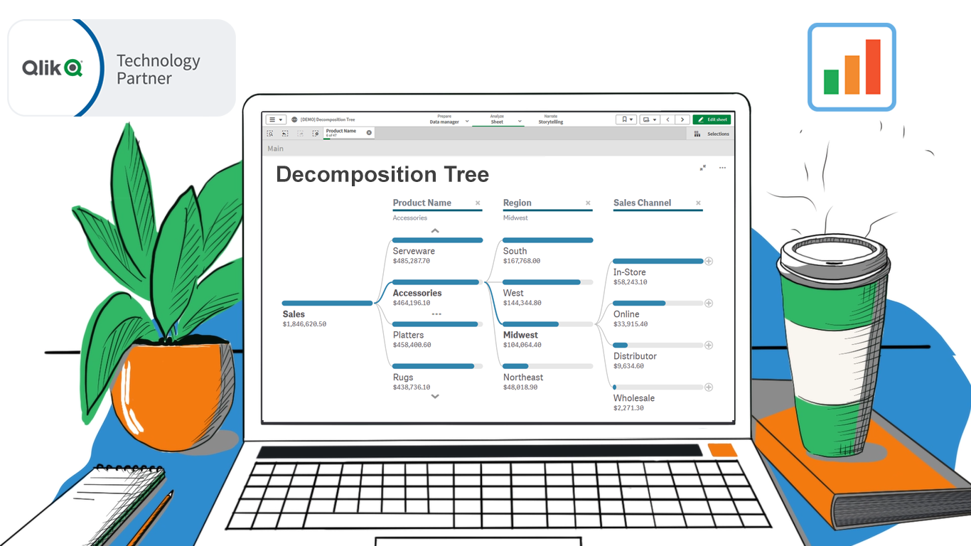 Happy day, data analysts using Qlik! We are thrilled to announce the release of our groundbreaking Decomposition Tree extension for Qlik Sense!
Previously unavailable in Qlik natively or in a third-party extension, a Decomposition Tree is an incredibly powerful technique. It allows you to intuitively explore your core metrics across a number of dimensions, quickly see which factors affect the totals, and make timely decisions to optimize business performance and profits!
Read more at qlik.anychart.com »
- Categories: AnyChart Charting Component, Big Data, Business Intelligence, News, Qlik
- No Comments »
Deluxe Combo Chart & Versatile Circular Gauge for Qlik Sense
January 24th, 2023 by AnyChart Team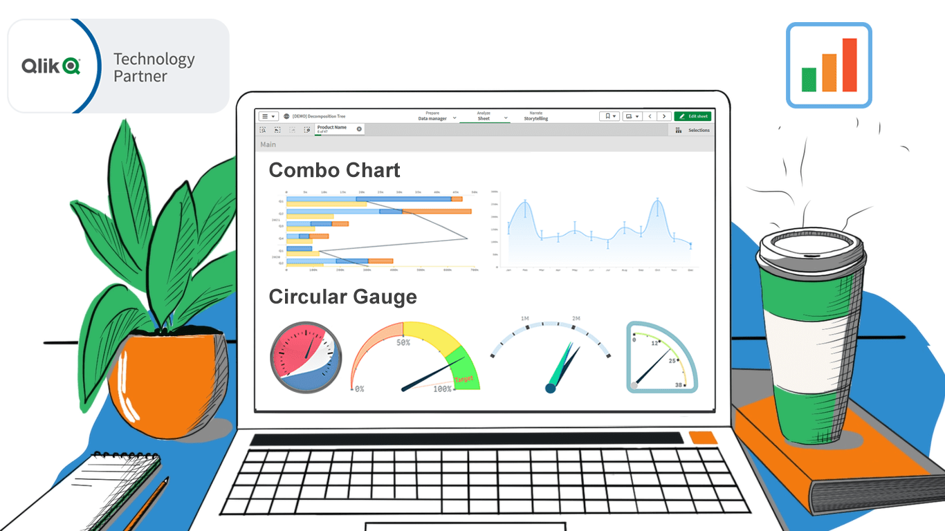 In addition to the Decomposition Tree and new Gantt Chart features, we are excited to release two astonishing extensions. Enjoy making sense of your metrics using the brand new approaches you never had in Qlik before — with our Deluxe Combo Chart and Versatile Circular Gauge for Qlik Sense!
Now, join us for a quick overview of these novel extensions and check them out right away!
Read more at qlik.anychart.com »
- Categories: AnyChart Charting Component, Big Data, Business Intelligence, Dashboards, News, Qlik
- No Comments »
How to Create Mosaic Plot with JavaScript
August 15th, 2022 by Shachee Swadia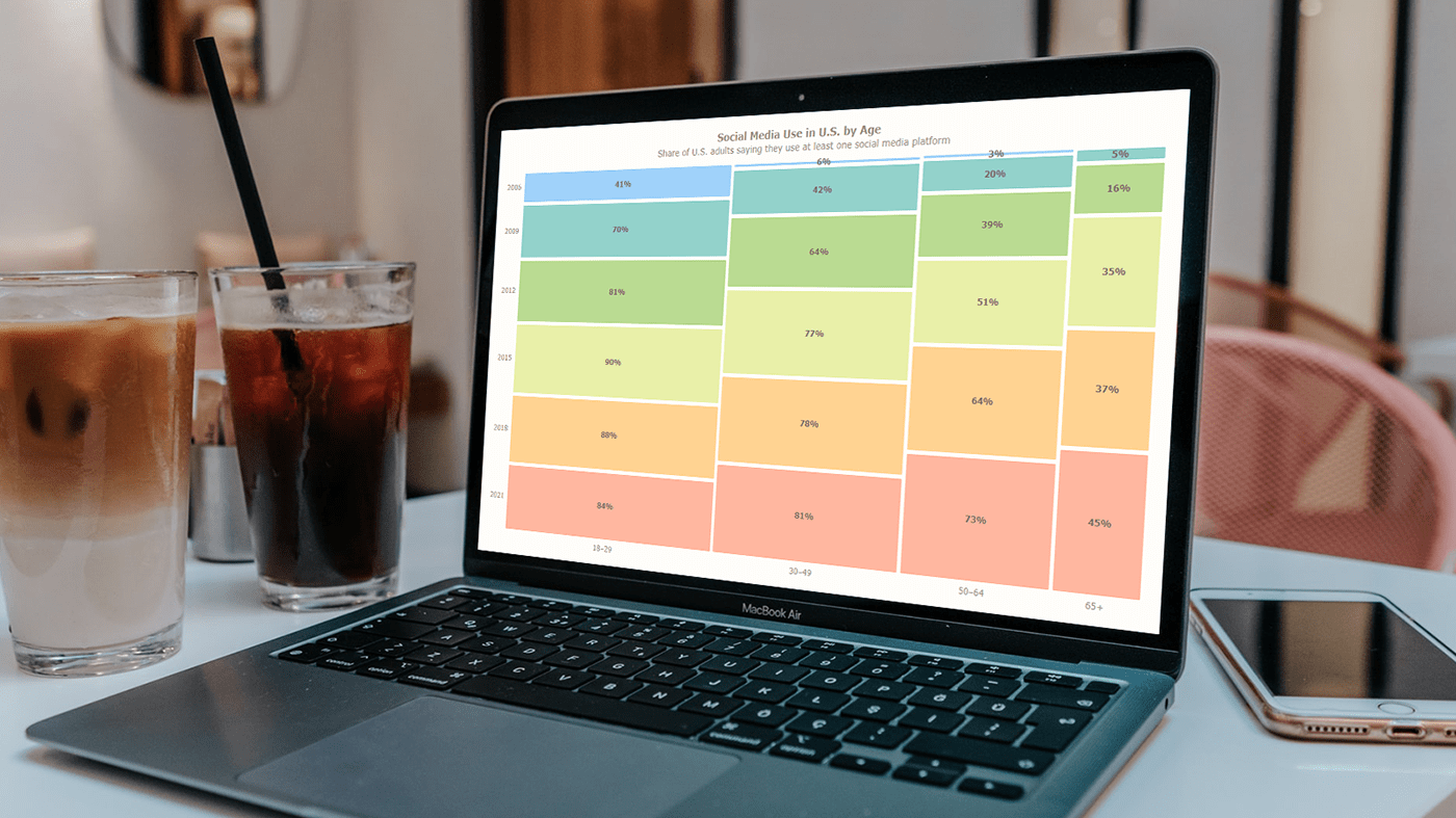 Have you heard of a mosaic plot? It is a very interesting chart type designed to facilitate exploring relationships between variables. Mosaic plots (also known as mosaic charts) visualize data in rectangular tiles whose width encodes one variable and height the other.
If you’d like to learn how to create such an elegant diagram with ease, follow me as I will show you the ropes right now! Along this tutorial, I will be building an interactive mosaic plot of social media adoption in the United States by age group and year, using JavaScript and explaining every step in detail.
Read the JS charting tutorial »
- Categories: AnyChart Charting Component, HTML5, JavaScript, JavaScript Chart Tutorials, Tips and Tricks
- No Comments »
AnyChart Recognized in Top 10 Business Intelligence and Analytics Companies of 2019
November 19th, 2019 by AnyChart Team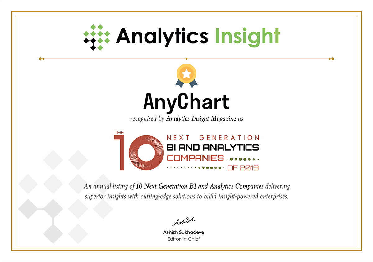 We are excited to announce that Analytics Insight, a magazine that covers big data and business intelligence developments, included AnyChart in The 10 Next Generation BI and Analytics Companies of 2019 — “for providing the most advanced solutions and playing a significant role in shaping the future of these disruptive technologies.”
The list has been made public in the just-released November issue of the magazine and is accompanied by the stories about each featured company. With permission of Analytics Insight, today we are republishing the magazine’s story about us on our blog — “AnyChart: Turning Data into Actionable Insights with Award-Winning Data Visualization Solutions.”
Read the story of AnyChart as it appeared on Analytics Insight »
- Categories: AnyChart Charting Component, AnyGantt, AnyMap, AnyStock, Big Data, Business Intelligence, Charts and Art, Dashboards, Financial Charts, Flash Platform, Gantt Chart, GraphicsJS, HTML5, Interesting Facts, JavaScript, News, Success Stories
- No Comments »