Choose Right Chart Type for Data Visualization. Part 3: Data Over Time (Trend Context)
April 26th, 2017 by AnyChart Team We are continuing the effort to better familiarize you with the world of chart types. This time let’s talk about good ways to visualize and explore Data Over Time.
Watching the change in data over time helps identify trends and dynamics in diverse timeline-based sets of values. Needless to say, choosing a right chart type is very important here. When applying an inappropriate form of visualization to your data, you might end up with an inaccurate idea of what happened in the past, what’s taking place now, and/or what will occur in the future. But we’ll do our best to help you avoid any mistakes in this field so you always make only right decisions based on your date/time data.
So, let’s get to the gist now.
- Categories: Choosing Chart Type, Tips and Tricks
- No Comments »
Web Analytics Dashboard – Made With JS Maps and Charts Powered by AnyChart
October 19th, 2016 by AnyChart TeamIn today’s world of data, a well-designed web analytics dashboard is a must-have for everyone who is managing a website, a web app, or a number of various web projects. You get tons of statistics about traffic, and you should make them work and help you make right decisions.
How much traffic are you getting? Who are your visitors? Where are they coming from? And maybe even most important – is your marketing strategy working well? It gets much easier and takes significantly less time to answer all these questions when the data is visualized. Here comes an interactive analytics dashboard that allows you to have your data organized, see everything at-a-glance, and pay sufficient attention to all metrics that are important to you.
First-class dashboarding experience is one of the biggest advantages of our interactive data visualization solutions. JavaScript graphs, maps, and stock charts powered by AnyChart can be easily put on a single, effective, interactive HTML5 dashboard, making your traffic data analytics even more powerful and insightful. And here is another great example – Web Audience Dashboard, freshly made by the team of AnyChart for your inspiration.
Look at this:

(large image / interactive version)
And now we definitely should take note of some composition and development features of this dashboard.
- Categories: AnyChart Charting Component, AnyMap, Business Intelligence, Dashboards, HTML5, JavaScript, Tips and Tricks
- No Comments »
First Ever Area Charts Created 200+ Years Ago
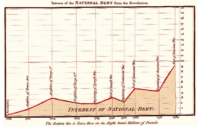
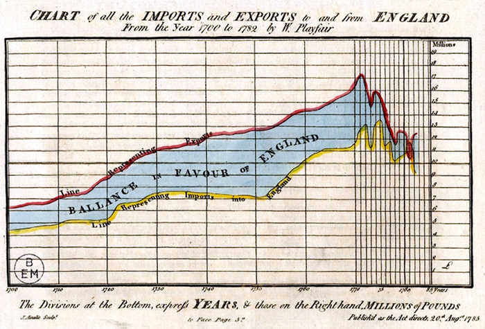
December 23rd, 2015 by AnyChart TeamScottish engineer and political economist William Playfair is credited with inventing not only the bar chart but also the area charts.
Generally speaking, Playfair’s publication The Commercial and Political Atlas, first appeared in 1786, contained many interesting time-series graphs. The following two of them are more particularly mentioned today as the first area charts in history.
1. Interest of the National Debt from the Revolution. Single-series.
2. Chart of all the Imports and Exports to and from England from the Year 1700 to 1782, originally dated August 20th, 1785. This chart can also be treated as at least one of the first multi-series area charts. The area between two curves shows the difference between them and is a great visual representation of the balance of trade.
- Categories: Interesting Facts
- 3 Comments »