December 3rd, 2024 by Michael Whittle
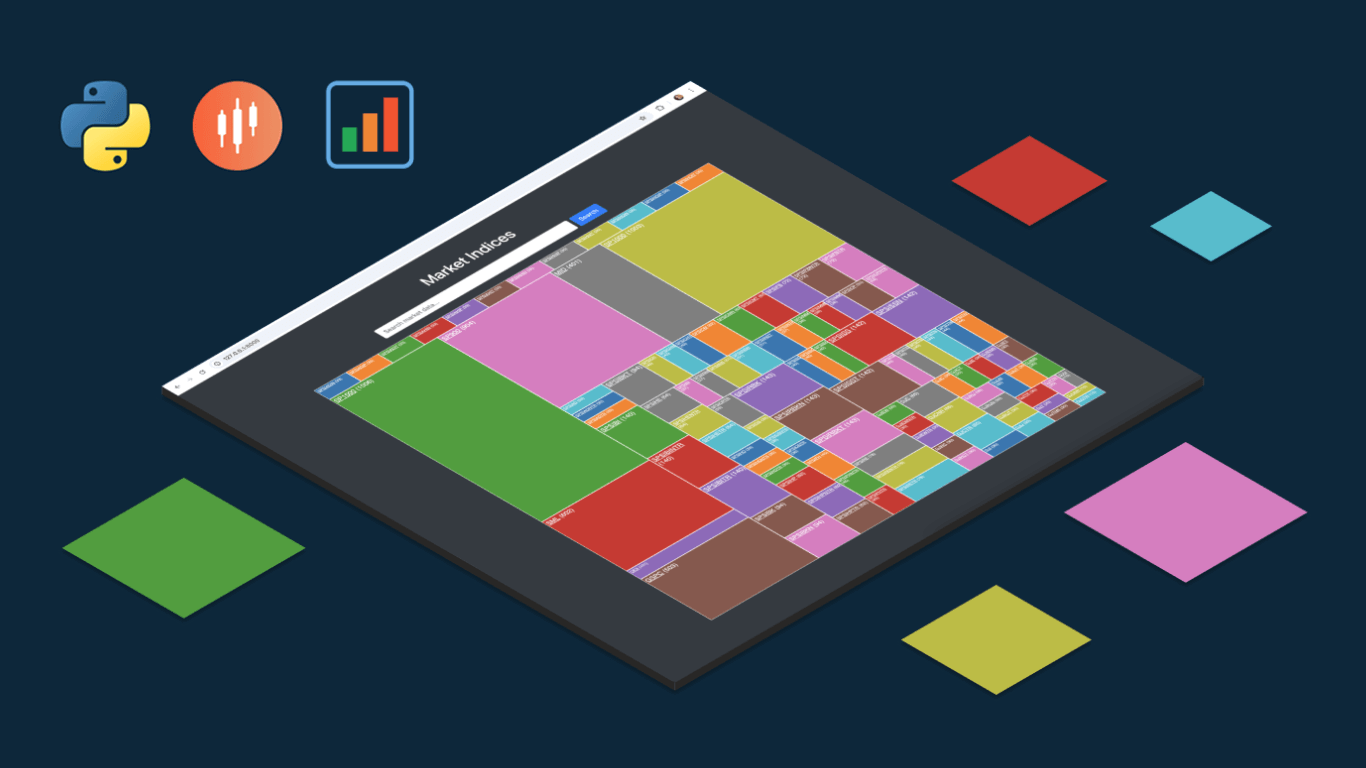 We are pleased to share an insightful article by Michael Whittle, a seasoned solution architect and developer with over 20 years of experience. Originally published on EODHD.com, it explores how he integrated our JavaScript charting library into a financial trading dashboard built with Python Django. Michael also shares his experience migrating a treemap from D3.js to AnyChart and explains why he chose our solution for implementing a stock chart, highlighting the intuitive code and enhanced functionality. Read on to discover how you can elevate your financial data visualizations in Python Django web applications with AnyChart JS Charts.
Read the article »
November 29th, 2024 by AnyChart Team
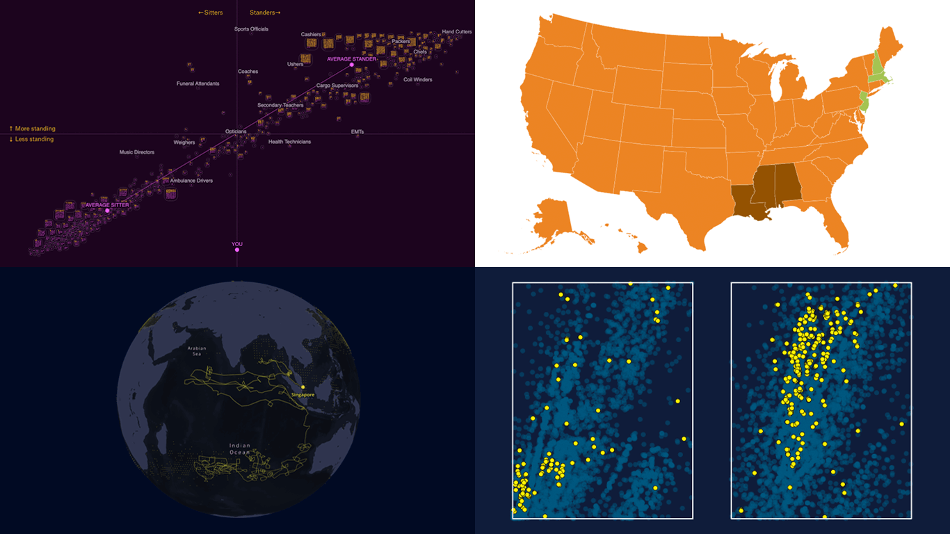
![A collage of some visuals from four great examples of real-world data visualizations curated for DataViz Weekly]() If you are looking for some great examples of real-world data visualizations, you are in the right place. DataViz Weekly brings you a fresh collection of charts and maps we think you will enjoy — perfect for inspiration or pure fun. Here’s what we have for you today:
If you are looking for some great examples of real-world data visualizations, you are in the right place. DataViz Weekly brings you a fresh collection of charts and maps we think you will enjoy — perfect for inspiration or pure fun. Here’s what we have for you today:
- Favorite Thanksgiving pies across the United States — Sherwood News
- Standing and sitting jobs — The Pudding
- Dark fleet tankers near Malaysia — Bloomberg
- Tracing microplastics — The Straits Times
Read more »
November 21st, 2024 by AnyChart Team
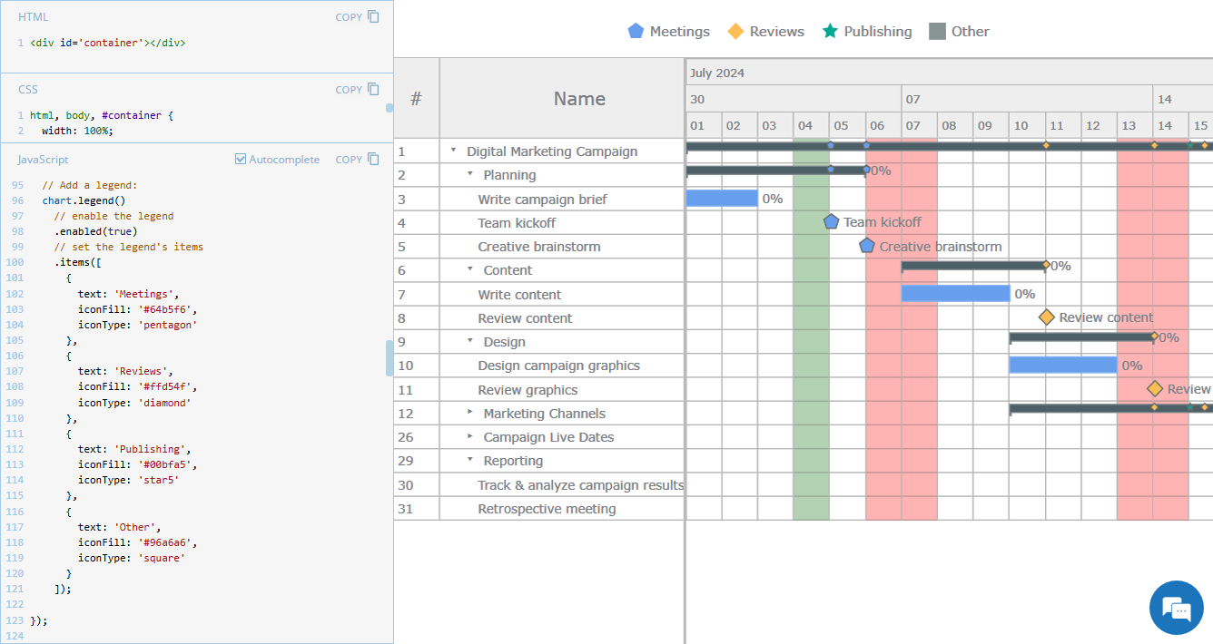 Legend is a vital element in many charts, helping viewers quickly understand what each visual component represents. However, it is not always a must-have for every chart type. For instance, Gantt charts often work perfectly fine without a legend, so it is not enabled in our JavaScript Gantt Chart by default. That said, creating one is straightforward. Right now, we will show you how to add a legend to a Gantt chart — join us as we continue our JS Chart Tips series, sharing quick solutions inspired by real customer queries!
Read more »
November 15th, 2024 by AnyChart Team
 Welcome back to DataViz Weekly, where we spotlight the most awesome data visualization works we have recently come across. Check out the projects we’re diving into this time:
- Love songs: death or evolution? — The Pudding
- Historical dry streaks in NYC — Bloomberg Green
- NYC subway ridership in detail — Subway Stories
- Vote swings in U.S. presidential elections — NYT
Read more »
November 8th, 2024 by AnyChart Team
 The 2024 U.S. presidential election has concluded, and media outlets worldwide are offering a plethora of data graphics to convey the election results. In this special edition of DataViz Weekly, we’ve curated a collection of over twenty election maps, showcasing diverse ways to represent voting data — cartograms, choropleth maps, bubble maps, and more. Whether you’re a data enthusiast, professional, or simply intrigued by the 2024 election outcomes, explore the latest U.S. election maps from top media!
? Also see our previous special editions with election maps: 2020 U.S. election maps and 2024 UK election maps.
Read more »
November 4th, 2024 by AnyChart Team
 We’re a bit behind schedule after last week’s big release of updates for our Qlik Sense extensions, including the transformative AI Splits feature in the Decomposition Tree. But finally, here we are with a fresh edition of DataViz Weekly! Check out the projects with charts and maps that stood out to us most lately:
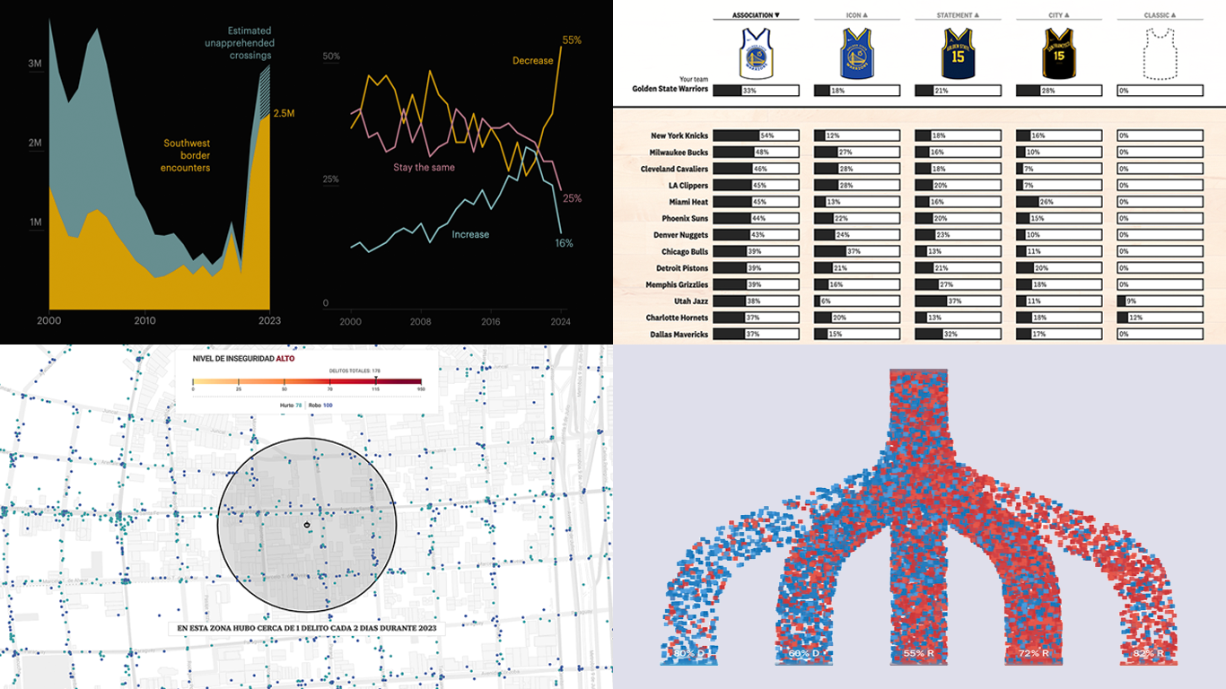
- U.S. immigration trends in historical context — ProPublica
- Crime trends in Buenos Aires — LA NACION
- Evolution of NBA uniform colors — The Pudding
- Internal migration and political polarization in the United States — The Upshot
Read more »
October 31st, 2024 by AnyChart Team
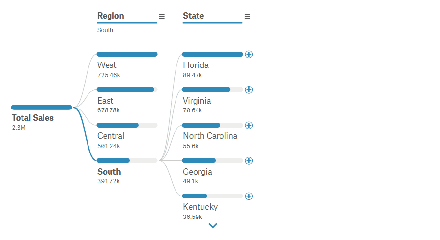
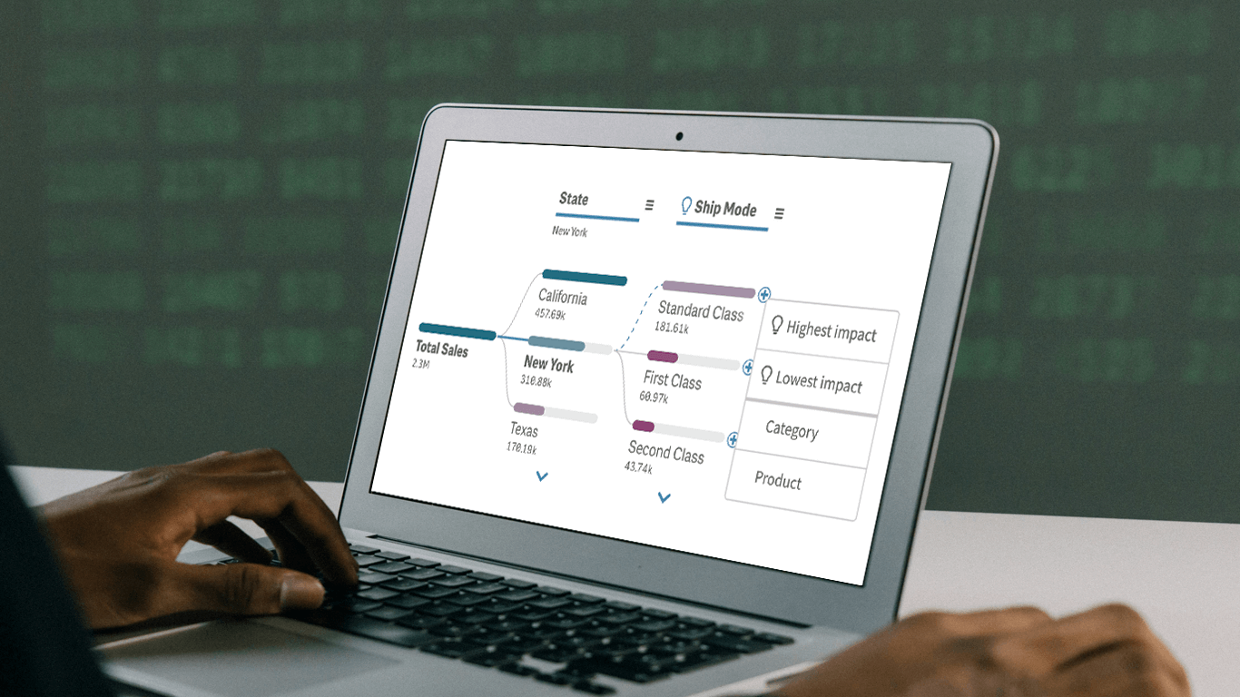 In today’s fast-paced business environment, rapidly understanding the underlying factors within vast amounts of data is crucial for informed decision-making. The Decomposition Tree in Qlik Sense excels at breaking down complex datasets to reveal the “why” behind the numbers. Now, with the game-changing AI Splits feature, this visual becomes even more powerful, automatically highlighting critical impacts and elevating root cause analysis to new heights.
Let’s explore what makes AI Splits transformative and how to implement it.
Read more at qlik.anychart.com »
October 31st, 2024 by AnyChart Team
 We’re excited to announce a series of updates to our extensions for Qlik Sense! They bring greater flexibility and precision to your data visualizations, allowing for uncovering deeper insights even more effectively. The most stunning new feature is AI Splits in the Decomposition Tree — let your users find the highest and lowest impacts with unprecedented speed!
Read on to learn what’s new at qlik.anychart.com »
October 25th, 2024 by AnyChart Team
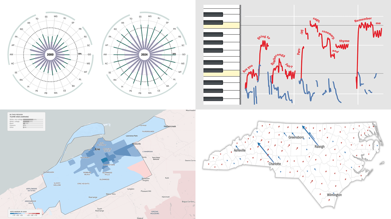 Every day brings a wave of new data visualizations on a range of topics across the internet. Our regular series DataViz Weekly introduces you to those that have lately caught our eye as especially interesting. Here’s what’s in the spotlight this time:
- Female representation in Brazilian municipal chambers — Gênero e Número
- Key battleground microcommunities in the 2024 U.S. presidential elections — NYT Opinion
- Local voting trends within the seven swing states — The Washington Post
- Hidden patterns in folk songs and music evolution — Scientific American
Read more »
October 18th, 2024 by AnyChart Team
 It’s Friday, which means it’s the perfect moment to look back at the data visualizations that have sparked our curiosity over the past few days. So, without further ado, welcome to DataViz Weekly!
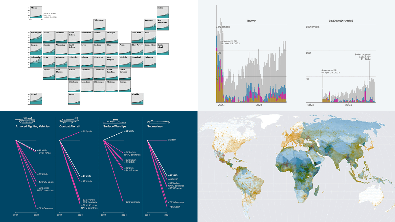
- Electric vehicle adoption across the United States — FlowingData
- Europe’s military reductions and defense challenges — Bloomberg
- Climate—Conflict—Vulnerability Index for global risk assessment — UniBw München, PIK, AA, Truth & Beauty
- Campaign emails with donation incentives in the 2024 U.S. presidential race — The New York Times
Read more »