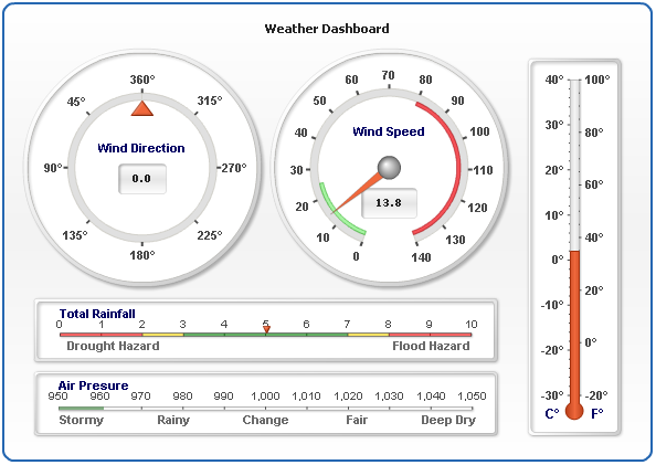
Circular and Linear Gauges in AnyChart
April 2nd, 2012 by Margaret SkomorokhToday we are going to highlight another useful feature of our product. A Gauge (also known as Meter) is an instrument with a graduated scale or a dial for measuring or indicating quantity. As a rule, it is used to show business Key Performance Indicators (KPIs) and to reproduce barometers, thermometers or voltmeters. In AnyChart two types of gauges are available: Circular and Linear.
The Circular Gauge is like gauges on a car dashboard. It consists of a radial scale holding your data range and a pointer. Gauges can be not only circular, but also semi-circular. In fact, AnyChart supports any angle ranges.
Our component also provides the opportunity to implement color ranges, which are used for classifying data. You can set the desired number of different colors depending on the number of your conditions. For example, you may have only 2 colors for satisfactory and unsatisfactory results or a whole palette consisting of 10 colors indicating different temperature ranges.
You can use multiple pointers and even multiple data ranges, place them anywhere or invert data ranges direction. Circular ranges have an adjustable data scale, so you can define its length, minimum and maximum values, and so on.
Horizontal Linear Gauges and Vertical Linear Gauges are sliders or a wide lines (either vertical or horizontal). Their main idea is moving a pointer or pointers over a range of data to some point’s value or the difference between points.
AnyChart gives you the opportunity to use multiple pointers and multiple data ranges, set the width of the line and the number of pointers. Different color ranges for background coloring are available, being a significant and very informative element of your gauge.
With AnyChart you have the freedom to create unique gauges, because all elements are fully adjustable. You can create any gauges needed, make them look like in real life and perform any functions, even surpassing their real analogues.
Here is the list of main available features:
- Circular Gauges with variable scale angles
- Vertical Linear Gauges
- Horizontal Linear Gauges
- Multiple Scales for any type of gauges
- Multiple Pointers and Pointer types (Needle, Marker, Bar, etc.)
- Complex Composite Gauges
- Real-time update
- Interactive update
- Thermometer styled Gauge
- Tank styled Gauge
- Bullet Graphs
To learn more about Gauges, see our documentation and the following sections of our gallery:
For easy start we recommend you these tutorials:
- Gauges Architecture
- Your First Circular Gauge
- Your First Horizontal Linear Gauge
- Your First Vertical Linear Gauge
Gauges can be a very suggestive and useful tool when all their potential is used, and in this post we have tried to give you some clues how to do it.
Also please feel free to ask our support team any questions about working with gauges. Thank you for being with us today.
- Categories: AnyChart Charting Component, Tips and Tricks
- No Comments »
Working with Event Markers in AnyStock
March 25th, 2012 by Margaret Skomorokh One of the most exciting features of AnyChart Stock are Event Markers – a special type of chart markers that are designed to provide the best experience in showing various events on financial charts: Key Developments, Dividends, Splits, Insider Transactions, Analyst Opinion Changes and so on. This information is very important for financial analysis and have to be properly visualized. That is why our component has a very flexible and convenient set of tools for working with Event Markers.
Event Markers in AnyStock can be added to a chart series or to a timeline. Due to the stacking and merging systems, you can put as many markers as necessary and at the same time keep your chart clean and readable. Rich interactivity improves the perception of events by users, and the opportunity to bind Event Markers to additional data turns them into a highly informative tool.
Available options include:
- complete control over all visual settings
- rich interactivity and the opportunity for users to select Event Markers
- grouping markers that hit the same date into stacks or into a single marker
- binding additional data (e.g URL links) to each Event Marker
- built-in elegant tooltip with the support of HTML formatting
- full range of supported external events and methods for controlling Event Markers from the outside
- four special marker shapes
and many, many more…
You can learn how to work with Event Markers from our documentation, gallery, and online demos, each of them containing a sample chart, its source code and description. Here is the full list of these demos:
- Adding/Removing Event Markers
- Navigating to an URL on Event Markers Click
- HTML Tooltips for Event Markers
- HTML Tooltips for Event Markers with Hyperlinks
- Simple HTML Tooltips for Event Markers
- Getting Event Markers List in a Time Range
- Merged Event Markers Events Handling
- Selecting Event Markers Using JavaScript
- Showing/Hiding Event Markers Groups
- Showing/Hiding Event Markers using JavaScript
- Updating Event Markers Visual Settings Using JavaScript
- Event Markers Events Handling
We want you to pay special attention to the following three samples because they can be used in real applications as ready-made building blocks. These samples also demonstrate a number of important characteristics of Event Markers. For example, as it is clear from the two RSS examples, Event Markers can be loaded and removed during runtime, which means that they can be equally as dynamic as data thought not being a part of it.
We hope that we succeeded to throw some light on this useful feature and this article will help you to implement new functionality in your applications, but if anything is still not clear, do not hesitate to contact our support team. We will do our best to help you.
- Categories: AnyChart Charting Component, Tips and Tricks
- No Comments »
How to Choose Chart/Graph Type for Seeing Data Over Time
March 13th, 2012 by Margaret SkomorokhWe continue publishing tips for choosing between different types of charts. Last time we were talking about comparing data, and today we will focus on seeing data over time.
The most popular and adequate ways to visualize time-based data are bar graphs and line graphs. What is the difference between them? First, large sets of data are better visualized via line graphs since line graphs are good in showing trends, and bar graphs in this case just look overcomplicated. Second, bar graphs emphasize the magnitude of changes, so they are an excellent way to demonstrate data with sharp fluctuations.
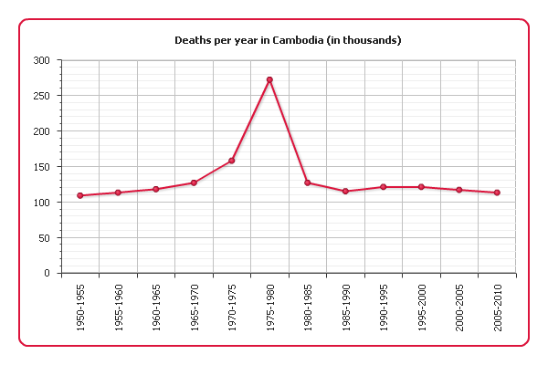
Example 1.
The following graph shows the number of deaths per year in Cambodia between 1960 and 1990 according to UN estimates:
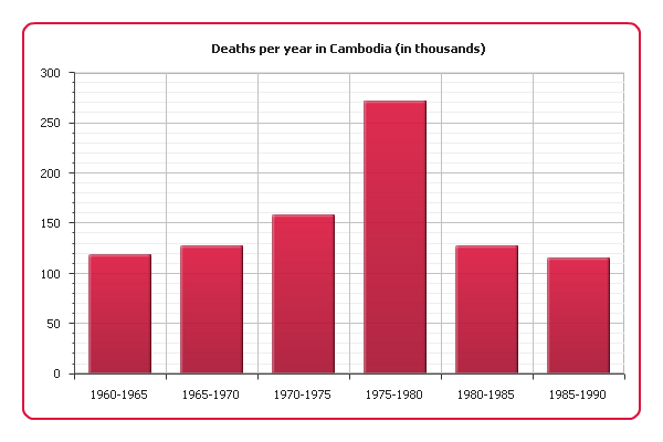
As you can see, there was a sharp increase of mortality in 1975-1980, which is almost the same period when Cambodia was under the Pol Pot regime (1975-1979). Our graph clearly shows the scale of the genocide this regime is responsible for.
Example 2.
And now we are going to demonstrate demographic data about Cambodia for a longer period: since 1950 and including modernity. A bar graph is not the best choice in this situation. Instead, we will use a line graph:
This visualization still shows the increase of mortality in 1975 quite well and at the same time comprehensively represents the long-term trend.
Example 3.
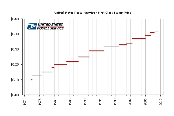
Sometimes a value we are interested in changes discreetly, i.e. stays constant between change points. For example, stamp prices change only in the rare moments when new stamps with new denominations are emitted. In this case we can choose a bar graph since it represents data discreetly, but what if our data covers a long period of time? A bar graph would be difficult to read, but a line graph should not be used either because to connect two points with a line would mean to distort the real picture.
Fortunately, there is one useful variation of line graphs – step line graphs. To connect data points they use only vertical and horizontal segments instead of straight lines. Here is such a graph demonstrating the US Postal Service prices for first class stamps from 1975 to 2008:

Step line graphs combine advantages of bar and line charts, being good at both showing trends and making the magnitude of changes explicit. And by omitting change points you can focus on the periods when the represented value is constant:
See also: Creating Step Line Chart with AnyChart and Line, Spline, Step Line Charts Gallery
That is all for today, more tips are coming soon.
Check the updated article on how to choose chart/graph type for seeing data over time published within the framework of the new 7-part Choose Chart Type feature on our blog.
- Categories: AnyChart Charting Component, Tips and Tricks
- 2 Comments »
How to Choose Chart/Graph Type for Comparing Data
January 27th, 2012 by Margaret SkomorokhToday we start publishing basic tips for choosing between different types of graphs. Visualization can be a very powerful and convincing instrument to present your data – the only thing needed is to use it correctly. One should always clearly understand what exactly he or she wants to show and what is the best way to do it.
There are three main situations when visualizations are made: comparing data, seeing data over time, and breaking data into parts, plus some mixed cases. We will consider them one by one and figure out what type of graphs fits each case. The first post will be about comparing data.
Example 1.
The most common tool for comparing data are bar graphs. For example, here is an AnyChart visualization showing men unemployment rate in the Nordic countries:
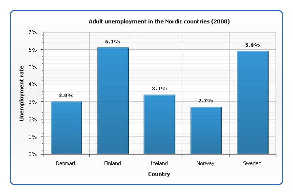
See also our documentation and gallery: Creating Bar/Column Chart with AnyChart, Bar/Column Charts Gallery
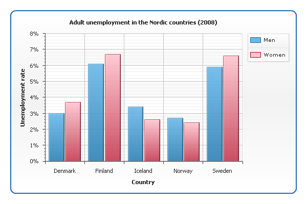
Example 2.
What if we want to show not only men but also women unemployment rate? Now we have two sets of data for each country, and to distinguish them, we need to use different colors:
Example 3.
When one needs to represent the correlation between two related values (which can be viewed as a kind of comparison too), a scatter graph is used. Take a look at a chart showing the correlation between religiosity index and suicide rate in different countries:
While bar charts are good for emphasizing the difference between individual entities, scatter graphs are good for generalizing. The information about particular countries is hardly readable from our graph, but it perfectly shows that more religious countries tend to have lower suicide rates: the points group around an imaginary line that falls down from left to right (sometimes called line of best fit, or trend line). It is considered that the closer the points are to this line, the stronger the correlation is.
See also: Creating Scatter Chart with AnyChart, Scatter Charts Gallery
Check the updated article on how to choose chart/graph type for comparing data published within the framework of the new 7-part Choose Chart Type feature on our blog.
- Categories: AnyChart Charting Component, Tips and Tricks
- 1 Comment »
Building Google Dart on Mac OS X Lion with XCode 4
October 12th, 2011 by Margaret SkomorokhWe are developing the HTML5 version of AnyChart using JavaScript, but our team takes an active interest in web development news – and now, of course, one of the main events is the new language Dart.
Dart is a web programming language developed by Google. It was unveiled at the GOTO conference in Aarhus, 2011 October 10-12. The goal of Dart is to replace JavaScript as the main built-in scripting language in web browsers. Dart is intended to solve JavaScript’s problems while offering better performance, the ability “to be more easily tooled for large-scale projects” and better security features.
Our lead developer Alex Batsuev is eager to become one of the first evangelists of Dart. He has faced some problems with building Google Dart on Mac OS X Lion. Please, check out the instruction how to do that in his blog: batsuev.com
- Categories: Tips and Tricks
- No Comments »
Advices by Edward Tufte: Importance of Context for Charts
July 29th, 2011 by Margaret SkomorokhWe continue posting tips from Edward Tufte‘s works. In The Visual Display Of Quantitative Information, he puts a lot of attention to the problem of lying in charts.
It is assumed that charts are aimed to show the truth about data in the most demonstrative way, but this demonstrativeness is a two-edged weapon. Owing to some tricks – or mistakes – data may seem not what they are. One of them is the lack of context.
According to Tufte,
To be truthful and revealing, data graphics must bear on the question at the heart of quantitative thinking: “Compared to what?” The emaciated, data-thin design should always provoke suspicion, for graphics often lie by omission, leaving out data sufficient for comparisons.
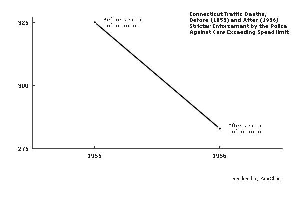
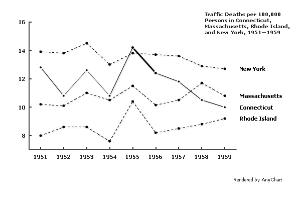
The author gives an example of such a graphic – it shows the number of traffic deaths before and after stricter enforcement by the police against cars exceeding the speed limit:
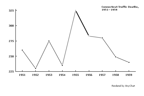
A few more data points make the situation much clearer:
A different context would cause a very different interpretation:
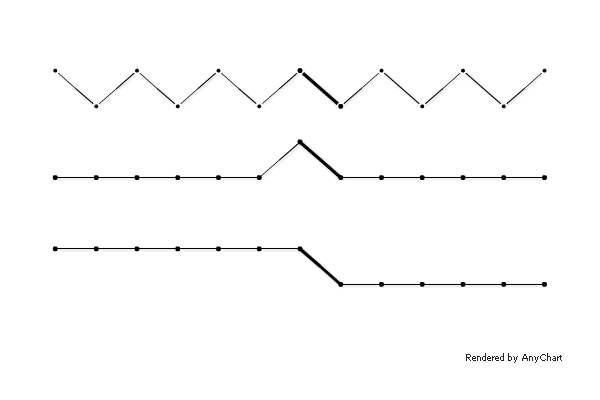
Comparison to adjacent states shows that the crackdown on speeding decreased the number of traffic fatalities not only in Connecticut:
Of course, if one needs to distort the meaning of data, concealing the context may be a relatively useful tip, but in other situations, it is definitely a mistake. The principle formulated by Edward Tufte is:
Graphics must not quote data out of context.
- Categories: AnyChart Charting Component, Tips and Tricks
- No Comments »
Data Design Advices by Edward Tufte
June 21st, 2011 by Margaret SkomorokhEdward Rolf Tufte is an American statistician and professor emeritus of political science, statistics, and computer science at Yale University. He is noted for his writings on information design and as a pioneer in the field of data visualization. Here is his website: http://www.edwardtufte.com/tufte/.
We appreciate his works very much, especially The Visual Display Of Quantitative Information, which we recommend to any developers or designers.
As it says,
Graphical displays should
- show the data
- induce the viewer to think about the substance rather than about methodology, graphic design, the technology of graphic production, or something else
- avoid distorting what the data have to say
- present many numbers in a small space
- make large data sets coherent
- encourage the eye to compare different pieces of data
- reveal the data at several levels of detail, from a broad overview to the fine structure
- serve a reasonably clear purpose: description, exploration, tabulation, or decoration
- be closely integrated with the statistical and verbal descriptions of a data set.
AnyChart is an instrument. We give the opportunity to create many different charts in many different ways, and this powerful instrument should be used correctly.
Speaking of “encouraging the eye to compare different pieces of data”: compare a table and a graphical representation of the famous Anscombe’s Quartet:
| I | II | III | IV | ||||
|---|---|---|---|---|---|---|---|
| x | y | x | y | x | y | x | y |
| 10.0 | 8.04 | 10.0 | 9.14 | 10.0 | 7.46 | 8.0 | 6.58 |
| 8.0 | 6.95 | 8.0 | 8.14 | 8.0 | 6.77 | 8.0 | 5.76 |
| 13.0 | 7.58 | 13.0 | 8.74 | 13.0 | 12.74 | 8.0 | 7.71 |
| 9.0 | 8.81 | 9.0 | 8.77 | 9.0 | 7.11 | 8.0 | 8.84 |
| 11.0 | 8.33 | 11.0 | 9.26 | 11.0 | 7.81 | 8.0 | 8.47 |
| 14.0 | 9.96 | 14.0 | 8.10 | 14.0 | 8.84 | 8.0 | 7.04 |
| 6.0 | 7.24 | 6.0 | 6.13 | 6.0 | 6.08 | 8.0 | 5.25 |
| 4.0 | 4.26 | 4.0 | 3.10 | 4.0 | 5.39 | 19.0 | 12.50 |
| 12.0 | 10.84 | 12.0 | 9.13 | 12.0 | 8.15 | 8.0 | 5.56 |
| 7.0 | 4.82 | 7.0 | 7.26 | 7.0 | 6.42 | 8.0 | 7.91 |
| 5.0 | 5.68 | 5.0 | 4.74 | 5.0 | 5.73 | 8.0 | 6.89 |

As you can see, in this case the graphical representation speaks loudly, whilst the table remains silent.
We will go on posting here some important tips from Edward Tufte’s books, but after all, the most helpful thing is just considering carefully the way to visualize your data.
- Categories: AnyChart Charting Component, Tips and Tricks
- No Comments »
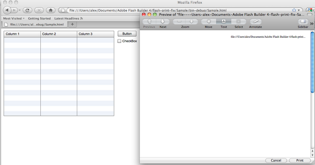
Printing Flash Content in Firefox
February 24th, 2011 by Margaret SkomorokhFlash and Firefox have always had a lot of compatibility problems – for instance, Flash content can’t be printed in Firefox.
A long time ago we found a workaround and published it as a free library. Three years have passed, but the bug still exists, and the fix is still relevant.
So here it is – a small library that allows to achieve correct Flash content printing in Firefox:
http://code.google.com/p/flash-print-fix/
For example, that’s how a Flex application is printed in Firefox:
And that’s how it looks like with the fix applied:
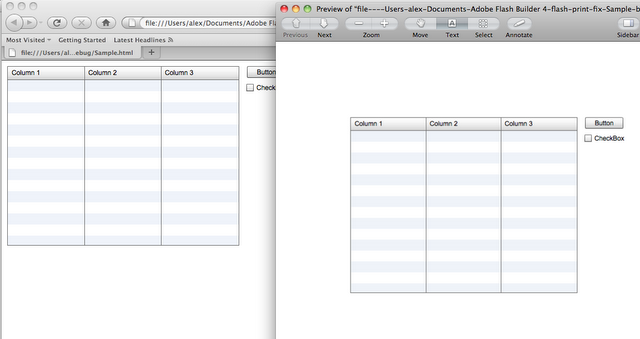
The idea is very simple:
1. Get a PNG screenshot.
2. Encode the PNG file in base64 string.
3. Add a picture with src=”data:img/png;base64,…” mce_src=”data:img/png;base64,…” to the page.
4. In CSS, specify to hide Flash while printing and to show the picture:
@media screen.flashScreenshot { display: none; }

@media print.printableFlashObj { display: none; };

.flashScreenshot { display: block; border: 0; outline: none; }
- Categories: Tips and Tricks
- No Comments »
AnyChart has discovered bug in Skype. Skype promises to fix it ASAP.
July 27th, 2009 by Margaret SkomorokhWe were getting strange bug reports during several years, and the main idea of that reports is the fact that memory in Internet Explorer 6/7 with Flash Player 9/10 leaks when user refreshes the page. We have spent a lot of time and money trying to locate it, we lost a lot of clients. It was a nightmare for everybody in our support and development teams. We have blamed Adobe and Microsoft, but we never could even think that it is not their fault. And today the miracle has happened. We have tested on two different PCs: one of of them had the memory leak, the second one did not. And the reason of the problem was… Internet Explorer Skype add-on.
Read more »
- Categories: AnyChart Charting Component, Tips and Tricks
- No Comments »
Using AnyChart with JSON and JavaScript
June 6th, 2008 by Alex BatsuevUntil now AnyChart was able to get data only in XML format. However it’s not always convenient and requires at least knowledge of XML.
Now we make the life of AnyChart users easier and add the ability of handy Flash chart implementation in JavaScript. Now AnyChart.js has a new method – setJSData, that allows you to set parameters and data to the chart as a JavaScript object.
You can view a simple example here:
http://6.anychart.com/tips_and_tricks/xml-and-js/js-sample.html
How to create an object with settings and data:An object with settings and data has the same structure as AnyChart XML. XML nodes and attributes are properties. Nodes, that can be repeated (for example, <point />) are arrays.
For example:
var chartData = {
 charts: {
   chart: {
     chart_settings: {
        title: { text: "Chart Title" }      },
      data: {
       series: [
         point: [{name: "pt1", y: 12}, {name: "pt2", y: 23}]
       ]
     }
   }
 }
}
Or:
var chartData = {}
chartData.charts = {};
chartData.charts.chart = {};
chartData.charts.chart.chart_settings = {};
chartData.charts.chart.chart_settings.title = {};
chartData.charts.chart.chart_settings.title.text = "Chart Title";
chartData.charts.chart.data = {};
chartData.charts.chart.data.series = [];

var seriesObj = {};
seriesObj.point = [];
seriesObj.point.push({name: "Pt1", y: 12});
seriesObj.point.push({name: "Pt1", y: 23});

chartData.charts.chart.data.series.push(seriesObj);
Object’s structure is equivalent to XML structure. The description of XML you can find here:
http://6.anychart.com/products/anychart/docs/xmlReference/index.html
Setting chart description object to AnyChart is done using setJSData method.
Also we’ve created several examples of using setJSData, including JSON example:
1. An example of object-creation using JavaScript:http://6.anychart.com/tips_and_tricks/xml-and-js/js-sample.html
2. An example of JSON-creation forming: http://6.anychart.com/tips_and_tricks/xml-and-js/json-sample.html
3. An example of JSON-data loading from the text file using AJAX:
http://6.anychart.com/tips_and_tricks/xml-and-js/json-ajax-sample.html
- Categories: AnyChart Charting Component, Tips and Tricks
- No Comments »