We continue posting tips from Edward Tufte‘s works. In The Visual Display Of Quantitative Information, he puts a lot of attention to the problem of lying in charts.
It is assumed that charts are aimed to show the truth about data in the most demonstrative way, but this demonstrativeness is a two-edged weapon. Owing to some tricks – or mistakes – data may seem not what they are. One of them is the lack of context.
According to Tufte,
To be truthful and revealing, data graphics must bear on the question at the heart of quantitative thinking: “Compared to what?” The emaciated, data-thin design should always provoke suspicion, for graphics often lie by omission, leaving out data sufficient for comparisons.
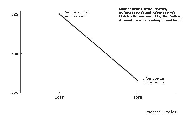
The author gives an example of such a graphic – it shows the number of traffic deaths before and after stricter enforcement by the police against cars exceeding the speed limit:
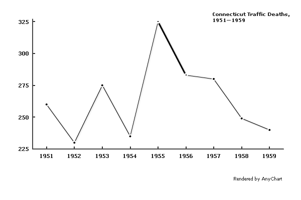
A few more data points make the situation much clearer:
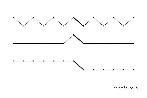
A different context would cause a very different interpretation:
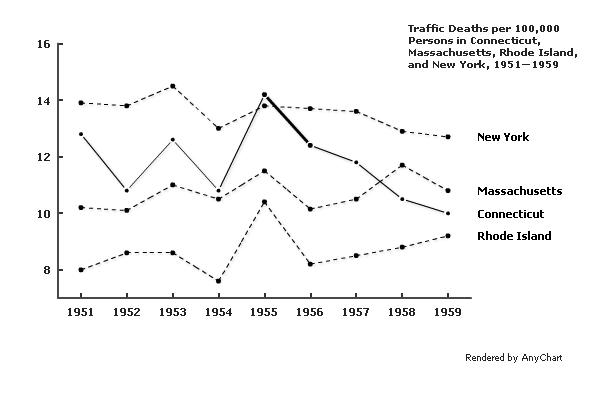
Comparison to adjacent states shows that the crackdown on speeding decreased the number of traffic fatalities not only in Connecticut:
Of course, if one needs to distort the meaning of data, concealing the context may be a relatively useful tip, but in other situations, it is definitely a mistake. The principle formulated by Edward Tufte is:
Graphics must not quote data out of context.
- Categories: AnyChart Charting Component, Tips and Tricks
- No Comments »