From Personal Grocery Receipts to Global Data Centers — DataViz Weekly
March 20th, 2026 by AnyChart Team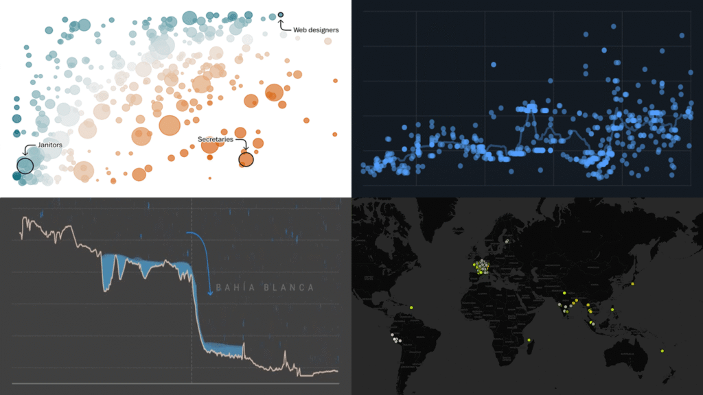
Data is everywhere, but what it means is rarely obvious on its own. DataViz Weekly is back with four projects that illustrate how good visuals help close that gap. Featured today:
- 25 years of egg prices — John Rush
- Jobs most at risk from AI — The Washington Post
- Bahía Blanca flood reconstruction — LA NACION
- Global data center expansion — Environmental Reporting Collective
- Categories: Data Visualization Weekly
- No Comments »
New Charts and Maps That Work — DataViz Weekly
March 13th, 2026 by AnyChart Team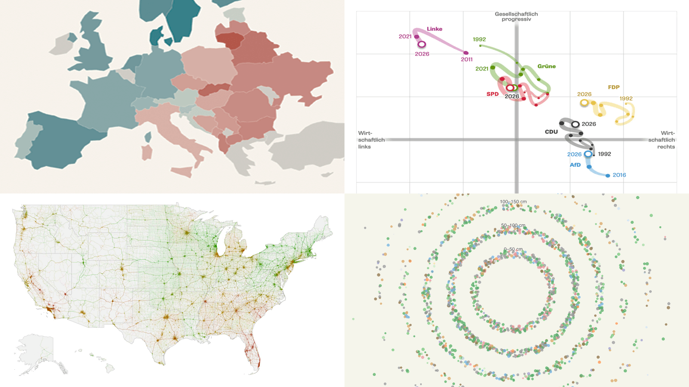 Looking for data visualization done well? You’re in the right place. In DataViz Weekly, we feature recent work that shows how charts and maps can make complex data easier to grasp. This edition’s lineup:
- Gender views in Europe — Teresa Talò
- Freiburg’s urban forest — Stefan Reifenberg
- Road risk across the United States — Mark Sanborn
- Party positions in Baden-Württemberg — DIE ZEIT
- Categories: Data Visualization Weekly
- No Comments »
Visualizing Data on Iran Crisis, Pokémon Taxonomy, U.S. Immigration, Human Happiness — DataViz Weekly
March 6th, 2026 by AnyChart Team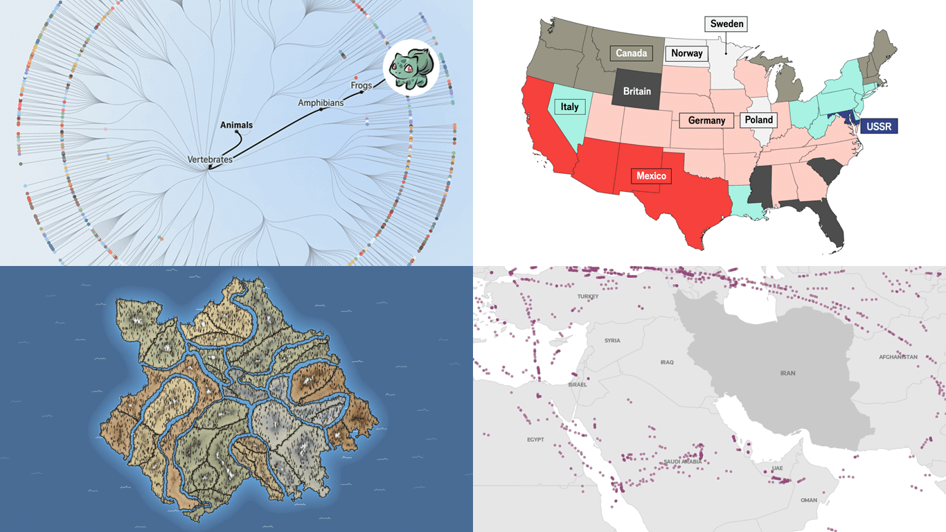 The web keeps producing data visualization work across all kinds of subjects and formats. We keep tracking it, and DataViz Weekly is where the most interesting projects we come across get their spotlight. See our latest picks:
- Iran crisis and its impact — Reuters
- Pokémon taxonomy tree — The Straits Times
- 250 years of U.S. immigration — The Economist
- Terrain of human happiness — The Pudding
- Categories: Data Visualization Weekly
- No Comments »
Fresh Examples of Visuals Bringing Data to Life — DataViz Weekly
February 27th, 2026 by AnyChart Team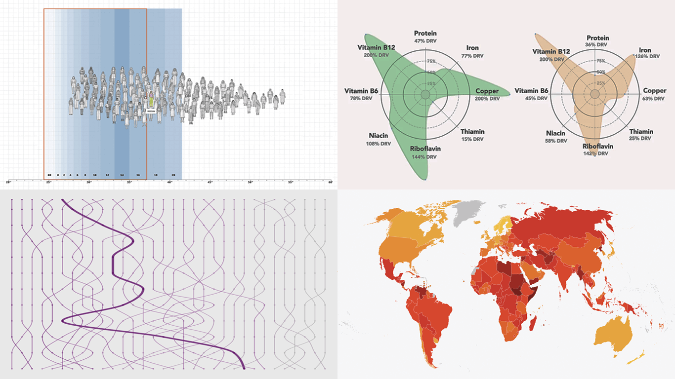 Every week, someone somewhere turns a pile of data into something you actually want to look at. We round up the best examples from what we found right here in DataViz Weekly. On the list this time:
- Corruption Perceptions Index 2025 — Transparency International
- U.S. college degrees by field since 1970 — FlowingData
- Women’s clothing sizes — The Pudding
- What’s actually in liver — Gourmet Data
- Categories: Data Visualization Weekly
- No Comments »
Noteworthy Data Visualization Projects to Explore — DataViz Weekly
February 20th, 2026 by AnyChart Team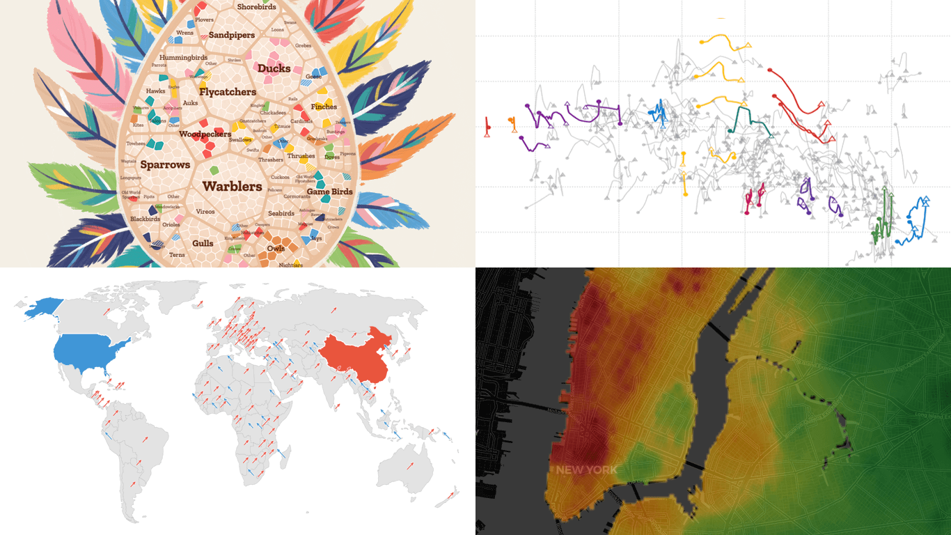 Visualization is designed to make data easier for the human brain to process, helping us compare, find structure, and see change. DataViz Weekly is here with great new examples we’ve spotted lately that demonstrate this in practice. Featured today:
- Bird search trends in the United States — Visual Cinnamon
- Rent prices across New York City — West Egg Development
- GDP vs. air pollution in world cities — Development Data Lab
- Shifts from U.S. to China through UN votes — The Guardian
- Categories: Data Visualization Weekly
- No Comments »
Data Graphics That Caught Our Eye This Week — DataViz Weekly
February 13th, 2026 by AnyChart Team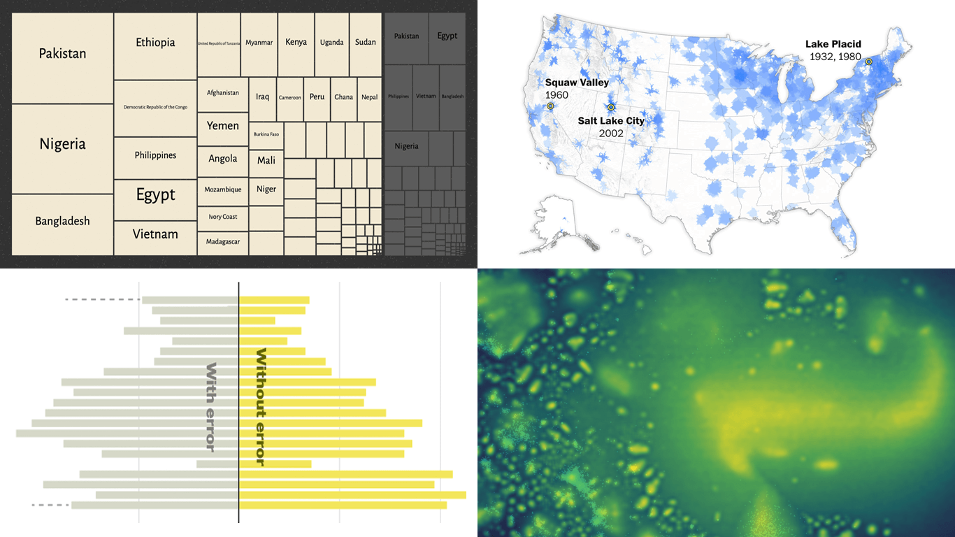 Welcome back to DataViz Weekly! This is our regular roundup of data graphics we think are worth opening and looking at closely. Here is what made the cut this week:
- Bluesky following clusters — Theo Sanderson
- Quadruple axel in figure skating — The New York Times
- Winter sports access across the United States — The Washington Post
- Climate vulnerability vs. social protection — SNRD AP, GIZ, and Revisual Labs
- Categories: Data Visualization Weekly
- No Comments »
New Visual Data Storytelling Worth a Look — DataViz Weekly
February 6th, 2026 by AnyChart Team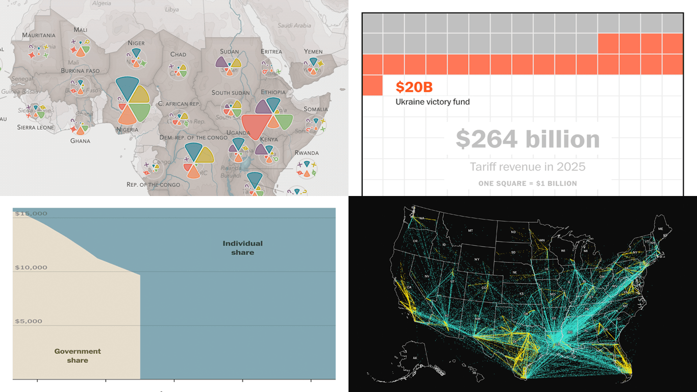 Good visual data storytelling is when charts and maps do more than support the text. They do the explaining by making patterns easier to see, putting numbers in context, and helping readers follow the key points. In this edition of DataViz Weekly, we share four new pieces that do exactly that:
- Neglected tropical diseases progress — The END Fund
- Health insurance subsidy cliff — The Upshot
- ICE detainee transfers across the United States — The Minnesota Star Tribune
- Tariff promises versus math — The Washington Post
- Categories: Data Visualization Weekly
- No Comments »
Clear Data Visualization That Works — DataViz Weekly
January 30th, 2026 by AnyChart Team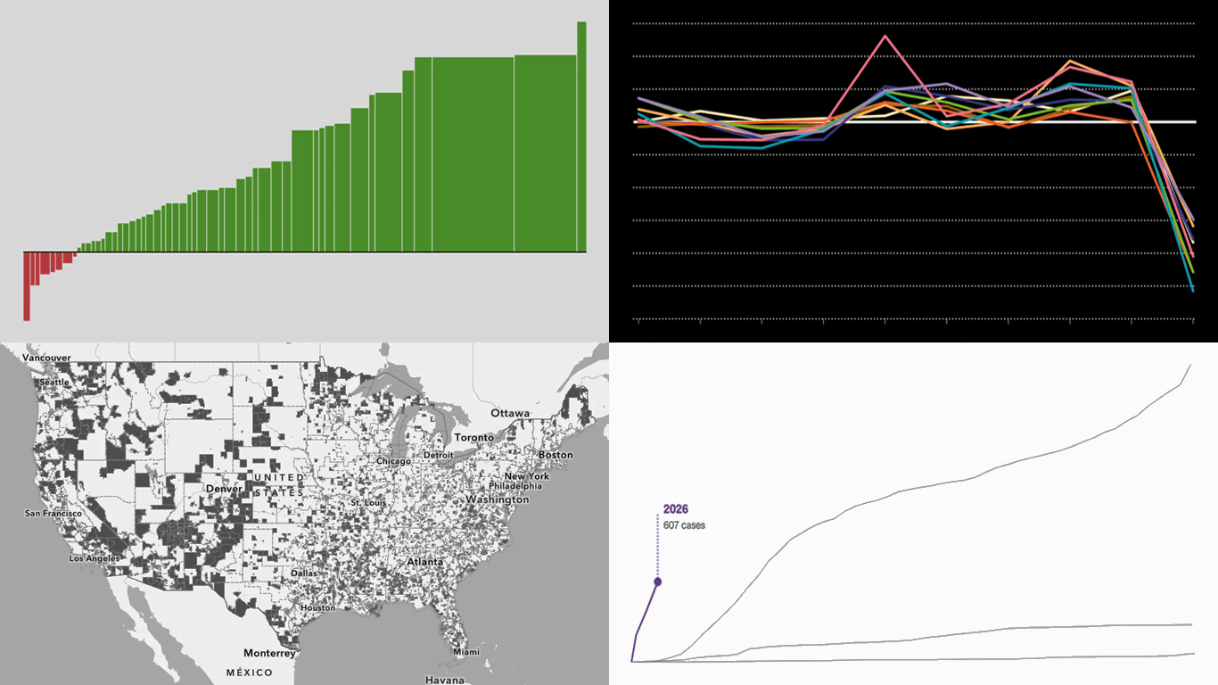 Data visuals do not have to be complicated to work. Clear structure can do a lot of the heavy lifting on its own. A few fresh examples like this are in the spotlight in this new edition of DataViz Weekly:
- Measles cases rise in the U.S. — CNN Health
- Population shifts across the U.S. — FlowingData
- U.S. science cutbacks — Nature
- Food deserts in the U.S. — ILSR
- Categories: Data Visualization Weekly
- No Comments »
New Examples of Visual Storytelling in Action — DataViz Weekly
January 23rd, 2026 by AnyChart Team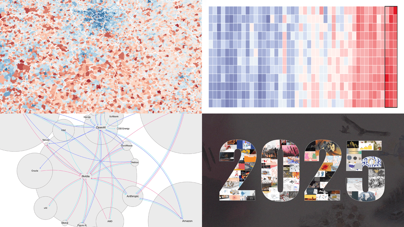 Visualizing data can help tell a story by making trends and patterns easier to see and letting insights land faster. Here are a few recent projects we are glad to share in DataViz Weekly this time that work as clear examples of visual storytelling in action.
- 2025 heat in the global warming trend — The Economist
- Circular AI deals network — The Big Take
- Births versus deaths across France — Le Monde
- 2025 year in Reuters graphics — Reuters
- Categories: Data Visualization Weekly
- No Comments »
Fresh Data Visualization Picks to Explore — DataViz Weekly
January 16th, 2026 by AnyChart Team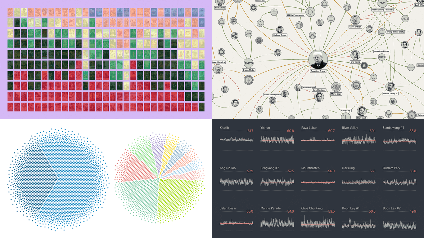 DataViz Weekly is back on the AnyChart blog! It is our regular roundup where we share the most interesting data visualization work we have come across recently. In this edition:
- Bollywood’s shift away from romance — Kontinentalist
- Homeland Security footprint in Minnesota — The Minnesota Star Tribune
- Traffic noise inside Singapore homes — The Straits Times
- Trump deal connections — The New York Times
- Categories: Data Visualization Weekly
- No Comments »