Data Visualization Weekly: Recent Popular Interesting Charts, Maps, and Infographics
March 3rd, 2017 by AnyChart Team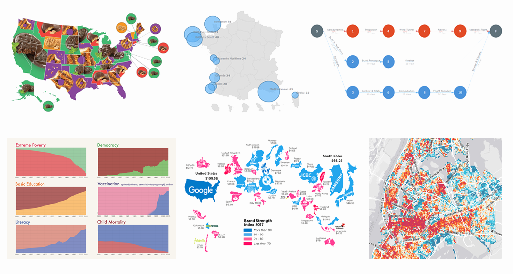 We are back with another collection of interesting charts, maps and infographics being popular lately. As you probably noticed, our Data Visualization Weekly series took a short break. In fact, no new issue came out last week. But the reason is simple and (hopefully) excusable. In fact, we were working really hard to get things done with the exciting major 7.13.0 update that our JavaScript charting libraries has received earlier this week.
Now the source code of AnyChart, AnyMap, AnyStock and AnyGantt is open. Plugins for all popular JS frameworks are available. And all the new features from the 7.13.0 release work great. That means we can finally get back to you to showcase new data visualizations that people followed most on our Twitter, Facebook and LinkedIn accounts over the last days. Moreover, the current issue of Data Visualization Weekly will cover the last two weeks instead of just one, to reimburse you for the delay. So, let’s take a look at the following great visual pieces now:
- Most Popular Girl Scout Cookies;
- History of Global Living Conditions in Interesting Charts;
- Interactive Map of Popular Surfing Areas in France;
- Most Popular Brands in Each Country;
- PERT Chart of Airplane Design Process;
- Revealing Age of Buildings in New York City.
- Categories: Charts and Art, Data Visualization Weekly, News
- No Comments »
AnyChart Wins 2017 Devies Award for Best JavaScript Technologies (PHOTO)
February 14th, 2017 by AnyChart Team We are proud to tell you today that our company AnyChart has won the JavaScript Technologies category at the 2017 Devies Awards! The ceremony took place yesterday in San Francisco, CA, as part of DeveloperWeek, the world’s largest developer conference and expo with 8,000 attendees. Our CEO Anton Baranchuk received the award on behalf of the AnyChart team.
The DeveloperWeek Advisory Board received hundreds of nominations and, of course, thoroughly studied how much we did last year. What excited the judges most was the public release of our JavaScript graphics library GraphicsJS. And they concluded that to be last year’s most notable innovation in JavaScript technologies, exceptionally meaningful to the whole web development community.
The Devies Awards celebrate the most innovative companies in the field of developer technologies across 13 categories. Together with AnyChart, among this year’s winners are industry giants Microsoft and IBM.
- Categories: Charts and Art, GraphicsJS, JavaScript, News, Success Stories
- 5 Comments »
AnyChart Open-Sources Powerful, Draw-Anything JS Graphics Library GraphicsJS
September 15th, 2016 by AnyChart TeamIt is a pleasure for us to announce this today! We have just launched GraphicsJS, a free, open-source, lightweight JavaScript library which allows you to draw any JS graphics and animation for your HTML5 projects very easily. It is significantly more powerful and feature-rich than Raphaël, BonsaiJS, and other formerly leading SVG/VML graphics solutions.
")
GraphicsJS has always been the graphics engine that our JavaScript (HTML5) charting libraries are built on – AnyChart, AnyStock, AnyGantt, and AnyMap. As a result, it already powers data visualization activities for many of you – Oracle, Microsoft, Volkswagen, AT&T, Samsung, BP, Bosch, Merck, Reuters, Bank of China, Lockheed Martin, and thousands of all the other highly respected AnyChart’s customers including more than 70% of Fortune 1000 companies.
Of course, data visualization is not the only but just one of multiple fields where the library of GraphicsJS can be helpful and even essential. Generally speaking, this solution can help you produce virtually anything graphical from scratch: static and animated images, cartoons, games, interactive infographics, mind maps, and many other amazing things in HTML5.
Key Features of JS Graphics Library
- Mighty line drawing abilities – Bézier curves, arcs, rectangles, and many other kinds of forms and deformations.
- Powerful text manipulation features – multiline texts, measurement, including width, height, as well as wrap, overflow, indent, spacing, align, etc.
- Virtual DOM for drawing fast and only what is necessary.
- Smart layering system with z-index.
- Transformation engine – embarrassing in-browser transformations are not used.
- Legacy browser support (Internet Explorer 6+).
- Concise and convenient JavaScript API with chaining support.
By the way, making our graphics engine open-source is just the beginning as – we are also pleased to tell you – AnyChart is going to open the source code of our charting libraries soon! We believe that our great developments in the fields of graphics and data visualization should be even more visible and reachable to any programmer from any part of the world, not to mention that we would love to allow the community to contribute.
Please refer to GraphicsJS.org to learn more about GraphicsJS. As always, the demos are available on our Playground (Graphics section). Also, let’s not forget about the Graphics Documentation and Graphics API Reference.
What’s more, the GraphicsJS library and all relevant samples can be freely downloaded and forked on GitHub.
- Categories: AnyChart Charting Component, AnyGantt, AnyMap, AnyStock, Charts and Art, Dashboards, Financial Charts, Gantt Chart, GraphicsJS, GraphJam, HTML5, JavaScript, News, Stock Charts, Third-Party Developers, Tips and Tricks, Uncategorized
- 5 Comments »
JavaScript Donut Charts: No Problems with Hole Size
April 22nd, 2016 by Margaret SkomorokhHow was the science of data visualization born? Maybe like this:
")
Sally L. Steinberg Collection of Doughnut Ephemera, Archives Center, National Museum of American History
We have no idea what it is and who it is, but this image is a part of Sally L. Steinberg Collection of Doughnut Ephemera of the Smithsonian Institution. You can read about the collection here and here. It includes a lot of nice pieces like this vintage donut-related infographic:
")
Sally L. Steinberg Collection of Doughnut Ephemera, Archives Center, National Museum of American History
So, does the mysterious chart tell the truth? Has donut hole size really shrunk over the years? It seems that this question is of great public interest! It is thoroughly discussed in this article on Vox.com: Have donut holes gotten smaller? There is also a fierce discussion on Reddit, where one of the participants wisely notes that “1927 was a sad time to be alive”.
However, our customers should not worry: when you work with AnyChart JavaScript donut charts, you can easily configure the size of the hole! Visit our Gallery to see some samples of our donut charts.
With AnyChart, you can create highly customized interactive donut charts like this one:

This chart was used in our Investment Portfolio Dashboard – we wrote about it earlier: Investment Portfolio Dashboard by AnyChart Charting Framework.
Stay tuned, we have something to say about pie charts too!
- Categories: AnyChart Charting Component, Charts and Art, HTML5, Humor, Interesting Facts, JavaScript
- 1 Comment »
Bubble JavaScript Map by AnyChart, Abolitionist infographic, and more
December 13th, 2015 by Margaret Skomorokh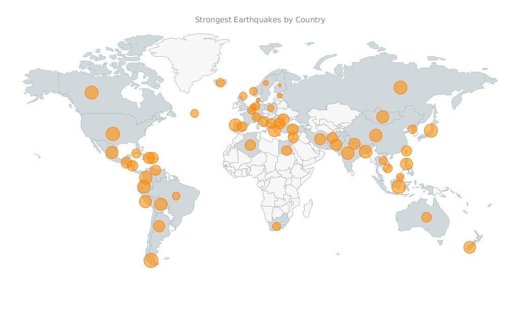
Javascript Map by AnyChart
Have you seen the cool data visualizations (including an interactive JavaScript map by AnyChart) that we have shared this week on AnyChart Facebook Page and Twitter? Here is a quick recap of these posts:
- This abolitionist infographic (1788) shows deck plans and cross sections of British slave ship Brookes. It is a strange, unexamined feature of the bicentenary that this image has still served to shape perceptions over two hundred years since its publication. Its continued usage cannot be explained away with traditional assumptions of its ‘innate power’ or ‘effective communication’. Read more about the poster in this article.
- NARKOZ/hacker-scripts – Hate to waste your time on routine tasks like waiting for the coffee-machine to make your latte? Use scripts to hack your life! LOL “The coffee machines uses telnet not SSH!!! this one waits exactly 17 seconds (!), then opens a telnet session to our coffee-machine (we had no frikin idea the coffee machine is on the network, runs linux and has a TCP socket up and running) and sends something like
sys brew…” - Bubble Earthquakes Map – Visit our gallery and check out this interactive bubble JavaScript map created with AnyMap. It shows where the world’s strongest earthquakes occurred. AnyMap is ideal for interactive dashboards and side-by-side reporting. This JavaScript mapping solution will help you to build interactive maps and display them in any browser on any platform. AnyMap is useful when you need to display sales by region, election results, population density, or any other information related to a geographic area.
- 15 Years of Terror – a time-lapse of all terrorist attacks with more than 20 fatalities between 1.12.2000 and 13.11.2015.
- Categories: AnyChart Charting Component, AnyMap, Charts and Art, HTML5, JavaScript, News
- No Comments »
Charts and Fiction
March 23rd, 2011 by Margaret SkomorokhOne would think that the only mission of charts is presenting boring information in scientific works and at report-back meetings. However, charts, along with some other data visualization methods, are a very refined and expressive tool, so they are able to reproduce more elevated meanings as well and even can become a kind of art. These splendid prospects inspire us so much that we have introduced a new tag – Charts and Art.
Let’s begin with charts in fiction. There are only two examples we’ve found for the moment (fiction being a text first of all), but they clearly demonstrate the powerful tragicomic potential of line charts!
Read more »
- Categories: Charts and Art
- No Comments »