Creating Timeline Chart of Roman History Using JavaScript
October 3rd, 2024 by AnyChart Team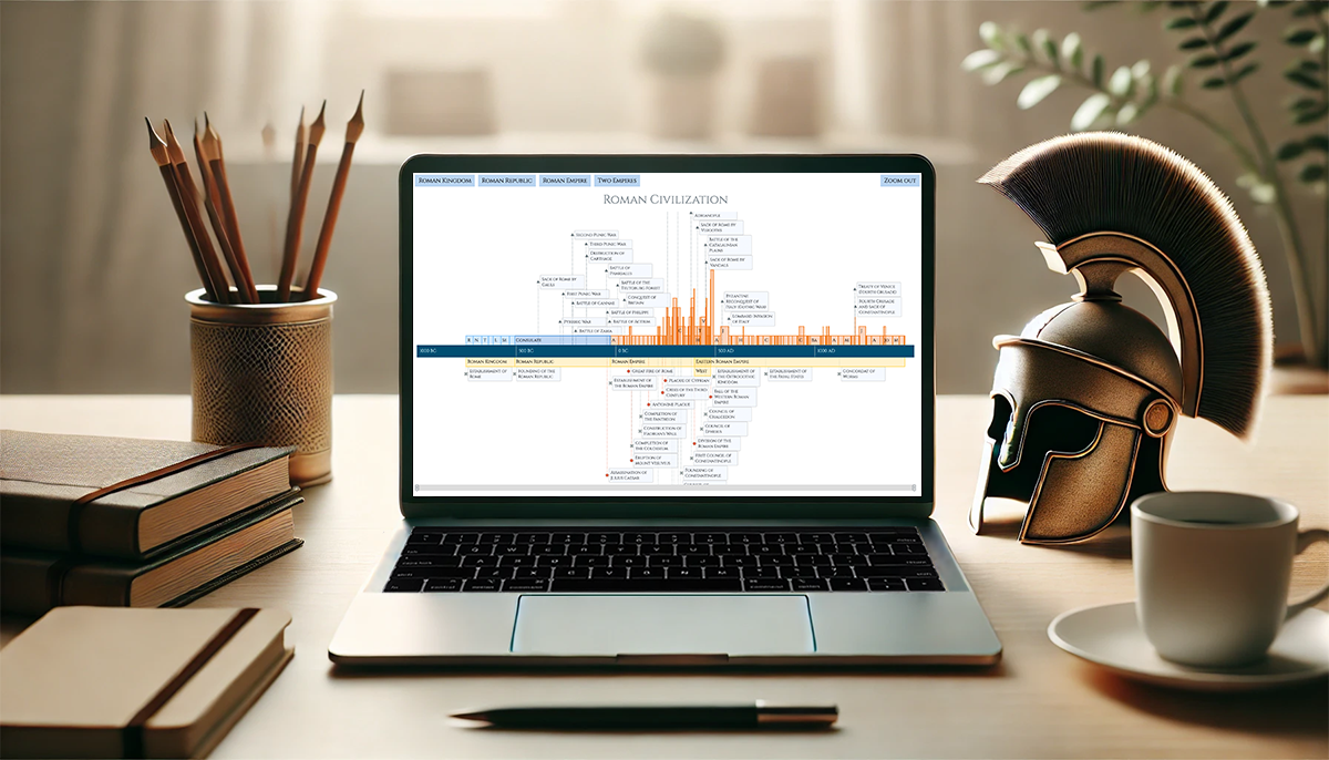 Ever caught yourself thinking about the Roman Empire more often than you’d like to admit? You’re not alone, and we’ve got just the thing for you! With the recent AnyChart JS Charts 8.13.0 release, we’ve enhanced our timeline chart for better support of historical data visualization. We’d love to showcase this improvement in action.
We’ve added a Roman History Timeline to our gallery of timeline chart examples, and we now invite you to discover how it was developed from scratch. In this in-depth JavaScript charting tutorial, we’ll cover everything from A to Z, meticulously guiding you through each step — from setting up the HTML environment to adding detailed data and customizing the visualization to make the chart both informative and engaging. The final result is an interactive timeline that you can proudly call your own Roman Empire.
So, whether you’re a history enthusiast caught up in the recent meme trend or a developer eager to expand your data visualization skills, follow along and learn how to create compelling historical timeline charts using JavaScript!
Read the JS charting tutorial »
- Categories: AnyChart Charting Component, Big Data, HTML5, JavaScript, JavaScript Chart Tutorials, Tips and Tricks
- No Comments »
Introducing AnyChart 8.13.0 for Elevated JavaScript Charting Experience
October 3rd, 2024 by AnyChart Team AnyChart 8.13.0 is now available, bringing a set of new features and improvements designed to further elevate your data visualization experience. In this release, we’ve focused on enhancing the Timeline, Waterfall, and Circle Packing charts in our JavaScript charting library, making them even more flexible and user-friendly. Read on to explore what’s new!
- Categories: AnyChart Charting Component, AnyGantt, AnyMap, AnyStock, Big Data, Business Intelligence, Dashboards, Financial Charts, Gantt Chart, HTML5, JavaScript, News, Stock Charts
- No Comments »
Austrian Academy of Sciences (ÖAW) Uses AnyChart JS for Literary Data Visualization
September 17th, 2024 by AnyChart Team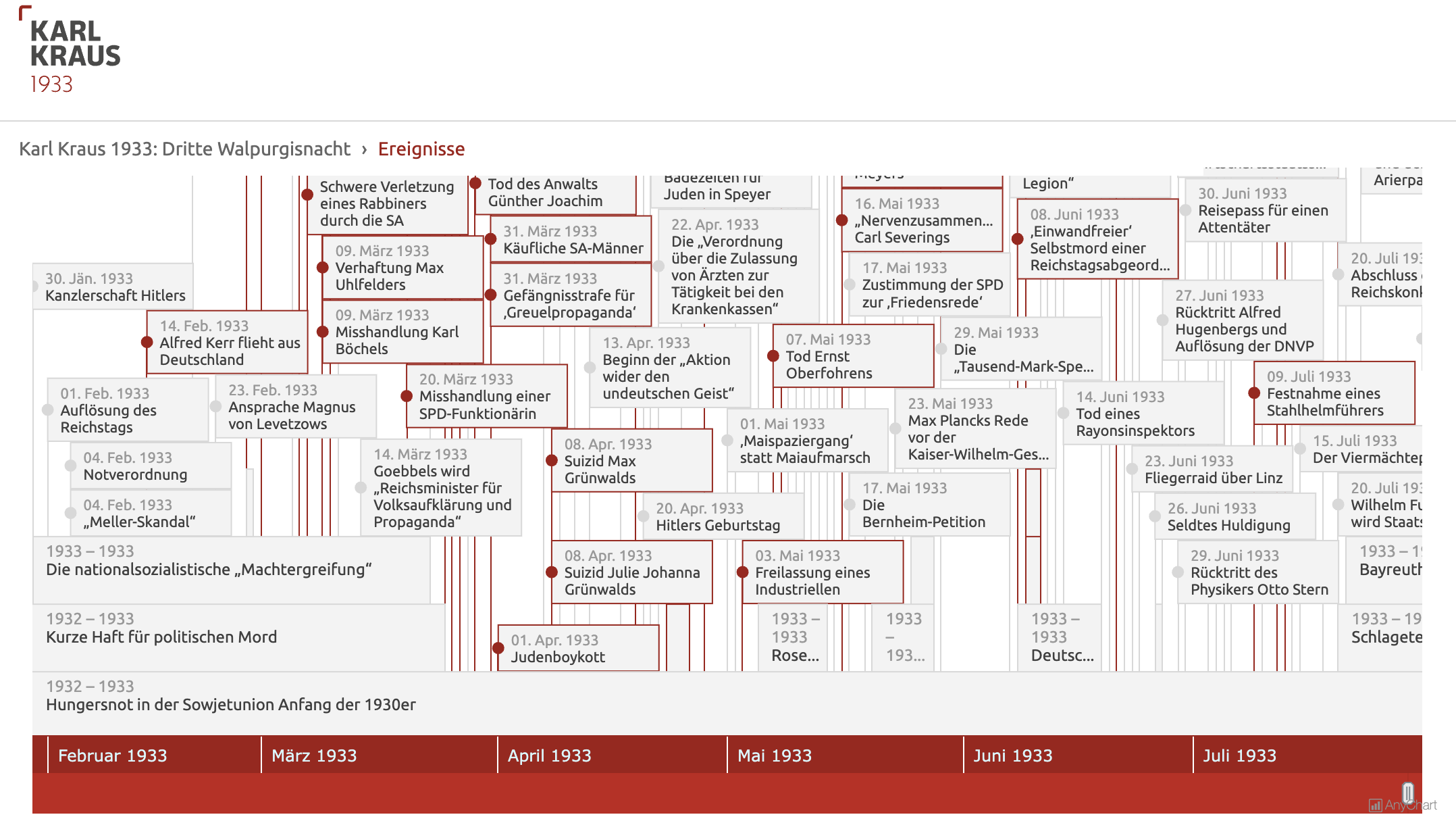 Visualizing data from a literary work can clarify complex structures and patterns, enhancing the understanding of its content and context. For example, a timeline chart can effectively organize events mentioned in the text into an intuitive graphical form, which can be especially beneficial for historical texts. Today, we are pleased to share a project where AnyChart was instrumental in clearly revealing this temporal aspect.
Researchers from the Austrian Academy of Sciences (ÖAW, for Österreichische Akademie der Wissenschaften) have created an expanded digital edition of Third Walpurgis Night by Karl Kraus, an esteemed Austrian writer and satirist, who was nominated three times for the Nobel Prize in Literature. Written in 1933 but published only posthumously in 1952, this essay provides a critical analysis of the early National Socialist rule in Germany. The digital edition integrates the original text into its historical context with extensive commentary, glossary entries, and now also an interactive timeline developed using our JavaScript charting library.
Learn more about the project and how it employs AnyChart in our conversation with Bernhard Oberreither and Barbara Krautgartner from the Austrian Center for Digital Humanities and Cultural Heritage (ACDH-CH) at the ÖAW, who brought this project to fruition. (Stack: eXist-db/TEI Publisher.)
- Categories: AnyChart Charting Component, Big Data, HTML5, JavaScript, Success Stories, Third-Party Developers
- No Comments »
Celebrating Success at Qlik Connect: Recap from AnyChart
July 10th, 2024 by AnyChart Team Qlik Connect 2024 was nothing short of amazing, not just for its vibrant atmosphere but also for the palpable successes we experienced. Beyond the buzz, we showcased our latest advancements for Qlik Sense, gathered a wealth of insights, made meaningful contacts, and ran a hit interactive game that became the talk of the event. We even clinched a win in the social media contest — an unplanned but welcome accolade indeed! Join us for a recap of our time at Qlik Connect in Orlando.
Read more at qlik.anychart.com »
- Categories: Big Data, Business Intelligence, Dashboards, News, Qlik, Success Stories
- No Comments »
Pivot Table vs. Decomposition Tree: Advancing Data Insights
June 27th, 2024 by AnyChart Team In the evolving data landscape, the pivot table has long been a cornerstone of the data analyst’s toolkit. Traditionally used to summarize datasets in a condensed tabular form, pivot tables facilitate quick overviews and basic drill-down capabilities. However, as data sets grow larger and more complex, the static and manual nature of pivot tables can limit their effectiveness.
Enter the decomposition tree, an advanced data visualization technique that not only presents data but also uncovers deeper patterns and insights ad-hoc, all through its dynamic, interactive hierarchical structure. As a relatively new tool in the realm of data analysis and business intelligence, it is increasingly used as an effective alternative to a pivot table yet still often underrated, given its inherent potential.
This article explores several reasons why decomposition trees can be advantageous over traditional pivot tables, illustrated with real-world use cases.
Read more at qlik.anychart.com »
- Categories: Big Data, Business Intelligence, Dashboards, Qlik, Tips and Tricks
- No Comments »
Test Your Data Literacy & Luck — Win iPad at Qlik Connect!
May 30th, 2024 by AnyChart Team If you’re heading to the Qlik Connect show next week (June 3–5), don’t miss out on the chance to test your data smarts with our fun, interactive game, “Connections.” It’s not only a challenge of knowledge but also an opportunity to win an iPad!
Read more at qlik.anychart.com »
- Categories: AnyChart Charting Component, AnyGantt, Big Data, Business Intelligence, Dashboards, Gantt Chart, Qlik
- No Comments »
How to Build Network Graph with JavaScript
May 23rd, 2024 by Alex Carter | DZone Network graphs are a practical and effective tool in data visualization, particularly useful for illustrating the relationships and connections within complex systems. These charts are useful for understanding structures in various contexts, from social networks to corporate hierarchies. In this tutorial, we’ll delve into a quick path to creating a compelling, interactive network graph using JavaScript.
We’ll use the Volkswagen Group as our example, mapping out its subsidiaries and product lines to showcase how network graphs can make complex organizational structures understandable and accessible. By the end of this step-by-step guide, you’ll have a clear understanding of how to quickly construct and customize a JS-based network graph. Buckle up, as it’s time to hit the road!
Read the JS charting tutorial »
- Categories: AnyChart Charting Component, Big Data, HTML5, JavaScript, JavaScript Chart Tutorials, Tips and Tricks
- No Comments »
Free Qlik Webinar: Qlik Sense Revolution — One Sheet Is Enough
March 6th, 2024 by AnyChart Team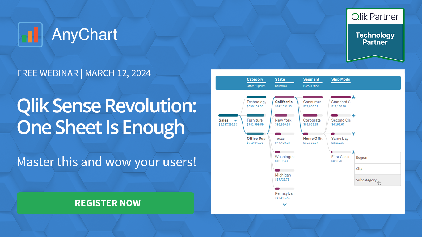 Hey Qlikkies! Still burying insights under layers of charts and sheets? It’s time to break free from wrestling with complex datasets and win the hearts of your business users!
Join our exclusive webinar and meet the Decomposition Tree — a new powerhouse visualization that’s taken Power BI by storm and now graces Qlik Sense. This game-changer slices through data complexity, offering root cause analysis on a single sheet. Drilling down into the heart of any value with superhero speed has never been easier! No more juggling overcomplicated visuals — just instant insights, effortlessly.
- Categories: Big Data, Business Intelligence, News, Qlik
- No Comments »
AnyChart Triumphs Again: Awarded Best in Data Analytics and Visualization in 2024
February 19th, 2024 by AnyChart Team We are delighted to announce that AnyChart has won the prestigious 2024 DEVIES Awards in the Data Analytics & Visualization category, marking our victory for the second consecutive year!
The award celebrates our JavaScript charting library, continuously acknowledged as the world’s leading data visualization solution for developers. As AnyChart JS forms the cornerstone of our broader product line, this recognition once again highlights the technological excellence and innovation inherent in our entire suite of offerings, including the extensions for Qlik Sense.
- Categories: AnyChart Charting Component, AnyGantt, AnyMap, AnyStock, Big Data, Blogroll, Business Intelligence, Dashboards, Financial Charts, Gantt Chart, HTML5, JavaScript, News, Oracle Apex, Qlik, Stock Charts, Success Stories
- No Comments »
Introducing Updates to Waterfall Charts for Qlik Sense
February 1st, 2024 by AnyChart Team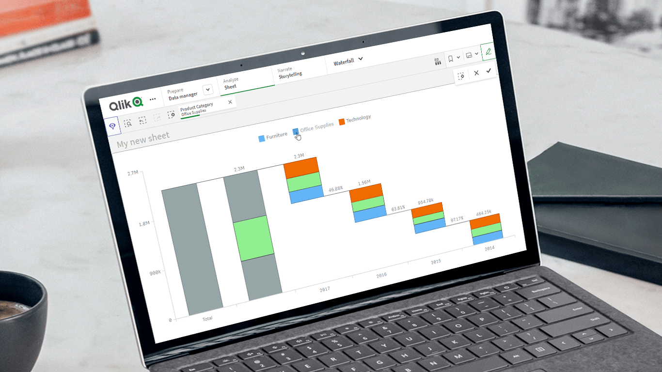 Unveiling the latest updates to our Waterfall Charts for Qlik Sense! In line with our commitment to empowering users to do more with Qlik, we’ve just added a set of new helpful features and improvements to our Waterfall Advanced and Waterfall Classic extensions. These enhancements are designed to further facilitate extracting valuable insights using stacked waterfall visualizations. Check out what’s in store!
Read more at qlik.anychart.com »
- Categories: Big Data, Business Intelligence, News, Qlik
- No Comments »