Integrating AnyChart JS Charts in Python Django Financial Trading Dashboard
December 3rd, 2024 by Michael Whittle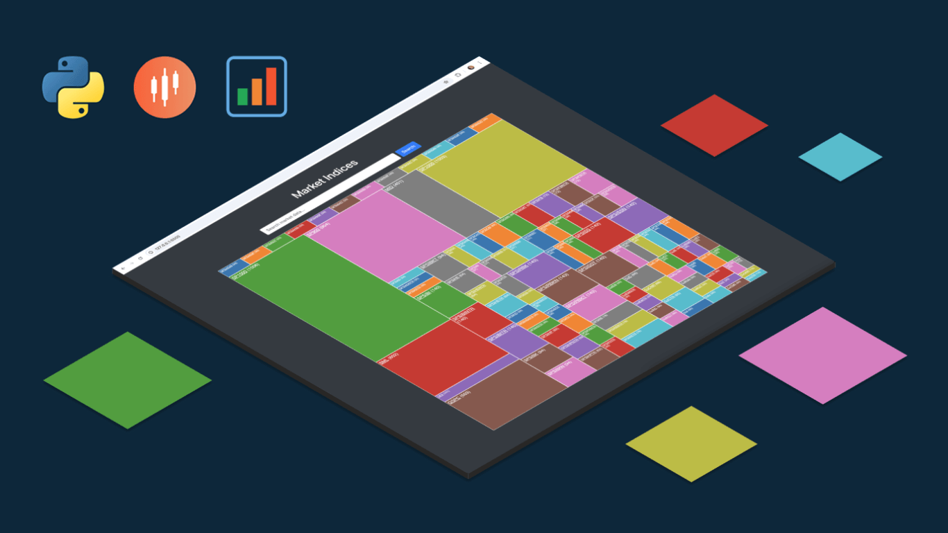 We are pleased to share an insightful article by Michael Whittle, a seasoned solution architect and developer with over 20 years of experience. Originally published on EODHD.com, it explores how he integrated our JavaScript charting library into a financial trading dashboard built with Python Django. Michael also shares his experience migrating a treemap from D3.js to AnyChart and explains why he chose our solution for implementing a stock chart, highlighting the intuitive code and enhanced functionality. Read on to discover how you can elevate your financial data visualizations in Python Django web applications with AnyChart JS Charts.
- Categories: AnyChart Charting Component, AnyStock, Big Data, Dashboards, Financial Charts, HTML5, JavaScript, Stock Charts, Third-Party Developers, Tips and Tricks
- No Comments »
Gantt Chart Legend — JS Chart Tips
November 21st, 2024 by AnyChart Team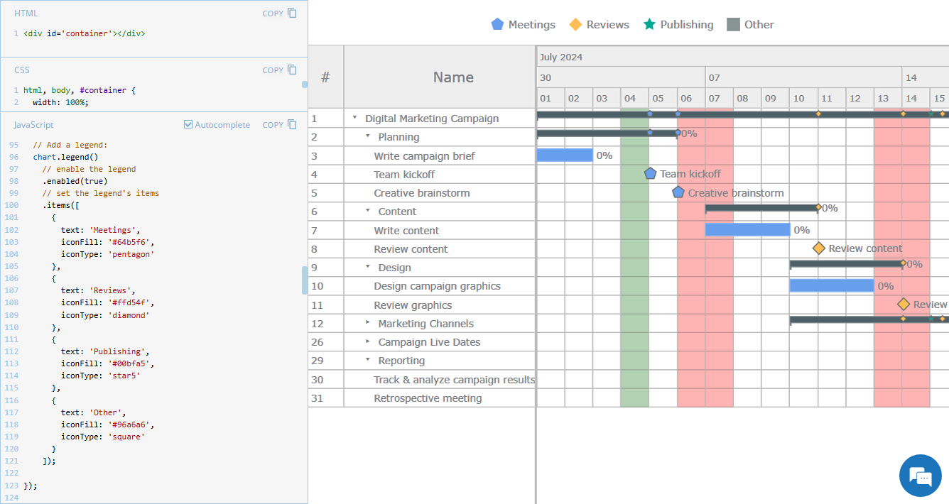 Legend is a vital element in many charts, helping viewers quickly understand what each visual component represents. However, it is not always a must-have for every chart type. For instance, Gantt charts often work perfectly fine without a legend, so it is not enabled in our JavaScript Gantt Chart by default. That said, creating one is straightforward. Right now, we will show you how to add a legend to a Gantt chart — join us as we continue our JS Chart Tips series, sharing quick solutions inspired by real customer queries!
- Categories: AnyChart Charting Component, AnyGantt, Business Intelligence, Gantt Chart, HTML5, JavaScript, JS Chart Tips, Tips and Tricks
- 2 Comments »
3 Ways to Set Height and Width of JavaScript Charts — JS Chart Tips
October 17th, 2024 by AnyChart Team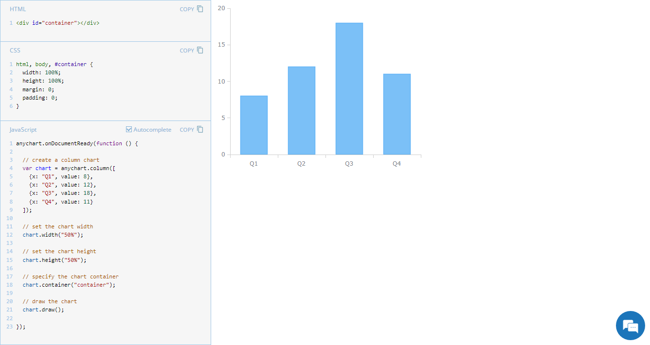 Navigating chart dimensions is key in crafting user-friendly visual presentations, especially when integrating multiple charts into an existing web page or app screen. In our JavaScript chart tutorials, charts are usually showcased as stretching across an entire web page. But it’s far from rocket science to make them smaller. In today’s JS Chart Tips, we explore three effective ways to resize your charts by adjusting their width and height.
- Categories: AnyChart Charting Component, Dashboards, HTML5, JavaScript, JS Chart Tips, Tips and Tricks
- No Comments »
JavaScript Line Chart with Annotations — JS Chart Tips
October 10th, 2024 by AnyChart Team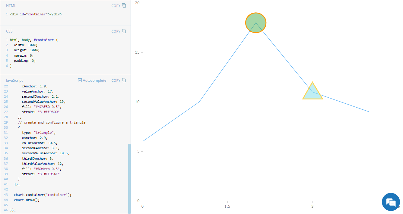 Annotations in charts, such as shapes or text markers, can greatly enhance data narratives by providing more context directly on the visual plane. Thus, it’s no surprise that the ability to add them is one of the most sought-after features of our JavaScript charting library. Although typically used in stock charts, annotations can be just as effective in standard graphics for highlighting specific data points or trends. In this edition of JS Chart Tips, you’ll learn how to add annotations to a basic line chart.
- Categories: AnyChart Charting Component, Charts and Art, HTML5, JavaScript, JS Chart Tips, Tips and Tricks
- No Comments »
Creating Timeline Chart of Roman History Using JavaScript
October 3rd, 2024 by AnyChart Team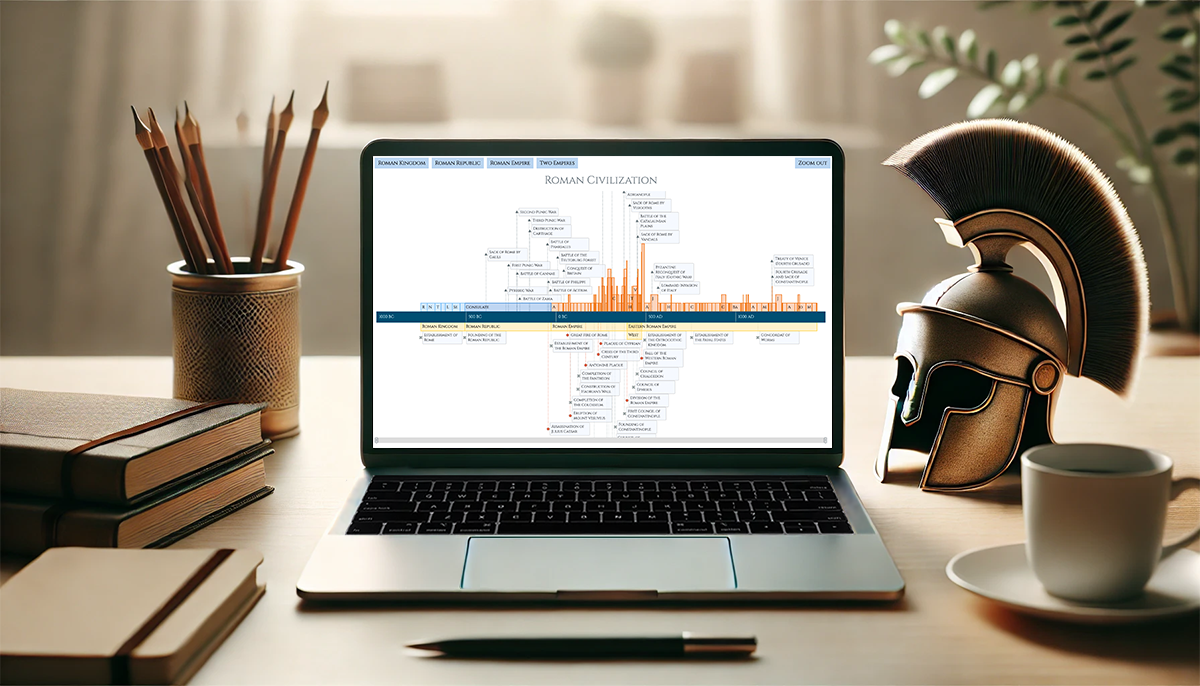 Ever caught yourself thinking about the Roman Empire more often than you’d like to admit? You’re not alone, and we’ve got just the thing for you! With the recent AnyChart JS Charts 8.13.0 release, we’ve enhanced our timeline chart for better support of historical data visualization. We’d love to showcase this improvement in action.
We’ve added a Roman History Timeline to our gallery of timeline chart examples, and we now invite you to discover how it was developed from scratch. In this in-depth JavaScript charting tutorial, we’ll cover everything from A to Z, meticulously guiding you through each step — from setting up the HTML environment to adding detailed data and customizing the visualization to make the chart both informative and engaging. The final result is an interactive timeline that you can proudly call your own Roman Empire.
So, whether you’re a history enthusiast caught up in the recent meme trend or a developer eager to expand your data visualization skills, follow along and learn how to create compelling historical timeline charts using JavaScript!
Read the JS charting tutorial »
- Categories: AnyChart Charting Component, Big Data, HTML5, JavaScript, JavaScript Chart Tutorials, Tips and Tricks
- No Comments »
Introducing AnyChart 8.13.0 for Elevated JavaScript Charting Experience
October 3rd, 2024 by AnyChart Team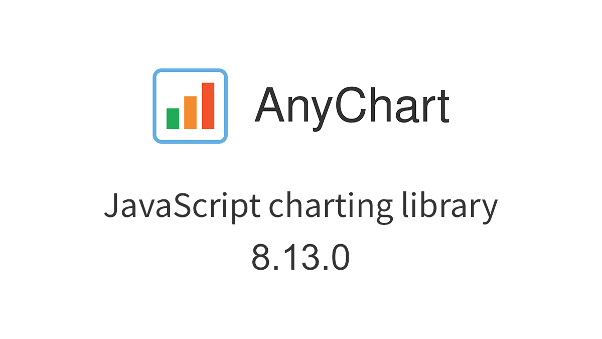 AnyChart 8.13.0 is now available, bringing a set of new features and improvements designed to further elevate your data visualization experience. In this release, we’ve focused on enhancing the Timeline, Waterfall, and Circle Packing charts in our JavaScript charting library, making them even more flexible and user-friendly. Read on to explore what’s new!
- Categories: AnyChart Charting Component, AnyGantt, AnyMap, AnyStock, Big Data, Business Intelligence, Dashboards, Financial Charts, Gantt Chart, HTML5, JavaScript, News, Stock Charts
- No Comments »
Figures Without Any Charts — JS Chart Tips
September 23rd, 2024 by AnyChart Team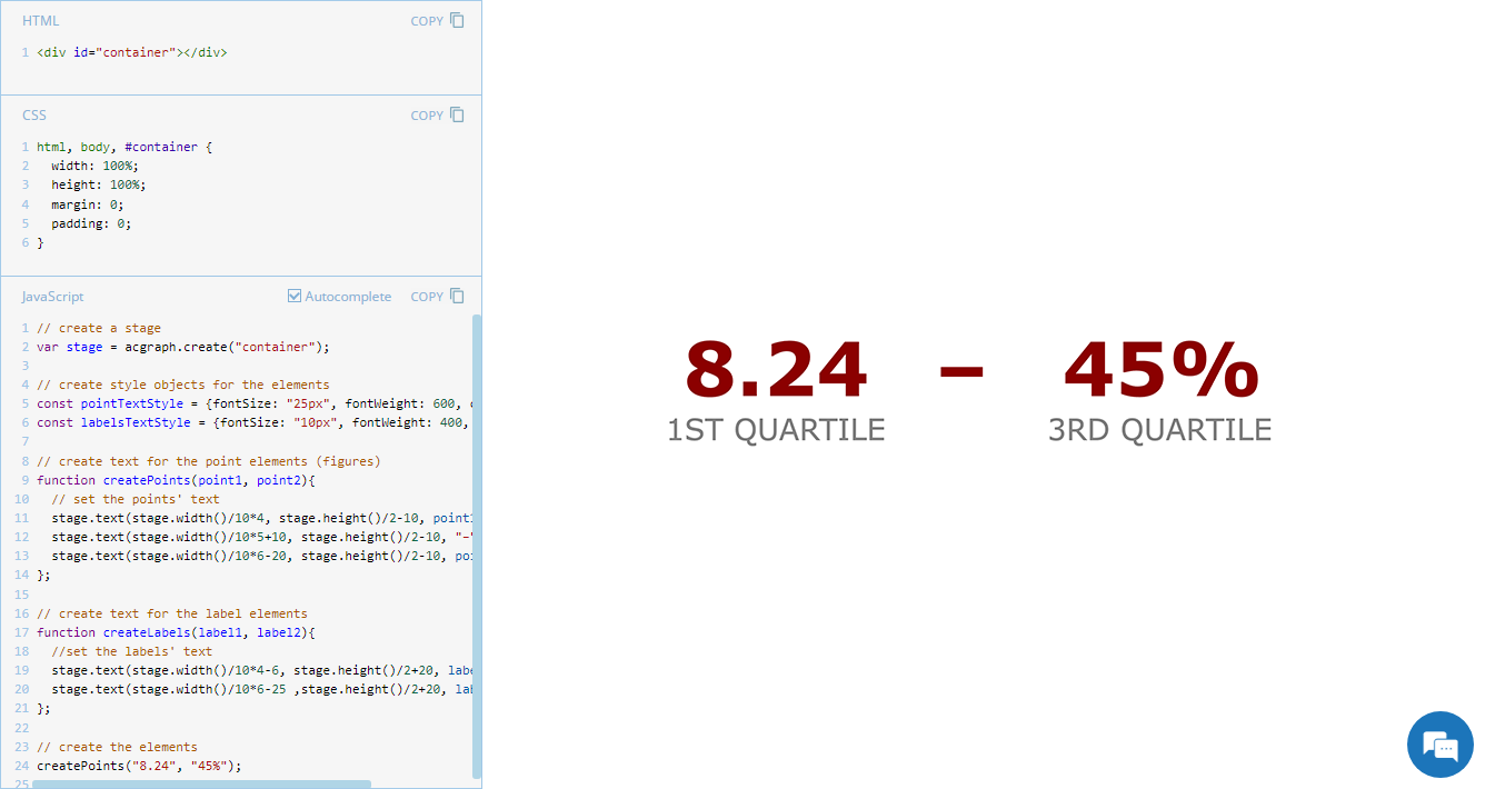 Exploring minimalistic data presentation, this entry of JS Chart Tips shifts focus from complex visualizations to effectively showing raw numerical data. While our JavaScript charting library is designed to enable compelling graphical data displays, sometimes simplicity provides clearer insights. Reflecting on a recent customer request handled by our Support Team, now we’ll delve into how to display figures in a straightforward and direct way without creating any charts, offering a streamlined alternative that may be suitable in specific contexts.
- Categories: AnyChart Charting Component, Dashboards, GraphicsJS, HTML5, JavaScript, JS Chart Tips, Tips and Tricks
- No Comments »
Austrian Academy of Sciences (ÖAW) Uses AnyChart JS for Literary Data Visualization
September 17th, 2024 by AnyChart Team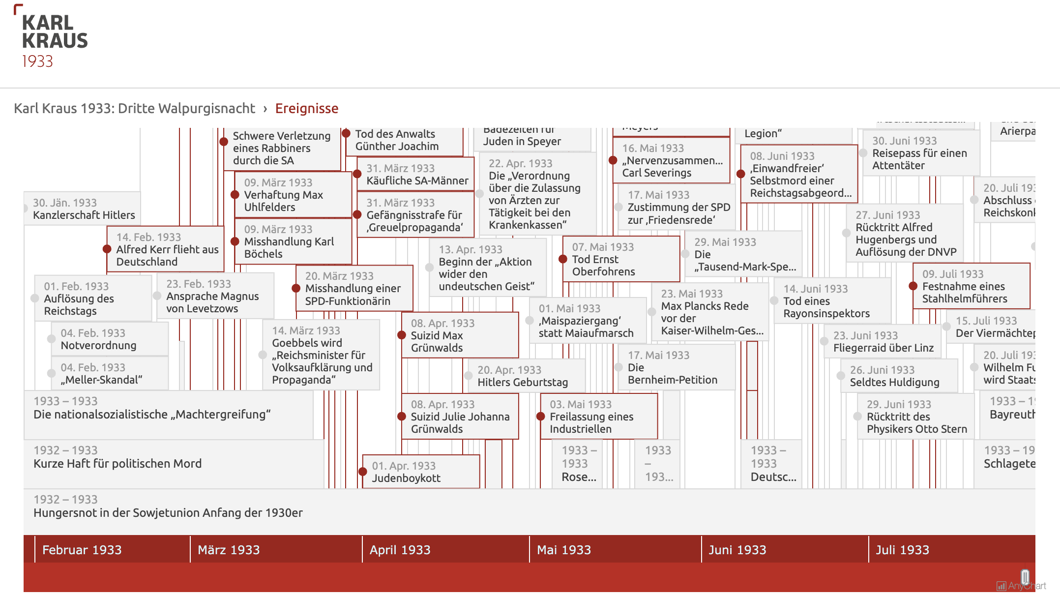 Visualizing data from a literary work can clarify complex structures and patterns, enhancing the understanding of its content and context. For example, a timeline chart can effectively organize events mentioned in the text into an intuitive graphical form, which can be especially beneficial for historical texts. Today, we are pleased to share a project where AnyChart was instrumental in clearly revealing this temporal aspect.
Researchers from the Austrian Academy of Sciences (ÖAW, for Österreichische Akademie der Wissenschaften) have created an expanded digital edition of Third Walpurgis Night by Karl Kraus, an esteemed Austrian writer and satirist, who was nominated three times for the Nobel Prize in Literature. Written in 1933 but published only posthumously in 1952, this essay provides a critical analysis of the early National Socialist rule in Germany. The digital edition integrates the original text into its historical context with extensive commentary, glossary entries, and now also an interactive timeline developed using our JavaScript charting library.
Learn more about the project and how it employs AnyChart in our conversation with Bernhard Oberreither and Barbara Krautgartner from the Austrian Center for Digital Humanities and Cultural Heritage (ACDH-CH) at the ÖAW, who brought this project to fruition. (Stack: eXist-db/TEI Publisher.)
- Categories: AnyChart Charting Component, Big Data, HTML5, JavaScript, Success Stories, Third-Party Developers
- No Comments »
JavaScript Pie Chart with Radial Scale — JS Chart Tips
September 9th, 2024 by AnyChart Team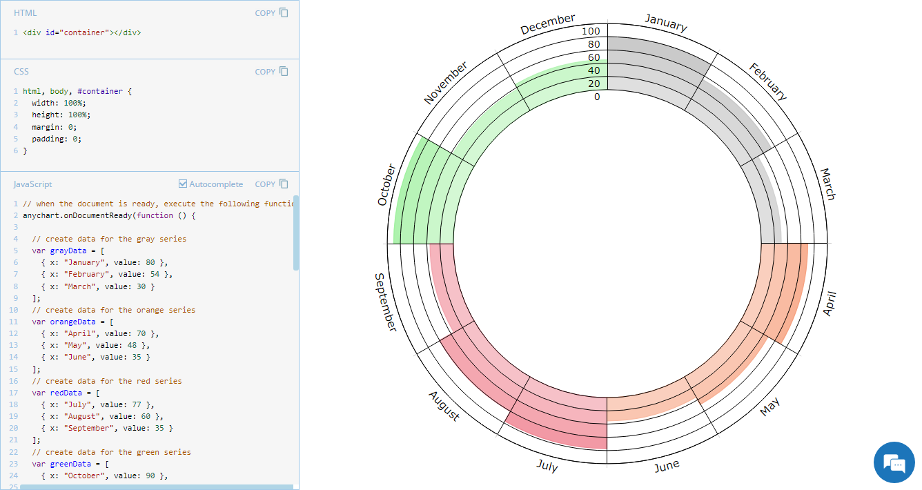 Welcome to JS Chart Tips, our new blog series where we showcase practical solutions to common and unique challenges our Support Team has helped customers overcome. This time, we’re eager to explain how to build a sophisticated circular diagram that may resemble a pie chart with a radial scale. Just a heads-up: this type of visualization is technically a polar column chart.
- Categories: AnyChart Charting Component, Business Intelligence, HTML5, JavaScript, JS Chart Tips, Tips and Tricks
- No Comments »
JavaScript Gantt Chart with Custom Data Grid Header Font — JS Chart Tips
August 20th, 2024 by AnyChart Team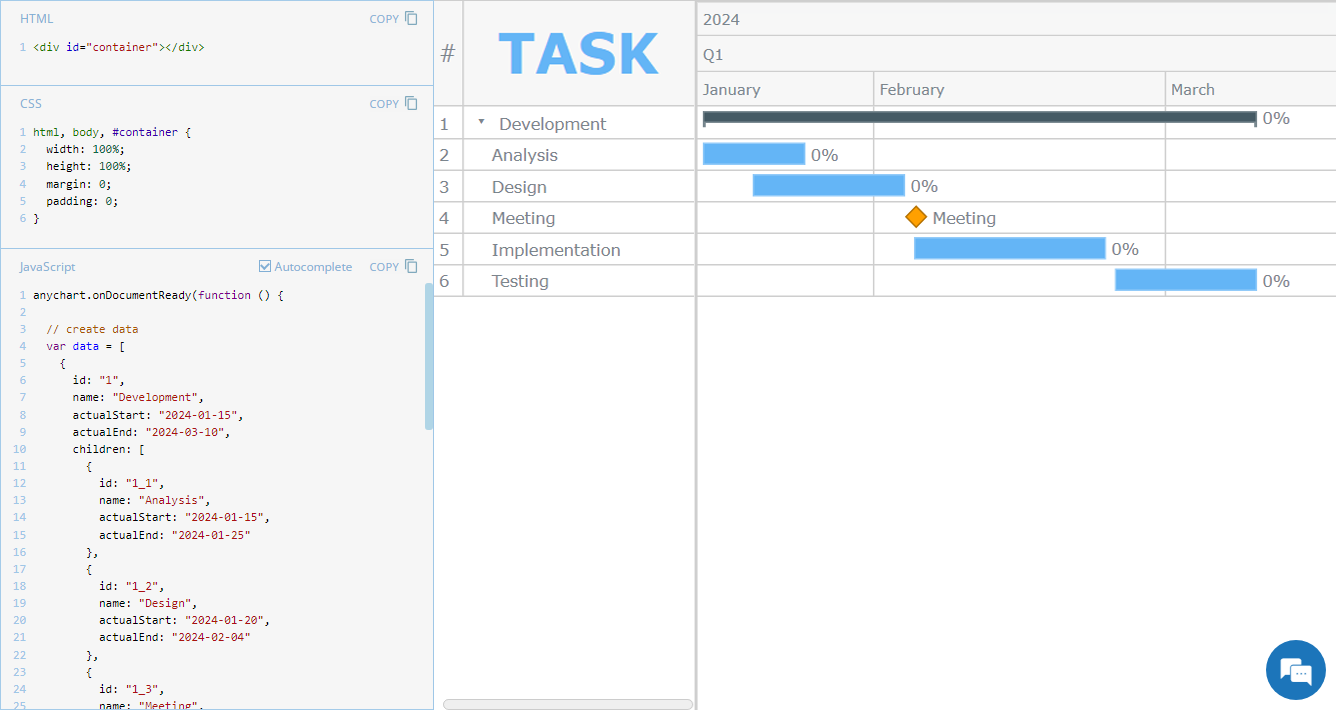 Hey everyone! We’re excited to launch a new regular feature on our blog called JS Chart Tips. In this series, we’ll share some recent cases handled by our Support Team for users of our JavaScript charting library, highlighting both frequent questions and those unique solutions that shouldn’t remain hidden.
Whether these scenarios directly resonate with a challenge you’re facing or simply spark an idea for your current or future data visualization development tasks, we hope you’ll find valuable insights. Each entry will include code snippets and JS chart examples to illustrate the solutions. If you get additional questions or need more details, simply comment below or contact our Support Team directly. We’re here to help enhance your JavaScript charting experience!
Without further ado, welcome to the first edition of JS Chart Tips! Today, you’ll learn how to customize the font of the data grid header in a JavaScript Gantt chart.
- Categories: AnyChart Charting Component, AnyGantt, Business Intelligence, Gantt Chart, HTML5, JavaScript, JS Chart Tips, Tips and Tricks
- No Comments »