 Welcome to JS Chart Tips, our new blog series where we showcase practical solutions to common and unique challenges our Support Team has helped customers overcome. This time, we’re eager to explain how to build a sophisticated circular diagram that may resemble a pie chart with a radial scale. Just a heads-up: this type of visualization is technically a polar column chart.
Question: How to Create Pie Chart with Radial Scale?
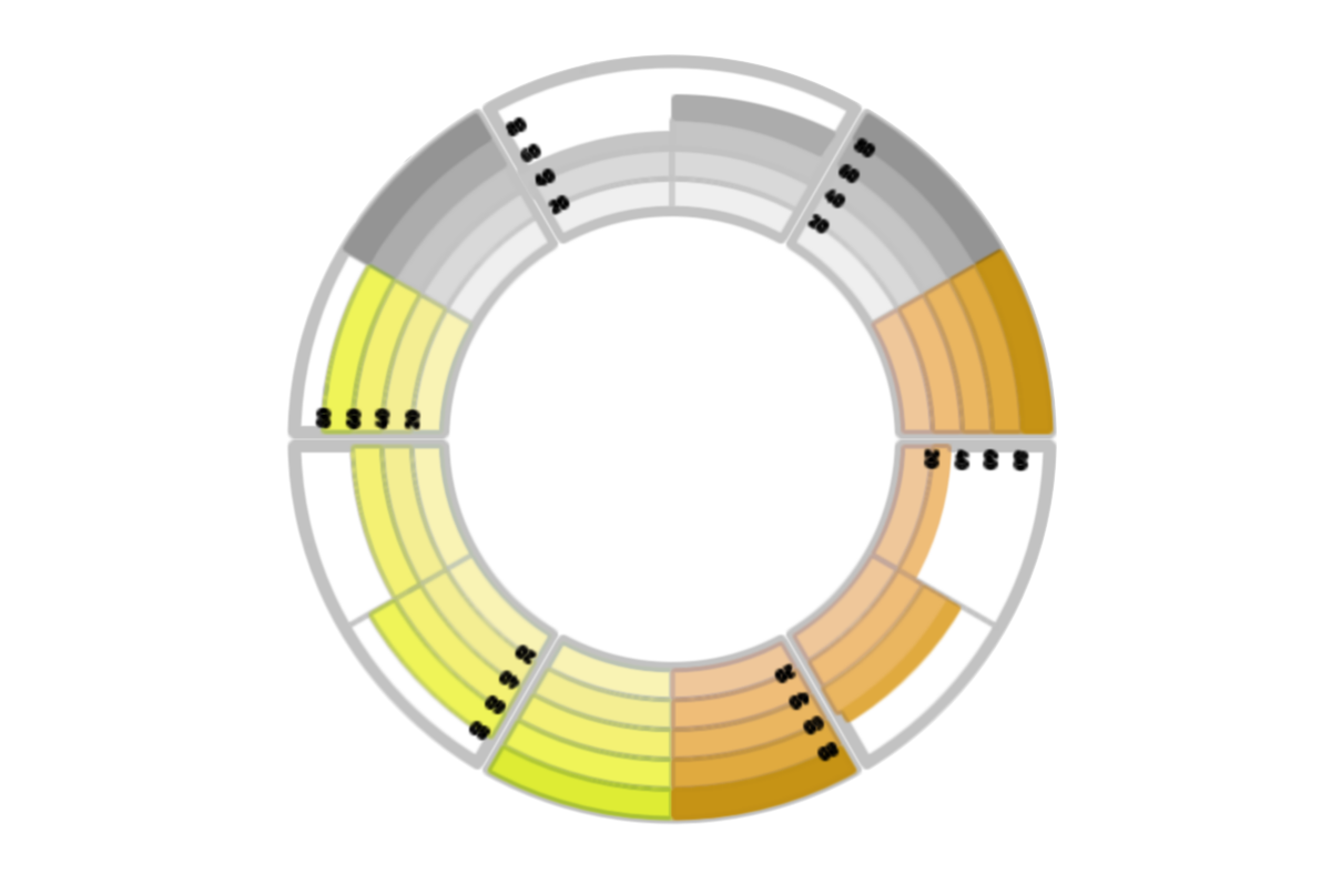
Our Support Team was recently asked about a way to build what was called a pie chart, described as one with equal segments, each filled from the center outward based on the percentage value in that category. The customer provided an image of the desired visualization similar to the one below.

An easy solution appeared to be readily available in our JavaScript charting library right out of the box.
Solution: Creating Radial Pie Chart as Polar Column Chart
Overview
While a pie chart doesn’t support this kind of visualization, a polar chart with a column series is designed for exactly this purpose.
To create a polar column (bar) chart, the core of the approach lies in using the anychart.polar() chart constructor and calling the column() method. Join us as we demonstrate this data visualization technique.
In Detail
First, create a polar chart instance:
var chart = anychart.polar();Second, add your data, which might look something like this:
var data = [
  { x: "January", value: 80 },
  { x: "February", value: 54 },
  { x: "March", value: 30 },
  { x: "April", value: 70 },
  { x: "May", value: 48 },
  { x: "June", value: 35 },
  { x: "July", value: 77 },
  { x: "August", value: 60 },
  { x: "September", value: 35 },
  { x: "October", value: 90 },
  { x: "November", value: 37 },
  { x: "December", value: 45 }
];
Third, create a column series in this chart with this data:
var series = chart.column(data);Fourth, since the data in this case is categorical, set the ordinal type of the X-scale:
chart.xScale("ordinal");Finally, complete with setting the container, commanding to draw the result, and wrapping the entire JS chart code into the anychart.onDocumentReady() function. Here’s how it can look:
// when the document is ready, execute the following function
anychart.onDocumentReady(function () {

  // create a polar chart
  var chart = anychart.polar();

  // create data for the gray series
  var data = [
    { x: "January", value: 80 },
    { x: "February", value: 54 },
    { x: "March", value: 30 },
    { x: "April", value: 70 },
    { x: "May", value: 48 },
    { x: "June", value: 35 },
    { x: "July", value: 77 },
    { x: "August", value: 60 },
    { x: "September", value: 35 },
    { x: "October", value: 90 },
    { x: "November", value: 37 },
    { x: "December", value: 45 }
  ];

  // create a column series
  var series = chart.column(data);

  // set the type of the x-scale to ordinal
  chart.xScale("ordinal");

  // set the container id for the chart
  chart.container("container");

  // initiate drawing the chart
  chart.draw();

});
Examples
Check out two examples of such a circular diagram and feel free to experiment further with the code and visualizations.
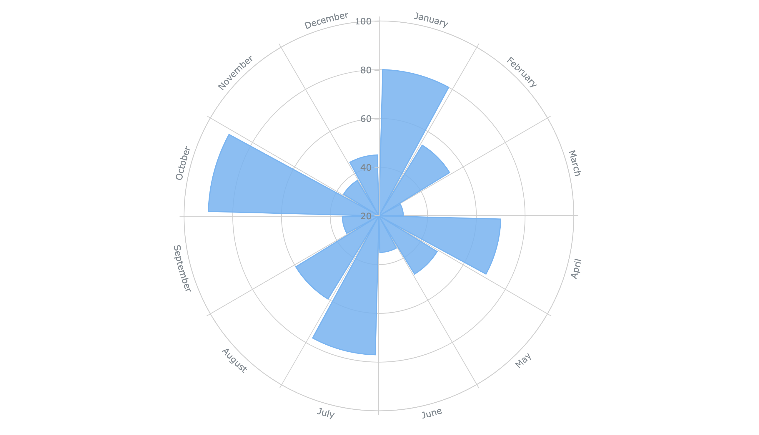
First, here’s a basic one using the code shown above:
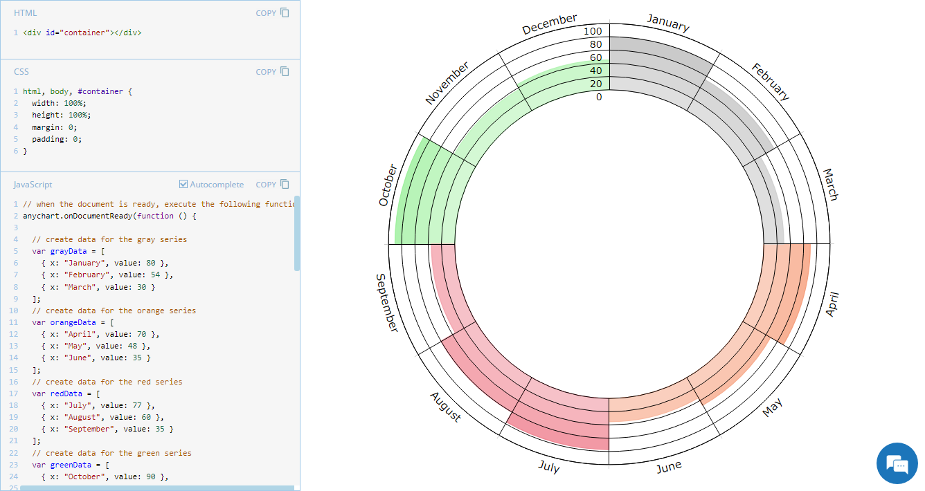
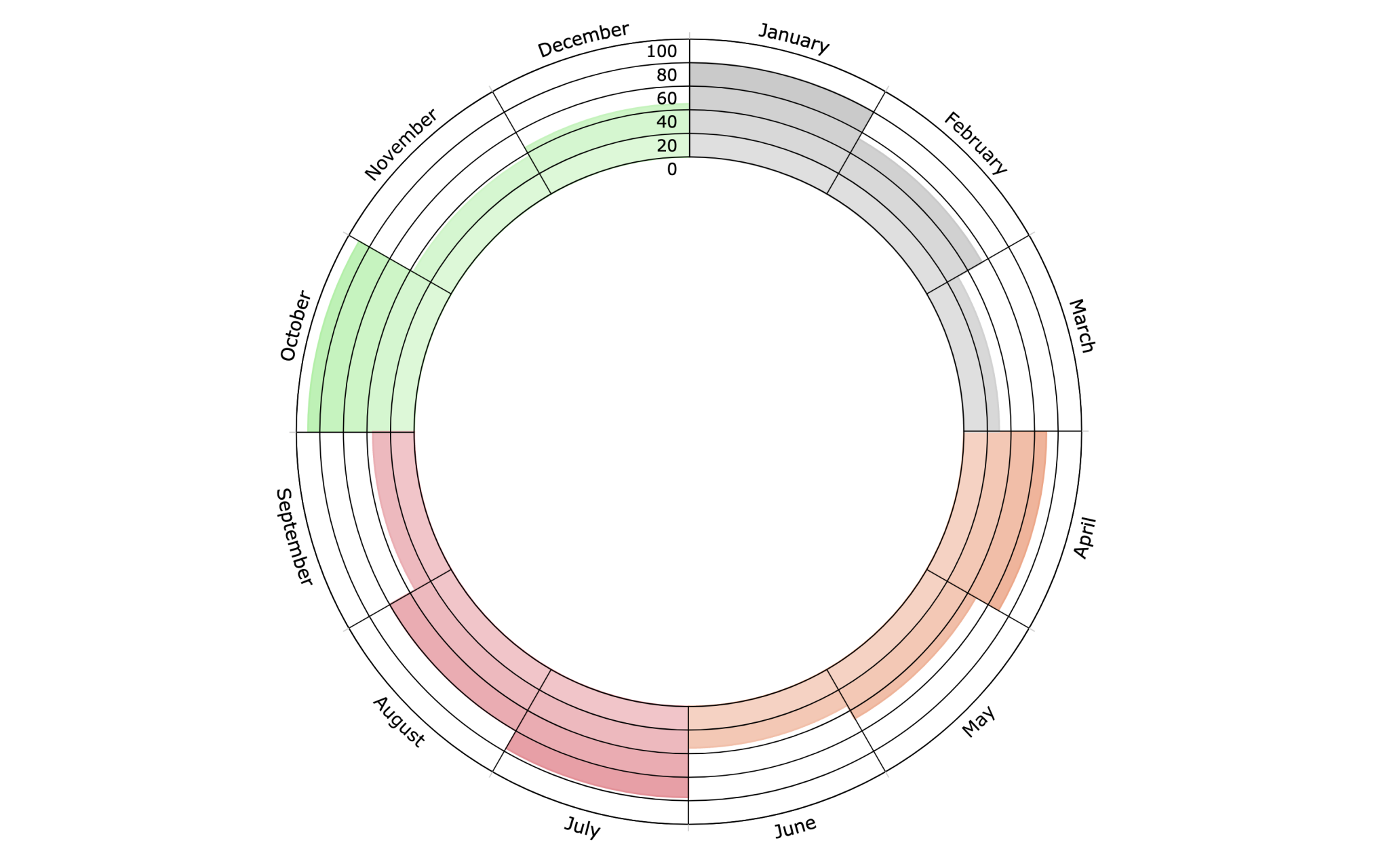
Second, here’s an advanced version similar to the one that we made for that customer, which additionally features series-based category groupings, customized coloring, and an empty space in the center:
Further Learning
Learn more about creating a polar column chart in our JavaScript charting docs:
Wrapping Up
Should you have any questions or require further help, don’t hesitate to comment below or get in touch with our Support Team.
Don’t miss future installments of our JavaScript Chart Tips series for more useful advice.
Wishing you success with JavaScript charting!
- Categories: AnyChart Charting Component, Business Intelligence, HTML5, JavaScript, JS Chart Tips, Tips and Tricks
- No Comments »

