Powering Financial Charts in Free Online Currency Converter by EODHD APIs
April 21st, 2025 by AnyChart Team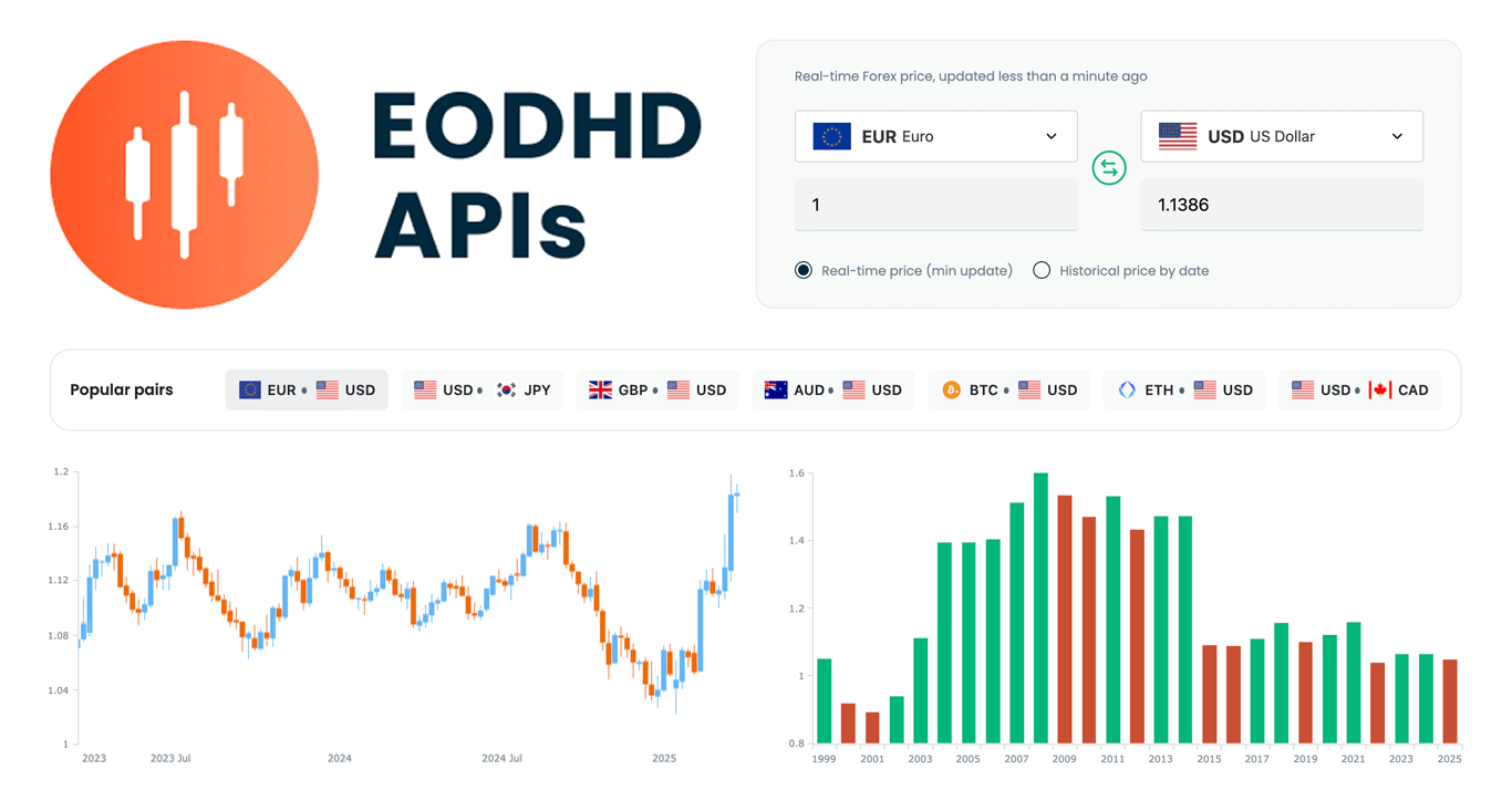 We are pleased to share that EODHD APIs, a prominent provider of financial market data, selected our JavaScript charting library to power charts in their new Online Currency Converter.
The tool provides free access to both live and historical exchange rates for more than 1,100 currency pairs. Interactive stock charts, built with our specialized AnyStock product, enrich numerical conversion data with clear visual context, providing insight into currency dynamics over time.
This case highlights how charts built with AnyChart can add clarity and usability to financial tools. Let’s take a closer look at how it works.
- Categories: AnyChart Charting Component, AnyStock, Big Data, Financial Charts, HTML5, JavaScript, News, Stock Charts, Third-Party Developers
- No Comments »
Explore U.S. Presidential Elections in Our New Qlik App — Feedback Welcome in Qlik Gallery!
April 3rd, 2025 by AnyChart Team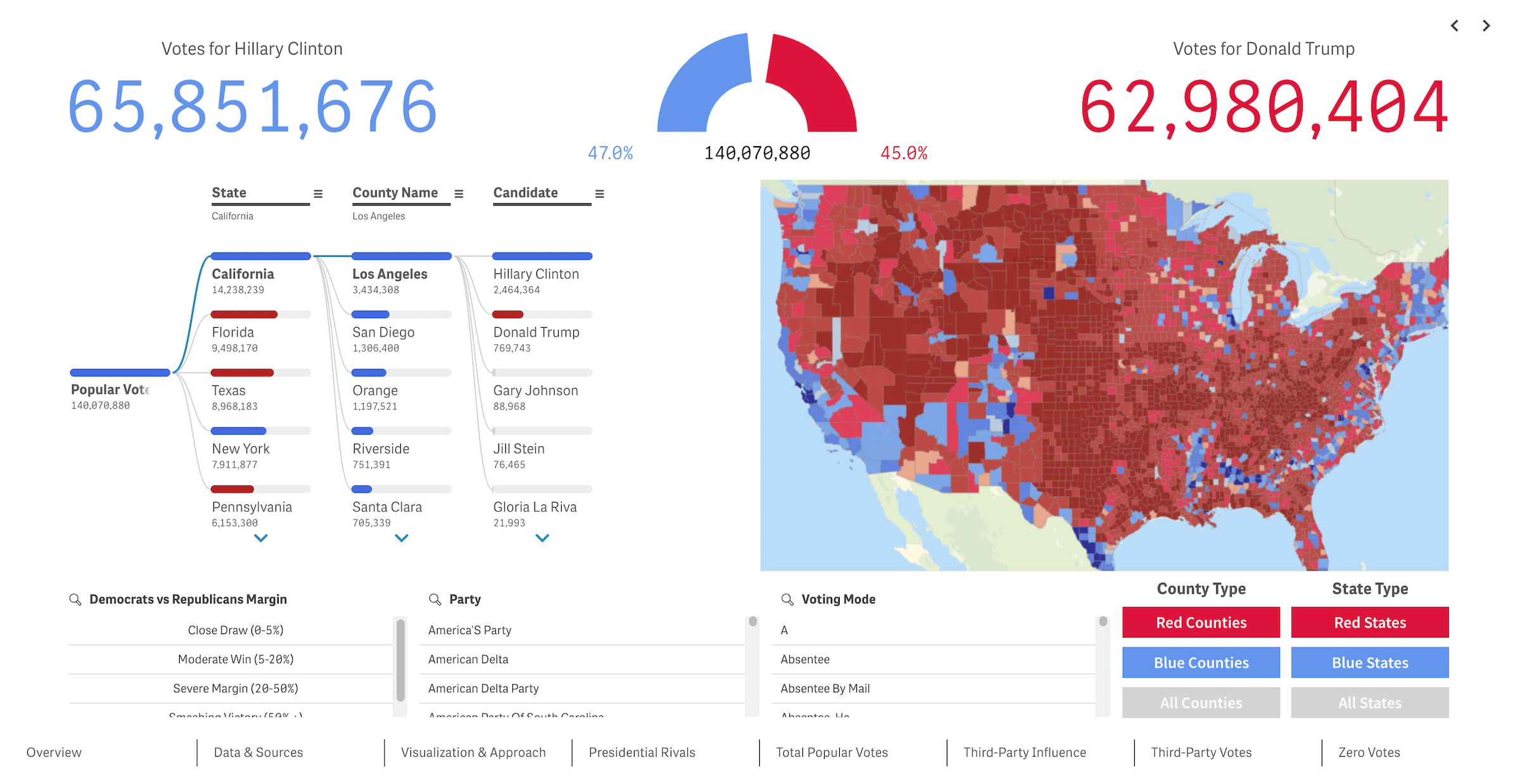 We recently released a new public Qlik Sense application that offers an interactive deep dive into U.S. presidential elections from 2016 through 2024 — our first step toward building the ultimate tool for exploring every presidential election in American history. We’re glad to see it’s already been well-received in the Qlik community and attracted significant attention, especially after being featured in the Qlik Gallery. The app is fully accessible in the browser, even if you do not have Qlik.
Read more at qlik.anychart.com »
- Categories: AnyChart Charting Component, Big Data, Business Intelligence, Dashboards, Qlik
- No Comments »
Hiding & Showing Data Points in JavaScript Scatter Plots — JS Chart Tips
March 25th, 2025 by AnyChart Team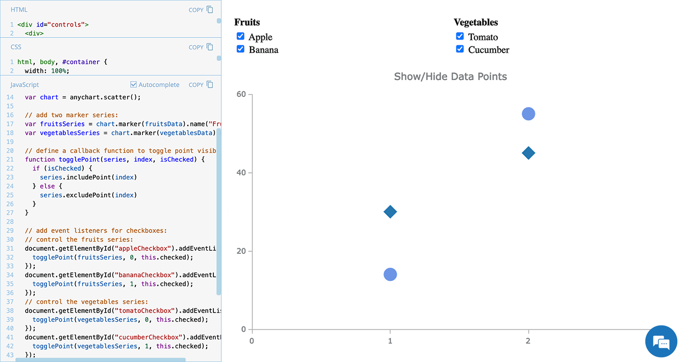 Scatter plots are widely used to visualize relationships between variables by displaying values on a coordinate plane. In some cases, users may need to control which data points remain visible — whether to focus on a specific category, filter out outliers, or simplify the view for better readability.
In this edition of JS Chart Tips — our blog series featuring practical solutions inspired by real customer questions — we’ll show you how to implement interactive point visibility control in a JavaScript scatter plot. By using specialized API methods, you can let users dynamically hide and show individual markers, making data exploration more flexible and insightful.
Let’s dive in!
- Categories: AnyChart Charting Component, HTML5, JavaScript, JS Chart Tips, Tips and Tricks
- No Comments »
Pinch-to-Zoom in Stock Charts — JS Chart Tips
March 5th, 2025 by AnyChart Team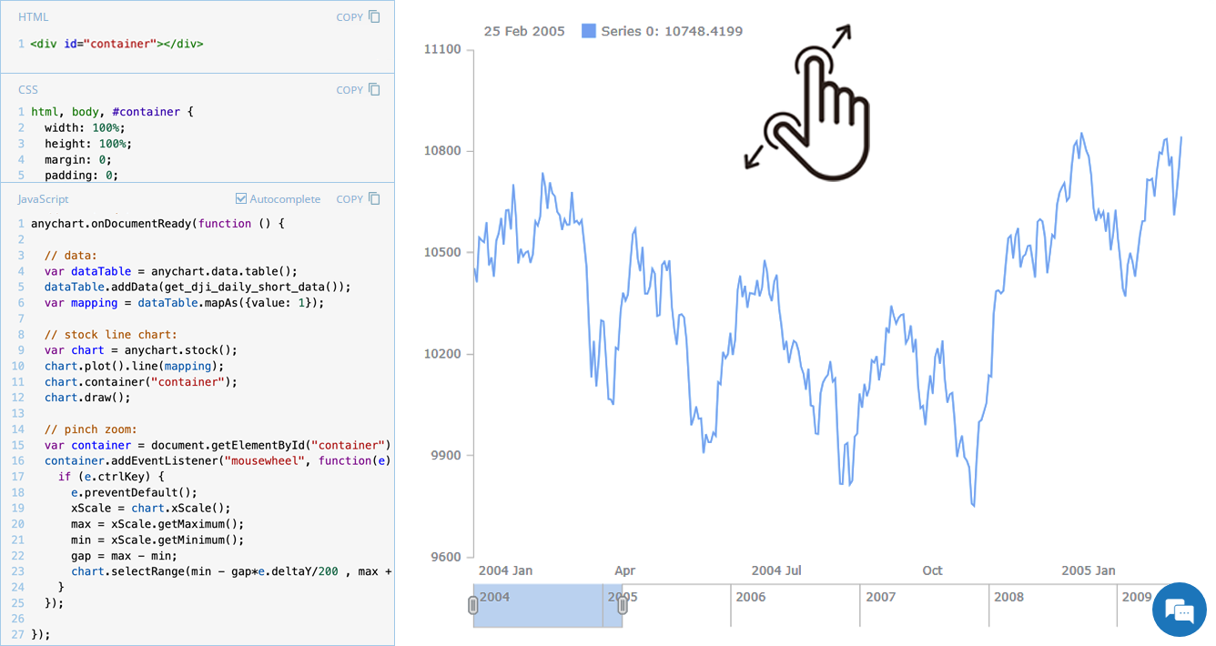 Stock charts are designed to handle large volumes of time-based data, and smooth navigation is key to working with them effectively. One common need is zooming — whether to focus on a specific time range in greater detail or to get a broader view of the data.
In our JavaScript stock charts, zooming works out of the box through the scroller element, which appears by default as the main navigational UI control, making it easy to adjust the visible range on the go. For even greater flexibility, the range selection UI provides extra tools like preset time period buttons and date input fields. You can also activate zooming via mouse wheel scrolling with the zoomOnMouseWheel() method, which corresponds to the two-finger swipe gesture on touchpads and trackpads.
Pinch-to-zoom is another intuitive zooming option. It allows users to zoom in and out naturally on mobile and touch devices by moving two fingers farther apart or closer together. This is also easy to implement — and it is exactly what we cover in this edition of JS Chart Tips. Learn how to add pinch-to-zoom to your JavaScript stock chart!
- Categories: AnyChart Charting Component, AnyStock, Big Data, Financial Charts, HTML5, JavaScript, JS Chart Tips, Stock Charts, Tips and Tricks
- No Comments »
Quadrant Chart with Custom Image Markers — JS Chart Tips
February 11th, 2025 by AnyChart Team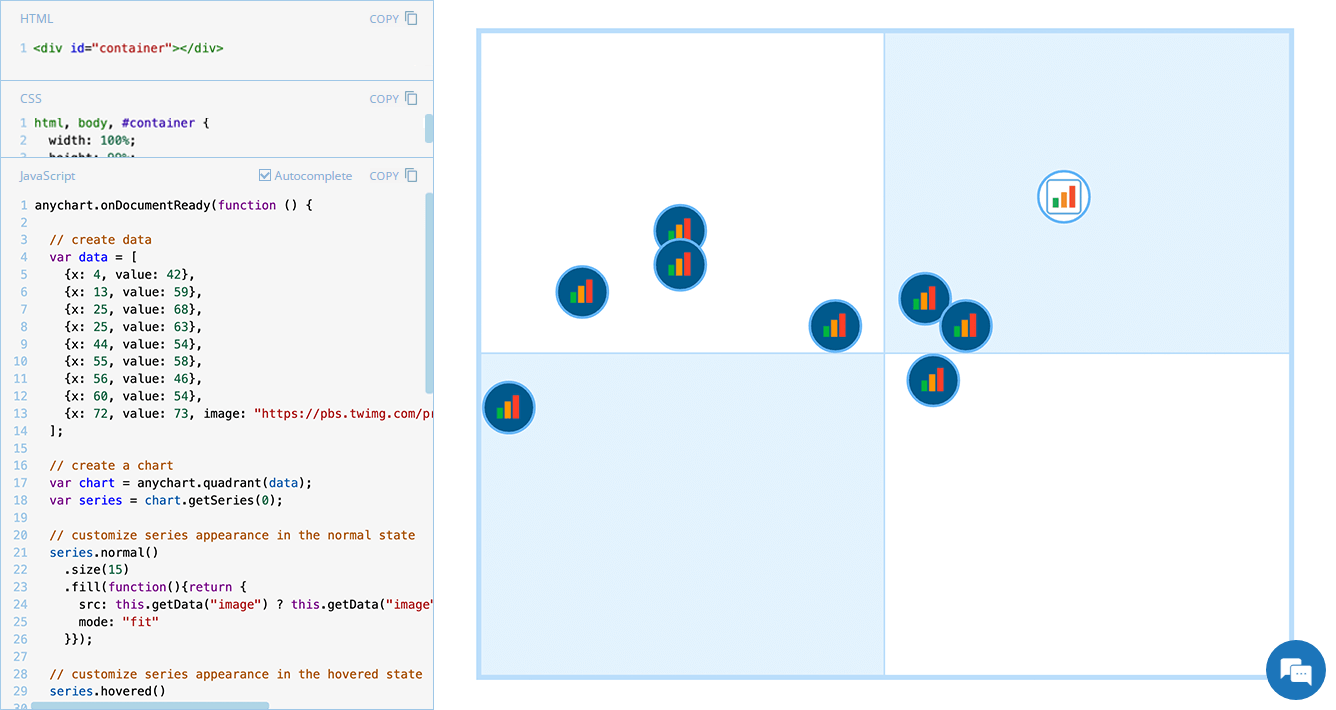 Displaying unique images as markers can add a distinctive touch to your charts, making data visualization more engaging and informative. In this edition of JS Chart Tips, we will guide you through the process of using custom image markers for each data point in a quadrant chart with our JavaScript charting library.
- Categories: AnyChart Charting Component, HTML5, JavaScript, JS Chart Tips, Tips and Tricks
- No Comments »
20+ Years of Advancing Data Visualization: Interview with Our CEO
February 5th, 2025 by AnyChart Team Unicorns Journal just published an interview with our CEO and co-founder, Anton Baranchuk, where he reflects on AnyChart’s journey from a small startup to a global leader in data visualization, trusted by enterprises worldwide.
Anton talks about how we got started, the transition from Flash to JavaScript charting, our work with Qlik, and the vision and values that continue to drive us forward.
- Categories: AnyChart Charting Component, AnyGantt, AnyMap, AnyStock, Big Data, Blogroll, Books, Business Intelligence, Dashboards, Financial Charts, Flash Platform, Gantt Chart, GraphicsJS, HTML5, JavaScript, News, Oracle Apex, Qlik, Stock Charts, Success Stories
- No Comments »
Stock Chart with Custom Time Intervals — JS Chart Tips
January 30th, 2025 by AnyChart Team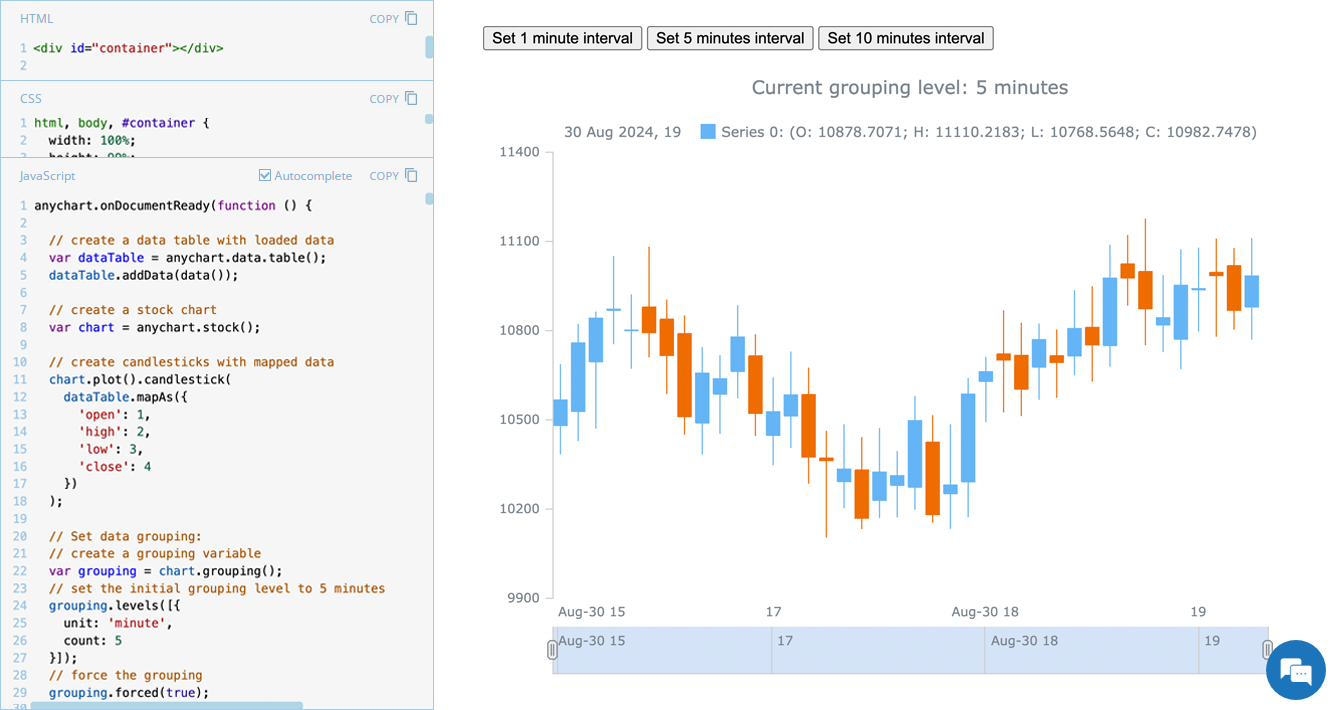 Grouping data points into appropriate time intervals is essential for making stock charts more readable and insightful. While raw data may be collected at a high frequency, such as every minute, financial analysts and traders often need to view broader trends, where grouping data into 5-minute, 15-minute, 1-hour, 1-day, and other time frames can provide clearer insights. In this edition of JS Chart Tips, we will walk you through the process of setting a custom time interval for a stock chart using our JavaScript charting library.
- Categories: AnyChart Charting Component, AnyStock, Big Data, Financial Charts, HTML5, JavaScript, JS Chart Tips, Stock Charts, Tips and Tricks
- No Comments »
Reflecting on 2024 and Embracing 2025 — Happy New Year!
January 9th, 2025 by AnyChart Team Another remarkable year is officially in the books! Here at AnyChart, 2024 was a truly rewarding journey marked by innovation and impact:
- Named Best Tech in Data Analytics & Visualization — once again!
- Enhanced our JavaScript charting library with exciting new features and tweaks, particularly in Timeline, Waterfall, and Circle Packing charts — plus multiple custom solutions tailored to your specific needs.
- Thrived in the Qlik ecosystem with transformative updates for our extensions for Qlik Sense, rocking Qlik Connect in Orlando, and more — explore our 2024 highlights as Qlik’s Technology Partner.
As we step into 2025, we remain committed to pushing the boundaries of data visualization and analytics, ensuring you always have the tools you need to excel and succeed. Here’s to an even greater year ahead — happy 2025, and stay tuned for what’s coming next!
- Categories: AnyChart Charting Component, AnyGantt, AnyMap, AnyStock, Big Data, Blogroll, Business Intelligence, Charts and Art, Dashboards, Financial Charts, Gantt Chart, HTML5, JavaScript, News, Qlik, Stock Charts
- No Comments »
Integrating AnyChart JS Charts in Python Django Financial Trading Dashboard
December 3rd, 2024 by Michael Whittle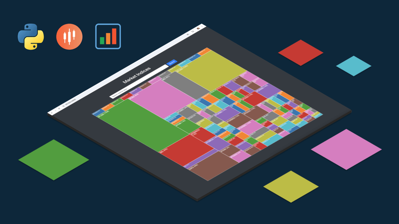 We are pleased to share an insightful article by Michael Whittle, a seasoned solution architect and developer with over 20 years of experience. Originally published on EODHD.com, it explores how he integrated our JavaScript charting library into a financial trading dashboard built with Python Django. Michael also shares his experience migrating a treemap from D3.js to AnyChart and explains why he chose our solution for implementing a stock chart, highlighting the intuitive code and enhanced functionality. Read on to discover how you can elevate your financial data visualizations in Python Django web applications with AnyChart JS Charts.
- Categories: AnyChart Charting Component, AnyStock, Big Data, Dashboards, Financial Charts, HTML5, JavaScript, Stock Charts, Third-Party Developers, Tips and Tricks
- No Comments »
Gantt Chart Legend — JS Chart Tips
November 21st, 2024 by AnyChart Team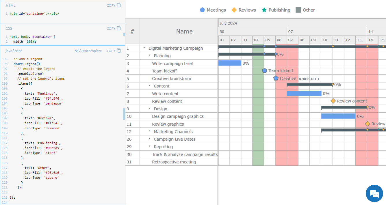 Legend is a vital element in many charts, helping viewers quickly understand what each visual component represents. However, it is not always a must-have for every chart type. For instance, Gantt charts often work perfectly fine without a legend, so it is not enabled in our JavaScript Gantt Chart by default. That said, creating one is straightforward. Right now, we will show you how to add a legend to a Gantt chart — join us as we continue our JS Chart Tips series, sharing quick solutions inspired by real customer queries!
- Categories: AnyChart Charting Component, AnyGantt, Business Intelligence, Gantt Chart, HTML5, JavaScript, JS Chart Tips, Tips and Tricks
- 2 Comments »