Clear Data Visualization That Works — DataViz Weekly
January 30th, 2026 by AnyChart Team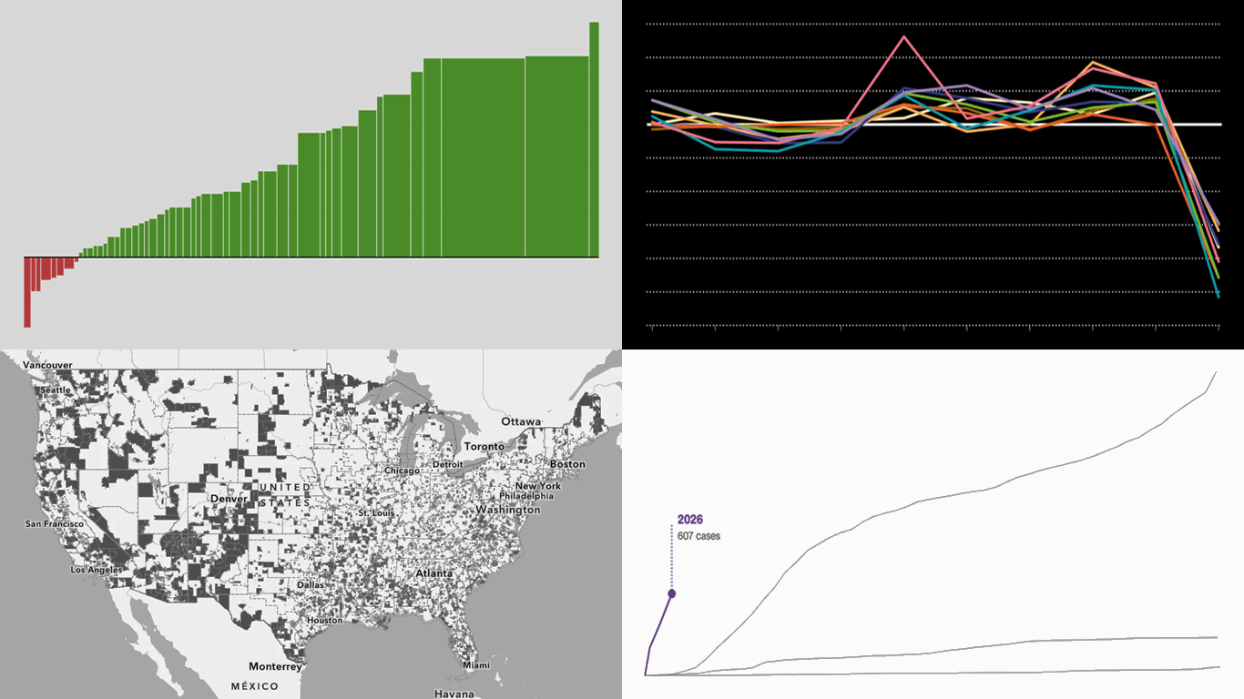 Data visuals do not have to be complicated to work. Clear structure can do a lot of the heavy lifting on its own. A few fresh examples like this are in the spotlight in this new edition of DataViz Weekly:
- Measles cases rise in the U.S. — CNN Health
- Population shifts across the U.S. — FlowingData
- U.S. science cutbacks — Nature
- Food deserts in the U.S. — ILSR
- Categories: Data Visualization Weekly
- No Comments »
New Examples of Visual Storytelling in Action — DataViz Weekly
January 23rd, 2026 by AnyChart Team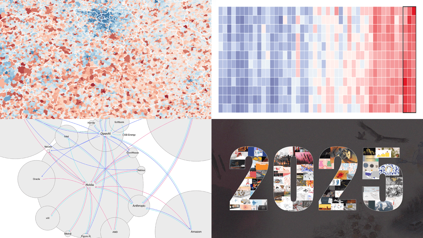 Visualizing data can help tell a story by making trends and patterns easier to see and letting insights land faster. Here are a few recent projects we are glad to share in DataViz Weekly this time that work as clear examples of visual storytelling in action.
- 2025 heat in the global warming trend — The Economist
- Circular AI deals network — The Big Take
- Births versus deaths across France — Le Monde
- 2025 year in Reuters graphics — Reuters
- Categories: Data Visualization Weekly
- No Comments »
How to Use Excel with Qlik Sense: Comprehensive Guide
January 21st, 2026 by AnyChart Team Microsoft Excel has been declared obsolete countless times. Yet even with the rise of modern BI platforms like Qlik Sense by Qlik, spreadsheets remain central in enterprise analytics. And that is unlikely to change anytime soon.
These two worlds are not rivals; they complement each other. Qlik Sense delivers trusted data, scale, and interactive dashboards. Excel gives formulas, quick checks, and everyday collaboration in an interface everyone knows. Together, they bring a single source of truth plus the familiar flexibility of spreadsheets.
This article provides a comprehensive guide to using Excel with Qlik Sense. We will cover methods from simple exports and imports to advanced integrations such as automated reporting, live connectors, and embedding fully functional spreadsheets directly into Qlik dashboards.
Continue reading at qlik.anychart.com »
- Categories: AnyChart Charting Component, Big Data, Business Intelligence, Dashboards, Qlik, Third-Party Developers, Tips and Tricks
- No Comments »
Fresh Data Visualization Picks to Explore — DataViz Weekly
January 16th, 2026 by AnyChart Team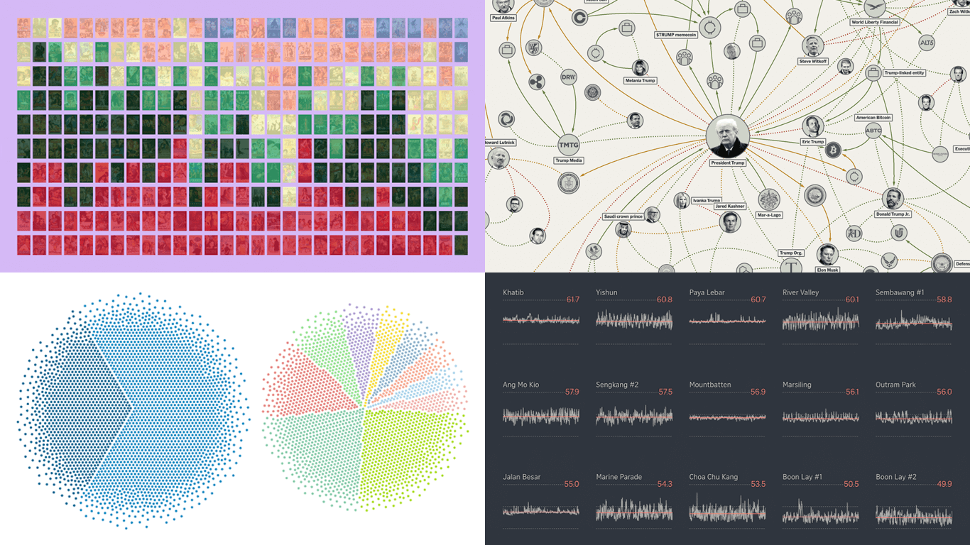 DataViz Weekly is back on the AnyChart blog! It is our regular roundup where we share the most interesting data visualization work we have come across recently. In this edition:
- Bollywood’s shift away from romance — Kontinentalist
- Homeland Security footprint in Minnesota — The Minnesota Star Tribune
- Traffic noise inside Singapore homes — The Straits Times
- Trump deal connections — The New York Times
- Categories: Data Visualization Weekly
- No Comments »
Best Data Visualizations of 2025 — DataViz Weekly
January 9th, 2026 by AnyChart Team In 2025, data visualization kept proving its value as a practical way to work through complexity without losing the thread. From conflict and humanitarian crises to climate risks, technology, culture, and long-running social trends, charts and maps helped people see structure, scale, and change more clearly.
This special edition of DataViz Weekly brings together the best data visualizations of 2025 as selected in major year-end picks. It features selections from FlowingData, GIJN, The Pudding, and Datawrapper, followed by a set of newsroom year-in-graphics roundups for more storytelling standouts from across the year.
- Categories: Data Visualization Weekly
- No Comments »