Happy Holidays and Year-End Note for 2025
December 23rd, 2025 by AnyChart Team As 2025 winds down, we want to say thank you to our customers, partners, and everyone who builds and uses analytics every day. Merry Christmas and Happy New Year from all of us at AnyChart!
Closing out 2025, we are sharing this holiday sweater as a small nod to a theme we focused on this year ?
- Categories: AnyChart Charting Component, Big Data, Blogroll, Business Intelligence, Dashboards, Humor, JavaScript, News, Qlik
- No Comments »
New Data Visualization Examples Worth Checking Out — DataViz Weekly
December 19th, 2025 by AnyChart Team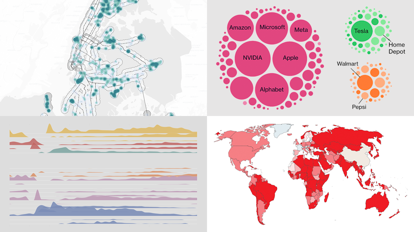 If you love good charts and maps or want inspiration for your own work, you are in the right place. DataViz Weekly rounds up great new data visualization examples from around the web. In this edition:
- Time with others across the day — Nathan Yau
- Housing potential of NYC parking lots — Tom Weatherburn
- China’s rise in global trade — Our World in Data
- AI questions beyond tech earnings — Bloomberg
- Categories: Data Visualization Weekly
- No Comments »
How to Create Excel-Style Spreadsheets in Qlik Sense
December 17th, 2025 by AnyChart Team Many teams still rely on Excel because it is familiar, flexible, and fast for ad-hoc analysis. But when spreadsheet work happens outside Qlik, it often means extra exports, duplicate files, and numbers that can drift away from what your dashboards show.
This tutorial shows how to create an Excel-style spreadsheet directly inside Qlik Sense using the Spreadsheets extension, so users can work in a familiar spreadsheet interface without leaving the app.
See the tutorial at qlik.anychart.com »
- Categories: AnyChart Charting Component, Big Data, Business Intelligence, Dashboards, Financial Charts, Qlik, Third-Party Developers, Tips and Tricks
- No Comments »
Data Visuals That Stood Out to Us This Week — DataViz Weekly
December 12th, 2025 by AnyChart Team Welcome to DataViz Weekly, where we highlight strong examples of data visualization in action. Take a look at the projects that stood out to us this week:
- Global defense industry at record highs — Reuters
- Climate-driven rise in home insurance costs — The New York Times
- Interactive Star Wars galaxy map — Tim Sircoloumb
- Sizes of life on Earth — Neal Agarwal
- Categories: Data Visualization Weekly
- No Comments »
Data Visualization Work That Just Hit Our Radar — DataViz Weekly
December 5th, 2025 by AnyChart Team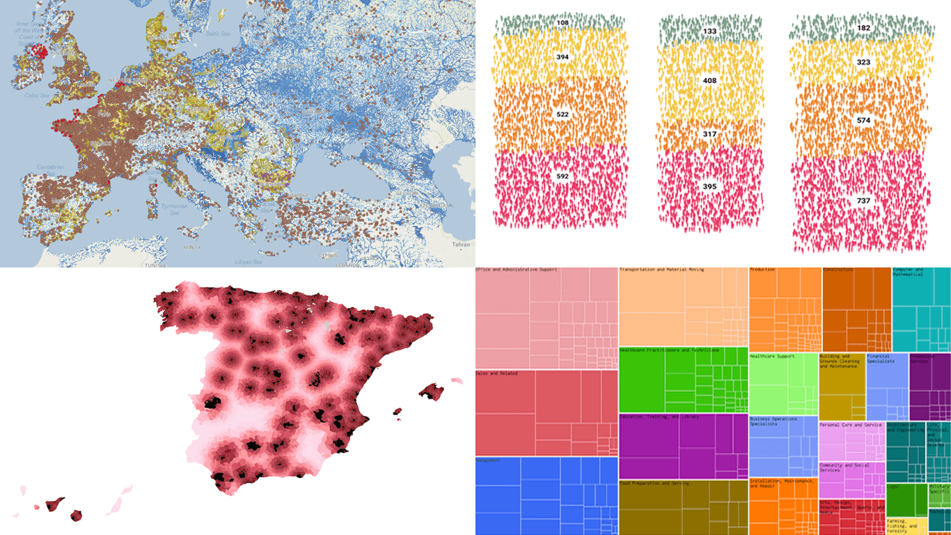 We continue our regular DataViz Weekly feature, where we curate the most interesting data visualization work we have come across over the past few days. Here is what made it into this edition:
- Michelin star restaurants in Spain — Colpisa
- Occupations with higher pay (than yours) — FlowingData
- Landfills across Europe — Investigate Europe & Watershed Investigations
- Catastrophic residential fire in Hong Kong — SCMP
- Categories: Data Visualization Weekly
- No Comments »