Best Recent Data Visualizations Not to Miss — DataViz Weekly
June 20th, 2025 by AnyChart Team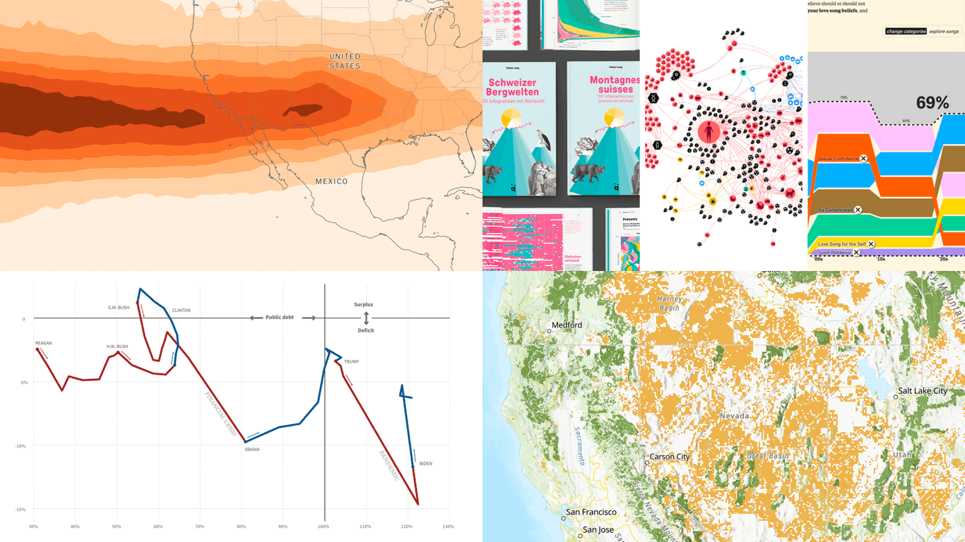 The human brain processes visual information more readily than raw numbers. That makes data visualization a particularly effective way to uncover insights. DataViz Weekly presents some of the best recent examples we have come across:
- Public lands for sale in the United States — The Wilderness Society
- Future flight turbulence under warming — The Washington Post
- U.S. federal finances — Reuters
- Winners of the Information is Beautiful Awards — Data Visualization Society
- Categories: Data Visualization Weekly
- No Comments »
Qlik Connect 2025 Recap: Incredible Ride for Excel-lence
June 19th, 2025 by AnyChart Team Qlik Connect 2025 is now in the books, and it was everything we hoped for — and more. Building on last year’s success, we returned to Orlando to find even more connections, deeper engagement, and a truly electric atmosphere around our booth. Our brand-new Excel-style Spreadsheets for Qlik Sense turned heads, and our chance-to-win activities became a real magnet on the show floor.
The buzz was real — just take a look below, then read on for a recap of our time at Qlik Connect:
Read more at qlik.anychart.com »
- Categories: AnyChart Charting Component, Big Data, Business Intelligence, Dashboards, News, Qlik
- No Comments »
Data Visualization Power on Display — DataViz Weekly
June 6th, 2025 by AnyChart Team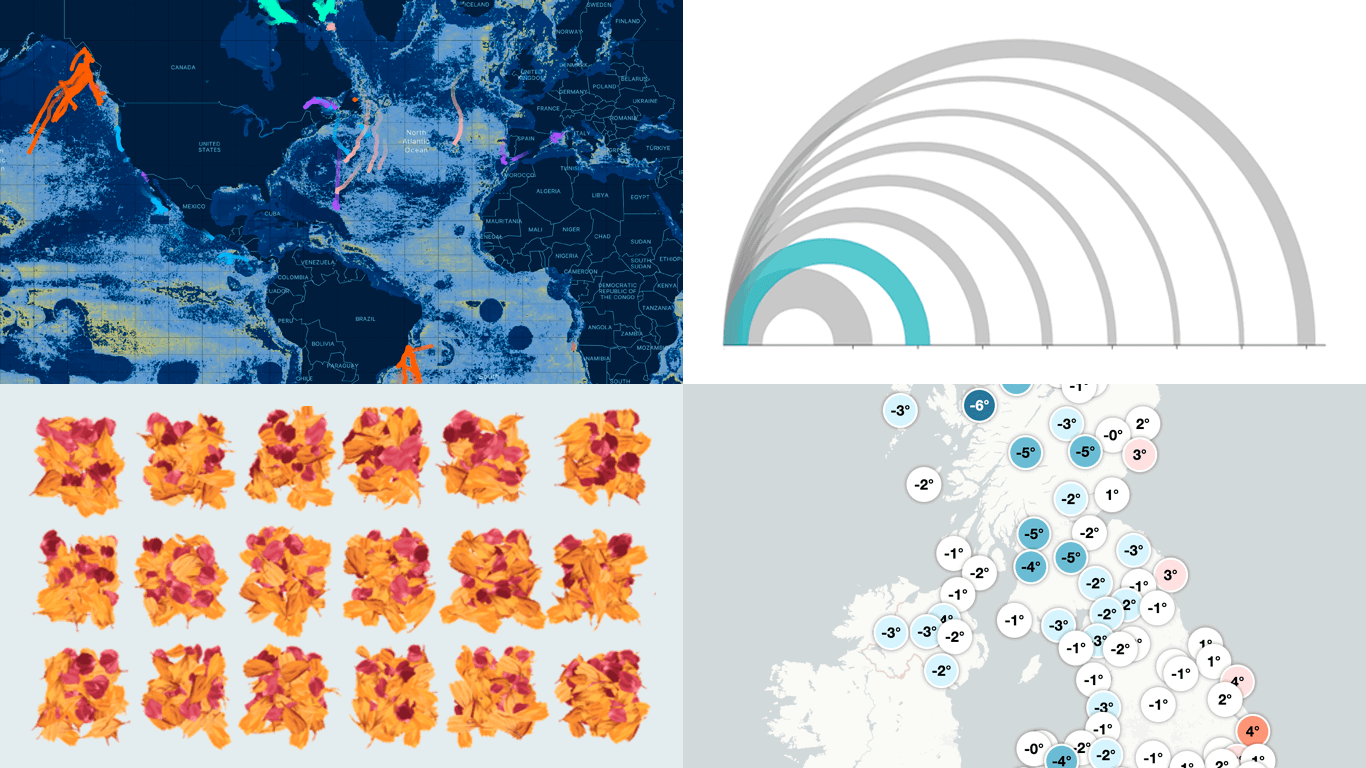 Here we are with a new selection of great examples showing the power of data visualization in action, whether for exploring or explaining. See which projects made it to this edition of DataViz Weekly:
- Flight delays and cancellations in Northern California — San Francisco Chronicle
- Real-time UK temperature tracker — Dan Harris and Ed Hawkins
- Threats to whale migration — Blue Corridors Initiative
- Maha Kumbh Mela crowds in petals — Reuters
- Categories: Data Visualization Weekly
- No Comments »