Notable New Visual Data Projects to See — DataViz Weekly
May 30th, 2025 by AnyChart Team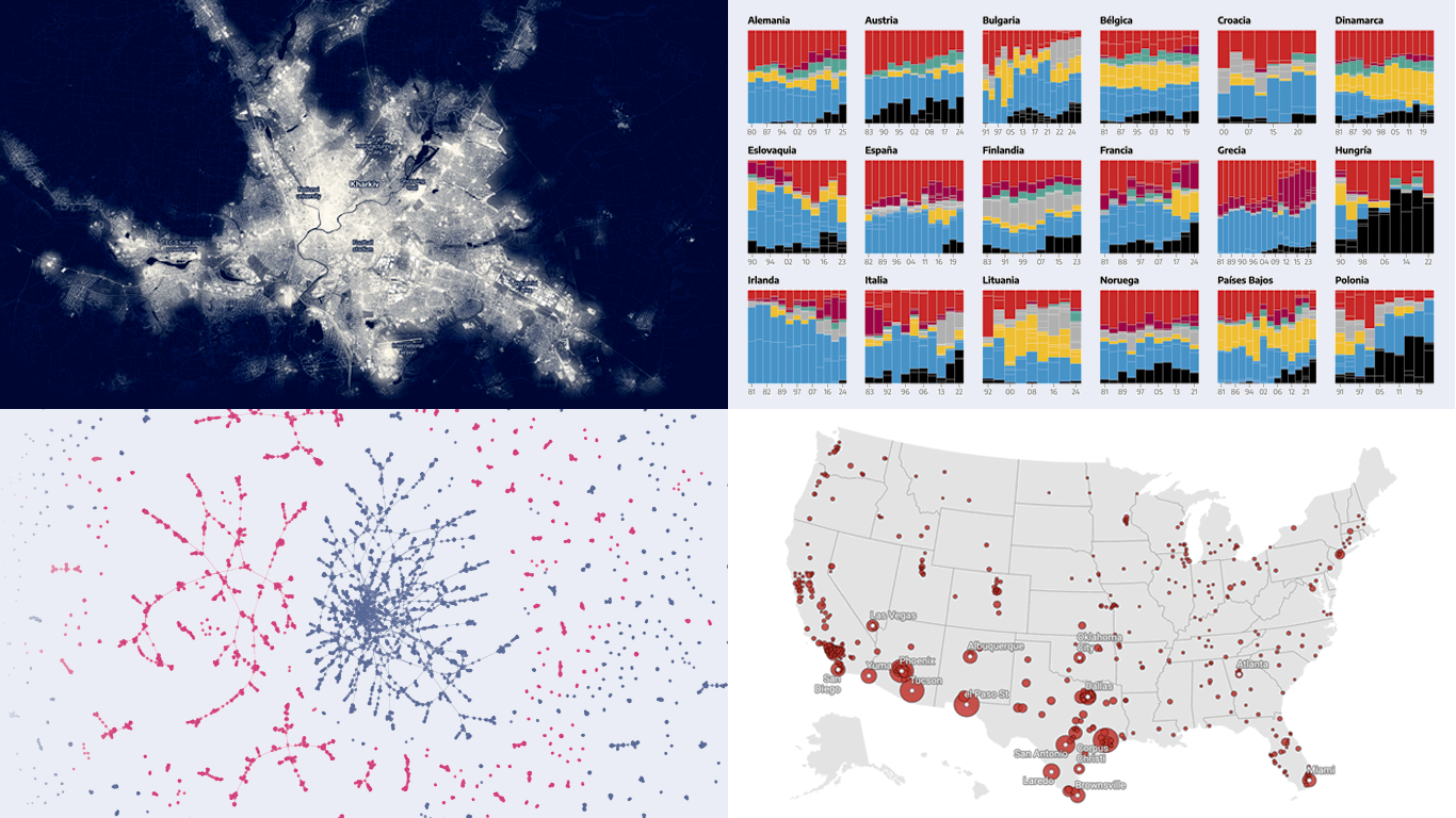 Hey data visualization lovers, ready for a new dose of inspiration? Welcome back to DataViz Weekly, where we spotlight the most interesting new projects in which charts and maps help make sense of data visually. Take a look at what stood out to us this time around:
- Ukraine’s energy crisis revealed by city lights — Bloomberg
- Far-right electoral growth across Europe — elDiario.es
- U.S. guns for Mexican cartels — The Conversation
- History of Lubartów’s Jewish population — WeDoData
- Categories: Data Visualization Weekly
- No Comments »
When Data Becomes Visual Insight — DataViz Weekly
May 23rd, 2025 by AnyChart Team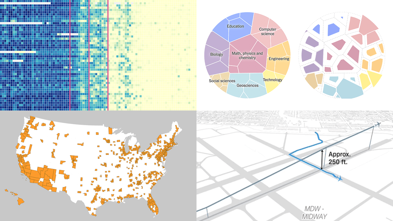 Seeing data is not the same as understanding it — that is where visualization makes the difference. This edition of DataViz Weekly features fresh examples showing how insight emerges when numbers are presented thoughtfully. Whether you work with data or just follow it, here’re four new projects we thought you wouldn’t want to miss:
- Aviation incidents in America — CNN
- County population across the United States — Kyle Walker
- Cuts in U.S. science funding — The Upshot
- Measles vaccination impact — Our World in Data
- Categories: Data Visualization Weekly
- No Comments »
New Visual Data Stories Worth Checking Out — DataViz Weekly
May 16th, 2025 by AnyChart Team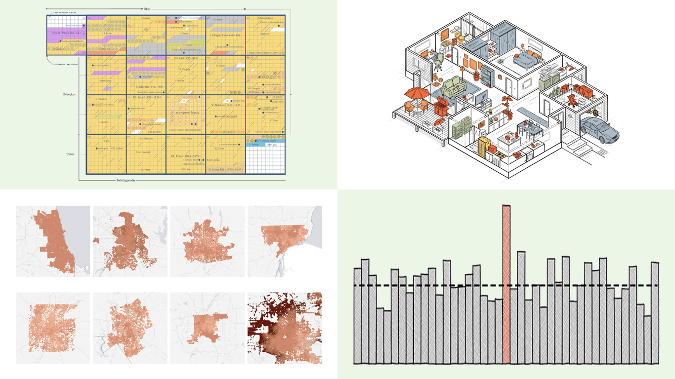 Qlik Connect was a blast — catch some highlights on our LinkedIn if you’re interested. With all that whirlwind now behind, we’re completely back in the flow of our Friday tradition with a new edition of DataViz Weekly. As always, it is all about sharing great projects that show how visualization lets data talk and sparks insight. Today, we bring you four new visual data stories to check out:
- Visual guide to papal election — Atlo
- Chance of death on birthday — The Pudding
- Sinking ground in U.S. cities — The Washington Post
- Chinese products in American homes — The New York Times
- Categories: Data Visualization Weekly
- No Comments »
Compelling Fresh Visualization Picks for Inspiration — DataViz Weekly
May 9th, 2025 by AnyChart Team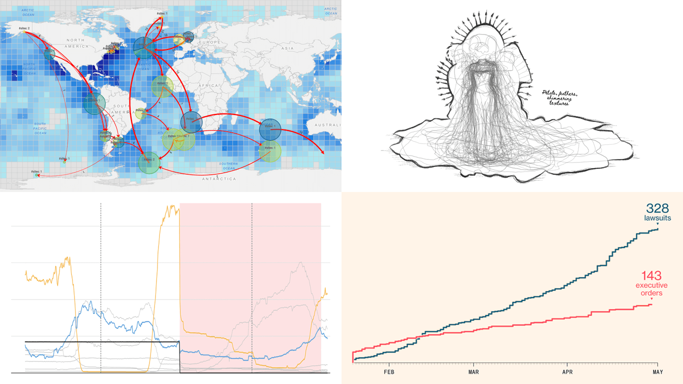 We skipped a few Fridays — but for good reason. With Qlik Connect just around the corner, we have been deep in prep mode: finalizing assets, polishing demos, and getting our brand-new Spreadsheets extension for Qlik Sense completely ready to launch. Still, we could not hold off any longer, so we carved out a quick break to bring you a new edition of DataViz Weekly! Here are the most compelling visualizations we have come across lately — take a look:
- Marine migration pathways — MiCO
- Spain’s energy system under strain — Colpisa
- Lawsuits against Trump’s executive orders — Bloomberg
- Met Gala outfit silhouettes over time — Reuters
- Categories: Data Visualization Weekly
- No Comments »