Meet AnyChart at Qlik Connect 2025: Booth #1007 — Plus Chances to Win Apple Prizes!
April 30th, 2025 by AnyChart Team Qlik Connect 2025 is coming up fast, and we at AnyChart are excited to return as a sponsor and exhibitor after last year’s success! Mark your calendar for May 13–15 and join us at Disney’s Coronado Springs Resort in Lake Buena Vista, Florida.
Be sure to stop by Booth #1007 to explore the latest in our suite of Qlik Sense extensions. Discover Excel-like Spreadsheets for Qlik, see what’s new and upcoming in other tools, and enter our contests for a chance to win premium Apple prizes — including a MacBook, Apple Watch, iPad, and more!
Read more at qlik.anychart.com »
- Categories: AnyChart Charting Component, Big Data, Business Intelligence, Dashboards, News, Qlik
- No Comments »
Powering Financial Charts in Free Online Currency Converter by EODHD APIs
April 21st, 2025 by AnyChart Team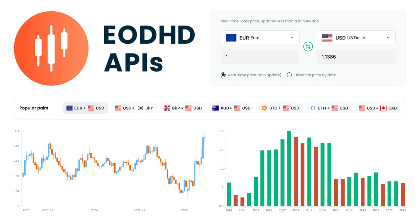 We are pleased to share that EODHD APIs, a prominent provider of financial market data, selected our JavaScript charting library to power charts in their new Online Currency Converter.
The tool provides free access to both live and historical exchange rates for more than 1,100 currency pairs. Interactive stock charts, built with our specialized AnyStock product, enrich numerical conversion data with clear visual context, providing insight into currency dynamics over time.
This case highlights how charts built with AnyChart can add clarity and usability to financial tools. Let’s take a closer look at how it works.
- Categories: AnyChart Charting Component, AnyStock, Big Data, Financial Charts, HTML5, JavaScript, News, Stock Charts, Third-Party Developers
- No Comments »
New Impressive Examples of How Data Visualization Works in Practice — DataViz Weekly
April 11th, 2025 by AnyChart Team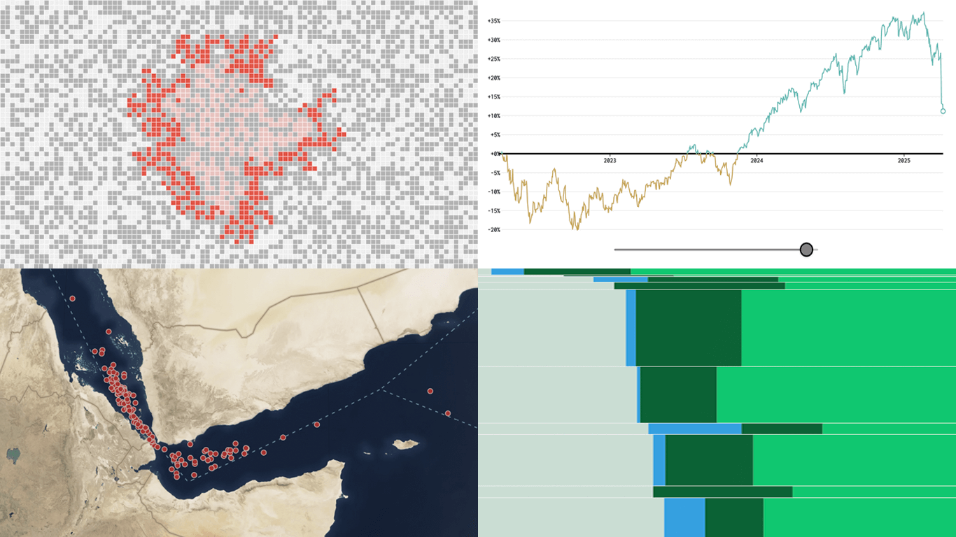 New week, new visualizations that deserve your look! DataViz Weekly brings together several strong new examples demonstrating how data visualization works in practice — making patterns visible, comparisons clearer, and context easier to understand.
- S&P 500 drops and recoveries over time — FlowingData
- Herd immunity thresholds in disease outbreaks — The Upshot
- Renewable energy targets in the Mediterranean — Ember
- Red Sea under Houthi attacks — International Crisis Group
- Categories: Data Visualization Weekly
- No Comments »
Politics Across New Data Visualizations — DataViz Weekly
April 4th, 2025 by AnyChart Team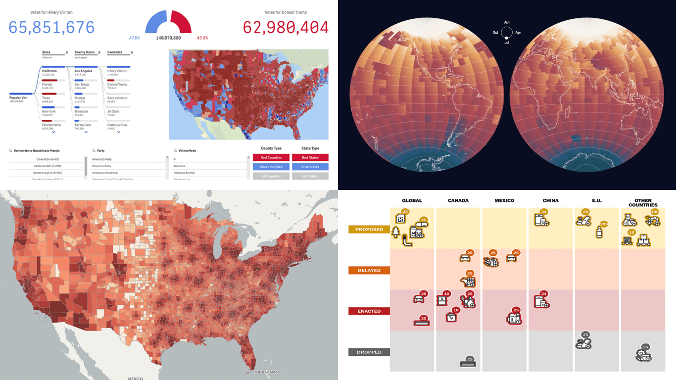 Politics shapes the world in many ways — and, as always, data visualization helps make sense of it all. This time in DataViz Weekly, we are looking at how charts and maps reflect political shifts, decisions, and consequences — from election results and government budgets to tariff policies and even time zones.
One of these projects is ours. We hesitated for a moment — but let’s be honest, we would have featured it anyway if we had stumbled upon it elsewhere.
So, without further ado, here are the four new data visualization projects we think you’ll want to check out:
- U.S. presidential elections — AnyChart
- Trump tariffs timeline — The Washington Post
- Science funding cuts in the United States — SCIMaP
- Politics of time zones — The Economist
- Categories: Data Visualization Weekly
- No Comments »
Explore U.S. Presidential Elections in Our New Qlik App — Feedback Welcome in Qlik Gallery!
April 3rd, 2025 by AnyChart Team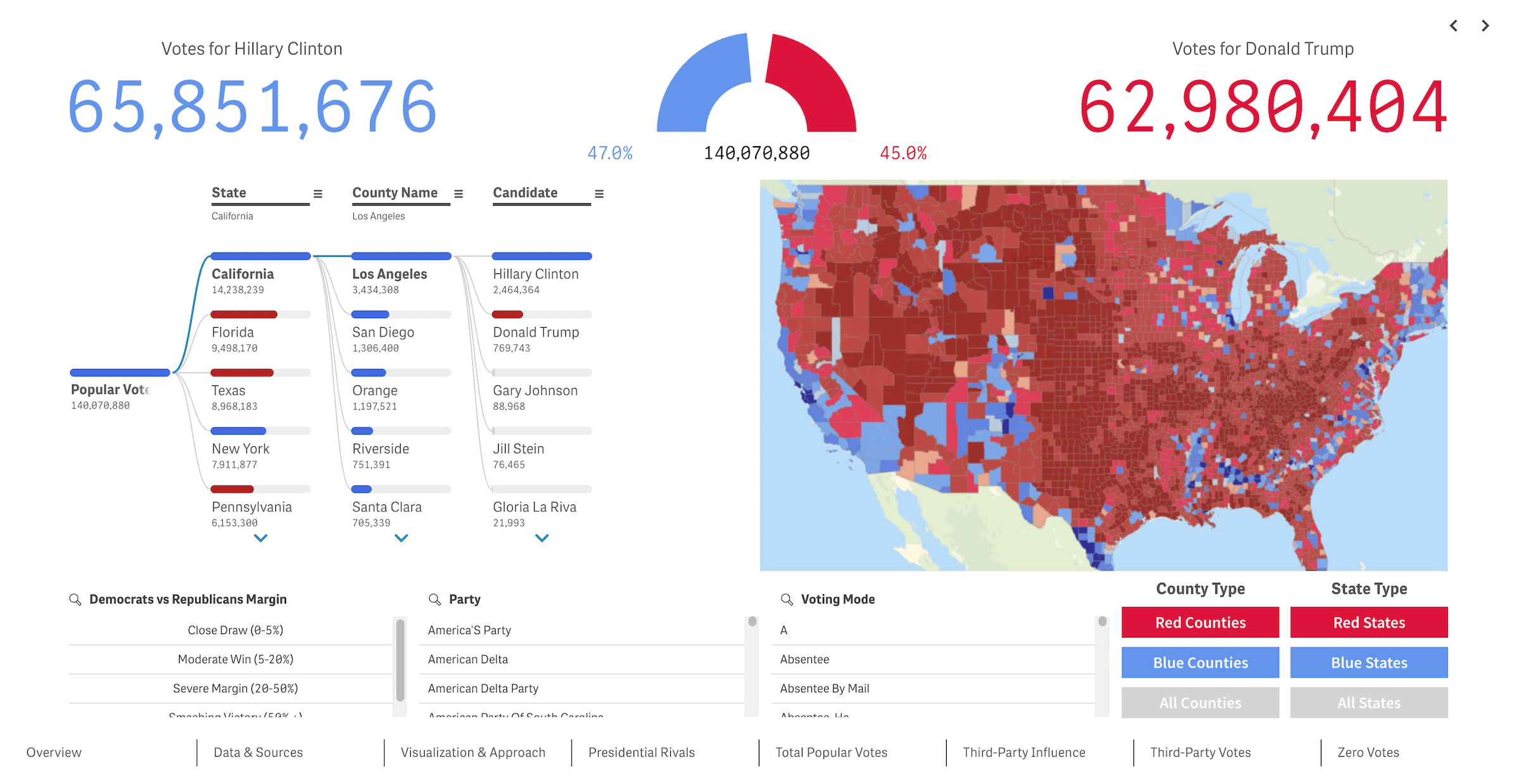 We recently released a new public Qlik Sense application that offers an interactive deep dive into U.S. presidential elections from 2016 through 2024 — our first step toward building the ultimate tool for exploring every presidential election in American history. We’re glad to see it’s already been well-received in the Qlik community and attracted significant attention, especially after being featured in the Qlik Gallery. The app is fully accessible in the browser, even if you do not have Qlik.
Read more at qlik.anychart.com »
- Categories: AnyChart Charting Component, Big Data, Business Intelligence, Dashboards, Qlik
- No Comments »