Pinch-to-Zoom in Stock Charts — JS Chart Tips
March 5th, 2025 by AnyChart Team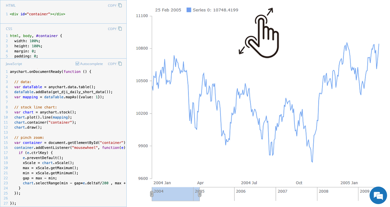 Stock charts are designed to handle large volumes of time-based data, and smooth navigation is key to working with them effectively. One common need is zooming — whether to focus on a specific time range in greater detail or to get a broader view of the data.
In our JavaScript stock charts, zooming works out of the box through the scroller element, which appears by default as the main navigational UI control, making it easy to adjust the visible range on the go. For even greater flexibility, the range selection UI provides extra tools like preset time period buttons and date input fields. You can also activate zooming via mouse wheel scrolling with the zoomOnMouseWheel() method, which corresponds to the two-finger swipe gesture on touchpads and trackpads.
Pinch-to-zoom is another intuitive zooming option. It allows users to zoom in and out naturally on mobile and touch devices by moving two fingers farther apart or closer together. This is also easy to implement — and it is exactly what we cover in this edition of JS Chart Tips. Learn how to add pinch-to-zoom to your JavaScript stock chart!
- Categories: AnyChart Charting Component, AnyStock, Big Data, Financial Charts, HTML5, JavaScript, JS Chart Tips, Stock Charts, Tips and Tricks
- No Comments »
Creating Timeline Chart of Roman History Using JavaScript
October 3rd, 2024 by AnyChart Team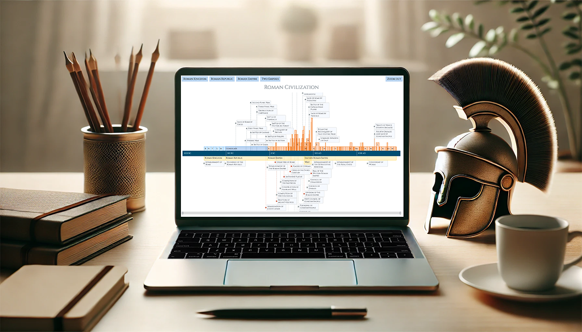 Ever caught yourself thinking about the Roman Empire more often than you’d like to admit? You’re not alone, and we’ve got just the thing for you! With the recent AnyChart JS Charts 8.13.0 release, we’ve enhanced our timeline chart for better support of historical data visualization. We’d love to showcase this improvement in action.
We’ve added a Roman History Timeline to our gallery of timeline chart examples, and we now invite you to discover how it was developed from scratch. In this in-depth JavaScript charting tutorial, we’ll cover everything from A to Z, meticulously guiding you through each step — from setting up the HTML environment to adding detailed data and customizing the visualization to make the chart both informative and engaging. The final result is an interactive timeline that you can proudly call your own Roman Empire.
So, whether you’re a history enthusiast caught up in the recent meme trend or a developer eager to expand your data visualization skills, follow along and learn how to create compelling historical timeline charts using JavaScript!
Read the JS charting tutorial »
- Categories: AnyChart Charting Component, Big Data, HTML5, JavaScript, JavaScript Chart Tutorials, Tips and Tricks
- No Comments »
Introducing AnyChart 8.13.0 for Elevated JavaScript Charting Experience
October 3rd, 2024 by AnyChart Team AnyChart 8.13.0 is now available, bringing a set of new features and improvements designed to further elevate your data visualization experience. In this release, we’ve focused on enhancing the Timeline, Waterfall, and Circle Packing charts in our JavaScript charting library, making them even more flexible and user-friendly. Read on to explore what’s new!
- Categories: AnyChart Charting Component, AnyGantt, AnyMap, AnyStock, Big Data, Business Intelligence, Dashboards, Financial Charts, Gantt Chart, HTML5, JavaScript, News, Stock Charts
- No Comments »