Introducing Chartopedia to Help You Choose the Right Chart Types for Your Data Visualization
January 18th, 2017 by AnyChart Team Choosing the right chart types for data analysis and reporting solutions is always a challenge. In fact, there are so many data visualization options out there that it can be really complicated to determine which one to use in a certain situation. And you cannot afford to make a mistake here, because applying data to an inappropriate type of chart will very likely end up causing confusion and even wrong business decisions.
To help you cope with this issue better (and faster), we have developed an information resource named Chartopedia, and it is a pleasure for us to introduce it to you today.
- Categories: AnyGantt, AnyMap, AnyStock, Business Intelligence, Financial Charts, Gantt Chart, HTML5, JavaScript, News, Stock Charts, Tips and Tricks, Uncategorized
- 1 Comment »
JS Charting Without Borders: 21 New Integration Templates for Popular Stacks
December 19th, 2016 by AnyChart TeamMaking your data visualization life ever easier is what we at AnyChart are boundlessly passionate about. This time we focused on further simplifying the integration of our JS charting solutions into your web development environment.
So, prepare to replan your schedule! From now on, you will spend tangibly less time on charting. And please greet the 21 New Technical Integration Templates that we have just released! They will help you deploy HTML5 graphs, maps, stock charts, dashboards, and Gantt diagrams in your stack as easily (and rapidly!) as never before, no matter what programming languages, frameworks, and databases are used.
You can find the templates right here on our website, in the Technical Integrations section.

Basically, our powerful JavaScript/HTML5 based solutions for interactive data visualization – AnyChart, AnyMap, AnyStock, and AnyGantt – are inherently compatible with all major technologies and platforms. Configuring each JS charting library is easy, and we are sure all of you are more than capable of making even rather complicated integrations prefectly done by yourself. But we keep on doing our best to bring you the ultimate simplicity and clarity so you could get along without additional research and other time-consuming activities.
The integration templates we’ve added cover the most popular languages, frameworks and libraries, and database programs. Below is the list of the newly available combinations.
Templates for easily integrating AnyChart JS charting libraries into your stack:
 |
ASP.NET integration
|
 |
Go integration
|
Java integration
|
 |
Julia integration
|
 |
NodeJS integration
|
Perl integration
|
PHP integration
|
Python integration
|
 |
R integration
|
Ruby on Rails integration
|
Scala integration
|
We hope you agree that this is a tremendous addition to the JS charting integration samples published earlier:
- Clojure, ClojureScript and PostgreSQL,
- iOS, Objective-C and SQLite,
- NodeJS and MongoDB,
- PHP and MySQL,
- PHP, Slim and MySQL.
So, you are welcome to make use of our integration templates and samples for easier data visualization. All of them are released on GitHub under the Apache 2.0 License, rest in the AnyChart Integrations repository, and can be forked and changed in any way.
We are going to keep the collection growing further. Meanwhile, please send us your suggestions on what other particular integration you are interested to learn about first, and – as always! – that one will be prioritized; just contact our Support Team for that and name your stack.
To make your JS charting life even easier, we will release special AnyChart plugins for Angular, Ember, jQuery, Meteor, and React JavaScript frameworks in February 2017, with the 7.13.0 update. But this is a completely other remarkable story. Stay tuned. And thanks for being with us!
- Categories: AnyChart Charting Component, AnyGantt, AnyMap, AnyStock, Business Intelligence, Dashboards, Financial Charts, Gantt Chart, HTML5, JavaScript, News, Stock Charts, Third-Party Developers, Tips and Tricks
- 2 Comments »
Web Analytics Dashboard – Made With JS Maps and Charts Powered by AnyChart
October 19th, 2016 by AnyChart TeamIn today’s world of data, a well-designed web analytics dashboard is a must-have for everyone who is managing a website, a web app, or a number of various web projects. You get tons of statistics about traffic, and you should make them work and help you make right decisions.
How much traffic are you getting? Who are your visitors? Where are they coming from? And maybe even most important – is your marketing strategy working well? It gets much easier and takes significantly less time to answer all these questions when the data is visualized. Here comes an interactive analytics dashboard that allows you to have your data organized, see everything at-a-glance, and pay sufficient attention to all metrics that are important to you.
First-class dashboarding experience is one of the biggest advantages of our interactive data visualization solutions. JavaScript graphs, maps, and stock charts powered by AnyChart can be easily put on a single, effective, interactive HTML5 dashboard, making your traffic data analytics even more powerful and insightful. And here is another great example – Web Audience Dashboard, freshly made by the team of AnyChart for your inspiration.
Look at this:

(large image / interactive version)
And now we definitely should take note of some composition and development features of this dashboard.
- Categories: AnyChart Charting Component, AnyMap, Business Intelligence, Dashboards, HTML5, JavaScript, Tips and Tricks
- No Comments »
AnyChart Open-Sources Powerful, Draw-Anything JS Graphics Library GraphicsJS
September 15th, 2016 by AnyChart TeamIt is a pleasure for us to announce this today! We have just launched GraphicsJS, a free, open-source, lightweight JavaScript library which allows you to draw any JS graphics and animation for your HTML5 projects very easily. It is significantly more powerful and feature-rich than Raphaël, BonsaiJS, and other formerly leading SVG/VML graphics solutions.
")
GraphicsJS has always been the graphics engine that our JavaScript (HTML5) charting libraries are built on – AnyChart, AnyStock, AnyGantt, and AnyMap. As a result, it already powers data visualization activities for many of you – Oracle, Microsoft, Volkswagen, AT&T, Samsung, BP, Bosch, Merck, Reuters, Bank of China, Lockheed Martin, and thousands of all the other highly respected AnyChart’s customers including more than 70% of Fortune 1000 companies.
Of course, data visualization is not the only but just one of multiple fields where the library of GraphicsJS can be helpful and even essential. Generally speaking, this solution can help you produce virtually anything graphical from scratch: static and animated images, cartoons, games, interactive infographics, mind maps, and many other amazing things in HTML5.
Key Features of JS Graphics Library
- Mighty line drawing abilities – Bézier curves, arcs, rectangles, and many other kinds of forms and deformations.
- Powerful text manipulation features – multiline texts, measurement, including width, height, as well as wrap, overflow, indent, spacing, align, etc.
- Virtual DOM for drawing fast and only what is necessary.
- Smart layering system with z-index.
- Transformation engine – embarrassing in-browser transformations are not used.
- Legacy browser support (Internet Explorer 6+).
- Concise and convenient JavaScript API with chaining support.
By the way, making our graphics engine open-source is just the beginning as – we are also pleased to tell you – AnyChart is going to open the source code of our charting libraries soon! We believe that our great developments in the fields of graphics and data visualization should be even more visible and reachable to any programmer from any part of the world, not to mention that we would love to allow the community to contribute.
Please refer to GraphicsJS.org to learn more about GraphicsJS. As always, the demos are available on our Playground (Graphics section). Also, let’s not forget about the Graphics Documentation and Graphics API Reference.
What’s more, the GraphicsJS library and all relevant samples can be freely downloaded and forked on GitHub.
- Categories: AnyChart Charting Component, AnyGantt, AnyMap, AnyStock, Charts and Art, Dashboards, Financial Charts, Gantt Chart, GraphicsJS, GraphJam, HTML5, JavaScript, News, Stock Charts, Third-Party Developers, Tips and Tricks, Uncategorized
- 5 Comments »
Investment Portfolio Dashboard by AnyChart Charting Framework
March 26th, 2016 by Margaret Skomorokh
We have added a new dashboard to AnyChart Business Dashboard Solutions – a section of our site with sample dashboards demonstrating how AnyChart charting framework can be applied to various visualization tasks in various industries. Investment Portfolio Dashboard is a sample solution for personal portfolio management, based on data from finance.yahoo.com.
Some say that portfolio management is the art and science, which consists of making decisions about investment content combination and policy, matching investments to objectives, asset allocation for individuals and institutions, and balancing risk against performance.
If you want to be perfectly accurate, investment management is the professional asset management of various securities (shares, bonds, and other securities) and other assets (e.g., real estate) in order to meet specified investment goals for the benefit of the investors. Investors may be institutions (insurance companies, pension funds, corporations, charities, educational establishments, etc.) or private investors (both directly via investment contracts and more commonly via collective investment schemes e.g. mutual funds or exchange-traded funds).
Or, in plain English, managing investment porfolio is creating a collection of assets that can diminish the risk inherent in stock markets by diversification or avoiding having too many eggs in one basket.
Whatever the case is, any porfolio management must include the following steps: choosing investment horizon and goals, building portfolio, and performance monitoring. Each of the steps needs a dashboard of its’ own, so there are three tabs in our dashboard: Goals, Portfolio, and Performance.
The Goals tab provides a user with a way to mix the portfolio and a way to see the prognosis for it, so there are two charts: a Donut chart and a combination of a Line chart and a Range Area chart. The Portfolio tab shows the mix of the instruments and all basic information about them (here you see the same Donut chart and a table). Finally, in the Performance tab you will find a Stock chart demonrtrating the performance of our investment porfolio.
Using AnyChart, we have created a user-friendly and fast-rendering visualization. To learn how it was done, you can see a detailed tutorial: Creating Investment Portfolio Dashboard. Our dashboard is minimalistic, but it can be easily extended, and it does not matter how much additional information you need to show: our charting framework is flexible enough to cope with any task.
- Categories: AnyChart Charting Component, AnyStock, HTML5, JavaScript, News, Stock Charts, Tips and Tricks
- 1 Comment »
AnyChart JavaScript Charts: Integration Samples
December 25th, 2015 by Margaret SkomorokhAnyChart JavaScript Charts: Integration with PHP, MySQL, iOS, SQLite, Clojure, Clojurescript, NodeJs, and MongoDB
AnyChart JavaScript charts run on any platform and with any database. To make integration of AnyChart into your application as easy as possible, we have created several samples demonstrating how to integrate our component into the most popular platforms and databases. With the help of these tutorials, you will be able to start developing a prototype of your application right now.
Below you will find the samples that are currently available. Please note that all of them are repositories on GitHub, distributed under an Apache 2.0 License, and you can fork and change them as you like. Do not hesitate to pull requests or raise issues if you want to suggest an improvement or think that there is a bug in the code. We are going to expand this list and improve the samples, but if right now you are interested in a particular integration not listed here, please contact us.
|
|
Simple PHP Integration Sample PHP is one of the most popular tools for creating web applications and web pages. If you are a beginner developer or you need the simplest base for your charting application, this sample will help you. It shows Bar, Column, and Pie JavaScript charts created with PHP and displayed on a web page using AnyChart. |
|
|
PHP Integration Sample, Based on Slim If you are using the MySQL database (which is widely used with PHP applications) and the Slim PHP framework (a very convenient PHP microframework), this sample will help you to create a proof of concept of your charting application in a matter of minutes. You will see how to get data from MySQL, convert them into a format that can be used with AnyChart, and display as interactive JavaScript charts. You will also learn how to update your data without refreshing the page and how to customize different chart types, tooltips, labels, axes, and so on. |
|
|
iOS Objective-C Integration Sample Nowadays iPhone and iPad are used not only for making phone calls and entertainment. Phones and tablet computers are the integral part of an entrepreneur’s everyday life, and iOS apps serve business. Though AnyChart is a JavaScript charting library, you can easily combine it with the native Objective-C code and make any iOS app display big or small data as charts, with all great big and small features of AnyChart: from continuous real-time updates and multi-level drill-downs to the ability to customize the color of a particular axis label. Run our sample charting application in XCode, and you will get an iOS project where data are stored in the SQLite database management system and displayed as HTML5 charts on the screens of mobile devices. |
|
|
Clojure and ClojureScript Integration Sample Clojure is a dialect of the Lisp programming language, which is a very popular choice for creating server/backend applications. ClojureScript and the Postgresql database together make an excellent combination of tools, suitable for the most wide range of applications including data visualization solutions of any kind. Today there is rarely just one or two charts in an application – usually you see a dashboard with many interrelated elements. In this sample you will find a sales dashboard with such common chart types as Line, Bar, and Pie, and you will be surprised to realize how well AnyChart’s ideology fit the principles of Closure: simple modules will allow you to quickly get all the things that users expect to see on an up-to-date HTML5 website. |
|
|
NodeJs and MongoDB Integration Sample The NoSQL database is an integral part of the modern world, and MongoDB is a good choice if you decide to go this way. And when MongoDB is in play, a Node.js server is a logical choice to go with. So, if you are breaking the ground with your scalable application where run-time performance is paramount, use our sample to see how AnyChart JavaScript charts fit into this environment (and they fit perfectly). We are confident that you will not be disappointed with AnyChart in this case – its client-side performance will compliment your server-side performance, and users will be glad to see their data seamlessly updated on-the-fly. |


AnyChart charting library is a number one choice for anyone who is going into the world of data visualization and wants to excel in the fast-evolving world of BI solutions. When we develop our charts, one of our aims is providing users with the best result in any browser, but we also do our best to make the process of creating and supporting applications easier for developers.
We maintain a clear system of versions, each version being saved at AnyChart CDN. The API of each version is available at https://api.anychart.com/, and the documentation is available here: https://docs.anychart.com/. There are thousands of samples in our API and documentation, and you can see and try any method and any feature of AnyChart JavaScript charts on our website. Still, if there is no answer to your question neither in API, nor in our documentation, nor in the FAQ, just contact AnyChart Support Center, and our engineers will solve your problem.
We hope that these integration samples will help you to jump-start your project, and you will become one of the lucky ones who enjoy the power and flexibility of our JavaScript charts.
PS: If you are already convinced and none of the standard licenses fits your needs, our sales team is dying to hear from you and work out the best deal ever. You will be amazed to discover how fair our Support, OEM, and SaaS contracts are.
- Categories: AnyChart Charting Component, Business Intelligence, Dashboards, HTML5, JavaScript, Tips and Tricks
- 1 Comment »
AnyChart and Java Standard Widget Toolkit (SWT)
September 15th, 2015 by Timothy LoginovOverview
The Standard Widget Toolkit (SWT) is a graphical widget toolkit for use with the Java platform. It was originally developed by Stephen Northover at IBM and is now maintained by the Eclipse Foundation in tandem with the Eclipse IDE. It is an alternative to the Abstract Window Toolkit (AWT) and Swing Java GUI toolkits provided by Oracle as part of the Java Platform.
We have created a basic sample to show how you can work with AnyChart in an SWT application.
Contents and Launching
The sample file (click to download) contains the ‘src’ folder with the source code and the ‘jar’ file. You can run the file using the java -jar <jar_file_name> command.
In Mac OS X you can launch the sample like this:
java -XstartOnFirstThread -jar anychart-java-example.jar
In Windows you can do that like this:
java -jar anychart-java-example.jar
Description
This sample shows a basic chart with five points. It listens for the chart draw and point hover events, and logs them into the textArea on the page; anychart.min.js is loaded from AnyChart CDN.
The ‘Add Random Point’ button keeps adding random points until the total point count is 20 and after then removes one point before adding a new one.
Source code is rather simple and self-descriptive, and there are only two things you should look at:
The static String myScript variable defines what script is executed when button is clicked;
The static String createHTML() method generates HTML and puts it into the browser window.
Summary
AnyChart and Java Standard Widget Toolkit (SWT) Sample: anychart-java-swt-example.zip
AnyChart Download: https://www.anychart.com/download/
AnyChart Documentation: https://docs.anychart.com/
AnyChart API: https://api.anychart.com/
AnyChart Overview: AnyChart Web Charts JavaScript Framework
Later we will extend the sample, add more features, and show how to achieve more with AnyChart in Java environment. We also have a number of other samples coming up.
If you created anything with AnyChart in Java applications and are ready to share – please drop us a line in comments, on Facebook, Twitter, or via email (support@anychart.com).
- Categories: AnyChart Charting Component, Tips and Tricks
- 3 Comments »
Saving AnyChart 6 Charts as Images in Oracle APEX
September 2nd, 2015 by Timothy LoginovNOTE: This article tells how to set up the script in Oracle APEX and doesn’t affect AnyChart customers who use AnyChart outside of Oracle APEX.
Oracle Application Express is a web-based application development tool integrated with all editions of Oracle Database. It enables users with limited programming skills to easily develop secure web applications that run inside their Oracle Database, and scale to support tens, hundreds, or thousands of users.
Since Oracle Application Express Release 3.0, AnyChart is used as a charting engine (you can read about this in a success story: Oracle Chooses AnyChart Solution for Latest Release of Oracle® Application Express).
One of the nice features available in AnyChart since version 4.1.0 is the ability to save a Flash chart as an image – in order to make it possible, we have to use a server-side script, which is hosted on the AnyChart.Com site by default (read more about saving charts as images in AnyChart 6).
Federico Bonifazi from Geko Sistemi Informativi s.r.l. shared a solution that allows to save charts as images on the server side. We are very thankful for that and present it here for anyone who wants to do the same. This tutorial is very basic and is not a ready-to-go solution, but it gives the general idea, so you can use it to break ground on your project.
This configuration in based on Oracle Standard Edition on a Linux server, Oracle Rest and Tomcat are used.
- Categories: AnyChart Charting Component, Oracle Apex, Tips and Tricks
- 1 Comment »
AnyChart JavaScript Charts in WordPress Posts
August 26th, 2015 by Margaret SkomorokhData visualization is a rapidly growing Internet industry rooted almost in any aspect of our life. As far as visualization is one of the most effective ways of presenting information, every presentation and every information dashboard requires visual information. Moreover, a well-designed dashboard makes any web page look even better, be it a personal blog or website of a big company.
AnyChart is a flexible JavaScript (HTML5) based solution which allows you to create interactive and great-looking charts, dashboards and visualizations. It is cross-browser and cross-platform, intended for everybody who deals with dashboards, reports, analytics and creates statistical, financial, or any other data visualizations. PCs, Macs, iPhones, iPads, Android devices – AnyChart works everywhere, and you will get the same experience across all devices and browsers.
This article highlights the basics of using AnyChart in WordPress – one of the most popular content management systems. You can easily add a dashboard or a chart in your post, making it more appealing and helping your storytelling.
Adding AnyChart to a WordPress Post
Adding AnyChart to a WordPress post is quite easy. You should open the page editor, switch into Text Editing Mode, insert link to an AnyChart JavaScript file, create a chart container, and add some data and settings, like this:
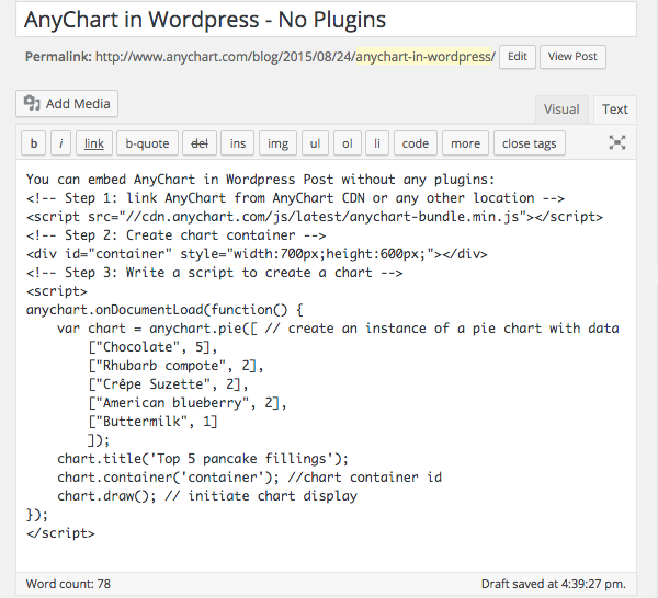
Note: A chart container may be of any size. However, if there are no style settings for the container and it has zero height and zero width, the chart will be added, but it will not be seen. So do not forget to set container size.
You can open your WordPress blog right now, copy paste the code below and try it yourself:
<!-- Step 1: link AnyChart from AnyChart CDN -->

<script src="//cdn.anychart.com/js/latest/anychart-bundle.min.js"></script>

<!-- Step 2: Create chart container -->

<div id="container" style="width:90%;height:600px;"></div>

<!-- Step 3: Write a script to create a chart -->

<script>

  anychart.onDocumentLoad(function() {

    var chart = anychart.pie([ // create an instance of a pie chart with data

    ["Chocolate", 5],

    ["Crêpe Suzette", 2],

    ["American blueberry", 2],

    ["Buttermilk", 1]

  ]);

  chart.title('Top 5 pancake fillings');

  chart.container('container'); //chart container id

  chart.draw(); // initiate chart display

  });

</script>
That’s basically all you need to to! Could it be easier? Now the page is ready to be published, but do not forget to preview it and make sure that everything looks fine and there are no mistakes in the data.
See below what you get if everything is done right – it actually is a live AnyChart JavaScript Pie Chart which is embedded in AnyChart WordPress Blog the way described above. Hover the slices to see tooltips, click to select them. If you don’t see anything – please check if JavaScript is enabled in your browser.
The <script> tag with data should not contain any empty lines! If there are any, WordPress will replace them with the <p> tag, and the data may be corrupted. Read below to learn how to avoid this.
Disabling Smart Insert
The way of integrating AnyChart from the sample above is quite convenient. But in most cases we may need a little bit more. Just dividing data into paragraphs may help in seeing what is right and what is not, and simple comments are very desirable in some cases. It doesn’t take much to achieve it: WordPress provides you with a number of plugins allowing to disable smart insert (which messes with your code in the first place). You can use, for example, the “Raw HTML” plugin or any other – it doesn’t matter which one you choose. After activating your plugin, wrap the script in the tags specified by the plugin developers (you will need the [raw]…[/raw] tag in case you choose the “Raw HTML” plugin). Then you are free to use any number of empty lines you want and insert comments and notes. It will make no difference in terms of visualization, but it may be of a great help in adjusting and debugging the chart.
Referencing the Script in the Head of a Page
AnyChart.js can be referenced in any part of a page, but we recommend to add the link to the head tag of your blog if you are going to use charts regularly. There are quite a few plugins (like this one) for inserting scripts into the head section, and in some themes you may need to work with wp_head.
Read More
All necessary information about AnyChart can be found in our extensive documentation, API, and Playground.
You can download the component at https://www.anychart.com/download/
Do not hesitate to contact our Support Team or Sales Team if something is still not quite clear.
- Categories: AnyChart Charting Component, Tips and Tricks
- 1 Comment »
9 Tips for AnyStock Best Performance
November 13th, 2012 by Margaret SkomorokhAnyChart Stock and Financial Charts, our tool for visualizing time-based data, is sophisticated and fast at the same time – but with some simple tricks, you can improve its performance even more. Here are nine tips for AnyStock best peformance with the links to detailed instructions and samples in our documentation:
1. When you have thousands of points on the chart, it is a good idea to use data grouping. Ungrouped data always slows the chart due to the fact that you actually have thousands of objects added to the plot. Grouping limits the number of objects displayed and keeps the ability to zoom in and see actual data.
2. Ungrouped data is particularly slow when you have a lot of peaks (i.e. sets like (1,-1,1,-1,1,1…) with more than a thousand of points). The reason is Flash poor performance with drawing vertical lines. This problem can be solved by turning on grouping, but please do not forget that the scroller thumbnail series always shows ungrouped data, so it is better to turn it off. To learn how to do it, please see: Scroller without Data Provider.
If you operate “peaky” data sets, by the same reason a Stick series performs better than a Bar series, Line — even better than Stick, and the utmost performance can be reached with a Marker series.
3. Using live update options, you should be careful with the number of technical indicators – due to their nature they are recalculated when new data arrives and sometimes may slow things down. However, calculation takes only 10% of time, and 90% is consumed by redrawing, so you should note this only when data set has more than 10.000 points and you are using more than 10 indicators.
4. The best timestamp format is %T since it is not converted on a data set parsing stage and is used as is. The %u timestamp format is good too. All “normal” date/time formats slow the performance down because they need to be converted into %T before being used by the internal data storage. See more: Timestamps in Milliseconds.
5. If you are using live update with the appendData() method, it is better to do, for example, one update with 5 rows each 10 seconds, rather than five updates with 1 point each 2 seconds.
6. Annotations slow the rendering down when you have more than a hundred of them on a chart (this will be improved in the future versions).
7. In case of a bad mouse-over experience, you may consider dropping the use of the {%SeriesIcon} token in the legend and use either text coloring or a UTF full block (U+2588) symbol.
8. If the Scroller responsiveness is poor, try to use the former without a data provider. To learn how, see the sample XML: Scroller without Data Provider.
9. If you are using ungrouped data, and the mouse-over performance is poor, please check if markers are enabled and consider disabling them.
- Categories: AnyStock, Tips and Tricks
- No Comments »