From Personal Grocery Receipts to Global Data Centers — DataViz Weekly
March 20th, 2026 by AnyChart Team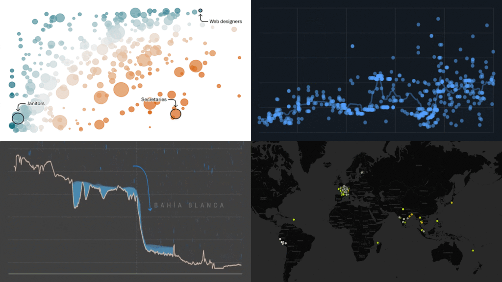
Data is everywhere, but what it means is rarely obvious on its own. DataViz Weekly is back with four projects that illustrate how good visuals help close that gap. Featured today:
- 25 years of egg prices — John Rush
- Jobs most at risk from AI — The Washington Post
- Bahía Blanca flood reconstruction — LA NACION
- Global data center expansion — Environmental Reporting Collective
- Categories: Data Visualization Weekly
- No Comments »
New Charts and Maps That Work — DataViz Weekly
March 13th, 2026 by AnyChart Team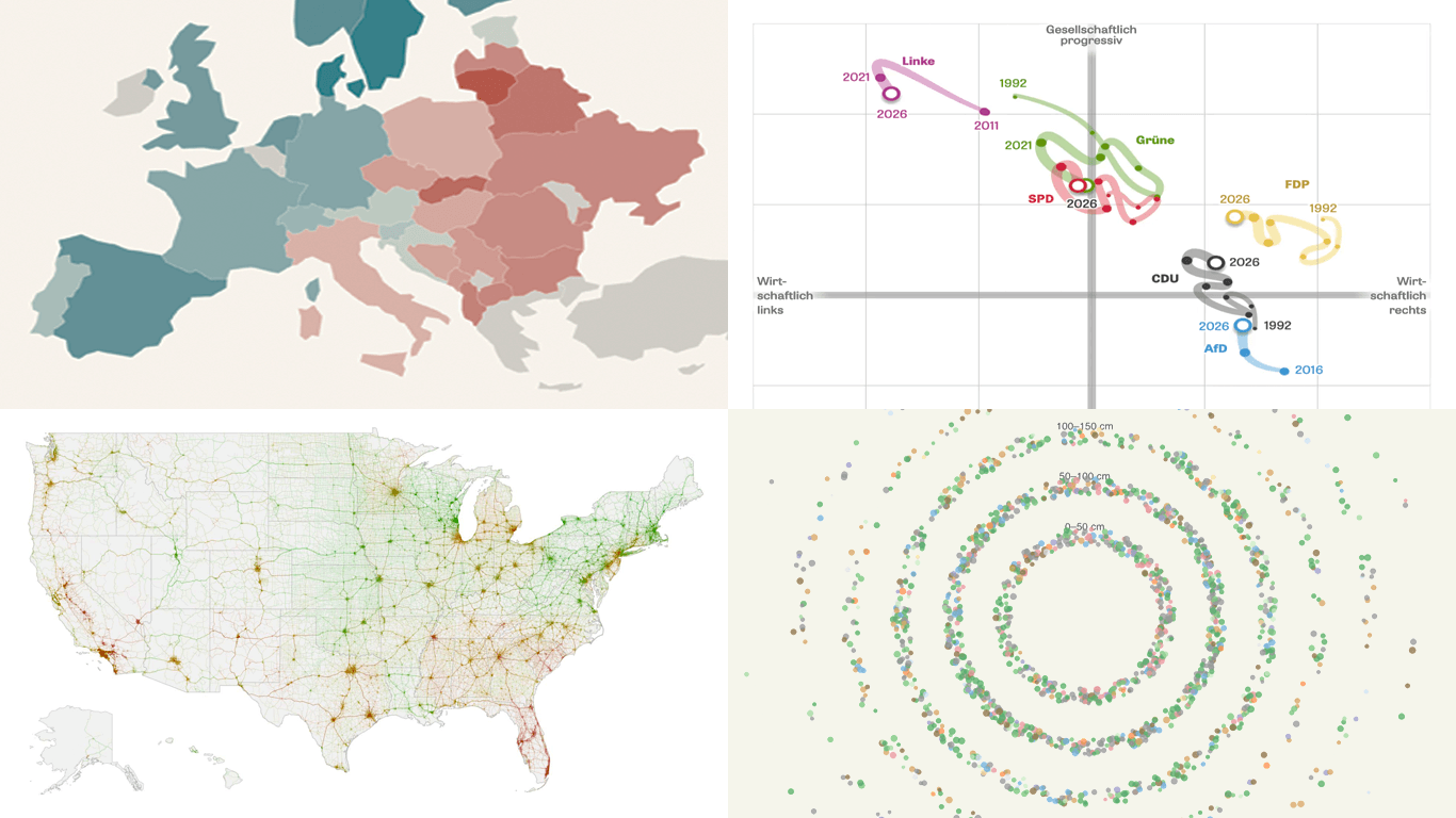 Looking for data visualization done well? You’re in the right place. In DataViz Weekly, we feature recent work that shows how charts and maps can make complex data easier to grasp. This edition’s lineup:
- Gender views in Europe — Teresa Talò
- Freiburg’s urban forest — Stefan Reifenberg
- Road risk across the United States — Mark Sanborn
- Party positions in Baden-Württemberg — DIE ZEIT
- Categories: Data Visualization Weekly
- No Comments »
Visualizing Data on Iran Crisis, Pokémon Taxonomy, U.S. Immigration, Human Happiness — DataViz Weekly
March 6th, 2026 by AnyChart Team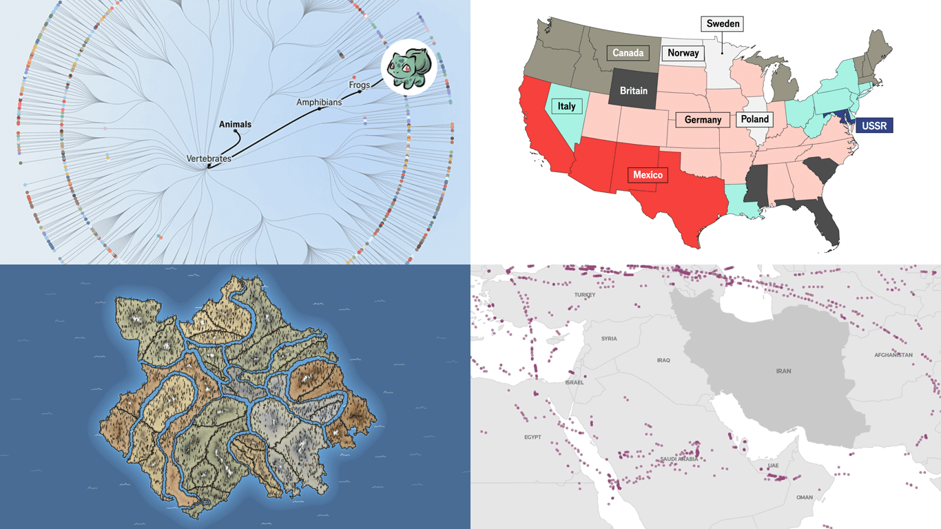 The web keeps producing data visualization work across all kinds of subjects and formats. We keep tracking it, and DataViz Weekly is where the most interesting projects we come across get their spotlight. See our latest picks:
- Iran crisis and its impact — Reuters
- Pokémon taxonomy tree — The Straits Times
- 250 years of U.S. immigration — The Economist
- Terrain of human happiness — The Pudding
- Categories: Data Visualization Weekly
- No Comments »