 In 2025, data visualization kept proving its value as a practical way to work through complexity without losing the thread. From conflict and humanitarian crises to climate risks, technology, culture, and long-running social trends, charts and maps helped people see structure, scale, and change more clearly.
This special edition of DataViz Weekly brings together the best data visualizations of 2025 as selected in major year-end picks. It features selections from FlowingData, GIJN, The Pudding, and Datawrapper, followed by a set of newsroom year-in-graphics roundups for more storytelling standouts from across the year.

Best Data Visualization Projects of 2025 — FlowingData
Each year, Nathan Yau publishes a personal selection of projects that stood out to him over the course of the year. The 2025 list brings together journalism, exploratory tools, and experimental interfaces, reflecting the wide range of ways data was visualized across media outlets and independent projects.
- Inside the Confusing World of Women’s Clothing Sizes by Alyssa Mungcal, Amanda Chai, Chee Wei Xian, Ernest Ong, Khoo Zi Qi, Stephanie Adeline, and Tang Hao Liang on The Straits Times — A multi-layered visual investigation into how women’s clothing sizes vary across brands, combining data collection, sizing charts, and 3D body models to show why finding a consistent fit is often so difficult.
- Your Zodiac Sign Is 2,000 Years Out of Date by Aatish Bhatia, Francesca Paris, and Rumsey Taylor on The Upshot — An interactive explainer showing how the alignment of zodiac signs has shifted over millennia, using timelines and astronomical data to contrast traditional astrology with the actual movement of constellations.
- How California Fights Fires from the Skies by Simon Scarr, Vijdan Mohammad Kawoosa, and Sudev Kiyada on Reuters
— Maps, diagrams, and charts illustrate how aerial firefighting operations are coordinated during major wildfires, detailing aircraft types, deployment strategies, and response timelines. - 30 Minutes with a Stranger by Alvin Chang on The Pudding — A data-driven exploration of conversations between strangers, translating qualitative human interactions into visual patterns that reveal how connection forms over a short, shared window of time.
- Museum of All Things by Maya Claire — An experimental project that turns Wikipedia into a navigable, virtual museum, allowing users to wander through topics spatially rather than searching for specific entries.
- Eroding Protections for Public Lands by Ally J. Levine, Soumya Karwa, and Travis Hartman on Reuters — A visually distinctive examination of how public land protections have changed, using an atlas-inspired aesthetic to map policy shifts, land use, and regulatory trends over time.
- Swept Away by J. David Goodman, Malika Khurana, Bora Erden, Marco Hernandez, Yuhan Liu, Karthik Patanjali, Bedel Saget, and Charlie Smart on The New York Times — A detailed reconstruction of deadly flooding at Camp Mystic, combining video, maps, and spatial analysis to show how water moved through the area and how events unfolded minute by minute.
- Size of Life by Neal Agarwal, Julius Csotonyi, Aleix Ramon, and Iratxe Ibaibarriaga — An immersive, sensory-rich experience that compares the scale of living organisms, blending illustration, sound, and interaction to convey vast differences in size intuitively.
- Bird Migration Is Changing. What Does This Reveal About Our Planet? by Phoebe Weston, Ana Lucía González Paz, Prina Shah, and Antonio Voce on The Guardian — Animated maps and visual storytelling trace shifting bird migration patterns, linking changes in flight routes and timing to broader environmental signals.
- Motorway Cycle XI by Matthew Wilcock — A sonification project that transforms routine movements into music, demonstrating how everyday data can be reinterpreted as calm, structured soundscapes.
For additional context and commentary on each selection, see FlowingData’s full roundup.
Top Data Journalism Projects of 2025 — GIJN
In 2025, data journalism continued to document conflict, climate impacts, technological change, and social issues through a combination of reporting, analysis, and visual evidence. Many of the projects published during the year relied on mapping, satellite imagery, open source data, and large-scale datasets to examine events that were otherwise difficult to observe or verify.
Drawing from more than 200 projects featured in its Data Journalism Top 10 columns, the Global Investigative Journalism Network (GIJN) selected a group of investigations that stood out for methodological rigor, clarity of execution, and depth of reporting.
Conflict
Russia–Ukraine
- What Does AI Think About Ukraine? by Anton Polishko, Artur Küllian, Inna Gadzynska, Mykola Khandoha, Nataliia Romanyshyn, Serhii Mikhalkov, Yevhen Kostiuk, and Yurii Filipchuk on Texty.org.ua — An analysis of how large language models from different countries respond to questions about the war in Ukraine, revealing measurable geopolitical biases. Thousands of prompts were tested across themes such as history, identity, and international relations, showing significant variation between models developed in different regions.
War in Gaza
- Aid in Gaza by Forensic Architecture and World Peace Foundation — A spatial investigation documenting attacks on civilians seeking humanitarian aid in Gaza. Using satellite imagery, verified videos, and geolocation techniques, the project maps incidents over time and shows patterns of destruction affecting food infrastructure and aid distribution sites.
- Hunger in Gaza by Lara Villalón and Isabel González on El Mundo — A narrative-driven visual report following one family’s attempts to obtain food amid shortages, supported by maps and illustrations that show delays, bottlenecks, and risks at aid distribution points.
Sudan
- Sudanese Refugees Trapped by Smuggling Gangs by Salma Abdel Aziz and Ihab Zidan, Arab Reporters for Investigative Journalism (ARIJ) — An investigation into how criminal networks exploit refugees fleeing Sudan’s civil war. Survey data, interviews, and mapping were used to trace smuggling routes into Egypt and document patterns of abuse, including sexual violence.
- Killing Fields Around El-Fasher by Yousra Elbagir on Sky News — Open source reporting and satellite analysis expose sites where civilians fleeing El-Fasher were killed, linking testimonies with geospatial evidence to reconstruct events on the ground.
Syria After Assad
- Inside Sednaya Prison by Christina Goldbaum, Charlie Smart, Helmuth Rosales, Anjali Singhvi, and Reham Mourshed on The New York Times — A detailed 3D reconstruction of Syria’s most notorious prison, created after journalists gained access following the fall of the Assad regime. The interactive model guides users through the structure while documenting how detainees were held and moved within the facility.
Climate
California Wildfires
- Power Shutoffs and Fire Risk in Rural California by Emma Foehringer Merchant and Maria Parazo Rose on High Country News — An analysis linking wildfire prevention measures to electricity outages, showing that rural communities experienced significantly more power shutoffs than urban areas. The project maps fire locations, grid infrastructure, and outage data over several years.
- Why Some Homes Survived the Los Angeles Fires by Anna Phillips, Niko Kommenda, Alice Li, Naema Ahmed, John Muyskens, Joshua Partlow, and Emily Wright on The Washington Post — A visual explainer examining building materials, construction age, and location to understand why certain houses remained standing while others were destroyed.
Drought in the Amazon
- Amazon Drought by the Numbers by Jullie Pereira on InfoAmazonia — A data-driven report showing that more than half of municipalities in the Brazilian Amazon experienced drought throughout 2024. Charts and maps break down monthly patterns, regional differences, and environmental policy indicators.
Artificial Intelligence
Data Centers
- AI Data Centers and Electricity Prices by Josh Saul Leonardo Nicoletti, Demetrios Pogkas, Dina Bass, and Naureen Malik on Bloomberg — An investigation into how the expansion of AI infrastructure affects local power grids, revealing sharp spikes in wholesale electricity prices near major data center clusters through granular grid-level analysis.
AI and the Workforce
- Inside the AI Tutor Economy by Marché Arends and Kathryn Cleary on Africa Uncensored — A visual investigation into the global market for AI training labor, mapping thousands of job postings across dozens of countries and examining how large-scale recruitment supports investment narratives rather than long-term employment.
Social Media and Disinformation
- How X Amplifies Extremist Content by Kaitlin Tosh and Michelle Inez Simon on Sky News — A controlled experiment using test accounts to analyze political content recommendations on X. Circle-packing charts and classification models reveal disproportionate exposure to right-wing and extremist accounts.
- Climate Disinformation Networks by Mohammed Tolba, ARIJ — An investigation tracing coordinated hashtag campaigns promoting climate conspiracy theories, identifying links to oil interests and automated amplification networks.
Other Topics
- China’s Trade Surplus and Global Tariffs by Joe Leahy, William Langley, Edward White, Nassos Stylianou, Dan Clark, Irene de la Torre Arenas, and Sam Joiner on the Financial Times — A series of charts explaining China’s expanding trade surplus and the economic rationale behind escalating tariffs, based on customs data and bilateral trade flows.
- Election of Pope Leo XIV by Szabó Krisztián and Bátorfy Attila, Atlo (Átlátszó) — An illustrated guide to the papal conclave, combining maps, diagrams, and 3D models to explain voting procedures, elector demographics, and Vatican geography.
- Iran’s Sanctioned Oil Fleet by Paul Carsten and Prasanta Kumar Dutta on Reuters — A global investigation using satellite imagery and leaked documents to track oil shipments moved through ship-to-ship transfers and falsified records, revealing how sanctions were bypassed at scale.
- Indigenous Women Confront Sexual Violence in Peru by El Comercio — An interactive report visualizing cases of sexual violence and teenage pregnancy in the Peruvian Amazon, focusing on community-led responses among the Awajún people.
- Myanmar’s Scam Centers by Nikkei Asia — A geospatial investigation identifying compounds where trafficked workers are forced into online fraud schemes, using satellite imagery, night-time light data, and NGO reports.
The full selection and explanation of GIJN’s editorial criteria are available in GIJN’s complete year-end feature.
Best Visual and Data-Driven Stories of 2025 — The Pudding

Each year, The Pudding awards the Pudding Cup to a small number of visual essays selected from an open submission process. The projects recognized in 2025 span technical explanation, document-based analysis, and narrative-driven exploration, reflecting the range of formats contributors used to examine data-intensive topics.
2025 Pudding Cup Winners
- Dithering — Part I by Damar Aji Pramudita — An interactive visual explanation of dithering that uses motion and carefully timed animations to clarify a technical concept. Rather than relying on dense text, the project lets visual transitions do the explanatory work, gradually building intuition through repetition and variation.
- The Legislative Network Behind State Trans Laws by C.J. Robinson — A document-driven data story that traces how similar legislative language appears across state-level trans laws. Through animated text, small multiples, and restrained design, the project exposes patterns of replication and coordination embedded in legal documents.
- Benford’s Law by Schubert de Abreu — A thorough visual explainer of Benford’s Law that combines clear diagrams with a wide range of examples. The project systematically answers common questions about when the law applies, why it works, and how it is used in practice.
Honorable Mentions
- Who Opens the Door for Whom? by Sihang Sun — A behavioral study visualized through observational data, examining subtle social patterns in everyday interactions.
- This Is How the Premier League Works by SportsBall (Riley and Claire Martin) — A short-form visual breakdown of how the Premier League operates, designed for social platforms and optimized for clarity in motion.
- Baby Name Trends by Karim Douieb — An exploratory interface that lets users examine naming patterns over time, highlighting shifts in popularity and cultural influence.
- Dogs with Jobs by Stephanie Wu — A playful yet structured visualization cataloging working dogs across roles, blending illustration with categorical data.
- Hidden Constellations by Yuki Zhang — A reinterpretation of star maps that reveals overlooked patterns in the night sky through alternative grouping and visual emphasis.
- Grocery Signery by Monsicha Srisuantang — A visual survey of grocery store signage, examining how language, layout, and color guide everyday shopping behavior.
- The Disappearing Act by Ricardo Fernandes Garcia, Khadijah Olufayo, and Jocelyn Shek — A narrative-driven project exploring absence and loss through sequential visuals and restrained interaction.
- This Modern Career by Aki Matsushima — A reflective data essay examining contemporary career paths, expectations, and uncertainty through personal and aggregate data.
More information about the 2025 selections and past Pudding Cup winners can be found on The Pudding Cup page.
Data Visualization Highlights of 2025 — Datawrapper
In its end-of-year holiday edition of Data Vis Dispatch, the Datawrapper team compiled visualizations from 2025 that individual team members found most memorable. The selection spans journalism, explanatory graphics, and exploratory projects, reflecting a wide range of topics, formats, and production contexts.
- Dicing an Onion the Mathematically Optimal Way by Andrew Aquino with Russell Samora and Jan Diehm on The Pudding — An interactive explainer that applies mathematical reasoning to a familiar kitchen task, using animation and step-by-step visuals to show how cutting technique affects surface area.
- Bird Migration Is Changing. What Does This Reveal About Our Planet? by Phoebe Weston, Ana Lucía González Paz, Prina Shah, and Antonio Voce on The Guardian — A visually rich piece combining animated maps, illustration, and sound to trace shifts in bird migration routes and timing, linking observed changes to environmental conditions.
- Was Millennials beim Hauskauf ruiniert by Dana Hajek and Marcus Rohwetter on DIE ZEIT — A data-driven analysis explaining why home ownership has become increasingly difficult for younger generations, supported by carefully designed charts that place housing prices, income, and additional costs in context.
- 30 Minutes with a Stranger by Alvin Chang on The Pudding — A visual essay translating social science research into an interactive narrative about conversations between strangers, balancing individual experiences with aggregate patterns.
- Inside the Confusing World of Women’s Clothing Sizes by Alyssa Mungcal, Amanda Chai, Chee Wei Xian, Ernest Ong, Khoo Zi Qi, Stephanie Adeline, and Tang Hao Liang on The Straits Times — A comprehensive investigation into inconsistent clothing sizes, combining interviews, data collection, and 3D models to explain why standardization remains elusive.
- 104 Women Killed by Partners in Germany by Elisabeth Raether, Annick Ehmann, Tamara Flemisch, and Dana Hajek on DIE ZEIT — A sensitive and data-informed report documenting femicides in Germany, ensuring that individual stories remain visible alongside national statistics.
- Measles Vaccines Save Millions of Lives Each Year by Saloni Dattani and Fiona Spooner on Our World in Data — A clear and compact visualization showing the long-term impact of vaccination programs, using a heatmap-style approach to communicate change over time.
- When You Will Die by Nathan Yau on FlowingData — A probabilistic visualization that presents life expectancy through simulated outcomes, offering an alternative to average-based representations of lifespan.
- The Rising Cost of ICE Flying Immigrants to Far-Flung Detention Centers by Leon Yin, Elena Mejía, Rachel Adams-Heard, and Polly Mosendz on Bloomberg — A map-based investigation using motion and layered routes to show how immigration enforcement flights operate, emphasizing distance, direction, and cost.
- Biocubes: A Visual Story of the Living and the Built by Brice Ménard and Nikita Shtarkman — A 3D visualization comparing global biomass and human-made mass, using simple geometric forms to convey scale and proportion in an unconventional format.
- OpenAI, Nvidia, and the Web of AI Deals by Emily Forgash and Agnee Ghosh on Bloomberg — A complex network visualization mapping financial relationships and investments across the AI industry, revealing how capital flows connect major players.
The complete holiday edition, including individual reflections from Datawrapper team members, is available in Data Vis Dispatch: December 23, 2025.
2025 Year in Data Visualizations

Here are some more of the best data visualizations of 2025. The links below lead to year-end roundups from respected newsrooms and research teams, each collecting its own charts, maps, and graphics on what mattered in 2025.
- 2025: The Year in Graphics by Bloomberg — Bloomberg’s year-end collection of data visualizations, focusing on markets, economics, technology, and global events covered by its graphics team in 2025.
- From A.I. to Tariffs, 14 Charts That Explain 2025 by DealBook — A roundup from the DealBook newsletter by The New York Times, using fourteen charts to examine how tariffs, inflation, stock prices, and economic uncertainty shaped business and markets in 2025.
- A Year of Our Visual Journalism by The Economist — The Economist’s annual selection of visual journalism projects, focusing on how its graphics team mapped conflicts, crises, and global change during 2025.
- The HBR Charts That Help Explain 2025 by Harvard Business Review — A selection of charts published by Harvard Business Review that illustrate key business, economic, and organizational trends observed throughout 2025.
- Revisit the Most Popular Maps of 2025 by Maps.com — A year-end review from Maps.com highlighting the maps that attracted the most attention and engagement in 2025.
- 2025: The Year in Visual Stories and Graphics by The New York Times — A year-end collection from The New York Times visual team, covering the Trump administration, elections, artificial intelligence, ongoing wars, and extreme weather through interactive graphics and visual reporting.
- The Year of 2025 in the Nexo Charts by Nexo Jornal — A retrospective of charts produced by Nexo Jornal during 2025, covering topics such as census data, COP30, and other major developments in Brazil.
- Top of the Charts: Our Most Popular Work in 2025 by Our World in Data — A look back at the most read and widely shared charts and visual articles published by Our World in Data during the year.
- Our Favorite Data Visualizations of 2025 by Pew Research Center — A selection chosen by Pew Research Center highlighting data visualizations used to communicate social, demographic, and public opinion research in 2025.
- Best Data Visualization of 2025: Sportico’s Charts of the Year by Sportico — Sportico’s selection of its best sports-business data visualizations, covering media rights, college sports, betting markets, and structural changes across the industry in 2025.
- 2025 in Visual Stories and Digital Graphics by The Straits Times — A year-in-review gallery from The Straits Times featuring its most notable visual stories and digital graphics from 2025.
- Our Top 25 Visualizations of 2025 by Visual Capitalist — A curated list of Visual Capitalist’s most impactful charts and maps of the year, selected for reach, clarity, and their ability to communicate scale in global data.
- 2025: The Year in Graphics by The Wall Street Journal — A roundup from The Wall Street Journal showcasing its strongest visual stories of the year across business, politics, and international news.
Best AnyChart Visualizations in 2025
We could not resist joining this celebration of the best data visualizations of 2025 with a couple of our own projects ?
Here are two of AnyChart’s favorites from the past year.
Best New Qlik Tool in 2025
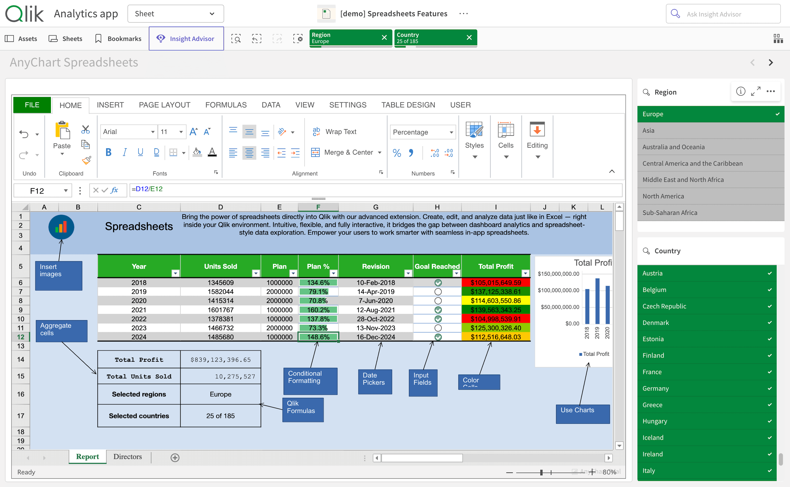
- Spreadsheets for Qlik — The Excel-style spreadsheet extension for Qlik Sense that brings a familiar grid, formulas, and spreadsheet workflows into Qlik apps, making it easier to input, calculate, and work with data directly inside analytics.
(First demoed at Qlik Connect 2025.)
Best New Qlik App in 2025
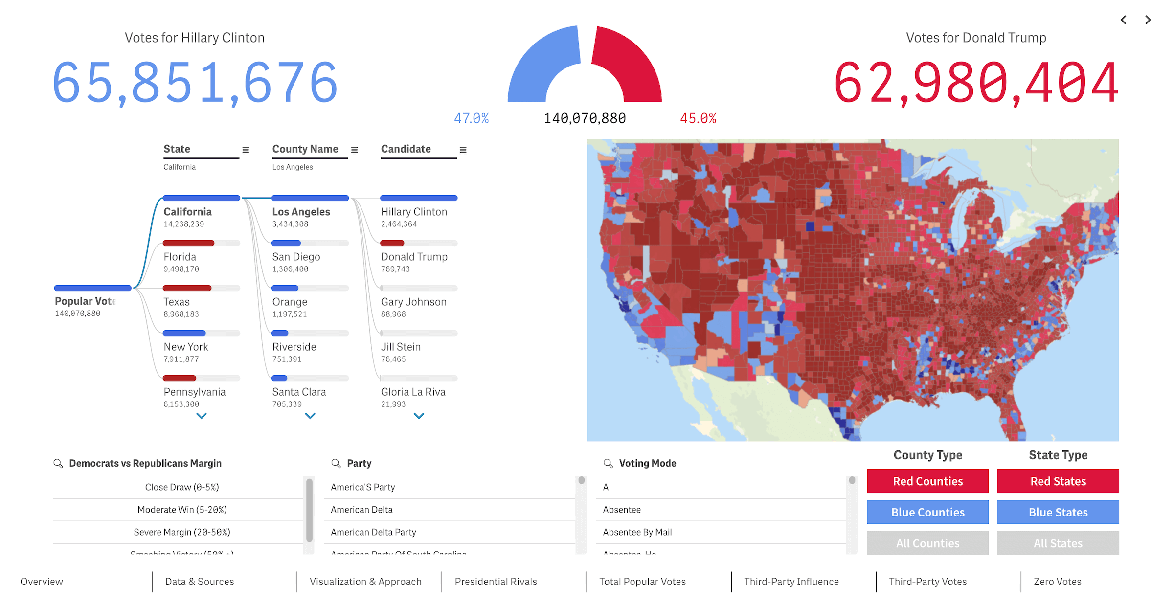
- U.S. Presidential Elections — A Qlik Sense app that visualizes the 2016, 2020, and 2024 U.S. presidential election results in an interactive format, letting viewers explore outcomes and compare patterns across years and geographies. Won the 2025 Qlik Gallery contest.
(Powered by a bunch of AnyChart’s extensions for Qlik Sense.)
Wrapping Up
2025 gave us plenty of memorable charts, maps, and visual reporting, and we are glad to have gathered the year’s best data visualizations for you in one place. We hope these projects give you fresh ideas, whether you build visualizations for work or just enjoy seeing data presented well.
In case you want more, the previous “best of year” collections can be found here: 2024, 2022, 2021, 2020, 2019, 2018.
Follow Data Visualization Weekly for more standout data graphics as we keep exploring what great data visualization can look like in 2026. And have a great new year!
- Categories: Data Visualization Weekly
- No Comments »