
Data visualization weekly recaps became a tradition for our AnyChart Blog some time ago. Good news: we decided to resume it to highlight the best and new practices shared on our Facebook and Twitter accounts within the previous seven days. This means you will always be in the know of what charts, dashboards, maps, infographics, and video animations are trending and worth seeing.
As a matter of fact, data visualization is further evolving and gaining popularity as the best way to convey various information, whether it is in business reporting, analytics solutions, journalism, presentations, etc. That is why we are trying to monitor a lot of different sources and hope to deliver you the best of noteworthy, peculiar projects and practices for inspiration.
Now, let’s proceed to the visualizations that particularly caught our – and our followers’ – eyes during the last seven days, starting from January 27th, 2017. To put it in a nutshell first, the current data visualization weekly recap includes New York trees, Trump’s emotions, ocean salinity, words from Hamilton, US venture industry, and microphone sensitivity polar pattern.
Data Visualization Weekly: January 27, 2017 – February 3, 2017
NYC Trees
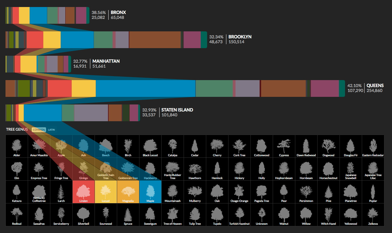
The Interactive Visualization of NYC Street Trees project visually represents the data, provided by NYC Open Data, on the quantity and the variety of tree species across New York City boroughs – Bronx, Brooklyn, Manhattan, Queens, and Staten Island.
Trump Emoto-Coaster
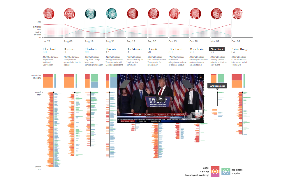
On the Trump Emoto-Coaster is a very interesting visualization of the emotional highs and lows of the new U.S. President, Donald Trump, in ten of his major speeches that took place between July and December last year. Its authors extracted the emotions data from conventional videos with the help of the Microsoft Emotion API, and then visualized it as a pretty nice information graphics project.
Salt Gyre
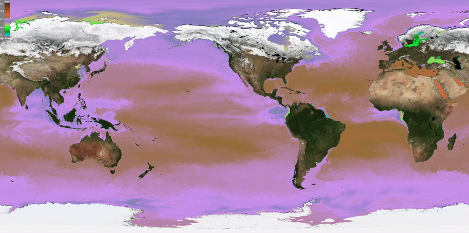
The video animation of A Gyre of Salt: A Climate Model Visualization displays and explains regular changes in ocean temperatures and salinity. It is a good example of how visualizing data helps us perceive and gain insight into even very large amounts of information.
Hamilton Lyrics
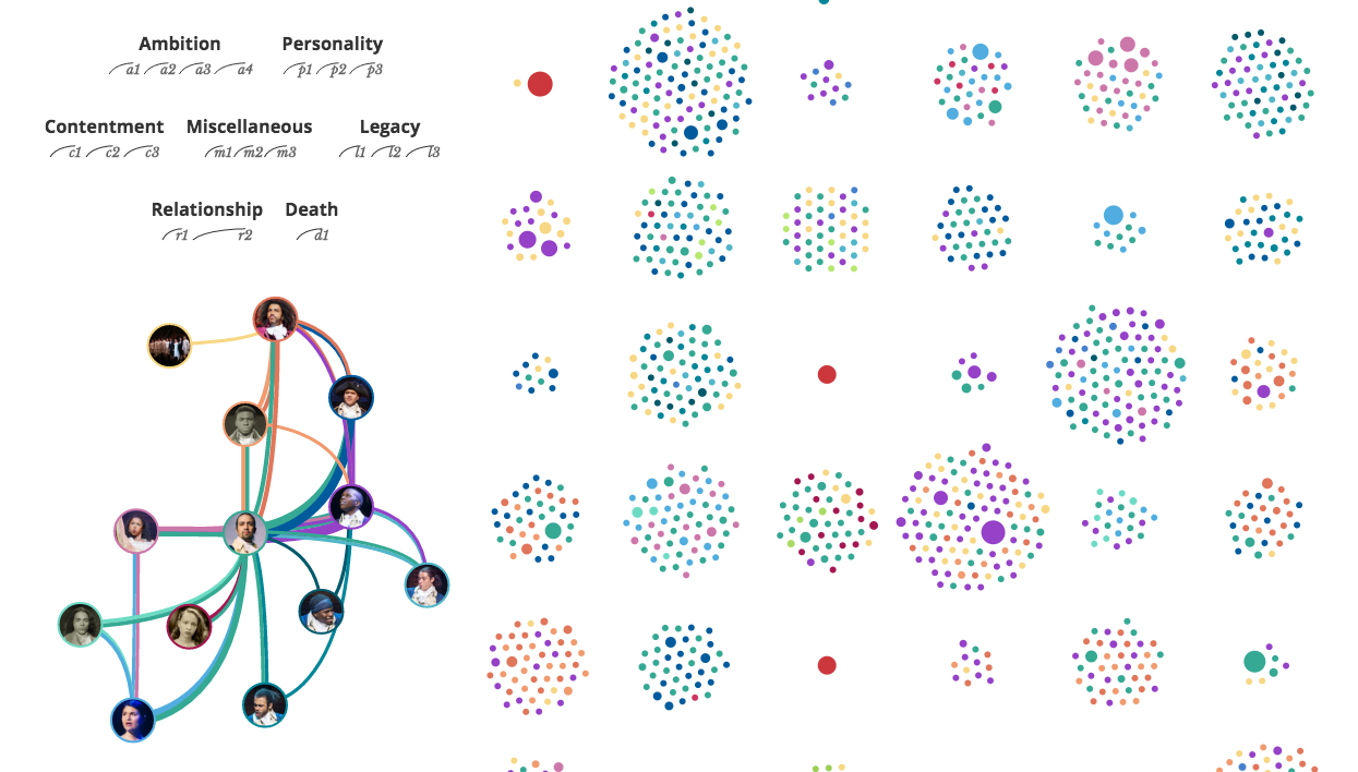
The Interactive Visualization of Every Line in Hamilton is a visual tool and analysis of all the lyrics in Hamilton, an award-winning Broadway musical that has been extremely popular in the United States for the last two years. Check out the project to wonder how all 20,520 words are visualized and what peculiar conclusions can be made.
Venture Industry Trends
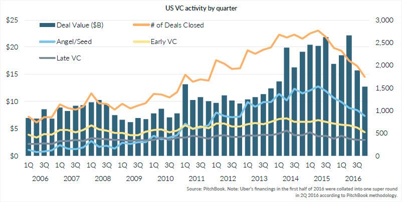
The article of 15 Charts That Illustrate How the US Venture Industry Looked in 2016 highlights the most interesting figures and trends in the US venture capital industry. VC activity, including angel/seed and early/late-stage, venture-backed exits, fundraising, and many other important subjects are illuminated here with the help of multiple charts.
Microphone Sensitivity: Polar Chart
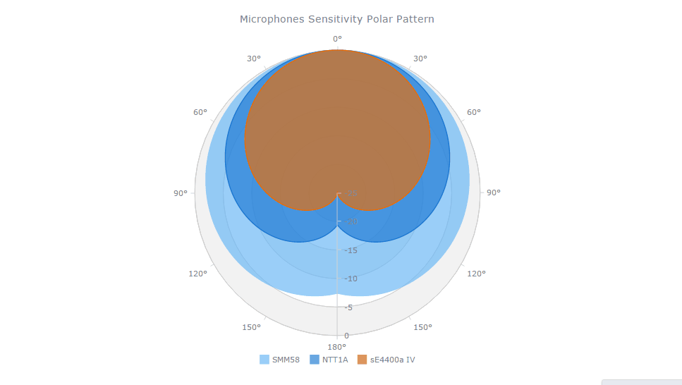
The Microphone Sensitivity Pattern was visualized as a JavaScript (HTML5) based polar chart with the help of the AnyChart JS charting library and is now one of the demos in the AnyChart Gallery. This solution provides a convenient way to compare sensitivity patterns of diverse microphones, and such an interactive legend allows the analyst to easily focus on one element or another.
Stay tuned to our further data visualization weekly posts!
- Categories: Data Visualization Weekly, News
- No Comments »