 All dataviz lovers are welcome to the new issue of Data Visualization Weekly brought to you by AnyChart JS Charts! Today we are publishing the best and new chart, map and infographic examples shared on our Twitter and Facebook accounts during the last seven days.
So, get ready for the best peculiar practices that made the previous week in data visualization special! And now let’s take a look at what dataviz inspirations were most followed.
DataViz of the Week: February 3, 2017 – February 10, 2017
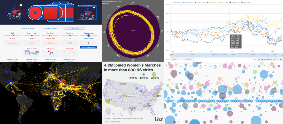
Using DSLR Camera: Visual Tutorial

Photography Mapped is a brilliant visual tutorial on how to use a digital single-lens reflex (DSLR) camera. Light, aperture, shutter, sensor, exposure – just change these settings and see how it influences the quality of a photo. This interactive dataviz is an amazing way to start understanding how your DSLR camera really works and in what way you should adjust everything to get the best, most realistic and beautiful photos.
Global Sea Ice Area Is Shrinking That Fast
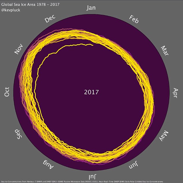
Watch out as the global sea ice is shrinking so fast! The alarming “doom spiral” animation created by Kevin Pluck and featured on Daily Mail displays the real situation in the Arctic and Antarctic. According to the data being visualized, the things were stable for many years, but then the global sea ice area diminished drastically in 2016.
Multiple Data Sets on One Interactive JS Line Chart
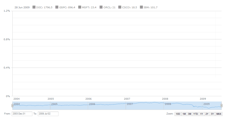
Plotting multiple data sets one a single chart is often a challenge. But here’s a JS multi-series line chart sample shared by AnyChart in its AnyStock JavaScript charting library’s gallery that proves it all can be nice and easy. Check out the dataviz to see how one can beautifully use multi-line JS (HTML5) charts on websites and in web apps and leverage various interactivity features to facilitate the review of several datasets on the same plot. The full source code is available.
World Map of Human Migration Flows
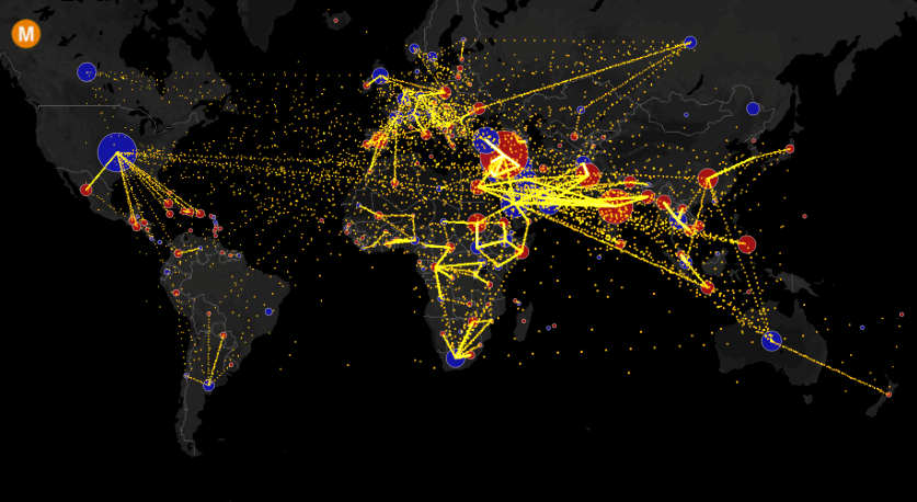
The World Migration Map by Metrocosm displays human migration flows by country of origin and destination. This is an animated interactive visualization of data from the United Nations Population Division (Department of Economic and Social Affairs).
Map of Women’s Marches Across the U.S.

More than 4.2 million people joined the Women’s Marches last week in over 600 cities in the United States of America. That is according the crowd estimate data that was collected by University of Denver’s Erica Chenoweth and University of Connecticut Jeremy Pressman. Political scientists are reported by Vox to say the Women’s Marches may well have been the largest demonstration ever, in the history of the U.S. And Vox greatly displays on a map and explains how widespread and popular it was.
All Active Satellites Orbiting Earth Visualized

The Union of Concerned Scientists collected data about more than 1.3 thousand currently active satellites that are orbiting our planet now, I mean right now! This impressive interactive visualization on Quartz displays all of them, and you can easily find what satellite was launched by what country, at what altitude, who uses it and for what purpose, and so on.
That’s all dataviz for now folks! Please stay tuned in order to not miss our next Data Visualization Weekly issues. And have a jolly good weekend time! 🙂
- Categories: Data Visualization Weekly, News
- No Comments »