 Flow maps are a powerful way to represent the movement of objects between different geographic locations, and with JavaScript, creating an interactive flow map is easier than you might think. Flow maps combine the functionality of a map and a flow diagram; this type of visualization shows the direction of movement of people, goods, money, or information, as well as the quantity of those.
In this step-by-step tutorial, we’ll guide you through the process of creating a JavaScript flow map. To make it more practical, we’ll use the example of visualizing the number of students from India studying abroad in different countries. By following the tutorial, you’ll learn how to create your own flow maps using JavaScript, regardless of the data you choose to use.
So, let’s get started! Follow along with us to learn how to develop your own JS Flow Map.
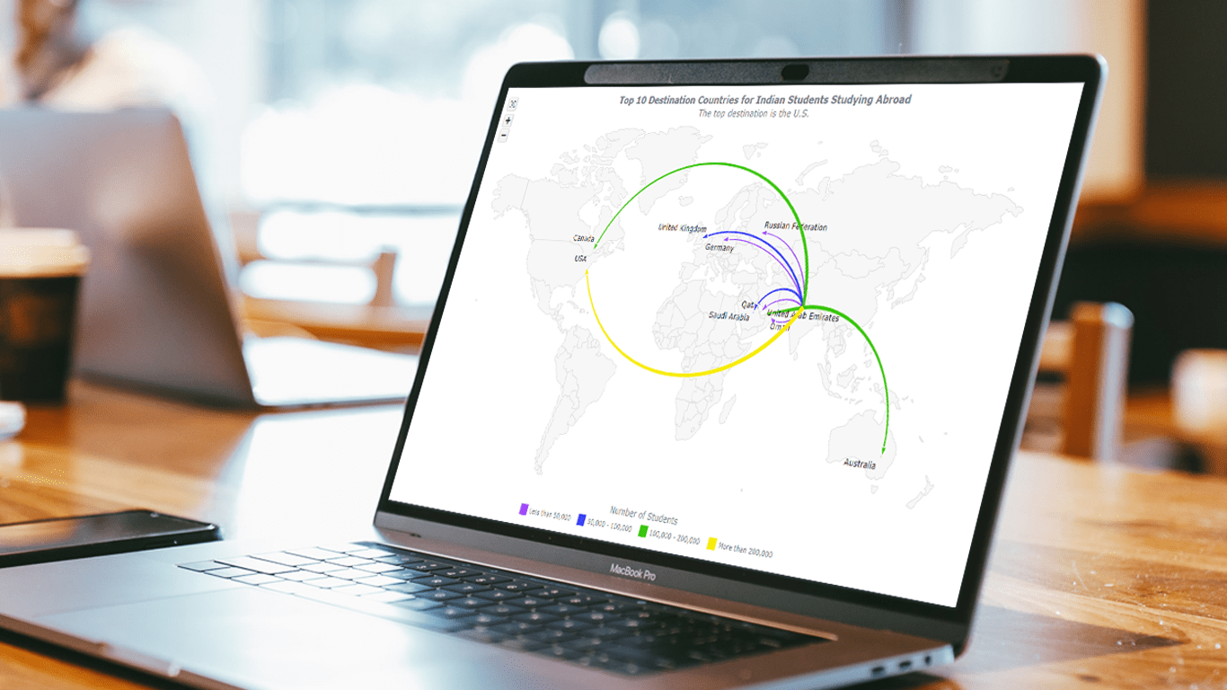
Flow Map Preview
Take a look at what your finished JavaScript flow map will look like once you’ve completed this tutorial. By following the step-by-step instructions, you’ll have the skills to build your own interactive flow maps using JavaScript.
Follow along with me to see how it’s done. I’ll guide you through each step of the process so you can create your own JS-based flow maps with ease.
How to Build Basic Flow Map with JavaScript
Creating a JavaScript-based flow map can be done in four basic steps:
- Create a web page using HTML.
- Include the necessary JavaScript files.
- Add the data.
- Write JavaScript code to draw the chart.
While having a good understanding of HTML, CSS, and JavaScript can be helpful, don’t worry if you’re new to these concepts. In this tutorial, we’ll guide you through each step in detail, and you’ll be able to follow along easily.
1. Create a web page using HTML
To begin, let’s create a basic HTML page, as we need a container to display our flow map. We’ll do this by creating a <div> element and setting its id attribute to “container”. This will allow us to reference the container later when we add the map.
To make sure the flow map is displayed over the entire page, we’ll also set the <div>‘s height and width to 100% using CSS. Feel free to adjust the styling to suit your preferences.
<!DOCTYPE html>
<html lang="en">
  <head>
    <meta charset="utf-8">
    <title>Flow Map</title>
    <style type="text/css">
      html, body, #container {
        width: 100%;
        height: 100%;
        margin: 0;
        padding: 0;
      }
    </style>
  </head>
  <body>
    <div id="container"></div>
  </body>
</html>
2. Include the necessary JavaScript files
Next, we’ll include the necessary scripts in the head section of our HTML file to develop the JS flow map.
Using a JavaScript charting library is the quickest and easiest way to create an interactive JavaScript flow map visualization. However, not all libraries support flow maps. For this tutorial, we’ll be using AnyChart JS Charts, which supports flow maps and is a great choice due to its excellent mapping documentation and numerous ready-to-use map examples.
To build our flow map, we’ll need to add a few AnyChart modules: the Core and Geo Map modules for data visualization, and geodata for the map. The Proj4js library will be used for geographic coordinates, so it is also included. In addition, we’ll need AnyChart’s Common UI module and CSS, for zoom UI controls.
<!DOCTYPE html>
<html lang="en">
  <head>
    <meta charset="utf-8">
    <title>Flow Map</title>
    <script src="https://cdn.anychart.com/releases/8.11.0/js/anychart-core.min.js"></script>
    <script src="https://cdn.anychart.com/releases/8.11.0/js/anychart-map.min.js"></script>
    <script src="https://cdn.anychart.com/releases/8.11.0/geodata/custom/world/world.js"></script>
    <script src="https://cdnjs.cloudflare.com/ajax/libs/proj4js/2.8.0/proj4.js"></script>
    <script src="https://cdn.anychart.com/releases/8.11.0/js/anychart-ui.min.js"></script>
    <link rel="stylesheet" href="https://cdn.anychart.com/releases/8.11.0/css/anychart-ui.min.css">
    <link rel="stylesheet" href="https://cdn.anychart.com/releases/8.11.0/fonts/css/anychart-font.min.css">
    <style type="text/css">
      html, body, #container {
        width: 100%;
        height: 100%;
        margin: 0;
        padding: 0;
      }
    </style>
  </head>
  <body>
    <div id="container"></div>
    <script>
      // The JS flow map code will be written here.
    </script>
  </body>
</html>
3. Add the data
In this JS flow map tutorial, we will be visualizing the Top 10 destination countries for Indian students as of 2022. The data source for this visualization is the Ministry of External Affairs, India, which provides information on the number of Indian students studying abroad.
To filter out the top 10 countries, I have analyzed the data and selected the following countries based on the number of Indian students studying there: Australia, Canada, Germany, Oman, Qatar, the Russian Federation, Saudi Arabia, the United Arab Emirates, the United Kingdom, and the United States.
To create the flow map, we will be using the capital cities of these countries as the ending points of the connectors, while the starting point for all connectors will be New Delhi, India. To determine the latitude and longitude of the capital cities, I used the website LatLong.net. The table below shows the list of the selected countries, along with the total number of Indian students studying there and the coordinates of their respective capital cities.
| Country | Number of Indian students | Latitude and longitude of the capital city |
|---|---|---|
| Australia | 100009 | -30.59, 145.94 |
| Canada | 183310 | 45.41, -75.69 |
| Germany | 34864 | 52.51, 13.40 |
| Oman | 39550 | 23.58, 58.38 |
| Qatar | 46000 | 25.28, 51.53 |
| Russian Federation | 18039 | 55.74, 37.62 |
| Saudi Arabia | 65800 | 24.71, 46.67 |
| United Arab Emirates | 164000 | 24.45, 54.37 |
| United Kingdom | 55465 | 52.66, -0.95 |
| United States | 465791 | 38.88, -77.03 |
Below is the dataset that we will use to build our flow map. It is an array of objects, where each object represents one flow direction. Each object contains the starting point and ending point latitude and longitude, the name of the destination country, and the number of Indian students studying there according to India’s MEA.
var data = [
  { points: [28.610198, 77.207584, -30.59, 145.94], to: "Australia", total: 100009 },
  { points: [28.610198, 77.207584, 45.41, -75.69], to: "Canada", total: 183310 },
  { points: [28.610198, 77.207584, 52.51, 13.40], to: "Germany", total: 34864 },
  { points: [28.610198, 77.207584, 23.58, 58.38], to: "Oman", total: 39550 },
  { points: [28.610198, 77.207584, 25.28, 51.53], to: "Qatar", total: 46000 },
  { points: [28.610198, 77.207584, 55.74, 37.62], to: "Russian Federation", total: 18039 },
  { points: [28.610198, 77.207584, 24.71, 46.67], to: "Saudi Arabia", total: 65800 },
  { points: [28.610198, 77.207584, 24.45, 54.37], to: "United Arab Emirates", total: 164000 },
  { points: [28.610198, 77.207584, 52.66, -0.95], to: "United Kingdom", total: 55465 },
  { points: [28.610198, 77.207584, 38.88, -77.03], to: "United States", total: 465791 }
];
4. Write JavaScript code to draw the map
Now that we have prepared our data, let’s move on to the main part of putting our flow map on our web page.
Before we begin, we need to make sure that our code only runs once the page has fully loaded and is ready. To do this, we will use the anychart.onDocumentReady() function to enclose all our flow map’s JavaScript code.
<script>
  anychart.onDocumentReady(function () {
    // The flow map code will be written here.
  });
</script>
Once that’s done, we can add the data we prepared in the previous step.
anychart.onDocumentReady(function () {
  var data = [
    { points: [28.610198, 77.207584, -30.59, 145.94], to: "Australia", total:    100009 },
    { points: [28.610198, 77.207584, 45.41, -75.69], to: "Canada", total: 183310 },
    { points: [28.610198, 77.207584, 52.51, 13.40], to: "Germany", total: 34864 },
    { points: [28.610198, 77.207584, 23.58, 58.38], to: "Oman", total: 39550 },
    { points: [28.610198, 77.207584, 25.28, 51.53], to: "Qatar", total: 46000 },
    { points: [28.610198, 77.207584, 55.74, 37.62], to: "Russian Federation", total: 18039 },
    { points: [28.610198, 77.207584, 24.71, 46.67], to: "Saudi Arabia", total: 65800 },
    { points: [28.610198, 77.207584, 24.45, 54.37], to: "United Arab Emirates", total: 164000 },
    { points: [28.610198, 77.207584, 52.66, -0.95], to: "United Kingdom", total: 55465 },
    { points: [28.610198, 77.207584, 38.88, -77.03], to: "United States", total: 465791 }
  ];
});
To create our flow map chart, we’ll use the AnyChart connector() function, passing in our data to create the flow map connectors, and including the world map geodata.
var map = anychart.connector();
var connectorSeries = map.connector(data);
map.geoData(anychart.maps.world);
Then, we’ll set the labels and add arrow markers at the end of each flow line.
connectorSeries
  .labels()
  .enabled(true)
  .position('100%')
  .format(function () {
    return this.getData('to')
  });

connectorSeries
  .markers()
  .position('100%')
  .size(12);
Next, let’s add a title for our flow map.
map.title("Top 10 Destination Countries for Indian Students Studying Abroad");Finally, we’ll reference the container ID, place the map in the container element, and display it on the page using the draw() function.
map.container('container');
map.draw();
This should be enough to get our JavaScript-based flow map onto the webpage. However, since we’re working with a world map, it would be helpful to add some zoom controls to allow users to easily zoom in and out.
Believe it or not, it’s actually quite simple! We just need to add three lines of code.
var zoomController = anychart.ui.zoom();
zoomController.target(map);
zoomController.render();
And that’s it! Our basic JavaScript flow map is now ready.
Take a look at the interactive version of this JavaScript flow map and play around with it in the AnyChart Playground. I’ve included the entire code for our basic map below for your convenience.
<!DOCTYPE html>
<html lang="en">
  <head>
    <meta charset="utf-8">
    <title>JavaScript Flow Map</title>
    <script src="https://cdn.anychart.com/releases/8.11.0/js/anychart-core.min.js"></script>
    <script src="https://cdn.anychart.com/releases/8.11.0/js/anychart-map.min.js"></script>
    <script src="https://cdn.anychart.com/releases/8.11.0/geodata/custom/world/world.js"></script>
    <script src="https://cdnjs.cloudflare.com/ajax/libs/proj4js/2.8.0/proj4.js"></script>
    <script src="https://cdn.anychart.com/releases/8.11.0/js/anychart-ui.min.js"></script>
    <link rel="stylesheet" href="https://cdn.anychart.com/releases/8.11.0/css/anychart-ui.min.css">
    <link rel="stylesheet" href="https://cdn.anychart.com/releases/8.11.0/fonts/css/anychart-font.min.css">
    <style type="text/css">
      html, body, #container {
        width: 100%;
        height: 100%;
        margin: 0;
        padding: 0;
      }
    </style>
  </head>
  <body>
    <div id="container"></div>
    <script>
      anychart.onDocumentReady(function () {
        // set data for the destination countries
        var data = [
          { points: [28.610198, 77.207584, -30.592659, 145.943667], to: "Australia", total: 100009 },
          { points: [28.610198, 77.207584, 45.411673, -75.69629], to: "Canada", total: 183310 },
          { points: [28.610198, 77.207584, 52.511693, 13.403121], to: "Germany", total: 34864 },
          { points: [28.610198, 77.207584, 23.5880, 58.3829], to: "Oman", total: 39550 },
          { points: [28.610198, 77.207584, 25.2854, 51.5310], to: "Qatar", total: 46000 },
          { points: [28.610198, 77.207584, 55.747362, 37.621273], to: "Russian Federation", total: 18039 },
          { points: [28.610198, 77.207584, 24.710437, 46.675164], to: "Saudi Arabia", total: 65800 },
          { points: [28.610198, 77.207584, 24.4539, 54.3773], to: "United Arab Emirates", total: 164000 },
          { points: [28.610198, 77.207584, 52.667078, -0.955920], to: "United Kingdom", total: 55465 },
          { points: [28.610198, 77.207584, 38.884053, -77.033513], to: "United States", total: 465791 },
        ]
        // create a connector map chart
        var map = anychart.connector();
        // include the world map geodata
        map.geoData(anychart.maps.world);
        // create onnector lines
        var connectorSeries = map.connector(data);
        // set labels for the connector lines
        connectorSeries
          .labels()
          .enabled(true)
          .position('100%')
          .format(function () {
            return this.getData('to')
          });
        // set arrow markers at the line end
        connectorSeries
          .markers()
          .position('100%')
          .size(12);
        // set zoom controls
        var zoomController = anychart.ui.zoom();
        zoomController.target(map);
        zoomController.render();
        // set the map title
        map.title('Top 10 Destination Countries for Indian Students Studying Abroad');
        // set the container
        map.container('container');
        // draw the map
        map.draw();
      });
    </script>
  </body>
</html>
How to Customize JS Flow Map
Great job! It’s true that creating a basic interactive JavaScript flow map can be quite straightforward. Now, let’s move on to the next steps to enhance and personalize our flow map to make it more visually appealing and informative.
In the upcoming steps, we will be making some quick and simple modifications to the code to add more features and customization options to the flow map. By doing so, we can engage our users more effectively and convey information more efficiently.
So, let’s get started and take our JS flow map to the next level!
A. Improve the curvature and label positions
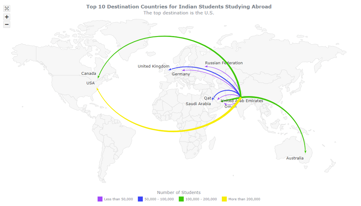
In our flow map, the studying patterns of Indian students in 10 different countries are represented by connector lines. However, with our data, the default settings cause overlapping of lines and some country names are hidden until zoomed in.
To improve this, we can modify our dataset by adding a new property called “curvature” to adjust the curvature of individual connectors. Additionally, we can add the “label” property and set its values to display the labels at desired positions.
var data = [
  { points: [28.610198, 77.207584, -30.592659, 145.943667], to: "Australia", total: 100009, curvature: 0.5 },
  { points: [28.610198, 77.207584, 45.411673, -75.69629], to: "Canada", total: 183310, curvature: 0.8, label: { offsetY: -30 } },
  { points: [28.610198, 77.207584, 52.511693, 13.403121], to: "Germany", total: 34864, curvature: 0.3, label: { anchor: 'center-top', offsetY: -2 } },
  { points: [28.610198, 77.207584, 23.5880, 58.3829], to: "Oman", total: 39550, curvature: -0.5, label: { anchor: 'left-top' } },
  { points: [28.610198, 77.207584, 25.2854, 51.5310], to: "Qatar", total: 46000, curvature: 0.4, label: { anchor: 'right-top', offsetY: -20 } },
  { points: [28.610198, 77.207584, 55.747362, 37.621273], to: "Russian Federation", total: 18039, curvature: 0.4, label: { anchor: 'left-bottom' } },
  { points: [28.610198, 77.207584, 24.710437, 46.675164], to: "Saudi Arabia", total: 65800, curvature: 0.7, label: { offsetY: -5 } },
  { points: [28.610198, 77.207584, 24.4539, 54.3773], to: "United Arab Emirates", total: 164000, curvature: 0, label: { anchor: 'left-top', offsetY: -15 } },
  { points: [28.610198, 77.207584, 52.667078, -0.955920], to: "United Kingdom", total: 55465, curvature: 0.4, label: { anchor: 'right-top', offsetY: -25, offsetX: -10 } },
  { points: [28.610198, 77.207584, 38.884053, -77.033513], to: "USA", total: 465791, curvature: -0.6 },
];
By doing this, we can display the labels even if there is an overlap. It can be achieved with a single line of code.
map.overlapMode("allow-overlap");
B. Enhance the tooltip
The current interactive flow map tooltip displays latitude and longitude, which is not very meaningful. To enhance the tooltip, we can display more relevant information.
One way to do this is by displaying the destination country name and the total number of students in the tooltip. This way, users can easily understand the information displayed and make better sense of the flow map.
connectorSeries
  .tooltip()
  .useHtml(true)
  .format(function () {
    return (
      '<h5 style="font-size:12px; font-weight:400; margin: 0.25rem 0;">To:<b> ' + this.getData('to') + '</b></h5>' +
      '<h5 style="font-size:12px; font-weight:400; margin: 0.25rem 0;">Total Students: <b>' + this.getData('total').toLocaleString() + '</b></h5>'
    );
  });
C. Improve the title
To make our JS flow map’s title more visually appealing, we can use HTML-based styling to make it stand out. This will help draw attention to the title and make it more noticeable to viewers.
map.title()
  .enabled(true)
  .useHtml(true)
  .text(
    '<span style="font-size:15px;font-weight:600;">Top 10 Destination Countries for Indian Students Studying Abroad</span><br/>' +
    '<span style="font-size: 14px;">The top destination is the U.S.</span>'
  );
D. Choose colors for the connectors and markers
To make some aesthetic changes, we can replace the default color of the connectors with a gradient color that fades from red to yellow.
We can modify the Javascrit flow mapping code where we created the series connector and use the fill() and stroke() functions to apply the gradient color.
var connectorSeries = map.connector(data)
  .fill(['#e8dd09', 'red'])
  .stroke(['#e8dd09', 'red']);
connectorSeries
  .hovered()
  .stroke('#808080')
  .fill('#808080');
connectorSeries
  .hovered()
  .markers()
  .stroke('#808080')
  .fill('#808080');
With this change, the flow map will appear more visually appealing and engaging. However, if you prefer different colors, you can experiment and try out various color combinations.
E. Change the color and thickness of connectors based on data
In our final customization step, we will make the connectors more interesting by changing their color and thickness based on the number of students, and add a legend for better understanding.
To achieve this, we first group the countries into four categories based on the total number of students.
- Less than 50,000
- Between 50,000 and 100,000
- Between 100,000 and 200,000
- More than 200,000
And we create a filter_function() to help filter the data according to these categories.
function filter_function(val1, val2) {
  if (val2)
    return function (fieldVal) {
      return val1 <= fieldVal && fieldVal < val2;
    };
    else
      return function (fieldVal) {
        return val1 <= fieldVal;
      };
}
Next, we create createSeries(), a function that takes in datasets and configurations and creates connectors based on the settings provided.
function createSeries(data, name, color, size) {

  // create the connector lines
  var connectorSeries = map.connector(data)
    .name(name)
    .fill(color)
    .stroke(color)
    .color(color);
  connectorSeries
    .hovered()
    .stroke('#808080')
    .fill('#808080');
  connectorSeries
    .hovered()
    .markers()
    .stroke('#808080')
    .fill('#808080');

  // set labels for the lines
  connectorSeries
    .labels()
    .enabled(true)
    .position('100%')
    .fontColor('#2D2D2D')
    .format(function () {
      return this.getData('to')
    });

  // set arrow markers at the line end
  connectorSeries
    .markers()
    .position('100%')
    .size(12);

  // configure the tooltip setting for the series
  connectorSeries
    .tooltip()
    .useHtml(true)
    .format(function () {
      return (
        '<h5 style="font-size:12px; font-weight:400; margin: 0.25rem 0;">To:<b> ' + this.getData('to') + '</b></h5>' +
        '<h5 style="font-size:12px; font-weight:400; margin: 0.25rem 0;">Total Students: <b>' + this.getData('total').toLocaleString() + '</b></h5>'
      );
    });

  // set the thickness of the connector line based on the number of students
  connectorSeries
     .startSize(size[0])
     .endSize(size[1]);
}
We also create a dataset from our data.
var dataSet = anychart.data.set(data).mapAs();And we filter it using the filter_function() and pass it to the createSeries() function to create our series.
createSeries(dataSet.filter('total', filter_function(0, 50000)), 'Less than 50,000', '#A149FA', [1, 0]);

createSeries(dataSet.filter('total', filter_function(50000, 100000)), '50,000 - 100,000', '#3B44F6', [2, 1]);

createSeries(dataSet.filter('total', filter_function(100000, 200000)), '100,000 - 200,000', '#3EC70B', [4, 1]);

createSeries(dataSet.filter('total', filter_function(200000, 500000)), 'More than 200,000', '#F7EC09', [6, 1]);
Lastly, we add legends for our flow map to help users understand the colors and thickness of the connectors.
map.legend().enabled(true).position('bottom').padding([20, 0, 0, 0]).fontSize(10);

map.legend().title().enabled(true).text('Number of Students').fontSize(13).padding([0, 0, 5, 0]);
And, we have reached our destination. To build this amazing, interactive, JavaScript-based flow map.
As a result, we can see that the colors and thickness of the connectors vary based on the number of students. The final interactive version of this JavaScript flow map can be explored in the AnyChart Playground. You can also make further changes to the code and experiment with it.
The full map code is available below:
<!DOCTYPE html>
<html lang="en">
  <head>
    <meta charset="utf-8">
    <title>JavaScript Flow Map</title>
    <script src="https://cdn.anychart.com/releases/8.11.0/js/anychart-core.min.js"></script>
    <script src="https://cdn.anychart.com/releases/8.11.0/js/anychart-map.min.js"></script>
    <script src="https://cdn.anychart.com/releases/8.11.0/geodata/custom/world/world.js"></script>
    <script src="https://cdnjs.cloudflare.com/ajax/libs/proj4js/2.8.0/proj4.js"></script>
    <script src="https://cdn.anychart.com/releases/8.11.0/js/anychart-ui.min.js"></script>
    <link rel="stylesheet" href="https://cdn.anychart.com/releases/8.11.0/css/anychart-ui.min.css">
    <link rel="stylesheet" href="https://cdn.anychart.com/releases/8.11.0/fonts/css/anychart-font.min.css">
    <style type="text/css">
      html, body, #container {
        width: 100%;
        height: 100%;
        margin: 0;
        padding: 0;
      }
    </style>
  </head>
  <body>
    <div id="container"></div>
    <script>
anychart.onDocumentReady(function () {
  // set data for the destination countries
  var data = [
    { points: [28.610198, 77.207584, -30.592659, 145.943667], to: "Australia", total: 100009, curvature: 0.5 },
    { points: [28.610198, 77.207584, 45.411673, -75.69629], to: "Canada", total: 183310, curvature: 0.8, label: {offsetY: -30} },
    { points: [28.610198, 77.207584, 52.511693, 13.403121], to: "Germany", total: 34864, curvature: 0.3, label: {anchor: 'center-top', offsetY: -2} },
    { points: [28.610198, 77.207584, 23.5880, 58.3829], to: "Oman", total: 39550, curvature: -0.5, label: {anchor: 'left-top'} },
    { points: [28.610198, 77.207584, 25.2854, 51.5310], to: "Qatar", total: 46000, curvature: 0.4, label: {anchor: 'right-top', offsetY: -20} },
    { points: [28.610198, 77.207584, 55.747362, 37.621273], to: "Russian Federation", total: 18039, curvature: 0.4, label: {anchor: 'left-bottom'} },
    { points: [28.610198, 77.207584, 24.710437, 46.675164], to: "Saudi Arabia", total: 65800, curvature: 0.7, label: {offsetY: -5} },
    { points: [28.610198, 77.207584, 24.4539, 54.3773], to: "United Arab Emirates", total: 164000, curvature: 0, label: {anchor: 'left-top', offsetY: -15} },
    { points: [28.610198, 77.207584, 52.667078, -0.955920], to: "United Kingdom", total: 55465, curvature: 0.4, label: {anchor: 'right-top', offsetY: -25, offsetX: -10} },
    { points: [28.610198, 77.207584, 38.884053, -77.033513], to: "USA", total: 465791, curvature: -0.6 },
  ]
  // create map chart
  var map = anychart.connector();
  // create a dataset from the data
  var dataSet = anychart.data.set(data).mapAs();
  // include the world map geodata
  map.geoData(anychart.maps.world);
  // create 4 series, filtering the data by the number of students
  createSeries(dataSet.filter('total', filter_function(0, 50000)), 'Less than 50,000', '#A149FA', [1, 0]);
  createSeries(dataSet.filter('total', filter_function(50000, 100000)), '50,000 - 100,000', '#3B44F6', [2, 1]);
  createSeries(dataSet.filter('total', filter_function(100000, 200000)), '100,000 - 200,000', '#3EC70B', [4, 1]);
  createSeries(dataSet.filter('total', filter_function(200000, 500000)), 'More than 200,000', '#F7EC09', [6, 1]);
  // function to create and configure the series
  function createSeries(data, name, color, size) {
    // create the connector lines
    var connectorSeries = map.connector(data)
      .name(name)
      .fill(color)
      .stroke(color)
      .color(color);
    connectorSeries
      .hovered()
      .stroke('#808080')
      .fill('#808080');
    connectorSeries
      .hovered()
      .markers()
      .stroke('#808080')
      .fill('#808080');
    // set labels for the lines
    connectorSeries
      .labels()
      .enabled(true)
      .position('100%')
      .fontColor('#2D2D2D')
      .format(function () {
        return this.getData('to')
      });
    // set arrow markers at the line end
    connectorSeries
      .markers()
      .position('100%')
      .size(12);
    // configure the tooltip setting for the series
    connectorSeries
      .tooltip()
      .useHtml(true)
      .format(function () {
        return (
          '<h5 style="font-size:12px; font-weight:400; margin: 0.25rem 0;">To:<b> ' + this.getData('to') + '</b></h5>' +
          '<h5 style="font-size:12px; font-weight:400; margin: 0.25rem 0;">Total Students: <b>' + this.getData('total').toLocaleString() + '</b></h5>'
          );
      });
    // set the thickness of the connector line based on the number of students
    connectorSeries
      .startSize(size[0])
      .endSize(size[1]);
  }
  // set zoom controls
  var zoomController = anychart.ui.zoom();
  zoomController.target(map);
  zoomController.render();
  // display all labels even if there is an overlap
  map.overlapMode("allow-overlap");
  // set the map chart title
  map.title()
    .enabled(true)
    .useHtml(true)
    .text(
      '<span style="font-size:15px;font-weight:600;">Top 10 Destination Countries for Indian Students Studying Abroad</span><br/>' +
      '<span style="font-size: 14px;">The top destination is the U.S.</span>'
    );
  // turn on the legend
  map.legend().enabled(true).position('bottom').padding([20, 0, 0, 0]).fontSize(10);
  map.legend().title().enabled(true).text('Number of Students').fontSize(13).padding([0, 0, 5, 0]);
  // set the container
  map.container('container');
  // draw the map
  map.draw();
});
// data filtering function
function filter_function(val1, val2) {
  if (val2)
    return function (fieldVal) {
      return val1 <= fieldVal && fieldVal < val2;
    };
  else
    return function (fieldVal) {
      return val1 <= fieldVal;
    };
}
    </script>
  </body>
</html>
Conclusion
Creating flow maps with JavaScript is a fun and easy process. I encourage you to explore other connector and flow map examples to gain inspiration for your own map.
If you have any queries or encounter any issues, don’t hesitate to ask for help right here in the comments.
Good luck and have fun building your own JavaScript flow map!
AnyChart thanks Awan Sretha for this amazing original Flow Map tutorial!
Don’t miss more JavaScript charting tutorials on our blog!
Do you want to write an awesome guest post? Let us know!
- Categories: AnyChart Charting Component, AnyMap, HTML5, JavaScript, JavaScript Chart Tutorials, Tips and Tricks
- No Comments »