 A new collection of fresh data visualization pieces that we’ve found out there on the Web just recently is already here! Check out the new DataViz Weekly post on our blog, putting a spotlight on some cool charts about the following:
- income mobility of different groups;
- job options by age;
- drinking habits in the UK;
- personal preferences of Republicans and Democrats.
Data Visualization Weekly: March 23, 2018 – March 30, 2018
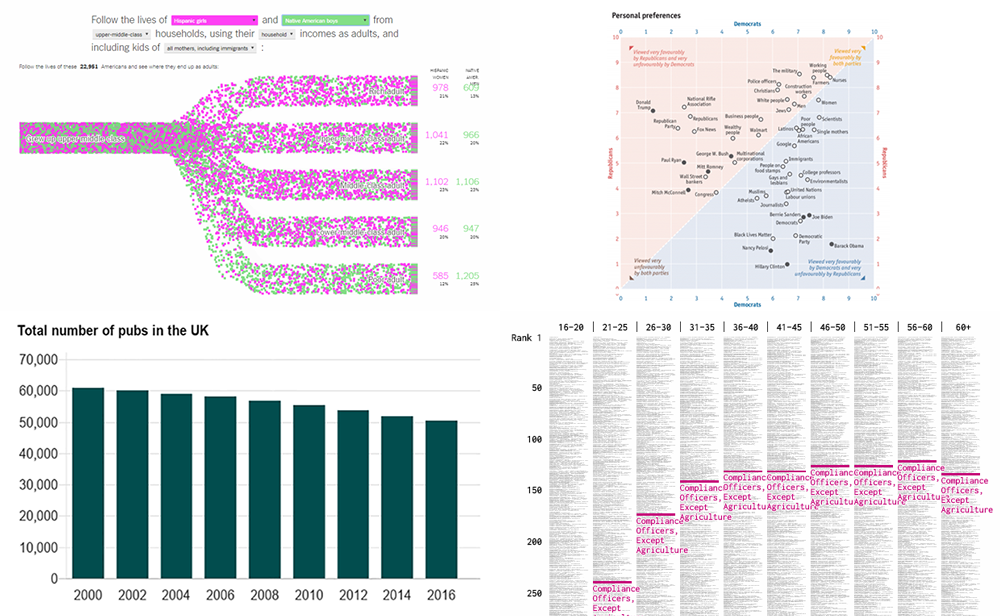
From Childhood to Adulthood: Income Mobility Charts for Different Groups
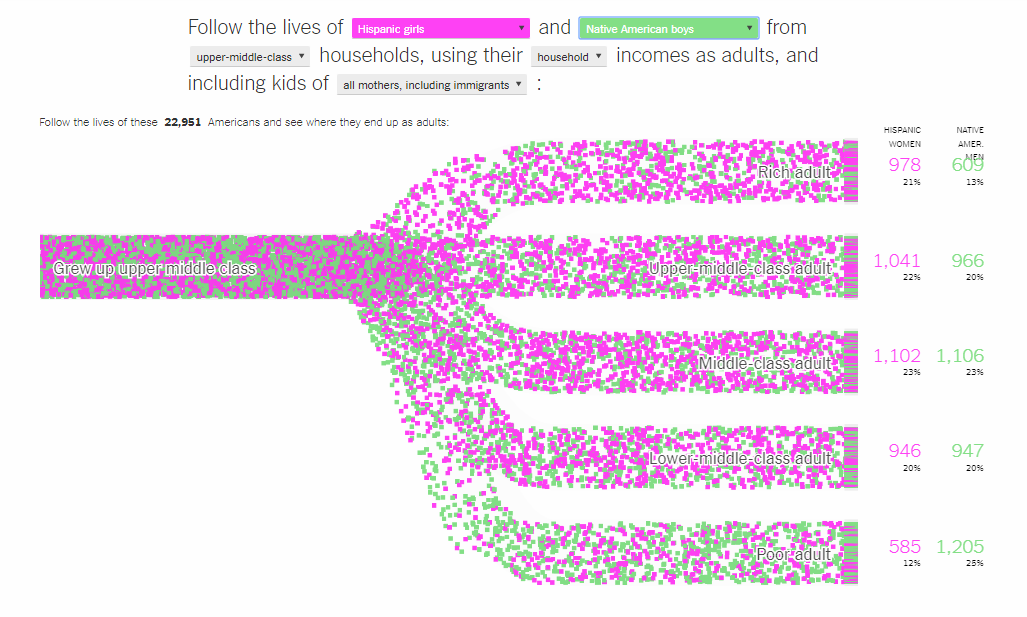
One of the data visualization pieces highlighted in our previous DataViz Weekly article was The Upshot’s work revealing that black boys raised in wealthy families usually lose in income after becoming adults. After that, another data study on the subject of the income mobility was made, now more comprehensive. Take a look at more charts or build your own animation to see what happens in the adulthood with the wealth of both boys and girls with different race and family origins.
Job Options and Most Common Occupations by Age

As we all get older, our skills change based on education and experience we earn. In fact, that’s a continuous process. So it is no surprise that job options available to us also change. Check out an awesome research of Nathan Yau and learn what occupations are more (or less) common for different age groups.
Charts Showing How British People Drink
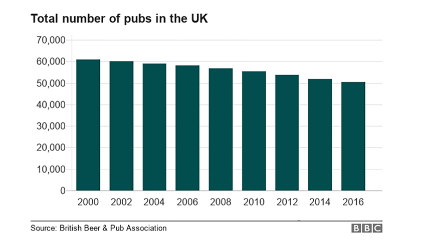
BBC says that pubs in the UK are in danger, and shares six interesting charts showing how British drink and how their drinking habits are changing.
Comparing Personal Preferences of Republicans and Democrats
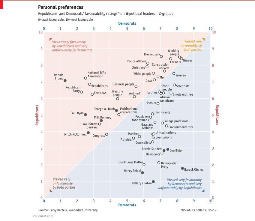
Larry Bartels from the Department of Political Science of the Vanderbilt University published a new working paper in which he looked into the contemporary partisan landscape in the United States. In particular, relying on YouGov surveys, he compared the current views of Democrats and Republicans on political leaders and groups, and found out that, for example, members of both parties do not like the US Congress to a pretty similar extent. This is the point what The Economist paid a special attention to and published Bartel’s chart “Republicans’ and Democrats’ Ratings of Political Leaders and Groups” re-designed. You can learn more from the original paper with several more charts on the subject.
***
Enjoy these visualizations! In addition, in case you missed it, check out what new cool features we’ve added to our JavaScript (HTML5) charting libraries with the AnyChart 8.2.0 update released earlier this week.
- Categories: Data Visualization Weekly
- No Comments »