 Hey chart lovers, check out a new portion of cool data visualizations! We have come across these fresh projects just about now and are glad to feature them in DataViz Weekly:
- Hours worked vs happiness — Visual Capitalist
- Mike Bloomberg’s advertising budget — The Washington Post
- Pesticide sales of global agrochemical giants — Unearthed
- Covid 2019 spread in comparison with other epidemics — London School of Hygiene & Tropical Medicine
Data Visualization Weekly: February 14, 2020 — February 21, 2020
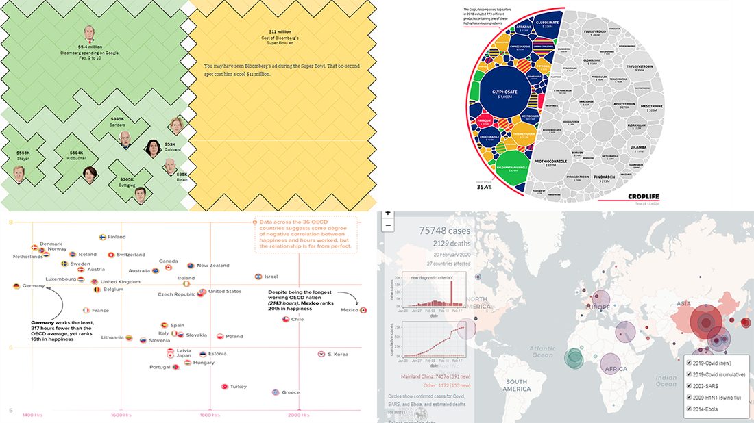
Hours Worked Vs Happiness
Visual Capitalist wondered if working less can make people happier or not. To find out, they charted data about the average hours worked per person in OECD member countries along with the happiness scores of these countries from the World Happiness Report 2019.
The resulting visualization shows there is some degree of correlation between how much people work and how happy they are. So, if you have ever been in doubt about that, a shorter workweek can actually bring greater happiness. Statistically. Check out the chart to see the details.
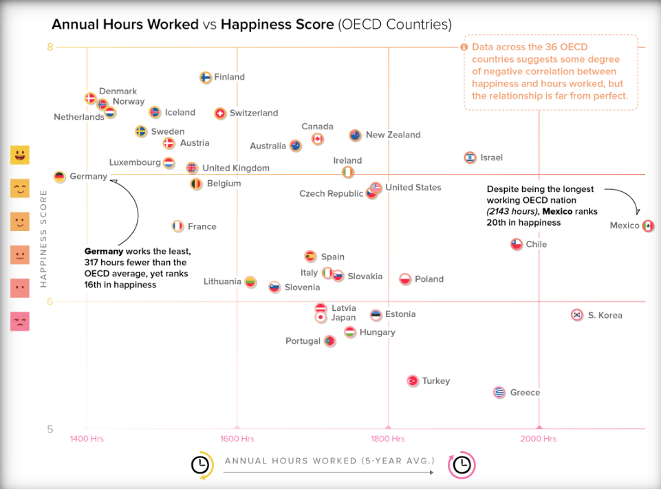
Mike Bloomberg’s Advertising Budget
Search results and social media are quite flooded with Mike Bloomberg’s advertising. Google and Facebook are reported to have served up 2 billion of his ads this year, working out 30 thousand per minute. It’s already a whole lot of money as you can imagine. However, digital platforms are only a part of the billionaire’s self-funded presidential campaign ad budget. Add television and spending figures become especially staggering.
The Washington Post provided context so we could better understand the actual scale of Bloomberg’s advertising budget in a new interesting piece of visual storytelling. Open the article and scroll down to realize how much he spent on television and digital advertising from January 1 to February 14 this year. Each rectangle represents $100,000.
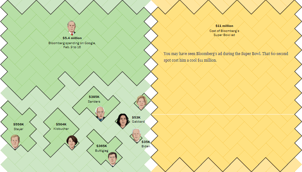
Pesticide Sales of Global Agrochemical Giants
Nadieh Bremer created multiple great-looking data visualizations for a joint investigation by Greenpeace’s journalism project Unearthed and Swiss NGO Public Eye on how pesticide giants make billions on selling substances that pose serious hazards to human health and environment.
According to the findings of the investigation, the world’s five biggest agrochemical companies — members of the CropLife International lobby group — are getting over one-third of their income from leading products selling highly toxic chemicals. See what else is revealed by this large-scale analysis of data about pesticide sales of BASF, Bayer, Corteva, FMC, and Syngenta.
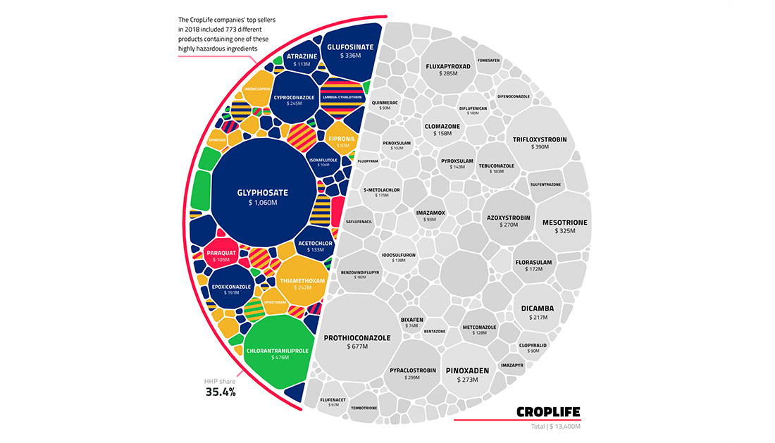
Covid 2019 Tracker
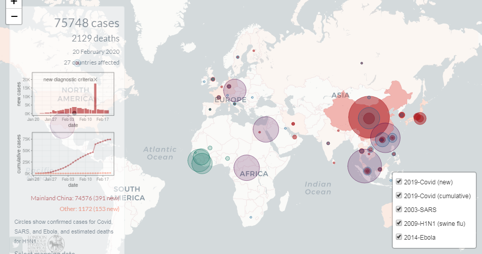
Dr Edward Parker from the London School of Hygiene & Tropical Medicine created a 2019-nCoV (Covid 2019) tracker that allows you not only to monitor how the Wuhan coronavirus spreads but also to compare the situation with previous epidemics. The website is updated on a daily basis using data about the number of confirmed cases as reported by the World Health Organization.
Track the novel coronavirus outbreak and see how it compares with H1N1 (suine flu), Ebola, and SARS.
***
We’ll keep you updated on the most interesting charts and infographics we come across around the web. Stay tuned for Data Visualization Weekly.
- Categories: Data Visualization Weekly
- No Comments »