 Charts are one of the best ways to display your data in a way that’s meaningful to readers, but if you don’t have great chart captions, your readers may interpret that meaningful information incorrectly.
Readers’ attention spans are waning by the second. In fact, humans now have a shorter attention span than goldfish (yes that cute, little fish you won from the carnival can pay attention better than the average person). This means that most people are scanning through your work. Without a clear, concise chart caption, your chances of getting your message across are slim.
Fear not! Here are some tips to help you come up with excellent chart captions, titles for graphs and dashboards.
Summarize Your Data in Plain English
The chart caption is the first thing a user sees when they’re reading your data visualization – so it should be easy to understand. Don’t just use numbers, use words to describe those numbers.
For example, the chart below is a nice-looking interactive combination of marker and line charts. But it definitely lacks reference for the left and bottom figures, not to mention what it’s all about. For example, we’re not sure what the “40,” “50,” and “60” measurements are referring to, and we’re not sure what the “2,” “3,” “4” measurements on the bottom are referring to either.
Instead, make sure you name your graph and add chart captions for any of your figures. The chart below clearly states it tells you about system interruptions as well as exactly which figures stand for waiting time between interruptions and which figures are the interruption duration.
Left Justify Chart Captions Below Figure
Charts are read from the bottom up, so chart captions should be left-justified below the visual representation of your data. Don’t create a chart with the main figures on the right-hand side – it will confuse your readers. Keep key information like the units of measure aligned left or along the bottom. Avoid putting them on the top (reserve that for your graph’s title) and on the right.
The chart above can give you an idea of how it can work in practice.
Keep Chart Captions Simple and Short
If you’re wondering how to make a good title for your graph, the most important thing you should know is to keep it simple. People are scanning your information and you don’t want the reader to have to work hard to understand what you’re trying to say.
For example, if you wanted to make a chart that described what channels had brought you users, there are two ways to go about it, and only one is the most precise. Here are two examples:
- Here’s the Composition of the User Acquisition Pattern Between the Months of January 2016 and December 2016 with Focus on the Share of Display Ads
- User Acquisition by Channel (2016)
The second option provides the same exact data in a much more streamlined, easy-to-read manner. This is the better title for the following pie chart in this case.
Simplify Your Information
Like I stated above, humans really only pay attention to something for a few, about 8 seconds to be precise. This is why your image should immediately be clear and simple to read. Consider the colors, the size of the info, the prominence of certain features. You don’t want users to have to strain their eyes to read your information.
Include Units of Representation
You definitely don’t want users to be confused about what your data means, so you need to have sub captions that clearly describe what you’re trying to say.
For example, If your chart caption is Profits in 2016 (Jan. – Dec.), you need to say exactly how you’re measuring it. This is how your caption should be formatted if you have a column chart like this:
Profits in 2016 (Jan. – Dec.)
In millions (USD)
Here’s a good example:
Don’t Forget Time Period!
You may have a bunch of awesome statistics in your data, but if you don’t have the time period in which your information occurred, then your data isn’t relevant.
You can put the time period anywhere – it can be in a chart caption or sub caption – it just has to be there, like in the example above.
Avoid Using Too Many Articles (Nix Any “A,” “An,” “The” That You Can)
Charts should be simple and precise. You don’t want to have too many wordy articles that muck up your text. For example, here are two titles:
- The Average Revenue per Each of the Days in September 2015
- Daily Revenue (September 2015)
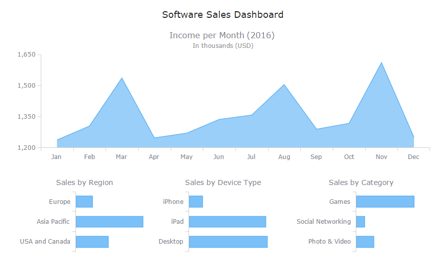
The second option is the better option, cutting out nearly every extra article. Check out the following area chart sample. It’s still completely specific, but no longer difficult to read and understand if you’re skimming.
Skip Out on Adjectives – Your Opinion Doesn’t Matter
If you’re wondering how to name a graph most effectively, consider cutting out adjectives. Adjectives often stem from opinion or an editorialized version of your data. You want your data to be fact with no opinion mixed in whatsoever. To do this – and also have the cleanest copy – cut out adjectives. The less editorialized your captions are, the more credible your chart will seem. For example, here are two titles:
- The Massive Daily Revenue We Pulled in September 2015 – Our Most Amazing Month
- Daily Revenue (September 2015)
If your revenue was massive, it will show in the chart (see the area chart above). Saying so just makes it seem like your data is inaccurate or you’re trying to make it look a certain way without the facts being there. Let your data speak for itself instead.
If You Need to Say “Pictured Above” or “Shown Above”, Reconsider Your Visuals
Visuals should be clean and easy to comprehend. If you find yourself having to describe them with phrases like “pictured above” or “shown below”, your visuals are failing you. Rethink the best way to visualize your chart information until you no longer have to describe where specific information is located.
Conclusion
Great data speaks for itself. Your captioning just complements your already well-researched facts and makes them easier to digest. Keep chart captions simple, keep them concise yet meaningful, and you will never have a problem.