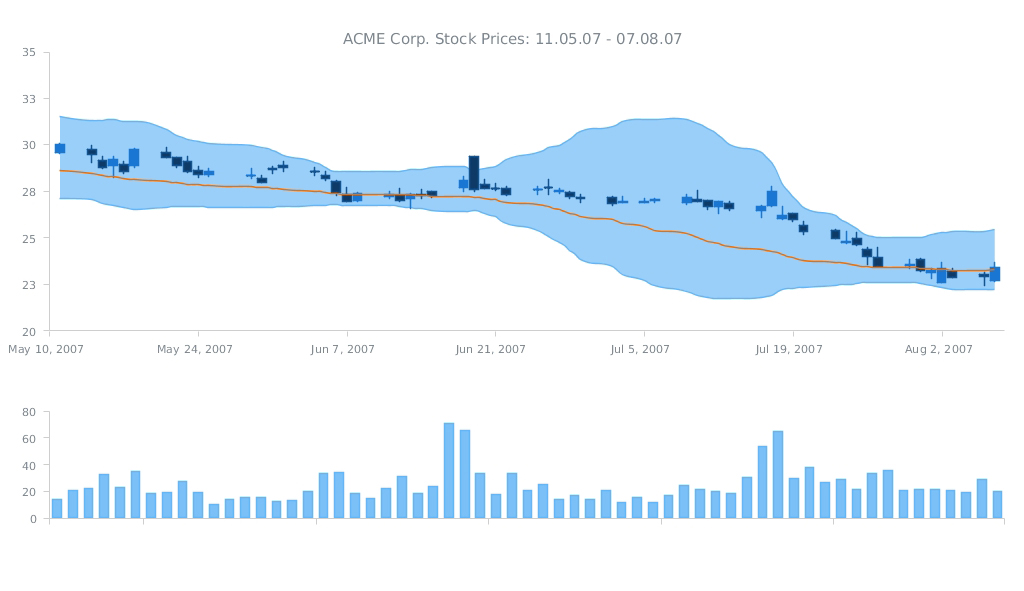
A dashboard is a set of charts, which is usually created when you need to show a lot of different information about one particular subject. It can contain as many charts (of the same type or of different types) as it is necessary.
As you can see from the title of this interactive JS dashboard, it shows information about the stock prices of ACME Corporation for the given period. The dashboard contains two charts: the first one is a combination of three chart types (Japanese Candlestick, Range Area, and Spline) and the second one is a simple Column chart.
The Japanese Candlestick series in the upper chart shows us the open, high, low, and closing prices of ACME Stocks for each trading day within the mentioned period. Each vertical line represents the range between the highest and the lowest prices during the trading period, and the body represents the opening and the closing trades. While in classical Candlesticks the rise and fall of a stock price are coded with a white-colored and a black-colored body, in this dashboard light blue and dark blue colors are used.
Besides the Candlestick series, there are Range Area and Spline series in the first chart. The second chart contains a Column series showing the change in the volume of stocks sold.
As you can see, AnyChart is a powerful and flexible tool, allowing you to create sophisticated data visualizations like this JS dashboard. AnyChart offers a wide range of features and chart types, so you can easily implement any visual solution and communicate your data in the best way possible.
By the way, we have recently updated the roadmaps of AnyChart, AnyStock, and AnyMap. Check out all these great features that are coming soon!
- Categories: AnyChart Charting Component, AnyMap, AnyStock, Dashboards, HTML5, JavaScript
- No Comments »
