Every week, countless data visuals appear across all domains and formats. Every Friday, we curate those we found most interesting, sharing them as examples of data visualization work in practice. Glad to feature today in DataViz Weekly:
- British voter intent by demographic — The Economist
- America’s electrical grid under strain — The New York Times
- Disappearance of iceberg A23a — The European Correspondent
- 2025 year in music — Chartmetric

Data Visualization Weekly: April 24–May 1, 2026
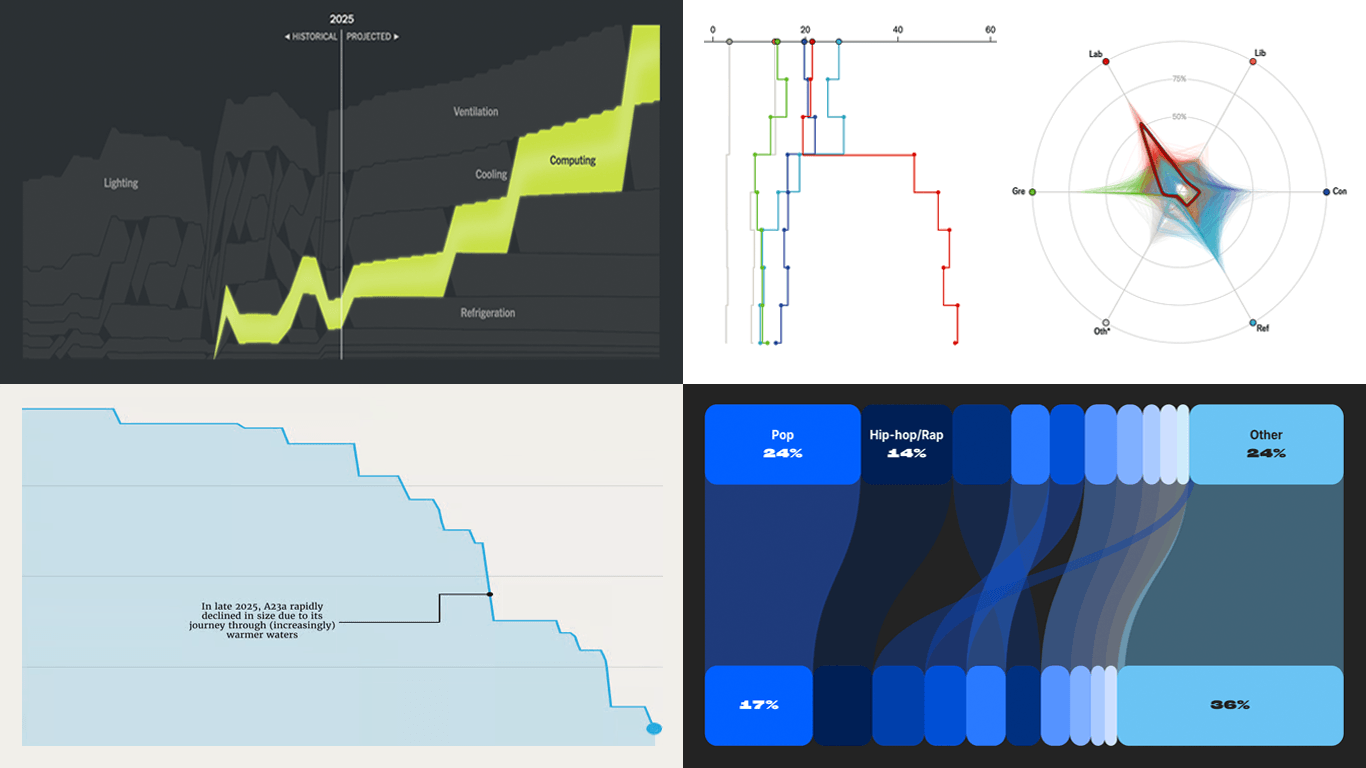
British Voter Intent by Demographic
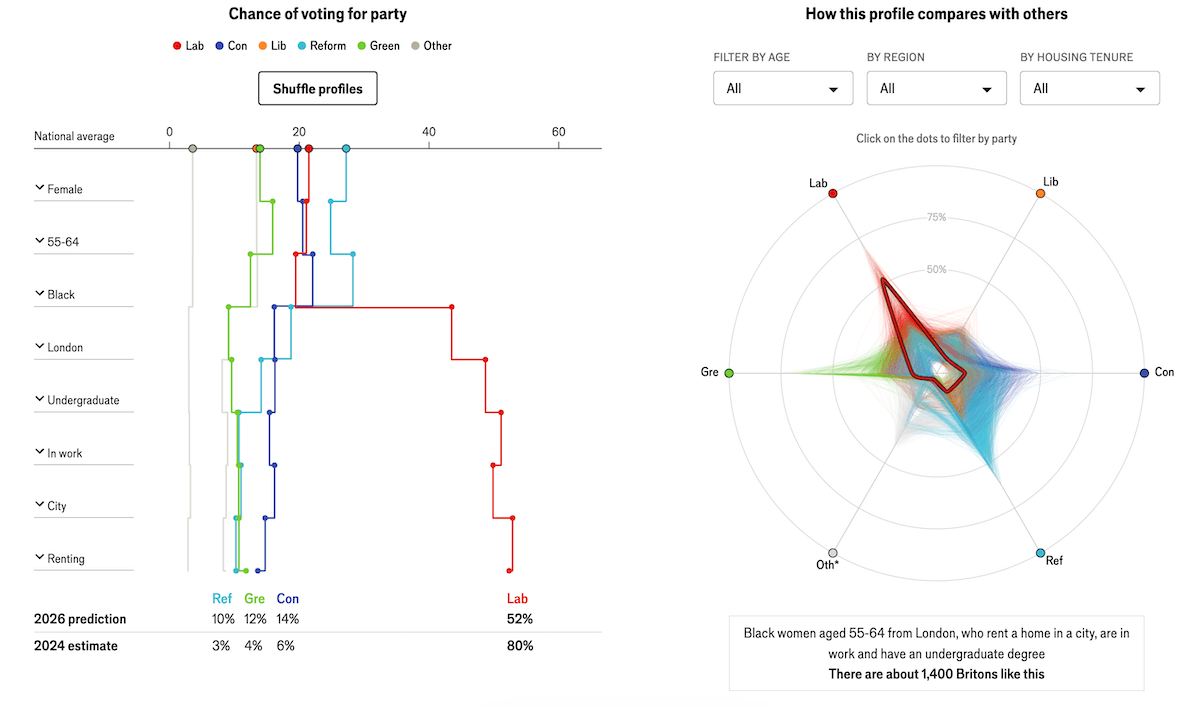
Britain’s two-party political system is fragmenting. Conservatives and Labour have dominated Westminster for a century, but Reform UK and the Green Party are now competing seriously for voters on both flanks.
The Economist built a statistical model of the British electorate based on nearly 40,000 survey responses from More In Common, updated weekly. Users select from eight demographic characteristics: sex, age, ethnicity, region, education, employment, housing tenure, and urban or rural setting. The combinations yield 275,000 possible voter profiles.
The first visual is a vertical stepped line chart. Each demographic selection appears as a row, with color-coded step-lines for Labour, Conservative, Liberal Democrats, Reform UK, Green, and Other showing how that choice pulls each party’s probability away from the national average. Final percentages for the assembled profile appear at the bottom, with 2024 estimates alongside for comparison.
A polar chart with an ordinal scale then plots the profile as a bold outlined polygon on six party-labeled axes. Thousands of faint overlapping shapes fill the same space, representing every other demographic combination in the dataset. Clicking any shape reveals the characteristics behind that profile.See the article on The Economist.
America’s Electrical Grid Under Strain
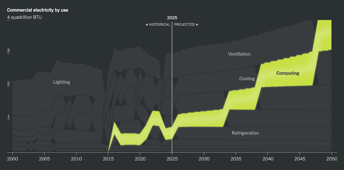
The United States electrical grid was built more than a century ago and has seen limited fundamental upgrades since. Electricity prices have risen sharply in recent years while demand, flat for over a decade, is growing again.
Robinson Meyer’s opinion essay in The New York Times opens with a scrollytelling sequence built around a map of U.S. transmission lines. As the narrative advances, planned data center locations appear across the network, showing where new demand is concentrating.
Line charts then trace retail electricity prices by sector from 2000 to 2025, and track changes in electricity sales across residential, commercial, and industrial customers. Two interactive stacked area charts with alluvial effect follow — one for residential consumption, one for commercial. Each tracks how electricity use by activity has shifted over time, with historical data extending into projections through 2050. Hovering highlights any individual use category across the full timeline.
Additional graphics include a dot chart comparing state-level changes in electricity load and price, a stepped line chart of utility spending shifting from generation toward distribution and transmission, and a cartogram mapping natural gas price risk by state.
Check out the essay on The New York Times, by Robinson Meyer and Sara Chodosh.
Disappearance of Iceberg A23a
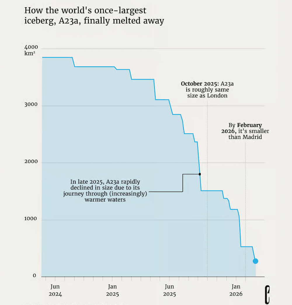
Iceberg A23a broke off from an Antarctic ice shelf 40 years ago as the largest iceberg on record. After remaining grounded for three decades, it began drifting north in 2020 and by early 2026 had broken apart almost entirely.
The European Correspondent tracks A23a’s disintegration through two charts by Meike Eijsberg that together give the iceberg’s size a concrete human scale. The first is a small multiples grid of proportional squares placing A23a’s footprint at two moments — 3,500 km² in January 2025 and 141 km² in March 2026 — alongside the areas of 30 European capital cities, from London down to Brussels.
The second is a stepped area chart tracking A23a’s area month by month from mid-2024 through early 2026. The descent is gradual at first, then near-vertical in late 2025 as the iceberg entered warmer waters, with annotations marking the points where it shrank below the size of London and then Madrid.
Look at the piece on The European Correspondent, by Ida Ovesson and Meike Eijsberg.
2025 Year in Music
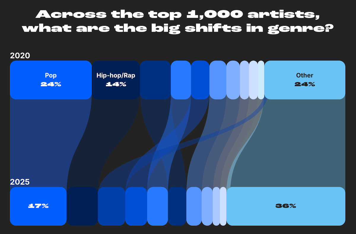
Each year, the global music industry produces millions of new releases and reshapes itself around new platforms, markets, and listening habits. 2025 brought another wave of change.
Chartmetric’s annual Year in Music report, designed by Beyond Words Studio, takes it on across nine themes: top artists and tracks, genres, live events, media syncs, brand affinities, songwriters, streaming, social media, and global trends. The piece is a scroll-driven interactive where each section stands on its own and can be navigated and downloaded independently. A scrollytelling intro animates key platform statistics and a career stage breakdown before handing off to the main report.
The visual range is wide. Across the nine sections, the report draws on circle packing, Sankey diagrams, bubble charts, quadrant charts, Venn diagrams, bar charts, and more to cover a year’s worth of the music industry from every angle.
Explore the full report on Chartmetric, designed by Beyond Words Studio.
Wrapping Up
Voter demographics, power infrastructure, a vanishing iceberg, a year of global music — data is everywhere, and visualization helps us understand it better. Next Friday, DataViz Weekly returns with another selection of charts and maps worth your attention. Stay tuned.
- Categories: Data Visualization Weekly
- No Comments »