 Looking for data visualization done well? You’re in the right place. In DataViz Weekly, we feature recent work that shows how charts and maps can make complex data easier to grasp. This edition’s lineup:
- Gender views in Europe — Teresa Talò
- Freiburg’s urban forest — Stefan Reifenberg
- Road risk across the United States — Mark Sanborn
- Party positions in Baden-Württemberg — DIE ZEIT

Data Visualization Weekly: March 6–13, 2026
Gender Views in Europe

Attitudes toward gender roles still differ widely across Europe. Men and women within the same country do not always see them the same way either.
Teresa Talò shows those differences in two interactive views built from European Values Study 2017 data. The project opens with a choropleth map that colors each country on a scale from more egalitarian to more traditional based on responses to statements about work, family, and the roles of men and women. The default setting combines all seven questions into a single score. A dropdown lets you switch to individual statements and see how the geographic pattern changes.
Further down, a dumbbell chart breaks the comparison down by country. Each row has two dots, one for men and one for women, linked by a line to highlight the distance between them. A dashed vertical line marks the European average. With countries sorted from less traditional to more traditional, the chart works as both a ranking and a compact view of gender gaps across the region.
Look at the project here.
Freiburg’s Urban Forest
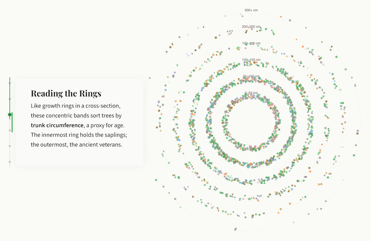
Cities maintain thousands of trees, but those numbers rarely come to life as data. Freiburg im Breisgau, one of the greenest cities in Germany, keeps a public registry of every tree it maintains.
Stefan Reifenberg turned that registry into a scroll-driven visual story. It opens with all 45,005 trees collapsed into a single large circle, then breaks that mass apart into a bubble chart showing the 21 genera, sized by count. The next chart subdivides each genus into individual species, forming a circle packing chart. Hovering reveals names, counts, and average height, trunk, and crown measurements.
The story then shifts to trunk circumference as a proxy for age. A dot plot arranges trees into concentric rings, mirroring the cross-section of a real trunk, with the youngest trees at the center and the oldest at the outer edge. A later view isolates only the trees with the thickest trunks, Freiburg’s oldest specimens. Further sections cover height distribution and a small-multiples panel of radar charts summarizing tree statistics across the city’s 27 districts.
The piece closes with a fully navigable 3D map placing every tree at its real coordinates.
Explore the story here.
Road Risk Across America
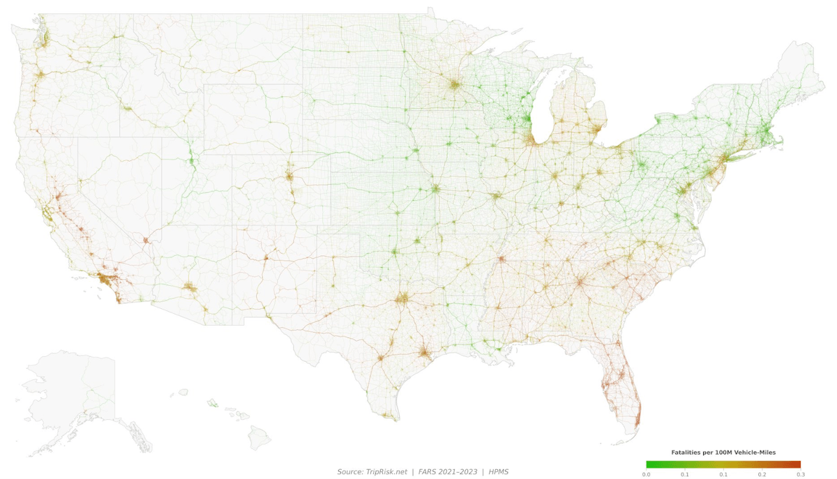
Thousands of people die on American roads every year. The risk is not evenly distributed. It varies by state, road type, speed limit, and metro area.
TripRisk uses federal crash and traffic data to map those differences across 8.7 million U.S. road segments. A dedicated road risk analysis page presents the national picture through a map of road segments colored by fatality rate, a ranked bar chart of all 50 states, a choropleth map of state-level risk, breakdowns by road type and speed limit, and a metro area ranking.
The Road Safety Explorer tool lets you zoom into any part of the country and load the visible road network colored by risk, with crash sites overlaid as point markers. A separate route planner uses those same segment-level scores, along with weather and daylight conditions, to compare fastest and safest routes between addresses.
Check out TripRisk: review the Analysis and try the Explorer and Route Planner tools, by Mark Sanborn.
Party Positions in Baden-Württemberg
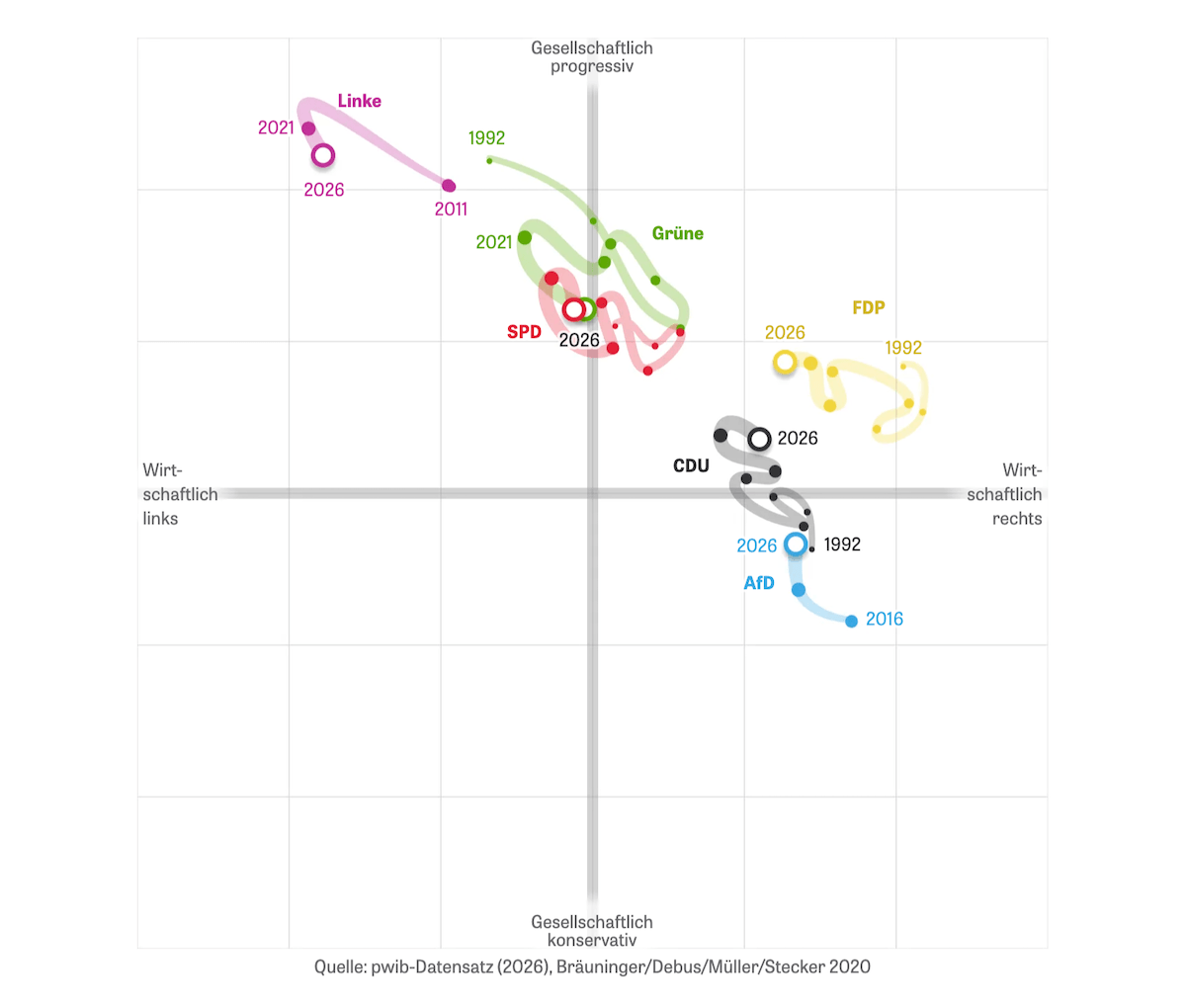
Party positions can shift from one level to another. In Germany, state branches do not always line up with the national party line or with their counterparts in other states.
DIE ZEIT uses a scatter plot to show where the parties in Baden-Württemberg’s 2026 state election stand. The horizontal axis runs from economically left to economically right. The vertical axis runs from socially progressive to socially conservative.
Each party appears as a labeled dot, first showing Baden-Württemberg positions alone, then, as you scroll, compared with federal parties and with party branches in Rhineland-Palatinate. A later sequence adds a time dimension, connecting points to trace party trajectories across election cycles since the early 1990s.
See the article on DIE ZEIT, by Paul Blickle and Michael Schlieben.
Wrapping Up
Gender attitudes, urban trees, road danger, and political positioning. Four very different subjects, one common thread: good charts and maps give complex data a shape people can follow. Stay tuned for more data viz done well in Data Visualization Weekly.
- Categories: Data Visualization Weekly
- No Comments »