 One of the best ways to understand the practice of data visualization is to look at how others put it to use. Every week, new projects come out that apply charts or maps to real issues in different ways. We keep an eye on this flow and bring together a few examples worth a look in DataViz Weekly. Here’s what we invite you to explore with us this time:
- Xi’s military purge — The Big Take
- Workplace harassment in Mexican hospitals — Serendipia
- Bias in AI models about Ukraine — Texty.org.ua
- Health risks from methane emissions in the U.S. — PSE Healthy Energy
Data Visualization Weekly: August 29, 2025 – September 5, 2025
Xi’s Military Purge
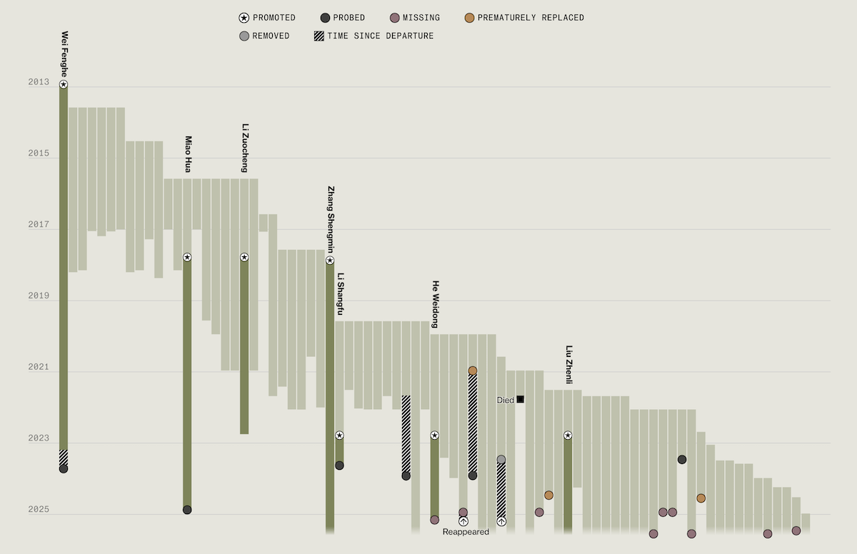
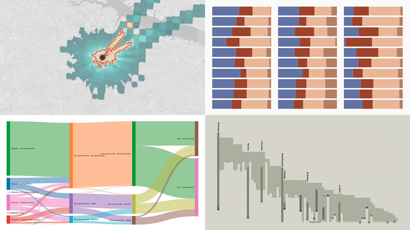
President Xi Jinping has overseen the biggest shake-up of China’s armed forces since Mao. In recent years, nearly a fifth of the generals he personally promoted have been dismissed or investigated, leaving the Central Military Commission (CMC) at its smallest size in the post-Mao era. The consequences extend beyond Beijing, raising questions about both China’s military readiness and Xi’s grip on power.
Bloomberg’s The Big Take explores the scale of the purge, providing visualizations that clarify the scope. The central chart, titled All of Xi’s Men, depicts the tenure of every general appointed since 2012. As readers scroll, Xi’s three terms are highlighted, showing when investigations began and how the trend has accelerated. Notes along the way mark pivotal events, such as the rise and fall of He Weidong. Additional context in the narrative explains how the purges unfolded and what they mean for China’s leadership.
See the story on The Big Take.
Workplace Harassment in Mexican Hospitals
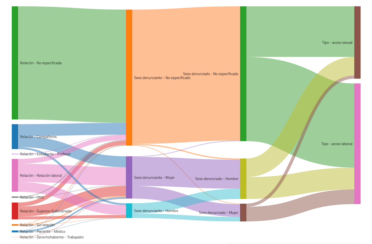
Medical trainees and residents in Mexico face exhausting 36-hour shifts and frequent harassment, a culture that continues despite regulations meant to prevent such practices. Surveys suggest that most doctors in training experience some form of abuse, whether verbal, physical, or even sexual — conditions that affect both their well-being and patient safety.
Serendipia investigates the issue with data obtained through information requests to major public health institutions. A Sankey diagram, pictured above, shows how complaints are distributed by type of abuse, the sex of the complainant, and their relationship to the aggressor. Additional visualizations, including line and stacked column charts, track the steady rise in workplace and sexual harassment reports since 2016, break them down by institution, and highlight differences across categories. The story combines these graphics with testimonies and case studies, highlighting the systemic nature of the problem faced by medical residents across Mexico.
Check out the article on Serendipia by Fernanda Izúcar and Hugo Osorio.
Bias in AI Models About Ukraine
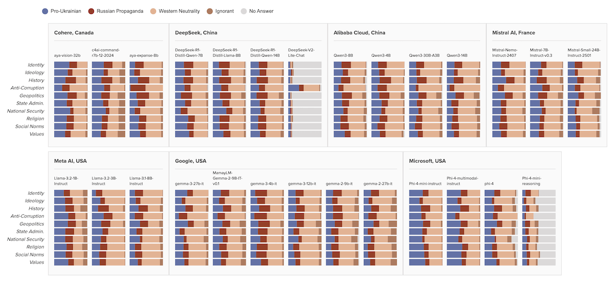
Large language models (LLMs) shape much of today’s information ecosystem, from search engines to translation services. Their built-in biases can therefore affect how millions of people perceive global issues — including Ukraine.
Texty.org.ua, in collaboration with OpenBabylon, tested 27 open-source AI models by asking them over 2,800 questions about Ukraine. Responses were evaluated across ten thematic areas, from geopolitics and national identity to public administration. A series of stacked bar charts shows how models aligned with categories such as “pro-Ukrainian,” “Russian propaganda,” “Western neutrality,” or “ignorant.” The graphics highlight striking differences: some models consistently called Russia the aggressor, while others echoed Kremlin narratives or avoided clear answers. The study also reveals systematic patterns — with Canadian and French models giving more Ukraine-friendly responses, while Chinese ones leaned more heavily toward pro-Russian positions.
Explore the investigation on Texty.org.ua by Anton Polishko, Artur Küllian, Inna Hadzynska, Mykola Khandoha, Nataliia Romanyshyn, Serhii Mikhalkov, Yevhen Kostiuk, and Yurii Filipchuk.
Health Risks from Methane Emissions in U.S.
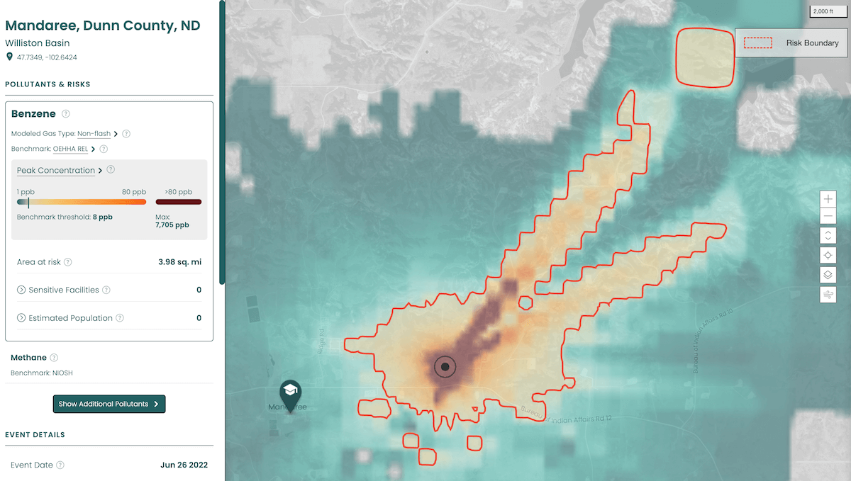
Methane leaks are often seen mainly as a climate issue, but they also release other hazardous pollutants that can endanger human health. Compounds like benzene, toluene, and xylene are emitted alongside methane during oil and gas operations, posing risks to the respiratory, reproductive, and nervous systems.
The nonprofit research institute PSE Healthy Energy, through its Methane + Health Initiative, has developed the Methane Risk Map. This interactive data visualization tool combines methane emissions records with regulatory-grade air quality modeling, mapping more than 1,300 methane leaks in the United States since 2016. It shows where pollutants released alongside methane may have reached harmful concentrations, helping to connect energy infrastructure with public health impacts. Users can explore locations, see modeled health risks, and understand how these emissions affect nearby communities. The tool is expected to be continually updated as new data becomes available, offering a unique way to connect methane events with public health concerns.
Take a look at the project on the Methane Risk Map.
Wrapping Up
Charting shifts in China’s military leadership, exposing workplace abuse in hospitals, revealing how AI models portray Ukraine, and mapping health risks from methane leaks - each of these projects demonstrates how data visualization can help make sense of complex realities.
Stay tuned for more data viz practices to explore in the next Data Visualization Weekly.
- Categories: Data Visualization Weekly
- No Comments »